
There’s a specific kind of creative frustration that comes from looking at a photo that’s almost there. The lighting is solid, the color grading is clean, the composition is tight – and yet something still feels slightly off. Not broken, just not quite finished. I’ve been in that situation more times than I want to count, usually sitting in a coffee shop somewhere, rotating the canvas and squinting at my screen like that’s somehow going to fix the problem.
What I’ve learned – sometimes painfully, sometimes from watching people who actually know what they’re doing – is that the final five percent of an image often lives inside the Liquify filter. Not for dramatic warping or the kind of heavy-handed reshaping that ends up on a bad retouching callout thread. I mean surgical, barely-visible nudges that bring a shape into harmony with what your eye expected to see. In this Visual Education tutorial, photographer Karl Taylor demonstrates exactly that approach using a rim-lit portrait submitted by one of his community members. Watch the full tutorial on YouTube – but if you want the breakdown of what he’s actually doing and why it works, keep reading.
The image he’s working with is genuinely excellent. The lighting is controlled, the color treatment is beautiful, and there’s real craft on display. Karl’s adjustments are small, which is actually what makes this tutorial so useful. When you watch someone improve a weak image, you learn how to fix problems. When you watch someone improve a strong image, you learn how to see.
Step 1: Duplicate the Layer Before You Touch Anything
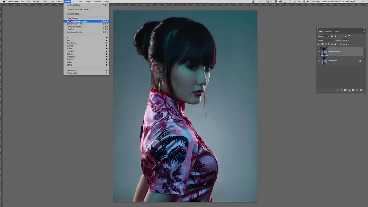 Photoshop layers panel with background layer being duplicated
Before opening Liquify, duplicate your base layer. Every time. I know you know this. I’m telling you anyway because I’ve definitely skipped this step at 1am on a deadline and regretted it. Liquify is a destructive filter when applied directly to a pixel layer, so working on a copy gives you a clean comparison and a safe fallback.
Photoshop layers panel with background layer being duplicated
Before opening Liquify, duplicate your base layer. Every time. I know you know this. I’m telling you anyway because I’ve definitely skipped this step at 1am on a deadline and regretted it. Liquify is a destructive filter when applied directly to a pixel layer, so working on a copy gives you a clean comparison and a safe fallback.
In Karl’s workflow, he duplicates the layer, then goes to Filter > Liquify. That’s it – no flattening, no merging yet. Keep the original locked and untouched underneath. If you want to get non-destructive about it, convert your layer to a Smart Object before going into Liquify and it’ll apply as a Smart Filter you can re-edit later.
Step 2: Reshape the Hair and Head for Better Visual Flow
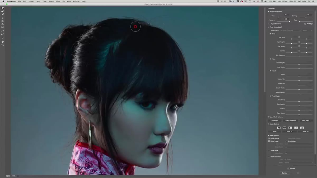 Liquify workspace open with Forward Warp tool active on subject’s hair
Karl’s first move is on the subject’s hair. The image features a traditional Asian hair bun, and while it reads clearly, the silhouette at the top of the head is a little flat and irregular. Using the Forward Warp tool (W inside Liquify), he gently rounds out the top of the head and pushes the bun into a more defined, symmetrical shape.
Liquify workspace open with Forward Warp tool active on subject’s hair
Karl’s first move is on the subject’s hair. The image features a traditional Asian hair bun, and while it reads clearly, the silhouette at the top of the head is a little flat and irregular. Using the Forward Warp tool (W inside Liquify), he gently rounds out the top of the head and pushes the bun into a more defined, symmetrical shape.
The key here is brush size. You want a brush that’s large enough to move the area smoothly without creating pinch points, but not so large that you’re accidentally dragging half the frame. Karl keeps his strokes short and deliberate – small pushes, check the result, push again. The before-and-after on just this one adjustment is more noticeable than you’d expect. A slightly more intentional head shape gives the portrait a cleaner, more composed feeling without looking touched.
Step 3: Work the Shoulders to Relax the Posture
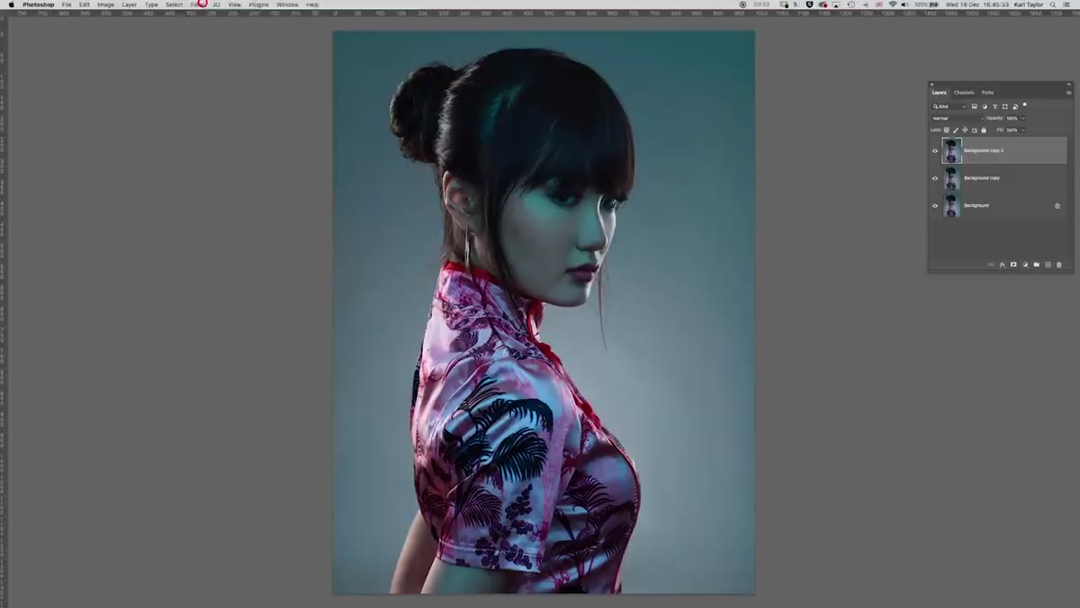 Liquify tool being used to adjust subject’s shoulder position
This is the adjustment I found most instructive. The subject’s arms are positioned behind her back, which is a stylistically interesting choice – but the angle at which they disappear behind her creates a slightly forced, tense look in the shoulders. Karl uses Liquify to pull the shoulder back slightly and let the arms drop into a more vertical line.
Liquify tool being used to adjust subject’s shoulder position
This is the adjustment I found most instructive. The subject’s arms are positioned behind her back, which is a stylistically interesting choice – but the angle at which they disappear behind her creates a slightly forced, tense look in the shoulders. Karl uses Liquify to pull the shoulder back slightly and let the arms drop into a more vertical line.
He’s the first to admit this isn’t a perfect fix. The arms are in a genuinely tricky position and there’s only so much you can do with warping before you start creating distortion that’s worse than the original problem. But even a subtle shift in the shoulder angle changes how relaxed the pose reads. If you’re doing this on your own work, zoom out frequently. It’s easy to over-correct when you’re nose-deep in the Liquify workspace. Step back, look at the whole frame, then go back in.
Step 4: Add a Small Curve to the Neck
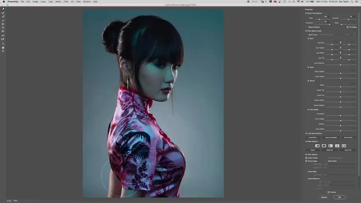 Close-up of neck area being adjusted with Forward Warp in Liquify
While he’s already inside the Liquify filter working on the shoulders, Karl also adds a tiny curve to the neck. This is the kind of adjustment that sounds almost pointlessly minor until you toggle it on and off. A neck that flows naturally into the shoulder reads as elegant. One that goes straight down at a rigid angle reads as stiff, even if you can’t consciously identify why.
Close-up of neck area being adjusted with Forward Warp in Liquify
While he’s already inside the Liquify filter working on the shoulders, Karl also adds a tiny curve to the neck. This is the kind of adjustment that sounds almost pointlessly minor until you toggle it on and off. A neck that flows naturally into the shoulder reads as elegant. One that goes straight down at a rigid angle reads as stiff, even if you can’t consciously identify why.
Keep your brush pressure low for this one – under 30 is a good starting point. You’re not moving anything dramatically, just introducing a slight organic lean. The goal is for it to look like the subject shifted naturally, not like the pixels got nudged in post.
Step 5: Use a Curves Adjustment to Lift the Deepest Shadows in the Fabric
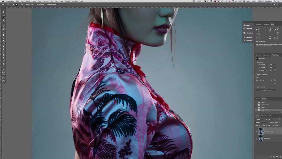 Curves adjustment panel open with shadow end being pulled up slightly
Once the structural work is done, Karl turns his attention to the fabric the subject is wearing. The deep shadows in the folds are doing important work – they’re what makes the material read as silky and luxurious. But a few of them have gone just dark enough to read as dead zones rather than deliberate shadow.
Curves adjustment panel open with shadow end being pulled up slightly
Once the structural work is done, Karl turns his attention to the fabric the subject is wearing. The deep shadows in the folds are doing important work – they’re what makes the material read as silky and luxurious. But a few of them have gone just dark enough to read as dead zones rather than deliberate shadow.
He makes a rough selection of the problematic areas with a feathered edge (five pixels in this case, which is gentle enough not to create obvious selection lines), then adds a Curves adjustment layer that lifts just the shadow end of the curve. When the shadows pull toward red, he dials the red channel back down to keep the color neutral. The result still has depth and texture – it just doesn’t have the areas that your eye wants to skip over.
What I’d Add: Use a Mask to Paint Liquify in Selectively
One thing Karl doesn’t cover in this particular walkthrough, but that I’ve found genuinely useful, is painting Liquify adjustments in with a layer mask rather than applying them to the whole image at once. The approach is simple: apply your Liquify adjustments to a duplicate layer, then add a black mask that hides everything. Use a soft white brush to reveal only the areas where you actually want the warp to show. This gives you much finer control over blended edges, especially around hair or anywhere two shapes overlap in a complex way. It adds a step, but for client work it’s saved me from some awkward conversations.
The real lesson from Karl’s walkthrough isn’t about any specific Liquify setting. It’s about learning to look at a finished image and identify the small structural things that are keeping it from its best version. The lighting in the original photo was already doing the heavy lifting. All that was left was a hair shape, a shoulder angle, and a couple of dark patches in the fabric.
Those adjustments took maybe ten minutes. The image looks meaningfully better. That ratio – small time investment, real visible improvement – is exactly why Liquify is worth getting comfortable with even if you’re not a retoucher by trade.
Watch the full tutorial on YouTube to see Karl’s hands-on technique in real time. Watching someone navigate Liquify live, with all the small course-corrections and second-guessing, is worth more than any written breakdown including this one.
Comments
Leave a Comment