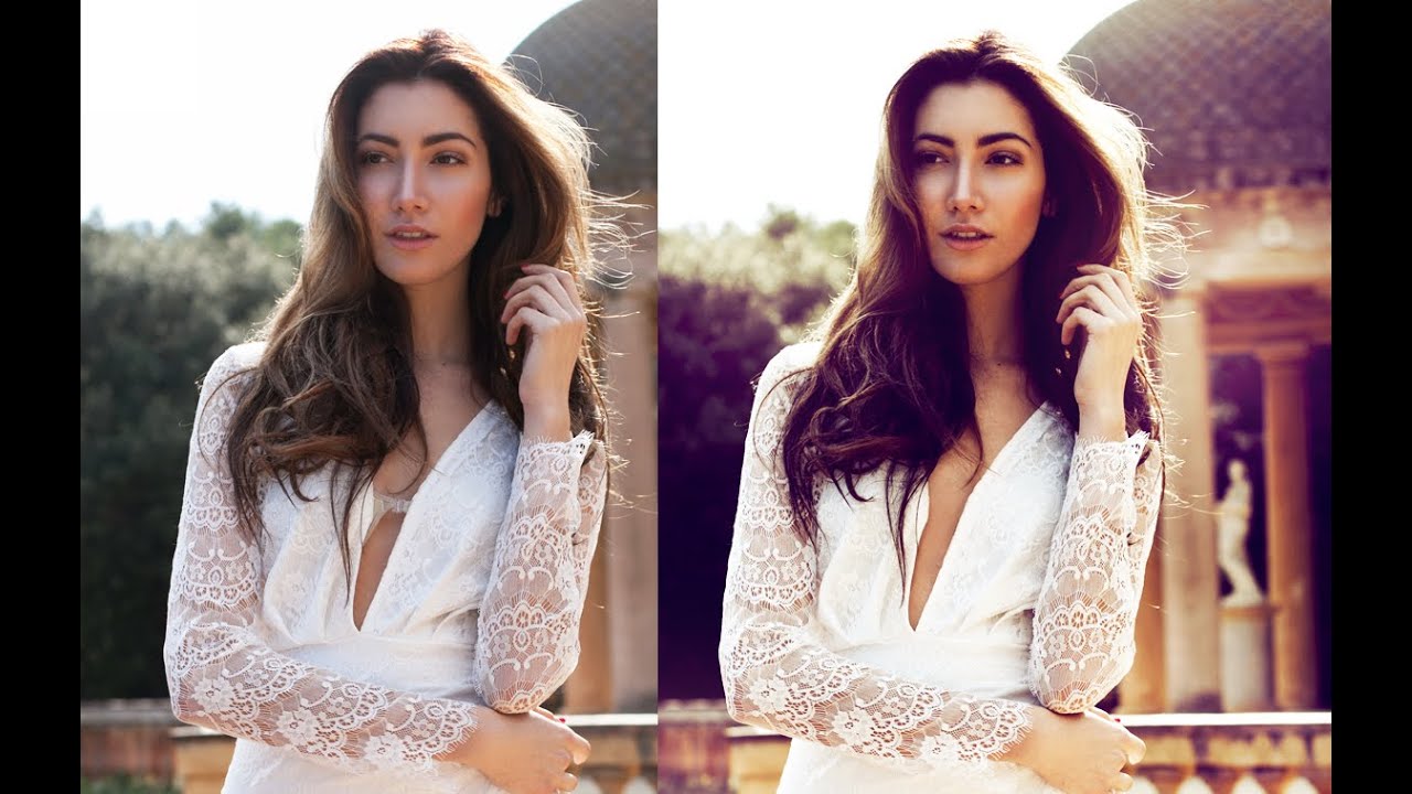
Portrait retouching is one of those skills that separates the “I know Photoshop” crowd from the people who actually get hired to use it. I spent a good chunk of my early freelance life dodging portrait work because I was terrified of making someone’s skin look like a wax sculpture. Turns out, the difference between a natural-looking retouch and a creepy one often comes down to a handful of small, deliberate choices — not some massive toolkit of esoteric techniques.
That’s exactly what makes this Jessica Kobeissi tutorial worth your time. Watch the full tutorial on YouTube — she walks through a realistic, working professional’s approach to portrait editing: removing a distracting strap, matching skin tones across the image, desaturating for a moodier base, and finishing with a curves-based color grade. It’s the kind of workflow you can actually use on client work, not just practice images. Here’s the full breakdown.
Step 1: Create a New Layer Before You Touch Anything
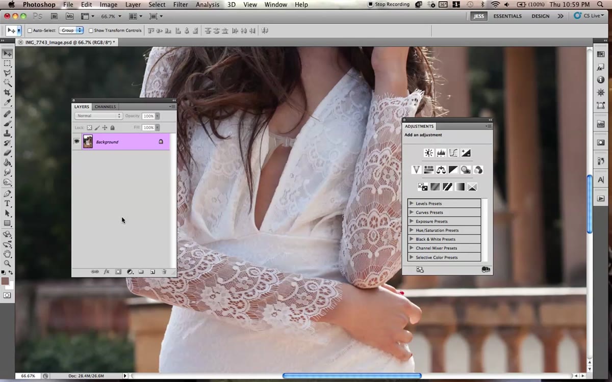 New layer created before using the Clone Stamp tool
Before you reach for any tool, get into the habit of creating a new blank layer to work on. On Mac that’s Command + Shift + N, on Windows it’s Control + Shift + N. This keeps your retouching completely separate from the original image, which means you can dial back, erase, or trash the whole thing without touching your base layer. It sounds basic, but I’ve watched people clone stamp directly onto their background layer and then have to explain to a client why they can’t undo a change from 45 minutes ago.
Name the layer something useful like “Clone Work” so you’re not hunting for it later.
Step 2: Use the Clone Stamp Tool to Remove Distractions
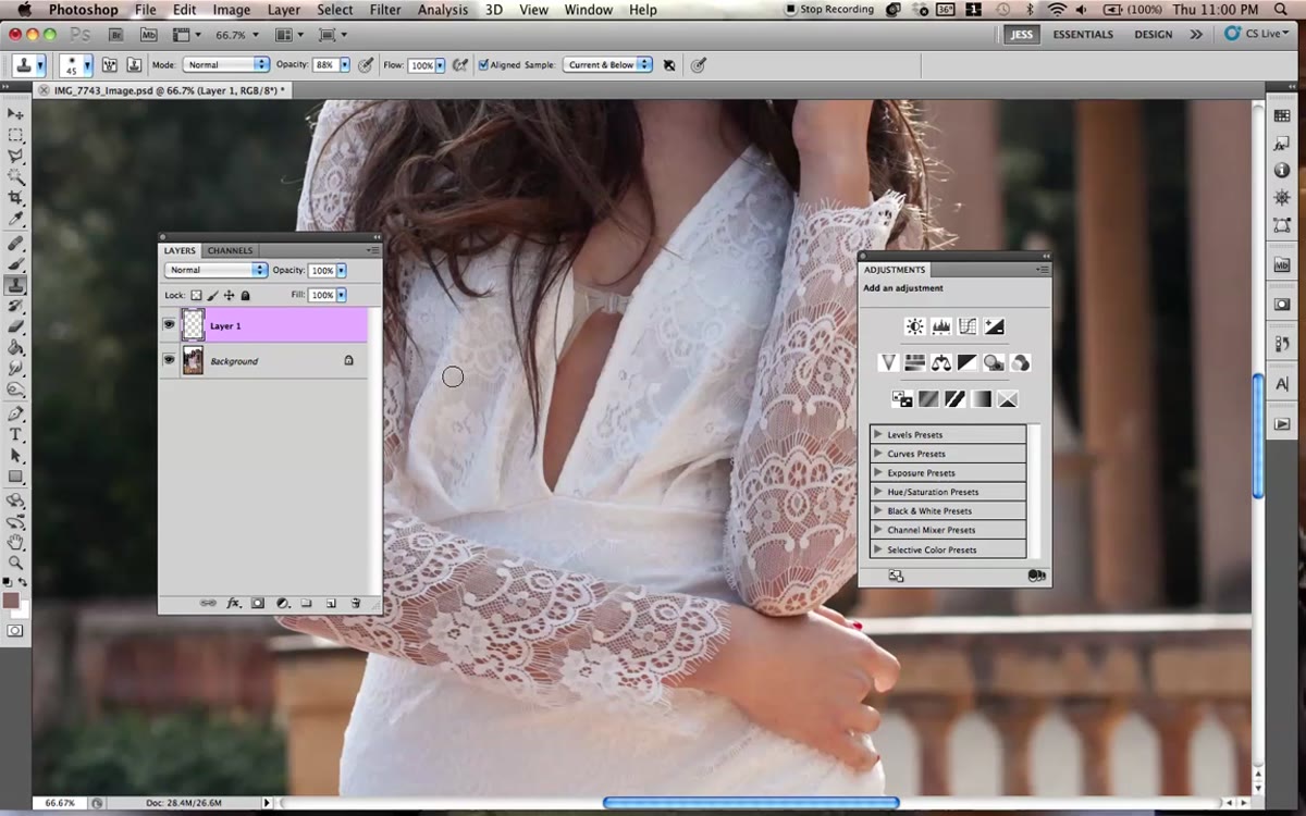 Clone Stamp tool selected, sampling skin near the strap
With your new layer selected, grab the Clone Stamp tool (S on the keyboard). Hold Alt (Option on Mac) and click to sample an area of skin near whatever you’re trying to remove. In this case, it’s a visible strap cutting across the subject’s skin. Set your brush opacity to around 80% to start. Going in at full opacity tends to produce hard, obvious patches that look like someone smeared digital clay on your model.
The trick Jessica demonstrates here is not obsessing over getting a perfect color match on the first pass. Get close, cover the area, and then refine. Work in short strokes and resample often so you’re pulling from slightly different areas of skin. This reduces the telltale “copy-paste” texture that makes clone stamp work look amateur. Nobody said it would be fun. It’s not. But it works.
Step 3: Clean Up the Edges and Blend with Low Opacity
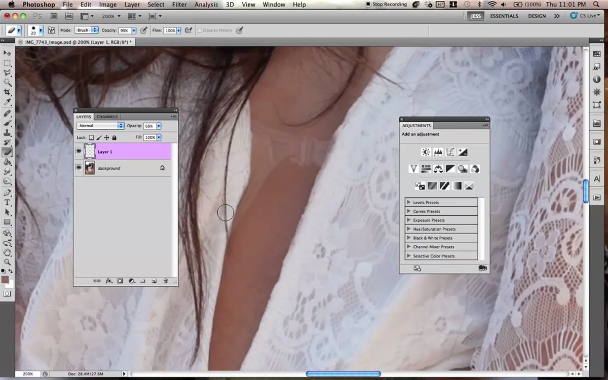 Erasing around dress edges to blend cloned area
Once the main object is covered, drop your brush opacity down significantly, somewhere in the range of 10-20%, and use the Eraser tool to feather out the edges of your clone work. The goal is to make the retouched area bleed naturally into the surrounding detail, like the edge of a dress or a lock of hair.
Jessica also adds a separate layer set to Overlay mode and paints with black at a very low opacity (around 11%) to hint at shadow in the retouched area. This is a subtle move but it matters. A flat patch of skin with no tonal variation reads as fake immediately. A tiny bit of shadow suggests dimension and your eye accepts it as real.
Step 4: Color Match Skin Tones Across the Image
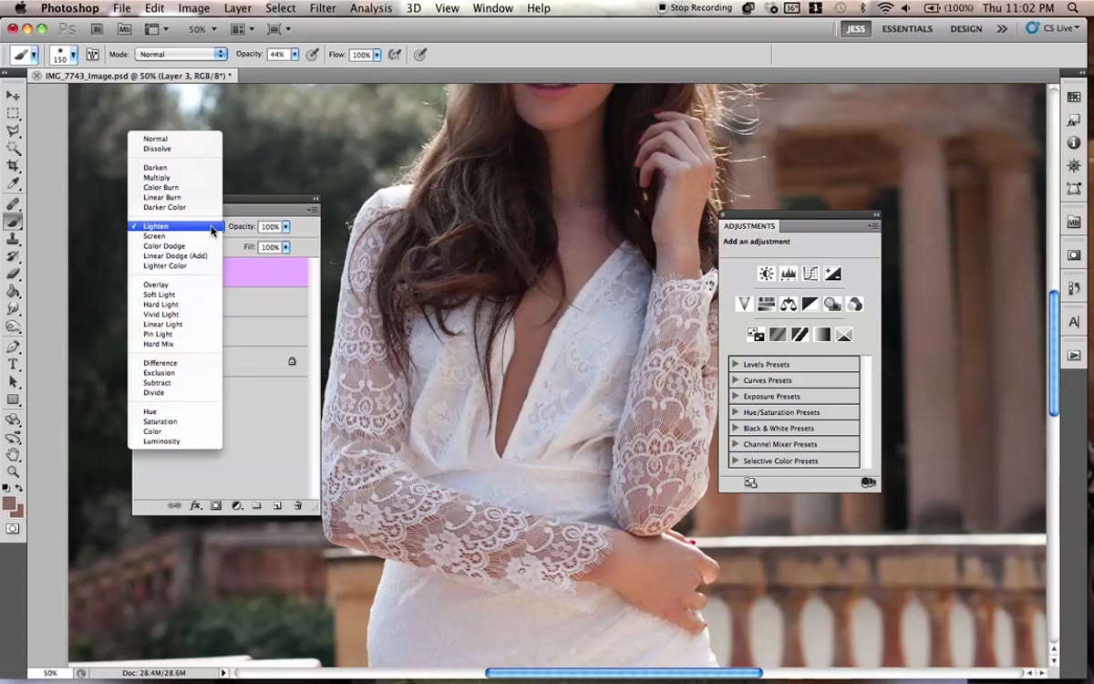 New layer set to Color blend mode for skin tone matching
Here’s a step a lot of people skip and then wonder why their edit looks slightly off. Create a new layer and set its blend mode to Color. Sample the dominant skin tone from the face or arm with the Eyedropper tool, then paint gently over any areas that aren’t matching. Legs especially tend to photograph differently than faces depending on light falloff.
Keep the layer opacity low. You’re not repainting skin, you’re nudging a few tones into agreement. The difference between the before and after on this step is subtle in isolation, but it’s the kind of thing that makes a finished image feel cohesive rather than stitched together.
Step 5: Desaturate with Hue/Saturation
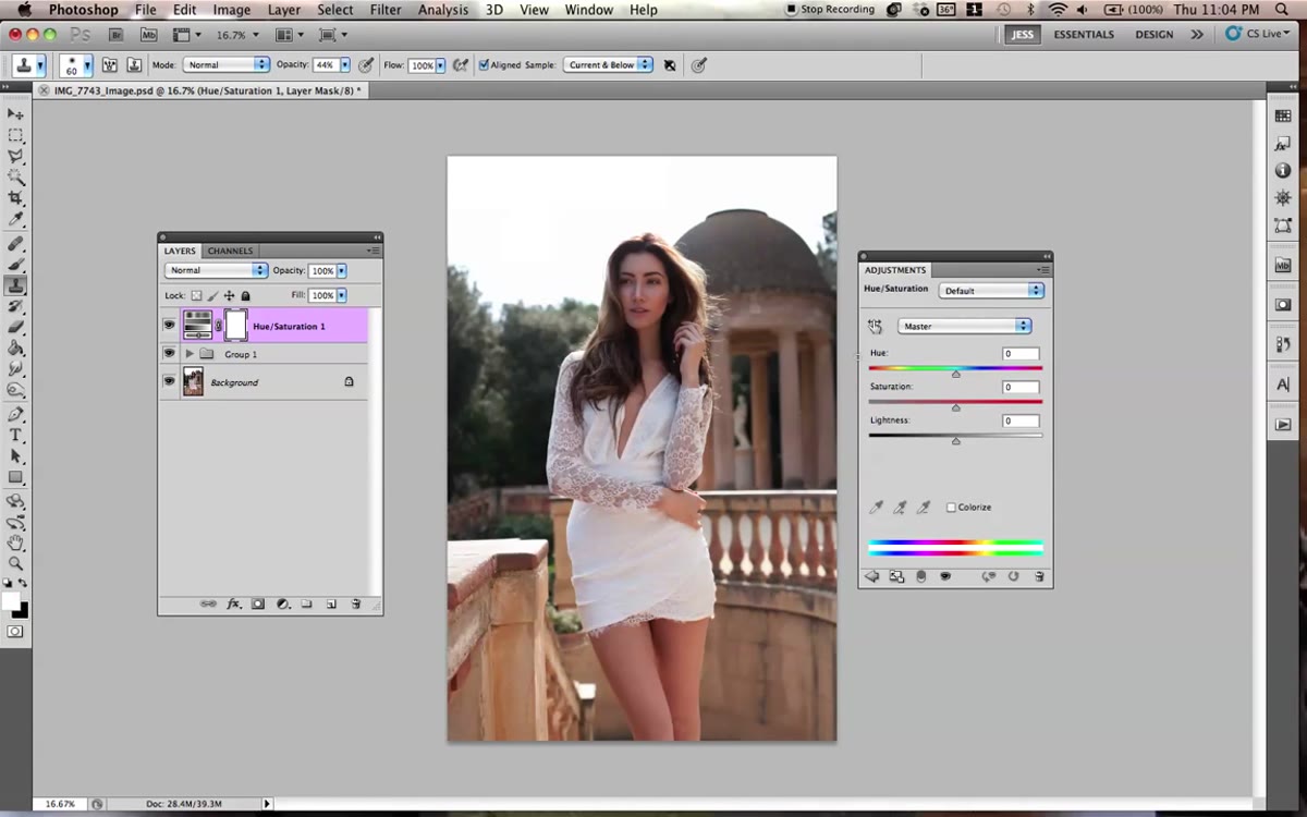 Hue/Saturation adjustment layer with saturation pulled down
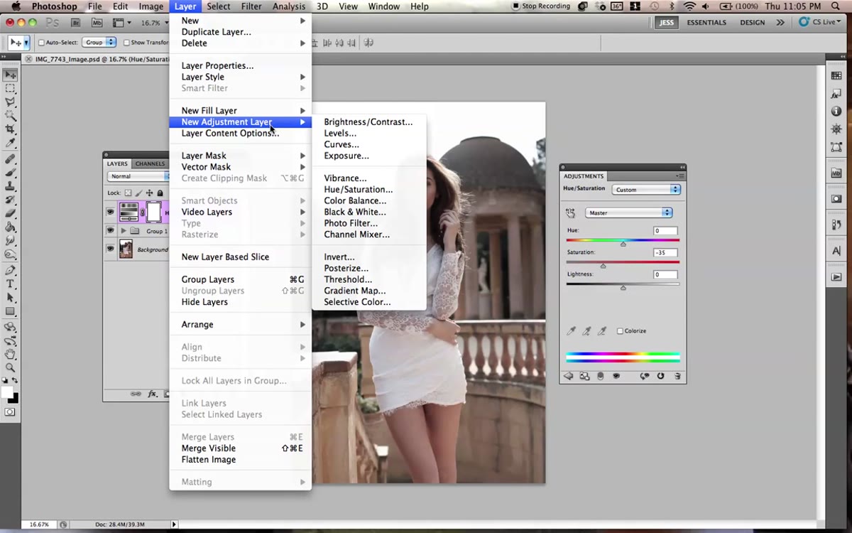
Now you get into the actual color grading. Add a Hue/Saturation adjustment layer (Layer > New Adjustment Layer > Hue/Saturation) and pull the Saturation slider down. How far depends on the look you’re after. Jessica pulls it back enough to take the edge off the raw colors without going full black and white. This creates a cooler, more editorial feel and sets the stage for the curves work coming next.
Think of this step as clearing the canvas. Over-saturated images fight your color grade. By bringing saturation down first, your curves adjustments have more room to breathe and the final tones land more cleanly.
Step 6: Shape the Contrast and Color with a Curves Layer
 Curves adjustment layer with dramatic S-curve applied
Add a Curves adjustment layer. This is where the image personality really comes through. Jessica builds a fairly dramatic curve to punch up contrast, then dips into the individual color channels. The move to pay attention to: she lifts the blue channel slightly in the shadows and midtones, which introduces a cool violet-blue tone that gives the image that moody, editorial quality.
Once the curve is shaped how you want it, change the layer blend mode from Normal to Soft Light and dial the opacity back to around 93%. Soft Light applies the curve’s contrast and color influence more gently, letting the underlying detail show through. Full Normal mode at 100% tends to be too aggressive for portrait work unless you’re going for something really stylized.
Step 7: Add Noise to Unify the Edit
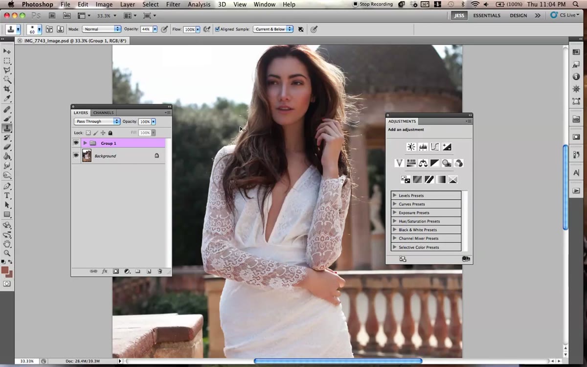 Noise addition mentioned to help retouched areas blend
At the end of the process, Jessica mentions adding a noise layer over the whole image. This is one of those finishing moves that sounds counterintuitive but is actually really effective. Retouched areas often have a slightly smoother texture than the rest of the image, which makes them visible on close inspection. A small amount of uniform noise ties everything back together and keeps the image from looking over-processed.
Add a new layer filled with 50% gray (Edit > Fill > 50% Gray), set it to Overlay mode, then go to Filter > Noise > Add Noise. Use a small value, Gaussian, Monochromatic checked. Lower the layer opacity until it’s barely visible. That’s it.
One Thing I’d Add: Save a Flattened Version at Every Major Stage
I learned the painful way that a multi-layer portrait file with adjustment layers, clone layers, and blend mode stacks can get complicated fast. Before you move from retouching into color grading, save a flattened copy (not your working file, a separate “checkpoint” PSD or TIFF). If a client comes back three weeks later asking for the version before the color grade, you’ll be glad you did. I once had to reverse engineer a color grade from a JPEG because my only save was the fully graded version. It took two hours and a lot of coffee.
The biggest thing I took from this tutorial is how much control you get by stacking simple adjustments rather than chasing one perfect setting. Desaturate a little, shape the curves, add a hint of noise. None of these moves are dramatic on their own. Together they build a professional, cohesive result. That’s the actual skill.
Watch the full tutorial on YouTube to see Jessica’s specific moves in real time. Her pacing and commentary while working through the clone stamp section alone is worth the watch.
Comments
Leave a Comment