There’s a certain kind of photo edit that looks incredibly complex but is actually embarrassingly simple once someone shows you the right approach. Changing the color of plants and foliage in Photoshop is one of those edits. I used to do it the hard way, making selections, painting on separate layers, swearing at my screen in a coffee shop while the person next to me slowly edged their chair away. Then I watched this tutorial from Aaron Nace over at PHLEARN and felt that particular mix of relief and mild personal insult that comes from realizing you’ve been overcomplicating something for years. Watch the full tutorial on YouTube
The specific use case Aaron walks through is matching plant colors to a subject’s clothing, which is a genuinely useful creative technique. Think portrait shoots where the background foliage feels disconnected from the overall palette, or product photography where you want everything to feel cohesive. The technique uses Hue/Saturation adjustment layers in a way most people never fully explore, combined with a group layer mask to keep the effect off your subject. It’s fast, it’s non-destructive, and it’s the kind of thing that makes clients think you spent way more time than you did.
Step 1: Add a Hue/Saturation Adjustment Layer
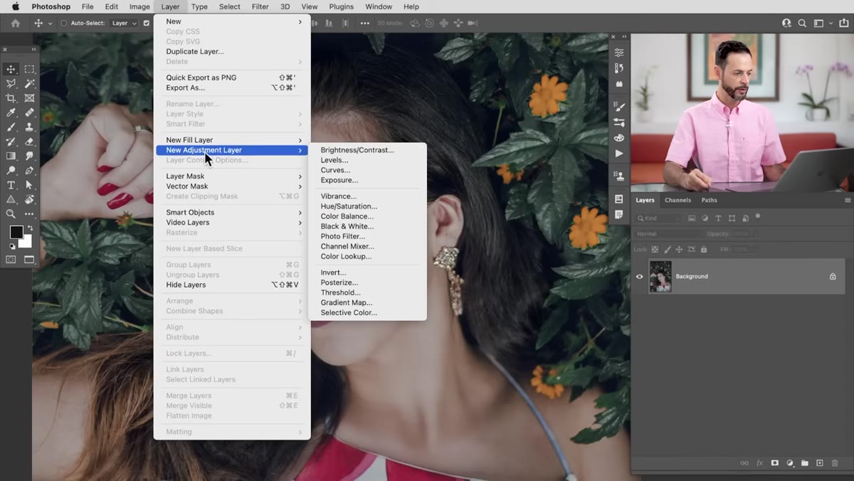 Hue/Saturation adjustment layer being added from Layer menu
Go to Layer, then New Adjustment Layer, then Hue/Saturation. You can also just click the half-circle adjustment layer icon at the bottom of the Layers panel and pick it from there. Either way gets you to the same place. This is the core tool for the whole technique, and the reason it works so well is that Hue/Saturation lets you target specific color ranges rather than shifting every color in the image at once.
Hue/Saturation adjustment layer being added from Layer menu
Go to Layer, then New Adjustment Layer, then Hue/Saturation. You can also just click the half-circle adjustment layer icon at the bottom of the Layers panel and pick it from there. Either way gets you to the same place. This is the core tool for the whole technique, and the reason it works so well is that Hue/Saturation lets you target specific color ranges rather than shifting every color in the image at once.
Step 2: Switch from Master to Greens
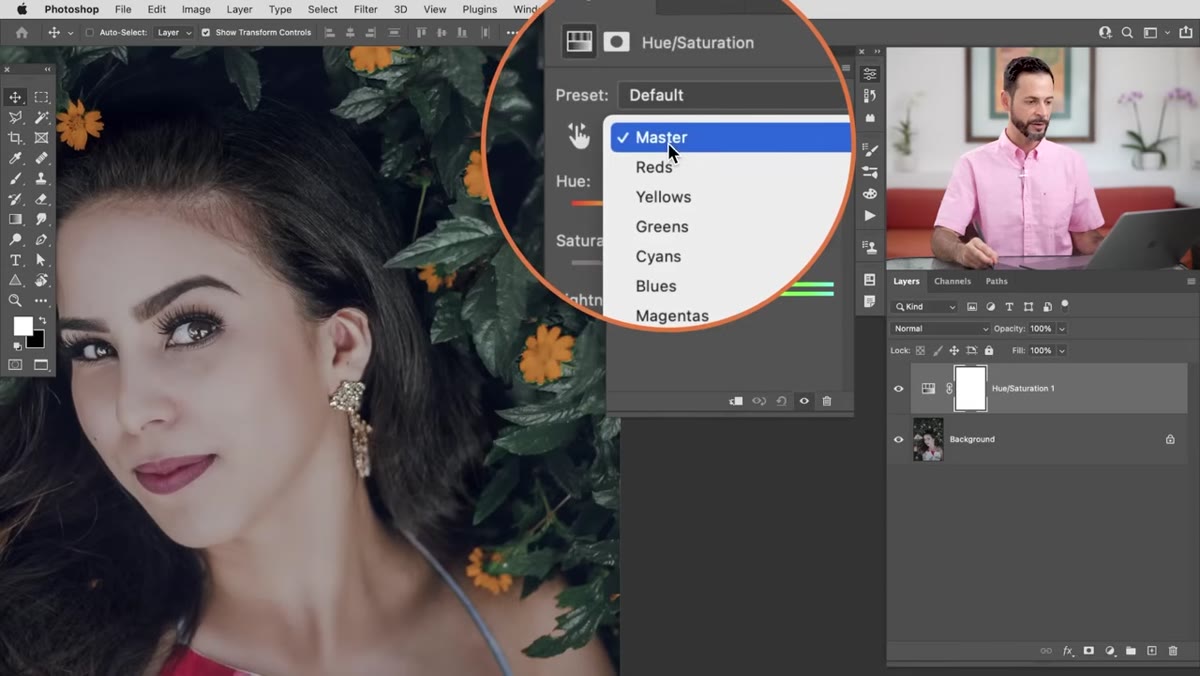 Hue/Saturation panel with color channel dropdown open showing Greens selected
In the Hue/Saturation Properties panel, you’ll see a dropdown at the top that says “Master” by default. Click that and switch it to “Greens.” This tells Photoshop you only want to mess with the green tones in the image, leaving everything else alone. Most foliage and plant life lives in this channel, which is why it’s your starting point. If you’re working with more golden or autumnal plants, you might need “Yellows” instead, and we’ll get to that.
Hue/Saturation panel with color channel dropdown open showing Greens selected
In the Hue/Saturation Properties panel, you’ll see a dropdown at the top that says “Master” by default. Click that and switch it to “Greens.” This tells Photoshop you only want to mess with the green tones in the image, leaving everything else alone. Most foliage and plant life lives in this channel, which is why it’s your starting point. If you’re working with more golden or autumnal plants, you might need “Yellows” instead, and we’ll get to that.
Step 3: Use the Eyedropper to Sample the Exact Green You Want to Change
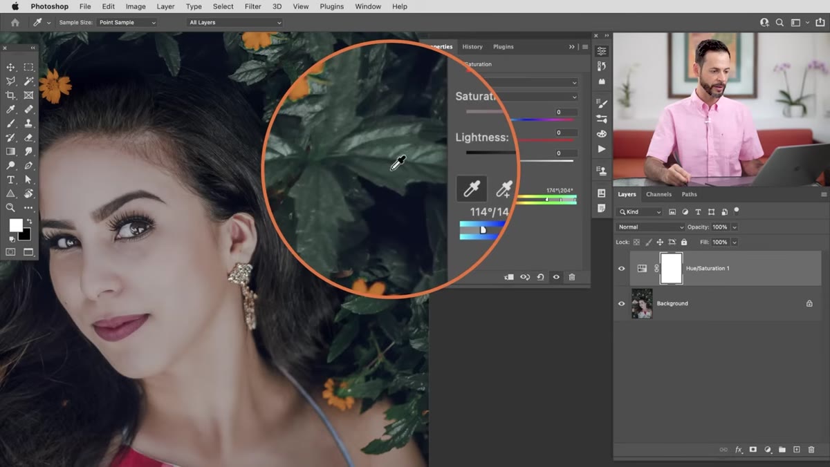 Eyedropper tool being used to click on green foliage in the image
Inside the Hue/Saturation panel, there’s a small eyedropper icon. Click it, then click directly on the green in your photo that you want to shift. Photoshop will fine-tune the selected color range based on exactly what you sampled, which is way more precise than trying to eyeball it with the slider. You’ll see the color bar at the bottom of the panel update to reflect the narrower target range. Now drag the Hue slider left or right and watch the plants shift color in real time. It’s genuinely satisfying.
Eyedropper tool being used to click on green foliage in the image
Inside the Hue/Saturation panel, there’s a small eyedropper icon. Click it, then click directly on the green in your photo that you want to shift. Photoshop will fine-tune the selected color range based on exactly what you sampled, which is way more precise than trying to eyeball it with the slider. You’ll see the color bar at the bottom of the panel update to reflect the narrower target range. Now drag the Hue slider left or right and watch the plants shift color in real time. It’s genuinely satisfying.
Step 4: Expand the Color Range if Some Areas Are Being Missed
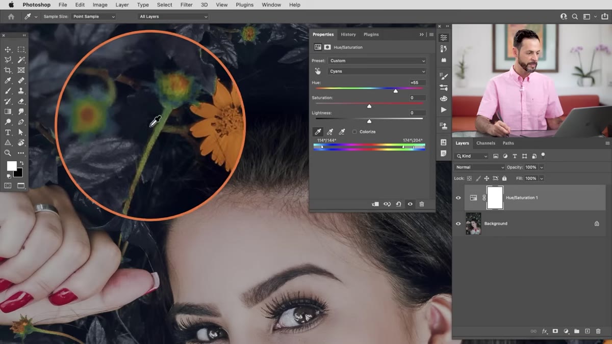 Color range sliders being adjusted wider at the bottom of Hue/Saturation panel
Sometimes the eyedropper doesn’t capture every shade of green in your image, especially if there are areas in shadow or highlights that read as a slightly different hue. If you zoom out and notice patches that didn’t shift, look at the color range indicator at the bottom of the Hue/Saturation panel. There are sliders on either side of the selected range. Drag those outward a little to widen the net and include more tones. Don’t go too wild or you’ll start pulling in colors you don’t want, but a nudge in each direction usually cleans things up.
Color range sliders being adjusted wider at the bottom of Hue/Saturation panel
Sometimes the eyedropper doesn’t capture every shade of green in your image, especially if there are areas in shadow or highlights that read as a slightly different hue. If you zoom out and notice patches that didn’t shift, look at the color range indicator at the bottom of the Hue/Saturation panel. There are sliders on either side of the selected range. Drag those outward a little to widen the net and include more tones. Don’t go too wild or you’ll start pulling in colors you don’t want, but a nudge in each direction usually cleans things up.
Step 5: Use a Color-Mode Paint Layer for Any Stubborn Spots
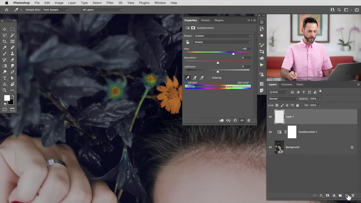 New layer being created with blend mode set to Color in the Layers panel
For anything the Hue/Saturation layer just won’t catch, create a new blank layer above it. Hit B for the Brush tool, then hold Alt (Option on Mac) to temporarily switch to the eyedropper and sample the target color from your subject or wherever you’re pulling the palette from. Paint over the stubborn areas, then change that layer’s blend mode from Normal to Color. The Color blend mode only affects the hue and saturation of whatever you paint over, leaving the luminosity intact. This means you get a color shift without that flat, painted-over look.
New layer being created with blend mode set to Color in the Layers panel
For anything the Hue/Saturation layer just won’t catch, create a new blank layer above it. Hit B for the Brush tool, then hold Alt (Option on Mac) to temporarily switch to the eyedropper and sample the target color from your subject or wherever you’re pulling the palette from. Paint over the stubborn areas, then change that layer’s blend mode from Normal to Color. The Color blend mode only affects the hue and saturation of whatever you paint over, leaving the luminosity intact. This means you get a color shift without that flat, painted-over look.
Step 6: Add a Second Hue/Saturation Layer for Flowers or Other Colors
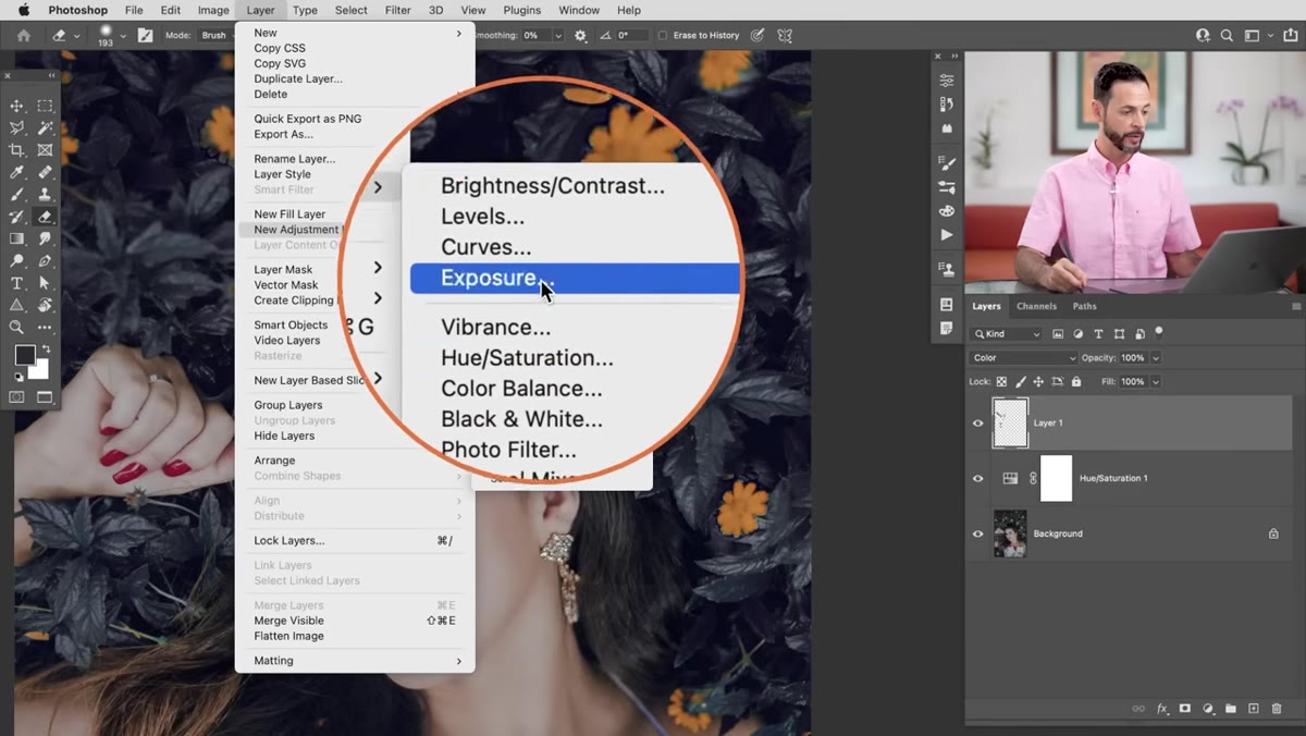 Second Hue/Saturation adjustment layer added with Yellows selected in dropdown
If your image has flowers or other non-green plant elements, repeat the whole process with a new Hue/Saturation adjustment layer. This time, switch the channel dropdown to “Yellows” (or whatever color applies to your flowers), sample with the eyedropper, and dial in your hue shift. Keeping these as separate adjustment layers means you can tweak each one independently without the changes fighting each other. Stack as many as you need, one per color range.
Second Hue/Saturation adjustment layer added with Yellows selected in dropdown
If your image has flowers or other non-green plant elements, repeat the whole process with a new Hue/Saturation adjustment layer. This time, switch the channel dropdown to “Yellows” (or whatever color applies to your flowers), sample with the eyedropper, and dial in your hue shift. Keeping these as separate adjustment layers means you can tweak each one independently without the changes fighting each other. Stack as many as you need, one per color range.
Step 7: Group All Color Layers and Mask Out Your Subject
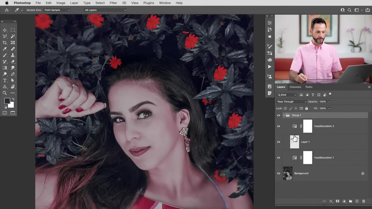 Layer group with mask applied, painting black over subject’s skin
Once you’re happy with the plant colors, select all your adjustment layers (and any paint layers you added) in the Layers panel and group them together with Ctrl+G (Cmd+G on Mac). Then click the Layer Mask icon at the bottom of the panel to add a mask to the entire group. Hit B for your brush, set the foreground color to black, and paint over any part of the image where you don’t want the color effect, typically your subject’s skin, hair, or clothing. Black hides the effect, white reveals it. This single mask controls the whole group, so you’re not managing a separate mask for every individual layer.
Layer group with mask applied, painting black over subject’s skin
Once you’re happy with the plant colors, select all your adjustment layers (and any paint layers you added) in the Layers panel and group them together with Ctrl+G (Cmd+G on Mac). Then click the Layer Mask icon at the bottom of the panel to add a mask to the entire group. Hit B for your brush, set the foreground color to black, and paint over any part of the image where you don’t want the color effect, typically your subject’s skin, hair, or clothing. Black hides the effect, white reveals it. This single mask controls the whole group, so you’re not managing a separate mask for every individual layer.
One Thing I’d Add: Sample Your Target Color Before You Start
Here’s something Aaron doesn’t explicitly call out but that I’ve found saves a lot of back-and-forth. Before you even add the first adjustment layer, use the eyedropper to sample and note the hue value of the color you’re trying to match, whether that’s from a piece of clothing, a product label, whatever. Open up the Color panel and write down the hue number. Then when you’re dragging the Hue slider in your Hue/Saturation adjustment, you can cross-reference and hit a more precise match instead of just eyeballing it. It’s a small thing but it cuts down on the “is this close enough?” spiral that eats up time when you’re on a deadline and on your third coffee.
The core lesson here is that Hue/Saturation is a far more surgical tool than most people give it credit for. Most folks use it in Master mode and wonder why everything looks wrong. Targeting specific channels and fine-tuning the range with the eyedropper is what makes it actually useful for precision work like this. Combine that with a group mask and you’ve got a flexible, non-destructive workflow that you can revisit and adjust any time.
Watch the full tutorial on YouTube to see Aaron walk through the whole thing on a real image. Well worth the five minutes.
Comments
Leave a Comment