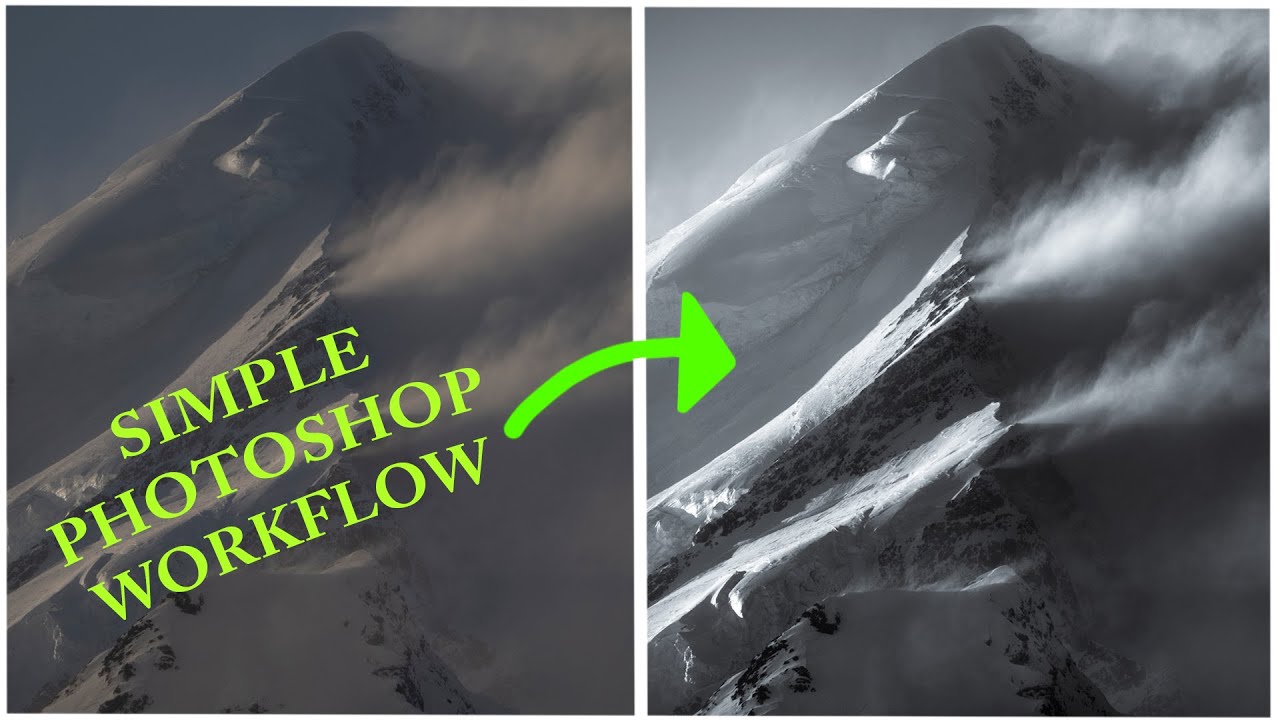
There’s a particular kind of black and white photo that stops you mid-scroll. Deep shadows, bright highlights, real tension between the two. Then there’s the other kind, which is just a color photo with the saturation turned off and a vague sense of disappointment. For a long time, most of what I was producing fell into that second category. I’d desaturate, maybe nudge the contrast slider, call it done. The results looked flat, lifeless, and honestly kind of embarrassing given how much time I’d spent on them.
That changed when I stumbled onto Watch the full tutorial on YouTube from photographer William Patino, where he walks through his process for creating dramatic monochrome images using a raw mountain shot from New Zealand. The workflow is methodical, the reasoning is clear, and it explains something I’d been getting wrong from the very first step. Here’s how it works.
Step 1: Open Your Raw File in Camera Raw (ACR)
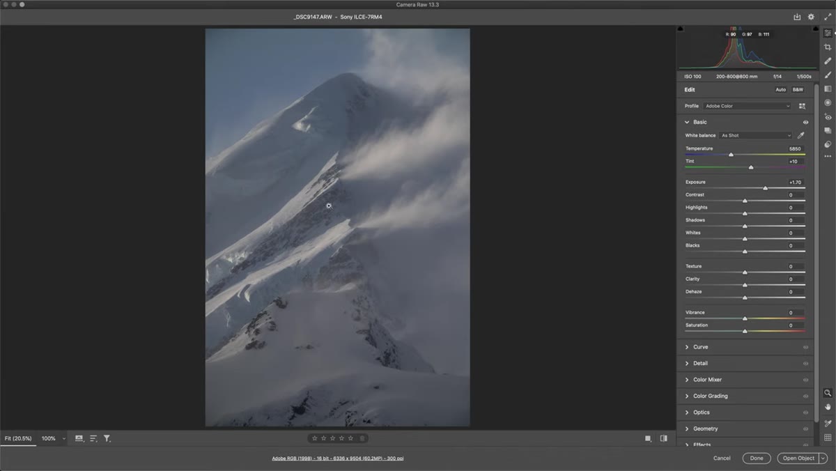
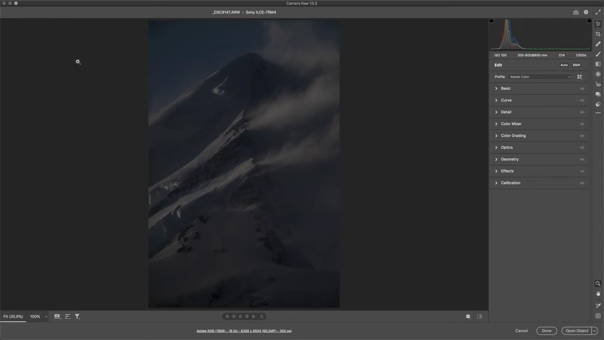 Raw mountain image open in Adobe Camera Raw
Start by opening your raw file in Photoshop, which will automatically launch Adobe Camera Raw. If you’re a Lightroom user, good news: the tools are essentially the same, so you can follow along there too. Patino’s source image looks almost alarmingly dark at first glance, but a quick check of the histogram tells a different story. It’s not severely underexposed, it’s just not bright. That distinction matters because it tells you what’s recoverable.
Raw mountain image open in Adobe Camera Raw
Start by opening your raw file in Photoshop, which will automatically launch Adobe Camera Raw. If you’re a Lightroom user, good news: the tools are essentially the same, so you can follow along there too. Patino’s source image looks almost alarmingly dark at first glance, but a quick check of the histogram tells a different story. It’s not severely underexposed, it’s just not bright. That distinction matters because it tells you what’s recoverable.
His shot was taken at 800mm, f/14, 1/500s, ISO 100 on a Sony camera. The conservative ISO setting is intentional: keeping it at 100 means there’s clean, workable data in the file to push later. Understanding your camera’s capabilities before you shoot is half the battle in getting a file you can actually do something with in post.
Step 2: Adjust Exposure to Reveal the Tonal Range
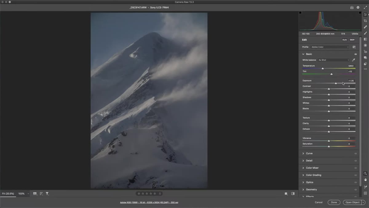 Exposure slider being pulled up in Camera Raw
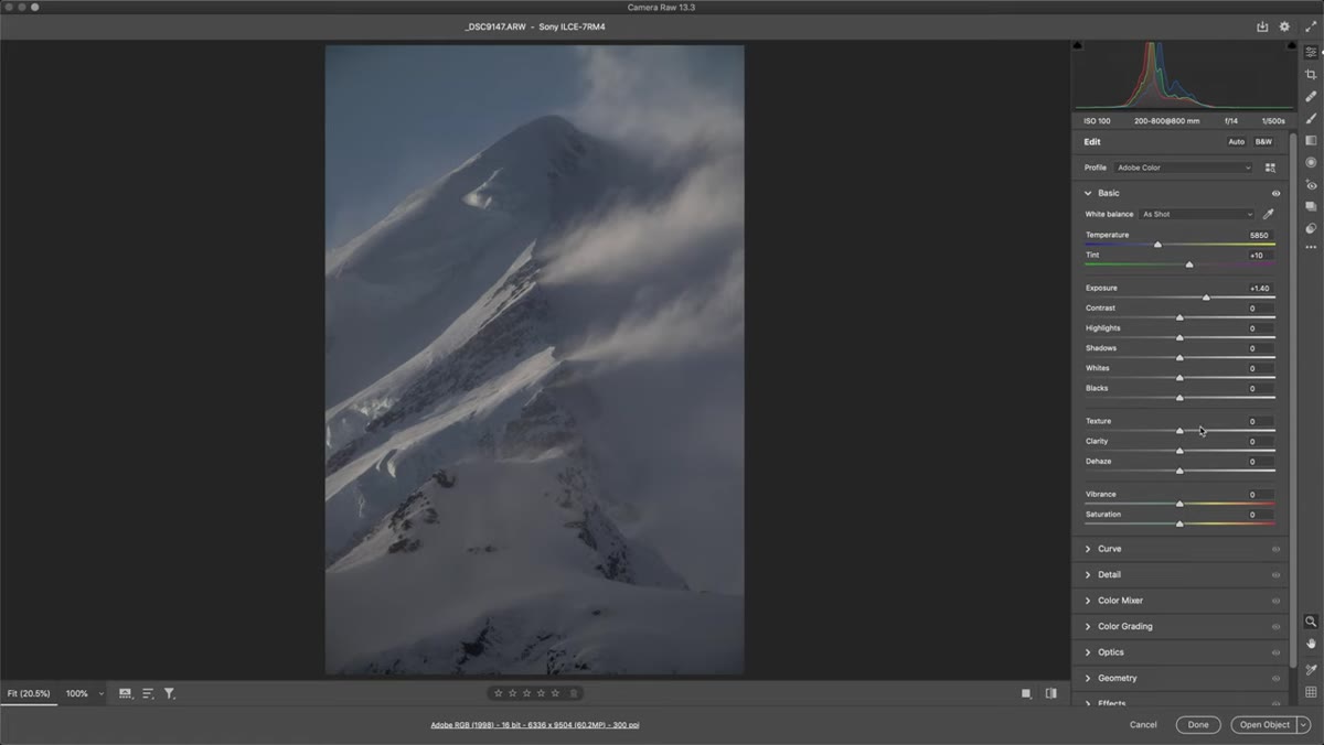
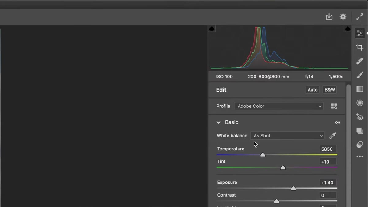
Patino’s first move in ACR is pulling the exposure up by about one and a half stops. That might sound like a lot, but with a modern Sony sensor at ISO 100, it’s well within the camera’s dynamic range. The goal here isn’t to make the image bright for its own sake. It’s to reveal the full spread of tones you’re going to work with.
Exposure slider being pulled up in Camera Raw
Patino’s first move in ACR is pulling the exposure up by about one and a half stops. That might sound like a lot, but with a modern Sony sensor at ISO 100, it’s well within the camera’s dynamic range. The goal here isn’t to make the image bright for its own sake. It’s to reveal the full spread of tones you’re going to work with.
This is the step I used to skip or do half-heartedly. I’d bump exposure a little and then try to fix contrast later, wondering why the result still looked muddy. The lesson is that you need to see the image’s actual tonal structure before you can make good decisions about anything else. Get the exposure roughly where you want the final result to live, then move on.
Step 3: Convert to Black and White Early
 Black and White toggle being activated in Camera Raw
Here’s the move that reordered how I think about monochrome work: convert to black and white before you do anything with contrast. In Camera Raw, you can hit the black and white toggle in the top right of the panel, and the image goes monochrome immediately. Alternatively, you can drag Vibrance and Saturation all the way down, which achieves a similar result.
Black and White toggle being activated in Camera Raw
Here’s the move that reordered how I think about monochrome work: convert to black and white before you do anything with contrast. In Camera Raw, you can hit the black and white toggle in the top right of the panel, and the image goes monochrome immediately. Alternatively, you can drag Vibrance and Saturation all the way down, which achieves a similar result.
The reason you do this early is so every adjustment you make from this point forward is being evaluated in monochrome. Contrast decisions that look fine in color can look completely wrong in black and white, and vice versa. You want to be editing the actual thing you’re making, not a color version of it.
Step 4: Evaluate Contrast Distribution Before Touching the Contrast Slider
 Histogram showing midtone-heavy distribution in Camera Raw
Before reaching for the contrast slider, Patino stops to look at what the histogram is actually telling him. In his image, it’s essentially one large midtone hump. Everything is clustered in the middle, which is precisely why the image lacks punch. Dramatic black and white lives at the edges of the histogram: deep blacks, bright whites, and enough separation between them to create visual tension.
Histogram showing midtone-heavy distribution in Camera Raw
Before reaching for the contrast slider, Patino stops to look at what the histogram is actually telling him. In his image, it’s essentially one large midtone hump. Everything is clustered in the middle, which is precisely why the image lacks punch. Dramatic black and white lives at the edges of the histogram: deep blacks, bright whites, and enough separation between them to create visual tension.
The image quality test he applies is worth memorizing. Look at your photo and ask whether dark and light areas are scattered throughout the frame, or whether the tonal values are all clumped in one region. A scene with dark shadows here, bright snow there, more shadow, more light, all distributed across the composition, will translate into a strong monochrome. A scene that’s mostly dark with a bright sky tacked on top usually won’t. Picking the right image before you start editing saves you a lot of frustrating uphill work.
Step 5: Build Contrast Deliberately in the Tone Panel
 Tone sliders being adjusted to push highlights and deepen shadows
Once you’ve converted to black and white and diagnosed the histogram, it’s time to actually build the contrast rather than just applying it as a single blunt adjustment. The Tone panel in Camera Raw gives you individual control over Highlights, Shadows, Whites, and Blacks. Patino’s approach is to push these in directions that expand the tonal range outward: recovering or boosting highlights where they exist, deepening shadows where the image needs weight.
Tone sliders being adjusted to push highlights and deepen shadows
Once you’ve converted to black and white and diagnosed the histogram, it’s time to actually build the contrast rather than just applying it as a single blunt adjustment. The Tone panel in Camera Raw gives you individual control over Highlights, Shadows, Whites, and Blacks. Patino’s approach is to push these in directions that expand the tonal range outward: recovering or boosting highlights where they exist, deepening shadows where the image needs weight.
The contrast slider in ACR does apply a global S-curve, which can work, but using the individual sliders gives you much more control over where the drama lives in the image. If your shadows are already rich, don’t blow them out further. If your highlights are the strongest element in the frame, let them breathe. Think of it as sculpting rather than applying a filter.
One Thing I’d Add: Use the HSL / B&W Mix Panel
The tutorial is focused on the broader workflow, so it doesn’t dig into one of my favorite tools for monochrome work: the Black and White Mix panel inside Camera Raw (or Lightroom’s HSL panel when in B&W mode). This lets you control how specific colors in the original image translate into gray tones.
Skies with blue in them can be pushed darker for that classic dramatic look. Green foliage can be separated from other mid-gray elements to add visual texture. This is especially useful if you shot a scene where multiple elements share similar tonal values in straight black and white. I’ve rescued a few landscape shots that looked like flat gray soup just by pulling the blue channel down and pushing the orange channel up slightly. Try it after you’ve set your base exposure and contrast, and treat it as fine-tuning rather than a first step.
The single most important takeaway from Patino’s workflow is this: convert to black and white early, then build contrast deliberately instead of slapping a preset on at the end and hoping for the best. The image selection matters too. High-contrast scenes with tonal variety distributed throughout the frame will always outperform low-contrast scenes with clever editing applied after the fact.
Watch the full tutorial on YouTube to see the complete walkthrough, including how Patino handles sharpening and the specific settings he uses on the Sony file. Worth your time.
Comments (1)
I tried this on a client project yesterday and the results were way better than expected.
Leave a Comment