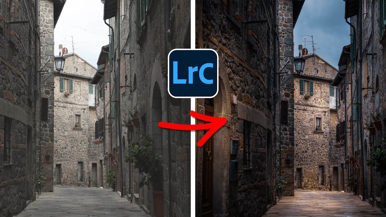
There’s a specific kind of frustration that comes from having a technically solid photo that just… sits there. Good composition, decent exposure, interesting subject. But the light was flat because it was an overcast Tuesday and the sky didn’t care about your shoot. I’ve been in that situation more times than I can count, and my usual move was to slap a preset on it and call it a day. That worked until clients started asking for something that actually looked intentional.
In this Matt Kloskowski tutorial, he takes a well-composed but flatly lit architectural photo submitted by a subscriber and completely transforms it into something moody and dramatic. The technique is primarily Lightroom-based, which surprised me because I always assumed this kind of relighting required heavy Photoshop work. Kloskowski is upfront that this isn’t documentary photography, it’s creative editing, and he doesn’t apologize for it. Neither will I. Watch the full tutorial on YouTube if you want to follow along with the actual footage.
The core idea is simple and worth repeating: rather than trying to brighten specific areas of a properly exposed image, you darken the whole thing first and then paint light back in exactly where you want it. It sounds counterintuitive but it gives you so much more control. Here’s how the whole process breaks down.
Step 1: Fix Geometry Before You Do Anything Creative
 Transform panel Auto button correcting vertical perspective
Before touching exposure or color, handle any lens distortion or perspective issues. In Lightroom Classic, go to the Transform panel and hit Auto. This corrects vertical line distortion that happens when you’re shooting buildings or interiors at anything other than a perfectly level angle. It takes about two seconds and if you skip it, it’ll bother you after you’ve spent an hour on the edit. Ask me how I know.
Transform panel Auto button correcting vertical perspective
Before touching exposure or color, handle any lens distortion or perspective issues. In Lightroom Classic, go to the Transform panel and hit Auto. This corrects vertical line distortion that happens when you’re shooting buildings or interiors at anything other than a perfectly level angle. It takes about two seconds and if you skip it, it’ll bother you after you’ve spent an hour on the edit. Ask me how I know.
Cropping also belongs here, not later. Once you start adjusting exposure and adding masks, changing the crop becomes a pain. Get your framing locked in now.
Step 2: Pull the Exposure Down Globally
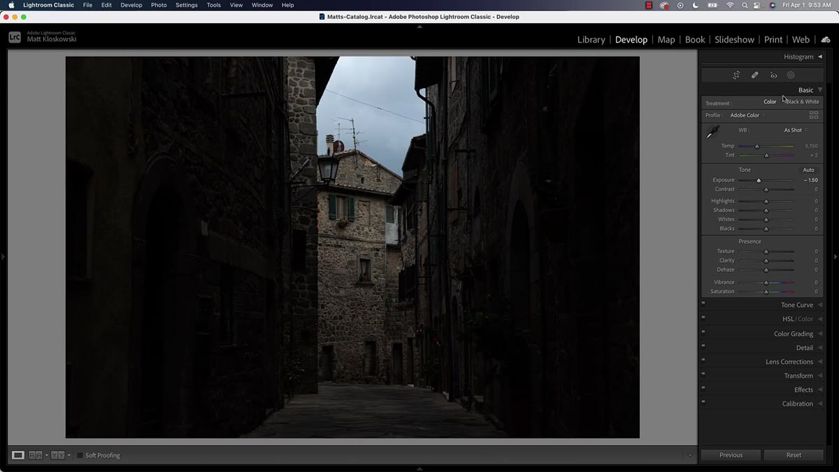 Basic panel with exposure slider pulled down significantly
Head to the Basic panel and drop your overall exposure. Kloskowski pulls it down pretty aggressively, and the goal is to darken the entire scene until the brightest areas are at roughly the level of brightness you want for your deepest shadows. This feels wrong the first time you do it. The photo looks terrible. Stay with it.
Basic panel with exposure slider pulled down significantly
Head to the Basic panel and drop your overall exposure. Kloskowski pulls it down pretty aggressively, and the goal is to darken the entire scene until the brightest areas are at roughly the level of brightness you want for your deepest shadows. This feels wrong the first time you do it. The photo looks terrible. Stay with it.
The reason this works is that you’re essentially creating a dark canvas to paint light back onto. If you try to go the other direction, brightening targeted areas of an already-bright image, you blow out highlights fast and the edit looks forced. Darker base, selective light addition, way more control.
Step 3: Add a Radial Gradient to Create Your Main Light Source
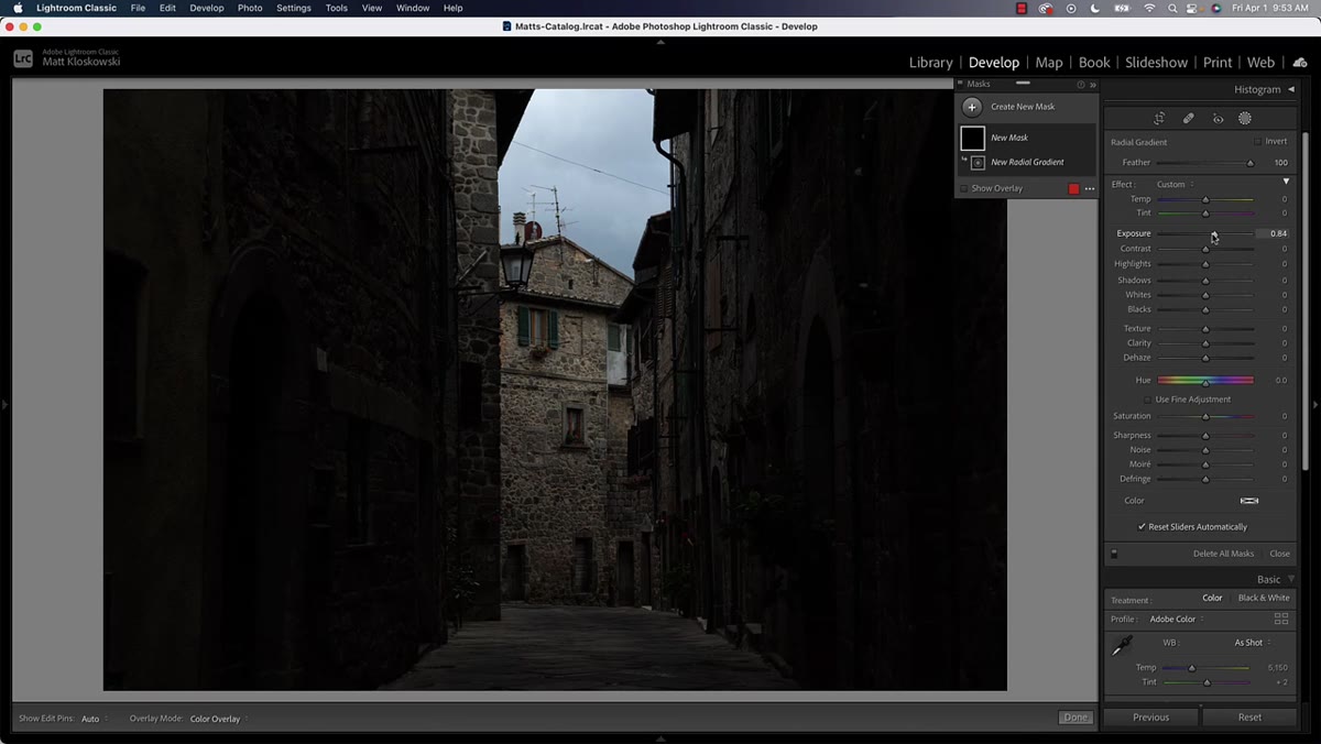 Radial gradient being drawn in center of the scene
Open the Masking panel and select Radial Gradient. Draw an ellipse roughly where you want your primary light to appear. In the tutorial, Kloskowski centers it in the middle of the scene, creating the impression of a natural spotlight. Crank the Exposure slider up within that mask to bring that area back to brightness.
Radial gradient being drawn in center of the scene
Open the Masking panel and select Radial Gradient. Draw an ellipse roughly where you want your primary light to appear. In the tutorial, Kloskowski centers it in the middle of the scene, creating the impression of a natural spotlight. Crank the Exposure slider up within that mask to bring that area back to brightness.
Here is the part people miss: also add some warmth to that brightened area using the Temperature slider inside the mask. When you artificially brighten a dark area, the result tends to go cool and milky. It looks fake. A little warmth counteracts that and makes the light feel like it’s coming from an actual source rather than a software slider. You don’t need much, just enough to keep it from looking sterile.
Step 4: Subtract the Sky from Your Radial Gradient if Needed
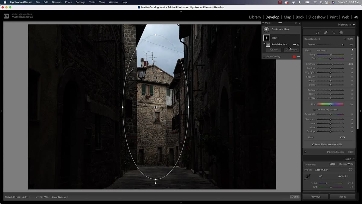 Subtract sky option removing sky from radial gradient mask
If your radial gradient is bleeding into the sky and creating an unnatural glow up there, you can clean that up without starting over. Inside your existing mask, use the Subtract option and choose Select Sky. Lightroom’s AI sky selection will automatically remove the sky region from your gradient, so the brightening effect stays grounded in the scene where it belongs.
Subtract sky option removing sky from radial gradient mask
If your radial gradient is bleeding into the sky and creating an unnatural glow up there, you can clean that up without starting over. Inside your existing mask, use the Subtract option and choose Select Sky. Lightroom’s AI sky selection will automatically remove the sky region from your gradient, so the brightening effect stays grounded in the scene where it belongs.
This is one of those small workflow details that separates a sloppy edit from a clean one. The sky in most architectural or landscape shots has its own light logic and you don’t want your fake ground-level light source contaminating it.
Step 5: Build Multiple Radial Gradients for Secondary Light Sources
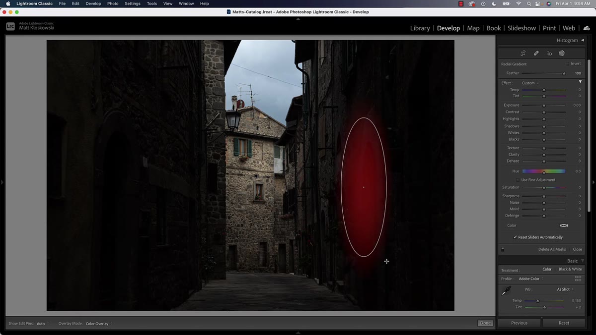 New mask being created for additional radial gradient
One light source is a start. Multiple light sources is a scene. Create additional masks with new radial gradients to add smaller pools of light in other areas of the image. Think about where light logically would fall if your main source were real. Walls, floors, archways, corners catching a bounce. Each new gradient gets its own exposure and temperature adjustment.
New mask being created for additional radial gradient
One light source is a start. Multiple light sources is a scene. Create additional masks with new radial gradients to add smaller pools of light in other areas of the image. Think about where light logically would fall if your main source were real. Walls, floors, archways, corners catching a bounce. Each new gradient gets its own exposure and temperature adjustment.
Keep these secondary gradients subtler than your primary one. The goal is to build a hierarchy: one dominant light source, a couple of supporting ones, and the rest of the image staying in that darker, moodier base you established in Step 2. If everything is equally bright, you’re back to flat.
Step 6: Move into Photoshop for Final Refinements
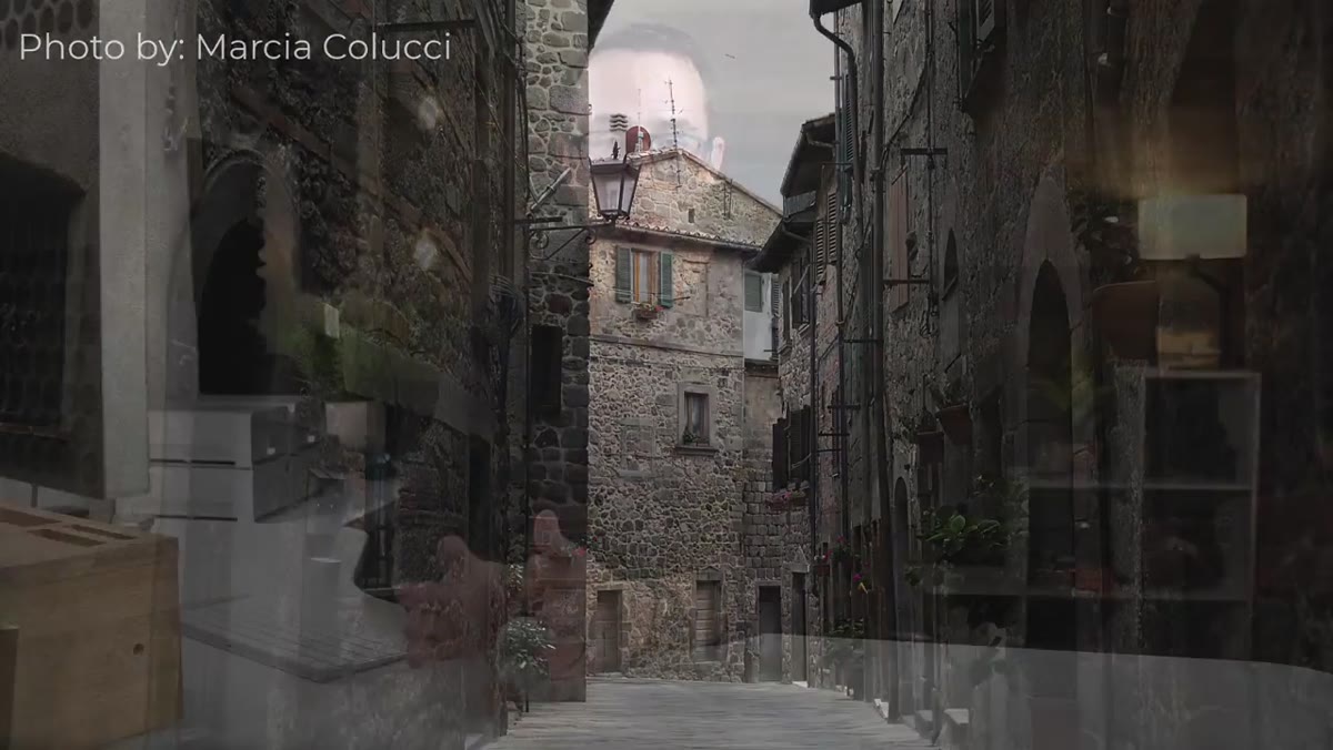 Before and after comparison showing dramatic lighting transformation
Once the relighting structure is in place in Lightroom, Kloskowski moves the file into Photoshop for any final compositing or cleanup work. This might include things like dodging and burning on specific texture areas, blending additional elements, or any localized adjustments that need a layer-based workflow rather than Lightroom’s mask system.
Before and after comparison showing dramatic lighting transformation
Once the relighting structure is in place in Lightroom, Kloskowski moves the file into Photoshop for any final compositing or cleanup work. This might include things like dodging and burning on specific texture areas, blending additional elements, or any localized adjustments that need a layer-based workflow rather than Lightroom’s mask system.
If your edit is clean and the Lightroom masks are doing their job, you may not need much Photoshop time at all. But having it as a second pass gives you options, especially for prints or client deliverables where you need pixel-level precision.
What I’d Add From My Own Workflow
The warm-shadows note from Step 3 is something I now apply almost everywhere, not just in relighting work. Any time I’m artificially lifting exposure in a localized area, I check the color temperature inside that mask. Cool shadows read as digital. Warm shadows read as photographic. It’s a small thing that consistently makes edits look less processed.
I’d also suggest experimenting with feathering on your radial gradients. Tighter feathering gives you harder-edged pools of light that feel more like a spotlight. More feathering creates a softer, more ambient feel. Neither is wrong, they just create different moods. Architectural shots tend to look good with tighter feathering. Portraits and landscapes usually want softer transitions.
The single biggest lesson from this tutorial is that the order of operations matters more than the individual tools. Darkening first and adding light selectively is a fundamentally different mental model than trying to selectively darken a bright image. Once that clicked for me, a lot of edits I’d given up on as “unsalvageable” suddenly had a path forward.
Watch the full tutorial on YouTube to see Matt walk through the full before-and-after with the actual photo. It’s worth seeing the transformation in motion.
Comments (3)
Printing this out and pinning it next to my monitor. That good.
Couldn't agree more. I've seen this make a huge difference in retouching work specifically.
Never thought of approaching it this way. Really creative.
Leave a Comment