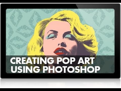
There’s a certain type of creative project I used to avoid. You know the one. It doesn’t fit your usual workflow, it’s not something a client is paying you for, and it looks like it might take a weirdly long time. Pop art effects fell squarely into that category for me. I got comfortable doing clean composites, product mockups, the occasional portrait retouch. Then a friend sent me Watch the full tutorial on YouTube and I realized I’d been sleeping on an entire corner of Photoshop I barely touched.
In this Aaron Nace (PHLEARN) tutorial, the goal is to recreate the look of Andy Warhol’s famous Marilyn Monroe screen prints using nothing but a regular photo and Photoshop. That sounds like a novelty project, but here’s the thing Aaron says early on that actually stuck with me: when you try to recreate a style that’s totally outside your normal work, you end up digging into tools and filters you’d otherwise skip. Filters, manual coloring, effect stacking. The stuff that isn’t in your everyday retouching muscle memory. You pick up techniques you didn’t know you needed, and then six months later you’re on a deadline and one of those weird little tricks saves you. That’s genuinely happened to me.
The tutorial covers Part 1 of a two-part series, focused on the setup, the photo shoot approach, and getting the image into Photoshop ready for the pop art treatment. Here’s how it breaks down.
Step 1: Start With the Right Reference
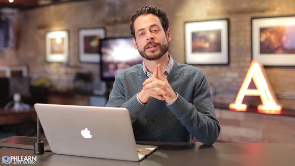
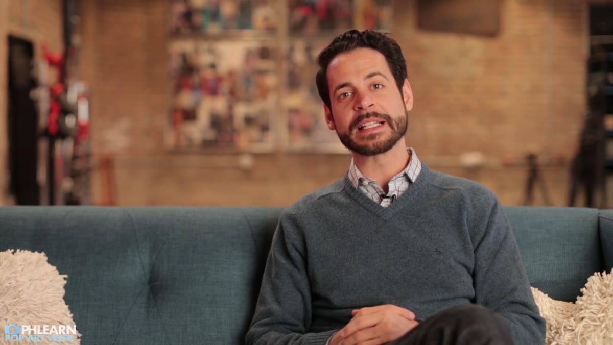 Aaron discussing Andy Warhol’s Marilyn Monroe screen prints
Before you open Photoshop, you need a reference. Aaron’s team chose Warhol’s Marilyn Monroe series specifically because it has a clearly defined visual language: flat color backgrounds, high contrast, simplified shadows, and that screen-print texture that removes fine photographic detail. Pick one specific piece, not a general vibe. The more specific your reference, the more concrete decisions you can make later about contrast, color palette, and how much detail to strip out. Vague goals make for muddy results.
This step also shapes the actual photo shoot. Aaron’s team shot their subject against a plain background with simple, relatively flat lighting. That’s not laziness. Warhol’s original screen prints work because the images are already high contrast and graphically simple. If your source photo is full of complex shadows and textural detail, you’re making more work for yourself in post.
Step 2: Shoot for the Effect, Not for Realism
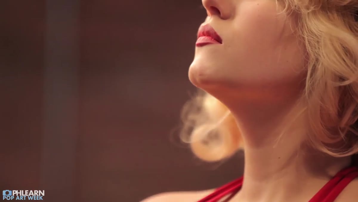
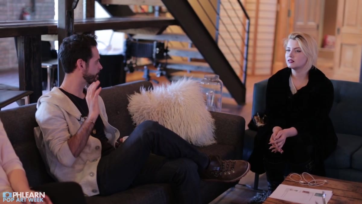 Behind-the-scenes footage of simple studio photo shoot setup
The lighting setup for this kind of project should be deliberately straightforward. Aaron’s team used clean, simple light that gave their subject good separation from the background without a lot of gradient shadow across the face. Think: one or two lights, minimal complexity. You want clear light and dark zones. Photoshop is going to reduce your image to a very limited tonal range, so you want that structure already present in the photo, not something you have to fight for later.
This is the part that changed how I think about shooting for composites and effects in general. The final output should inform how you shoot. If you know an image is going to be heavily stylized, stop trying to capture every bit of texture and nuance. Shoot for the shapes.
Step 3: Open Your Image and Evaluate It as a Graphic, Not a Photo
 Aaron opening the photo in Photoshop workspace
Once you’re in Photoshop, the first mental shift is to stop looking at your photo as a photograph. You’re looking at it as raw material for a graphic. Aaron opens the image and the first thing to assess is tonal contrast. Does the face read clearly in light and shadow zones? Is the subject well-separated from the background? If not, a Levels or Curves adjustment layer at this stage can push contrast before you do anything else. Drag the black point and white point sliders inward until the image feels almost too punchy. You’ll dial it back, but it’s easier to reduce contrast than to manufacture it.
Keep your adjustments non-destructive here. Use adjustment layers rather than editing the pixel layer directly. You’re going to be stacking a lot of effects and you want to be able to go back.
Step 4: Begin Breaking Down the Image into Flat Tonal Regions
 Photoshop layer panel and image adjustment tools visible
The signature look of a screen print is that it reduces a photograph to a small number of distinct tones. No smooth gradients, just defined zones of color. Aaron begins working toward this by pushing the image’s tonal structure so that the face reads as essentially two or three regions: highlight, midtone, shadow. Filters like Poster Edges or Cutout (Filter > Filter Gallery) are useful here for starting to simplify the image. Cutout in particular lets you reduce the number of tonal levels and simplify edge detail, which starts to give you that graphic, printed look.
The exact settings depend on your photo, but a starting point for Cutout is Number of Levels around 4, Edge Simplicity around 4, and Edge Fidelity at 2. Play with these. The goal is to get the face reading as bold, clean shapes without losing the recognizability of the person.
Step 5: Think About Color Before You Apply It
 Aaron referencing Warhol’s original color palette choices
Warhol’s color choices weren’t random. He used bold, often unexpected combinations. Bright teal background with yellow hair, hot pink skin tones with lime green eyeshadow. The colors are intentionally non-naturalistic. Before you start dropping color onto anything, look at your reference and note which color goes on which tonal region: background, hair, face, shadow, lips. Then build a rough swatch palette so you’re not making color decisions in real time on the image.
Aaron’s approach here is methodical. Plan the palette first, then apply it. That discipline prevents the common mistake of picking colors as you go and ending up with something muddy or inconsistent.
My Own Take: The “Wrong Tool” Principle
I spent years treating Photoshop’s Filter Gallery like a gimmick section. Stuff tourists click through. This tutorial genuinely made me go back and spend an afternoon just messing around in there. My actual takeaway, separate from the pop art stuff specifically, is that stylized effect projects are one of the best ways to learn the tools you’ve been ignoring. I got my start making genuinely terrible graphics in MS Paint before I ever touched Photoshop. That willingness to make something dumb and experimental is exactly the mindset Aaron is advocating here. Trying to copy a style you didn’t invent, in a tool you’re still figuring out, is not a waste of time. It’s how the toolbox gets bigger.
If you’re deep in a retouching or compositing routine, deliberately breaking that routine with a project like this is worth scheduling. Even if you never deliver a pop art image to a client, you’ll come out the other side knowing something you didn’t before.
The single biggest lesson from this tutorial isn’t a Photoshop technique. It’s that your reference should be specific enough to make decisions from. Vague inspiration produces vague results. Pick one Warhol. Know which colors go where. Shoot for the effect you want, not the effect you can fix later.
Watch the full tutorial on YouTube to see Aaron walk through Part 1 in real time, including the behind-the-scenes shoot footage and his exact Photoshop setup.
Comments (1)
Been doing this wrong for years apparently. Thanks for the wake-up call.
Leave a Comment