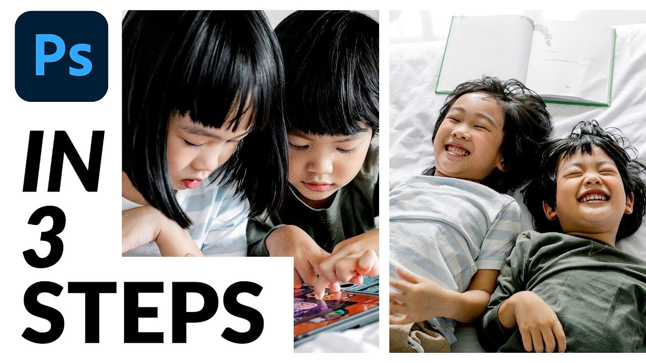
Client work has a funny way of exposing the gaps in your workflow. For years, whenever someone asked me to combine two photos into a single polished layout, I’d go full Frankenstein on it. Drag things around, eyeball the spacing, swear at the alignment, and end up with something that looked like a ransom note assembled by a graphic design student at 2am. Functional? Barely. Repeatable? Absolutely not.
That changed when I sat down with this Aaron Nace tutorial from PHLEARN on building a diptych in Photoshop. A diptych, if you’re not familiar, is simply two images presented side by side as a single unified piece. Portrait photographers love them. Travel shooters love them. And once you’ve built one properly, you’ll wonder why you ever manually eyeballed a dividing line in your life. Watch the full tutorial on YouTube if you want to follow along with the original footage, but this walkthrough will get you through every step without needing to pause and rewind constantly.
The whole process runs on about three core ideas: building a border structure, using selections to keep things clean, and applying layer masks so your images stay contained. It’s one of those techniques that feels almost too simple once you see it laid out properly.
Step 1: Get Both Images Into a Single Document
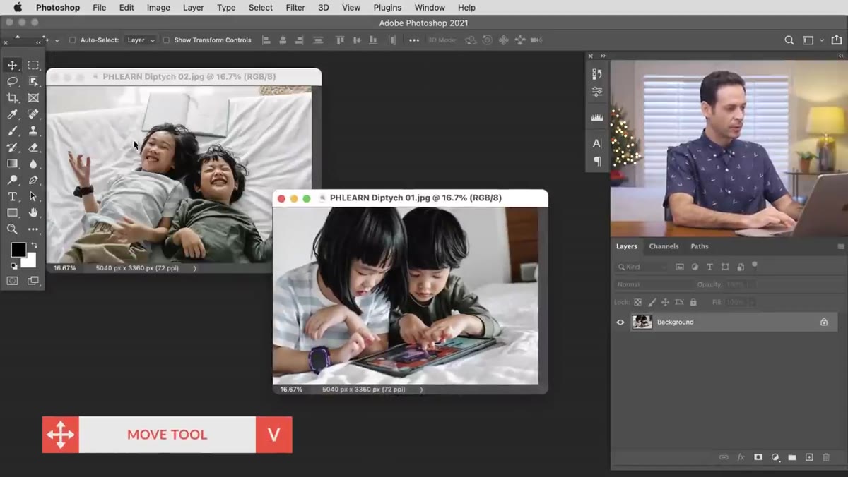 Moving image from one document to another using Move Tool
Open both of your photos in Photoshop. Don’t worry about sizing them against each other at this stage. With the Move Tool selected (keyboard shortcut: V), simply click on one image and drag it directly into the other document’s window. Photoshop will copy that layer right into the new document without destroying the original. Once it’s across, close the now-unnecessary second document window.
Moving image from one document to another using Move Tool
Open both of your photos in Photoshop. Don’t worry about sizing them against each other at this stage. With the Move Tool selected (keyboard shortcut: V), simply click on one image and drag it directly into the other document’s window. Photoshop will copy that layer right into the new document without destroying the original. Once it’s across, close the now-unnecessary second document window.
This drag-to-copy method is one of those small Photoshop moves that saves a surprising amount of time. No File > Place, no copy-paste weirdness. Just drag, drop, done.
Step 2: Create the Center Dividing Line
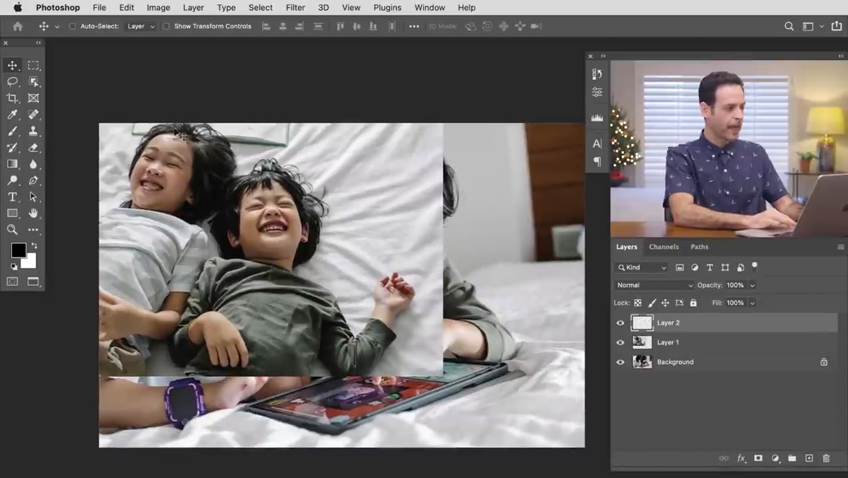 Drawing a rectangular marquee selection for the white divider
Create a new blank layer above everything else. Grab the Rectangular Marquee Tool (M) and draw a tall, narrow vertical selection somewhere roughly in the middle of the canvas. The exact position doesn’t matter yet because you’re going to align it properly in a moment. With your selection active, go to Edit > Fill, choose White as your fill color, and hit OK. You’ll now have a white vertical stripe cutting through your document.
Drawing a rectangular marquee selection for the white divider
Create a new blank layer above everything else. Grab the Rectangular Marquee Tool (M) and draw a tall, narrow vertical selection somewhere roughly in the middle of the canvas. The exact position doesn’t matter yet because you’re going to align it properly in a moment. With your selection active, go to Edit > Fill, choose White as your fill color, and hit OK. You’ll now have a white vertical stripe cutting through your document.
Here’s the part that makes this foolproof: hit Ctrl+A (Cmd+A on Mac) to select the entire canvas. Then, with your white stripe layer still selected, switch to the Move Tool and click the “Align Horizontal Centers” button in the top toolbar. Photoshop will snap that white line to the exact center of your document regardless of where you originally drew it. No guessing, no nudging pixel by pixel.
Step 3: Build the Outer Border
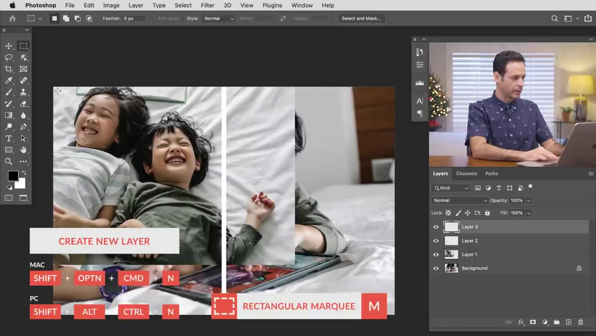 Creating marquee selection inside canvas edges for the border
Create another new blank layer. With the Rectangular Marquee Tool, draw a selection that covers the interior of your canvas, staying slightly inward from all four edges. This defines where your photos will actually live. Then go to Select > Inverse, which flips your selection so that only the outer edge area is now selected. Go to Edit > Fill, choose White again, and hit OK.
Creating marquee selection inside canvas edges for the border
Create another new blank layer. With the Rectangular Marquee Tool, draw a selection that covers the interior of your canvas, staying slightly inward from all four edges. This defines where your photos will actually live. Then go to Select > Inverse, which flips your selection so that only the outer edge area is now selected. Go to Edit > Fill, choose White again, and hit OK.
What you’ve just done is create a clean white frame around the entire composition. Combined with your center divider, the document now has a clear structure: left panel, right panel, and a consistent border holding it all together. It looks intentional because it is.
Step 4: Position Your Photos
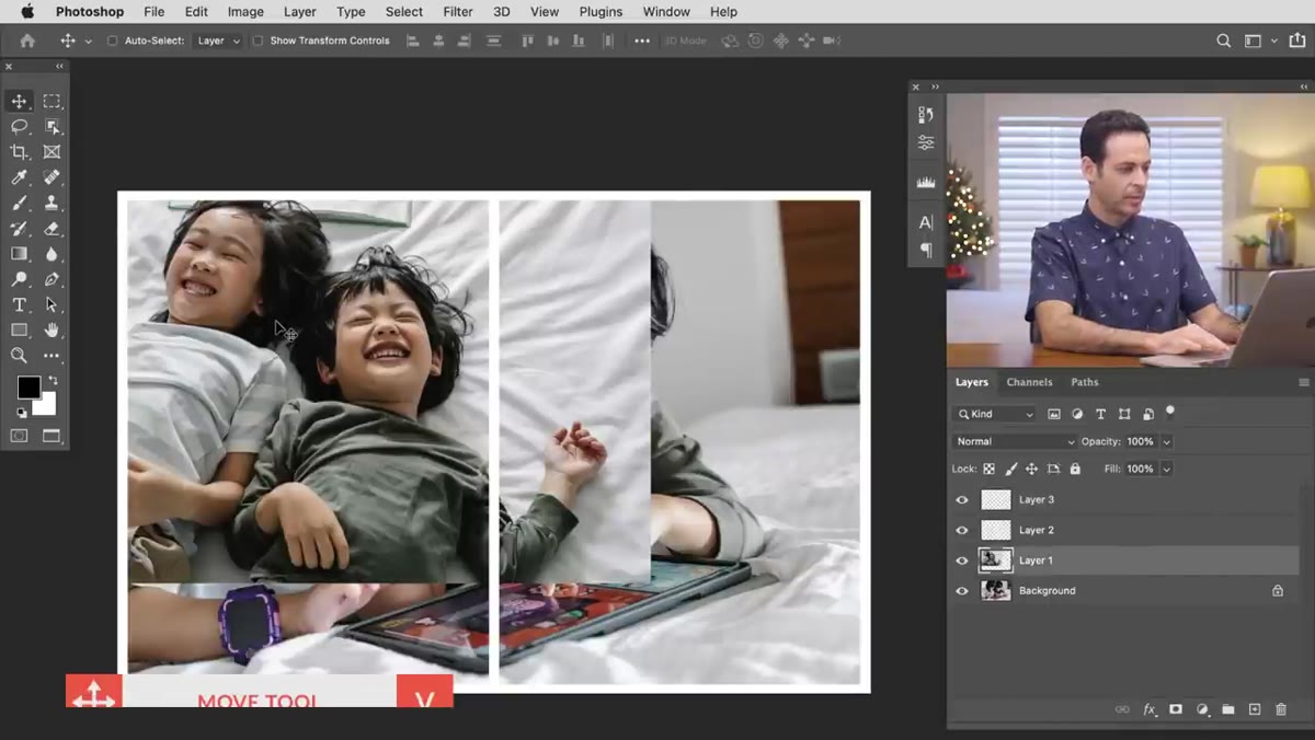 Moving first photo into position on right side of canvas
Now it’s time to actually place your images. Use the Move Tool to drag each photo into its respective panel. One image goes left, one goes right. At this stage, don’t stress about the images bleeding over into the wrong panel or outside the border area. That gets fixed in the next step. If you need to resize a photo to fill its panel or zoom into a specific area (maybe you want just the faces, or a tighter crop), hit Ctrl+T (Cmd+T) to bring up Free Transform and scale accordingly.
Moving first photo into position on right side of canvas
Now it’s time to actually place your images. Use the Move Tool to drag each photo into its respective panel. One image goes left, one goes right. At this stage, don’t stress about the images bleeding over into the wrong panel or outside the border area. That gets fixed in the next step. If you need to resize a photo to fill its panel or zoom into a specific area (maybe you want just the faces, or a tighter crop), hit Ctrl+T (Cmd+T) to bring up Free Transform and scale accordingly.
One thing to watch: your background layer will likely be locked by default. Just double-click it and rename it when prompted, which converts it from a locked Background layer to a regular editable layer. This lets you move and transform it freely.
Step 5: Apply Layer Masks to Contain Each Image
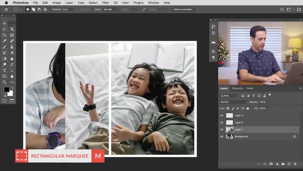 Applying layer mask to confine photo within panel boundary
This is where the whole thing clicks into place. Take your Rectangular Marquee Tool and draw a selection covering exactly one panel, say the right half of the canvas inside your white border. Then click on the photo layer that belongs in that panel, and click the “Add Layer Mask” button at the bottom of the Layers panel (the rectangle with a circle inside). Photoshop will use your selection to mask the layer, hiding anything outside that selection.
Applying layer mask to confine photo within panel boundary
This is where the whole thing clicks into place. Take your Rectangular Marquee Tool and draw a selection covering exactly one panel, say the right half of the canvas inside your white border. Then click on the photo layer that belongs in that panel, and click the “Add Layer Mask” button at the bottom of the Layers panel (the rectangle with a circle inside). Photoshop will use your selection to mask the layer, hiding anything outside that selection.
Repeat this for the other image, this time selecting the left panel before clicking Add Layer Mask. Both images are now neatly contained within their own sections, with the white border and center divider sitting cleanly on top. The images aren’t cropped or destroyed, they’re just masked. You can still move them underneath the mask to adjust composition at any time.
A Note on Making This Reusable
Here’s something Aaron touches on but that I’ve come to rely on heavily in actual client work: save this as a template PSD. Once you’ve built the border layers and set up the panel structure, group them, lock them, and save the file with placeholder layers underneath. Next time a client needs a diptych, you open the template, drop in two new photos, clip or move them into position, and you’re done in under five minutes.
I once spent the better part of an afternoon rebuilding this same layout from scratch for three separate deliverables because I hadn’t saved a template. That is the kind of mistake you only make once when you’re billing hourly and your coffee is going cold. Set up the template. Save yourself the grief.
If you want to push the design further, try swapping the white border for a dark neutral or even a color pulled from one of the photos. You can also experiment with the width of the center divider. A thinner line feels editorial and modern, while a wider gap gives the images more breathing room and a gallery-wall kind of feel.
The single most valuable thing in this technique is the combination of selection-based alignment and layer masks. It removes the guesswork entirely. You’re not eyeballing anything, you’re telling Photoshop exactly where the boundaries are and letting it do the math. That’s the difference between a layout that looks considered and one that looks like it was assembled in a hurry.
If you want to see Aaron walk through this himself with the sample images, Watch the full tutorial on YouTube. He also has a downloadable PSD on PHLEARN.com if you want a ready-made starting point before building your own template version.
Comments
Leave a Comment