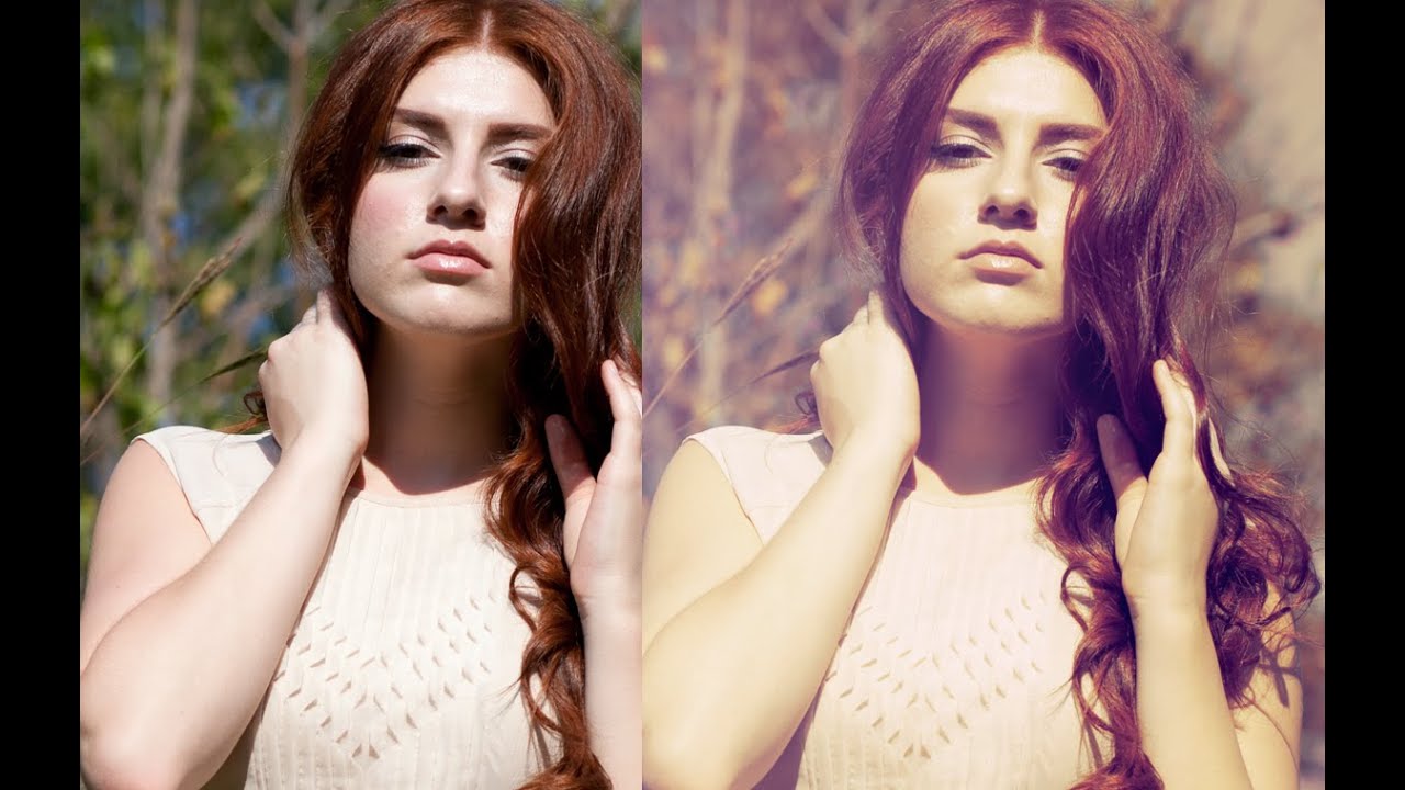
There’s a category of Photoshop tool that sits quietly in a submenu somewhere, never causing trouble, never demanding attention. Gradient maps are exactly that tool. I went years barely touching them, defaulting to Hue/Saturation or Color Balance whenever I needed to push a photo’s mood in a direction. Then I watched a Jessica Kobeissi tutorial on gradient maps and felt that specific embarrassment of realizing something simple had been right in front of me the whole time. It’s the same feeling I got when I discovered I’d been rasterizing layers I didn’t need to rasterize. Painful. Humbling. Useful.
In this Jessica Kobeissi tutorial on gradient maps, she walks through the whole workflow, from finding the adjustment layer to blending it into a photo using blend modes. It’s one of those tutorials that earns its runtime. What follows is my breakdown of every step she covers, written so you can follow along without pausing and rewinding every thirty seconds.
Step 1: Add a Gradient Map Adjustment Layer
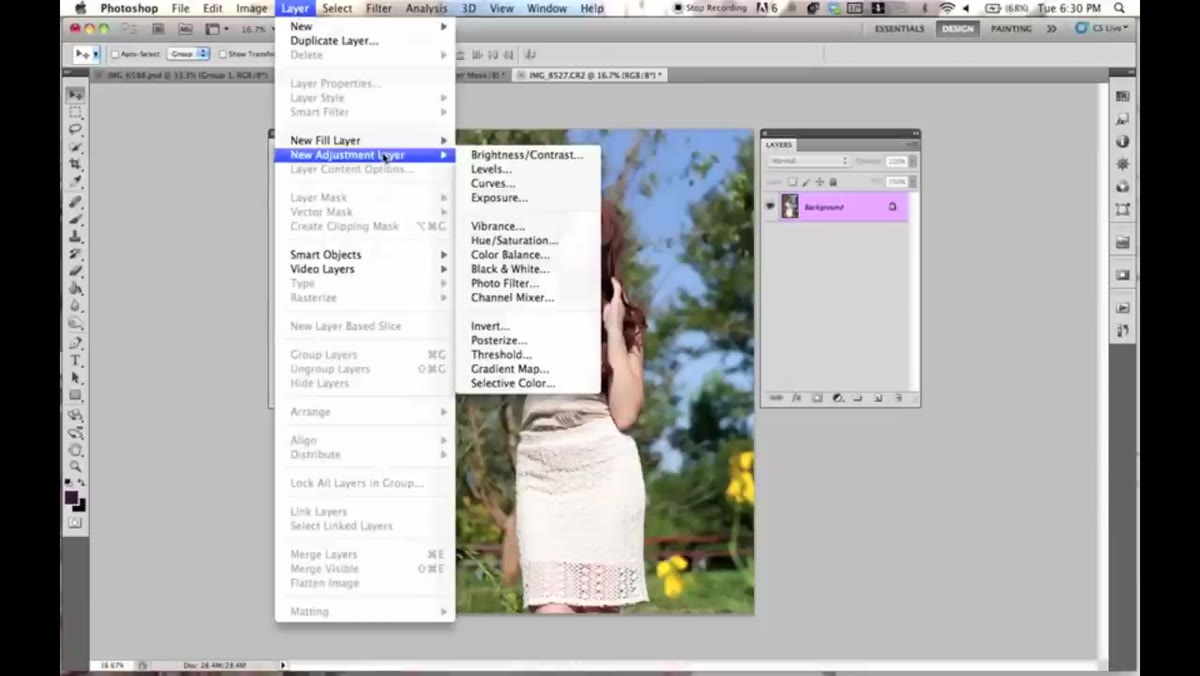 Navigating to Layer, New Adjustment Layer, Gradient Map
Don’t go hunting through the Filter menu. Gradient maps live under Layer, then New Adjustment Layer, then Gradient Map. Click that, hit OK on the dialog that pops up, and Photoshop applies a default gradient to your image. For most people, that default is going to look rough. Jessica’s came out as a purple-to-black situation, which isn’t exactly a vibe unless you’re editing album art for a 2005 emo band. That’s fine. The default is just a placeholder.
What you’re seeing is the gradient map doing its actual job: it replaces the luminosity values in your photo with the colors of the gradient. Dark areas get the color on the left side of the gradient, light areas get the color on the right. That’s the whole mechanic. Everything else is just control over what those colors are.
Step 2: Use the Reverse Button for a Quick Fix
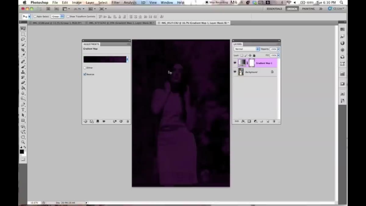 Clicking Reverse checkbox in Gradient Map properties
Before you start tearing apart the gradient, try the Reverse checkbox in the properties panel. It flips the gradient direction, which can completely change whether the result looks good or terrible. If the default gradient was pushing dark tones into an ugly hue, reversing it might put those tones somewhere much more workable. Jessica uses this as a first diagnostic step and honestly it’s a smart habit. One click, instant feedback, no commitment.
This matters more than it sounds because you’ll eventually build a library of saved gradients, and not all of them will apply cleanly to every image right out of the gate. Reverse gives you a second shot at any gradient before you decide to edit or abandon it.
Step 3: Choose a Preset or Build Your Own from the Gradient Bar
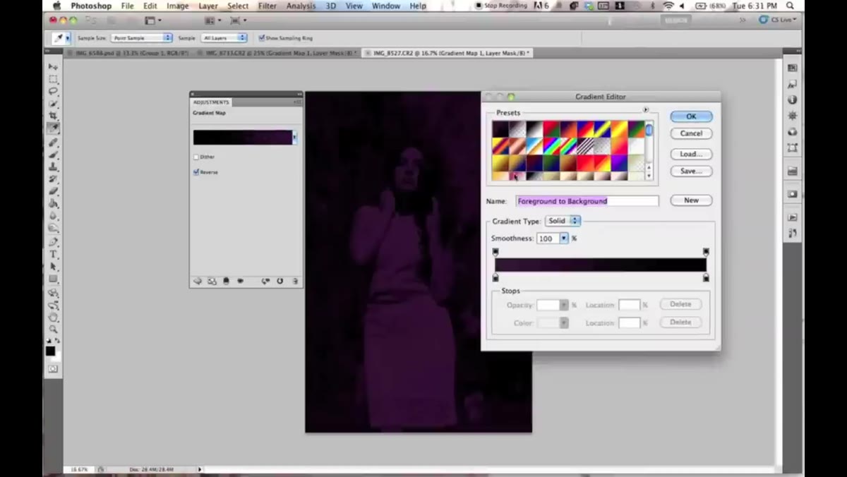 Gradient Editor window open with preset swatches visible
Click the gradient bar in the properties panel and the Gradient Editor opens up. You’ll see whatever presets Photoshop has loaded, plus any you’ve saved yourself. Clicking any preset shows you a live preview on your image, which makes it easy to audition options fast. If none of the presets work, you’re building a custom one, which is where this tool gets genuinely interesting.
To build a custom gradient, start by selecting one of the existing presets as a base. The color stops appear as small tabs along the bottom of the gradient bar. Click a tab to select it, then click the color swatch that appears below to change that color. Want to get rid of a stop entirely? Drag it downward off the bar and it disappears. Jessica strips things down to two stops when she wants a simple, vintage-feeling two-tone gradient. Pink on one end, soft yellow on the other. Clean and usable.
Step 4: Adjust Color Stops and Midpoints
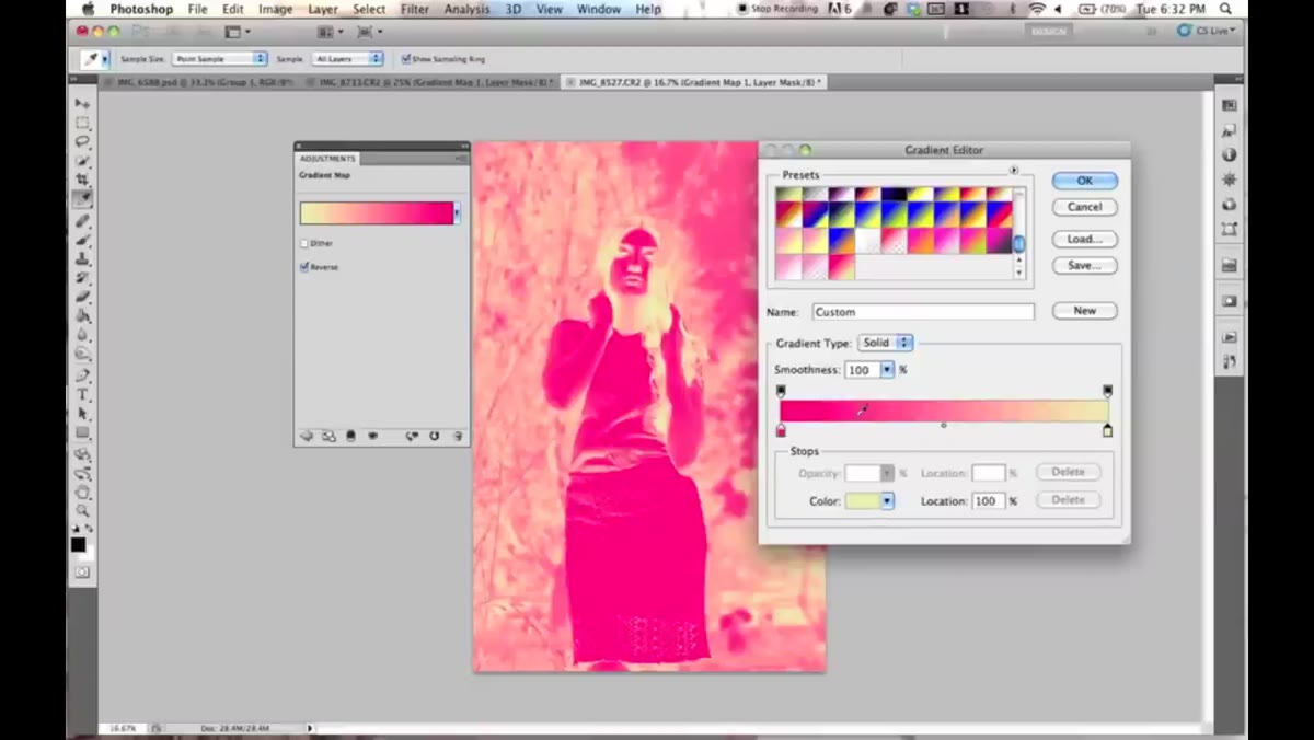 Dragging midpoint diamond between two color stops
Between any two color stops there’s a small diamond handle sitting above the gradient bar. That diamond is the midpoint, and dragging it left or right shifts where the transition between the two colors happens. Push it toward the left stop and the right color takes over earlier. Push it toward the right and the left color dominates longer. This is how you control whether a gradient reads as mostly one color with a hint of another, or something more balanced.
You can also reposition the color stops themselves, not just the midpoints. This lets you cluster colors in the shadows, or spread them across the whole tonal range. Jessica keeps her transitions clean and doesn’t pile on stops unnecessarily, which is good advice. Every stop you add is another thing to manage and another opportunity to make something that looks muddy.
Step 5: Add Additional Color Stops
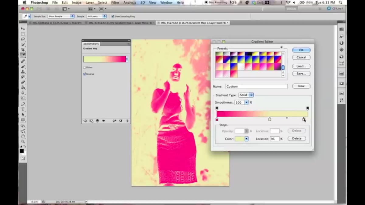 Clicking on gradient bar to create a new color stop
Adding a new stop is as simple as clicking anywhere on the bottom edge of the gradient bar. A new tab appears at that position and you can assign it whatever color you want. Jessica demonstrates this by adding white as a third stop, which softens the transition between the pink and yellow and gives the whole gradient a lighter, airier quality. It’s a good example of how a third color doesn’t have to be a dramatic one. Neutral whites or near-neutrals can do a lot of heavy lifting as bridge tones.
To save a custom gradient, hit the New button in the Gradient Editor. It won’t save automatically. This is a small thing that catches people, so just remember: edit, then New. Jessica admits she doesn’t always bother saving, which is fair, but if you land on something you actually like, save it. You’ll be annoyed with yourself later if you don’t.
Step 6: Blend the Gradient Map Using Blend Modes
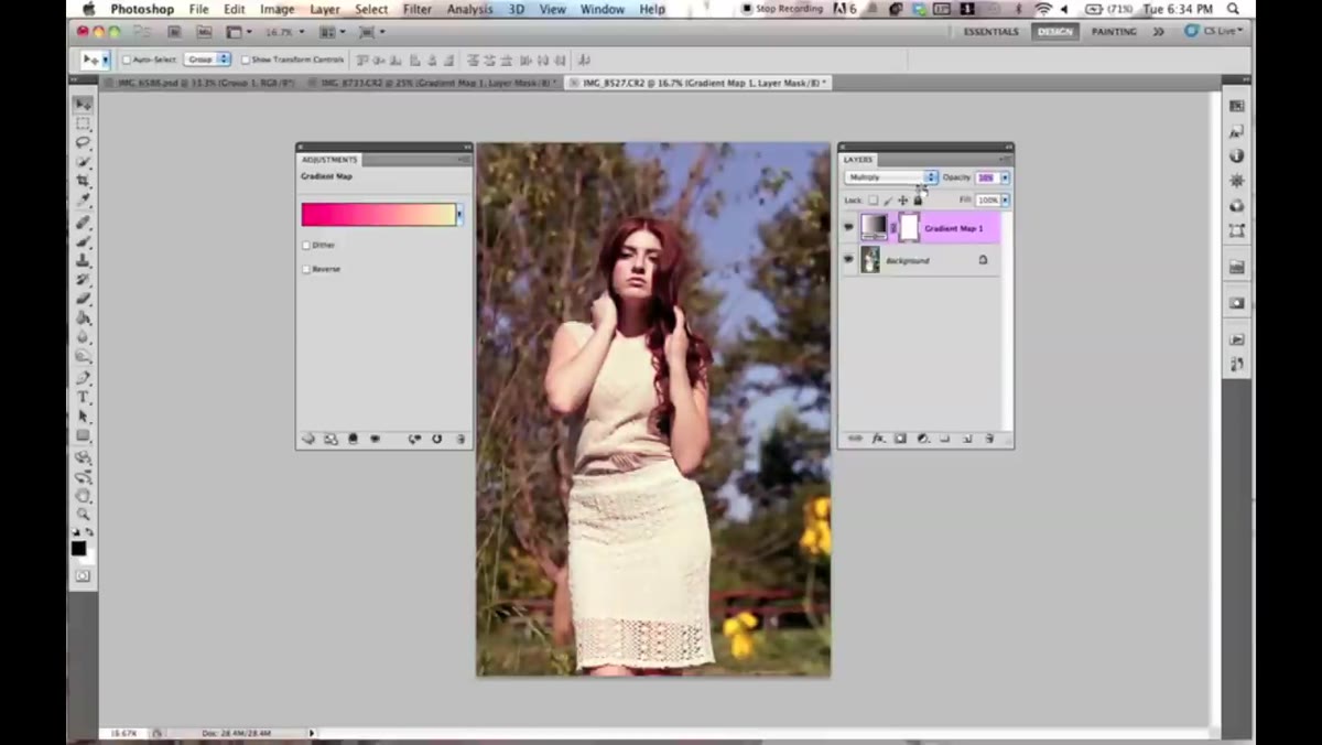 Cycling through blend modes in the Layers panel
A gradient map sitting at 100% opacity in Normal mode is usually too heavy-handed for real use. The move is to change the blend mode on the adjustment layer. Jessica goes through several options, with Darken and Multiply being the most practical starting points. Darken is subtle. It lets the gradient color influence only the areas where the gradient is darker than the underlying image, leaving highlights mostly untouched. Multiply deepens the effect and tends to add richness to shadows and midtones.
Lowering the opacity is another option, though Jessica uses it sparingly. The blend mode approach gives you more nuanced control because it’s not just making the effect less visible. It’s changing how the gradient interacts with the colors underneath. That’s a meaningful difference when you’re trying to get a color grade that feels integrated rather than slapped on.
What I Do Differently: Clipping Gradient Maps to Specific Layers
This is something Jessica doesn’t get into in this particular tutorial, but it changed how I use gradient maps day to day. If you clip a gradient map adjustment layer to a single layer below it (hold Alt and click between the two layers in the panel), the gradient map only affects that one layer. This is especially handy in composite work where you want to grade a sky separately from a subject, or push a background in a direction without touching anything else in the stack. Combined with blend modes, it’s a genuinely precise tool, not just a whole-image color wash.
Gradient maps are one of those features that look basic until you actually sit down with them. The core concept is simple enough to learn in ten minutes, but the blend mode combinations and custom gradient options give you enough range to use this in serious color grading work. Build a small library of gradients you like, learn which blend modes behave how, and this will quietly become a tool you reach for all the time.
Watch the full tutorial on YouTube to see Jessica walk through it herself. Watching her audition gradients in real time is worth the few minutes even if you’ve already read all of this.
Comments (2)
This saved me so much time on my last edit. Wish I'd found this sooner.
The tip about gradient maps are the secret w was the missing piece for me. Thank you.
Leave a Comment