There’s a specific kind of frustration that hits when you open Photoshop with a clear vision and spend the first ten minutes just… rearranging panels. Or worse, you dive straight into editing and realize halfway through that your workspace is fighting you the whole time. I used to lose embarrassing chunks of billable time to this exact problem before I started treating my workspace setup like a pre-flight checklist rather than an afterthought.
That’s why this Watch the full tutorial on YouTube tutorial from CreativeLive with photographer and educator Blake Rudis caught my attention. In four minutes, Rudis walks through his complete baseline workflow: workspace configuration, tonal adjustment, color control, and finishing with an artistic color grade. No fluff, no lengthy intros. Just the decisions he actually makes on every image and the reasoning behind them.
What makes this useful rather than just another “here are some tools” video is that Rudis explains why he’s doing each thing in terms of the viewer’s experience. He’s thinking about where the eye goes, what emotion the image communicates, and how every adjustment serves that goal. That framing changed how I think about editing, honestly.
Step 1: Strip Your Workspace Down to What You Actually Use
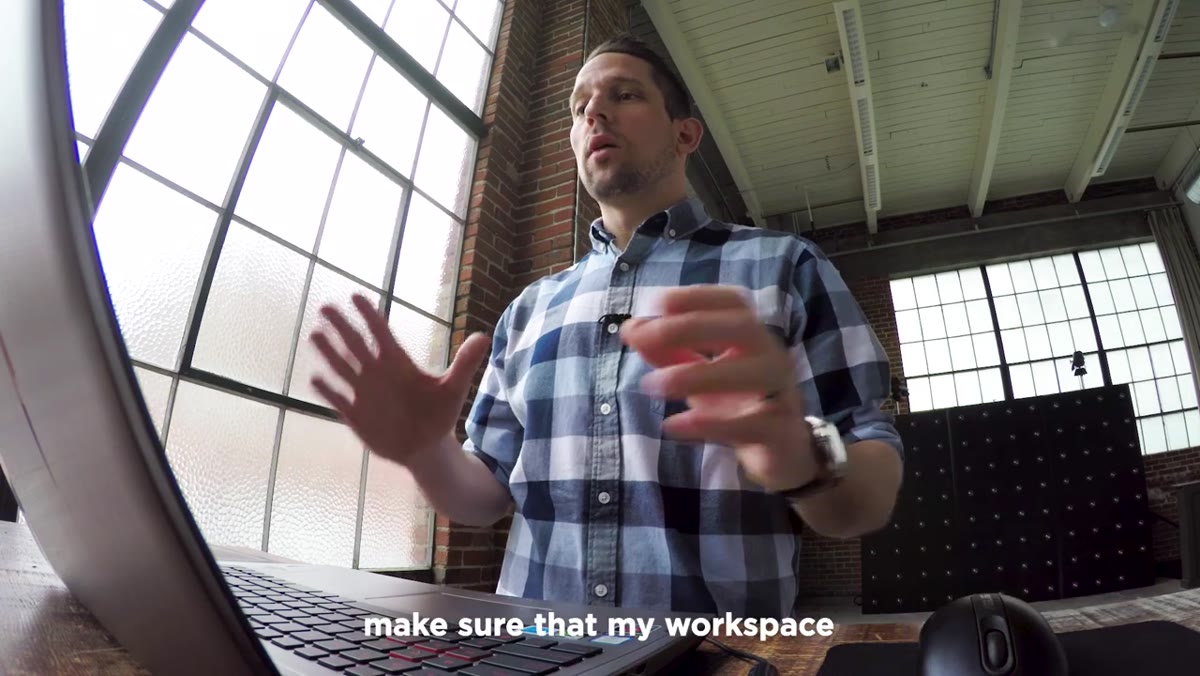 Photoshop workspace being configured with panels open
The first thing Rudis does is ditch the default Photography workspace clutter. Specifically, he closes the Libraries and Settings panels because he simply doesn’t use them in his workflow. This sounds obvious, but most people just leave defaults in place forever and work around the mess.
Photoshop workspace being configured with panels open
The first thing Rudis does is ditch the default Photography workspace clutter. Specifically, he closes the Libraries and Settings panels because he simply doesn’t use them in his workflow. This sounds obvious, but most people just leave defaults in place forever and work around the mess.
Once the dead weight is gone, he adds two panels back intentionally: Properties and History. Properties goes above the Layers panel so that when he clicks an adjustment layer, its settings appear right there without hunting through menus. History gets added so that any mistake can be reversed by clicking back to an earlier state, which is faster than hammering Cmd/Ctrl+Z repeatedly. Set these up once, save the workspace under a custom name via Window > Workspace > New Workspace, and you never have to do it again.
Step 2: Add a Curves Adjustment Layer for Tonal Control
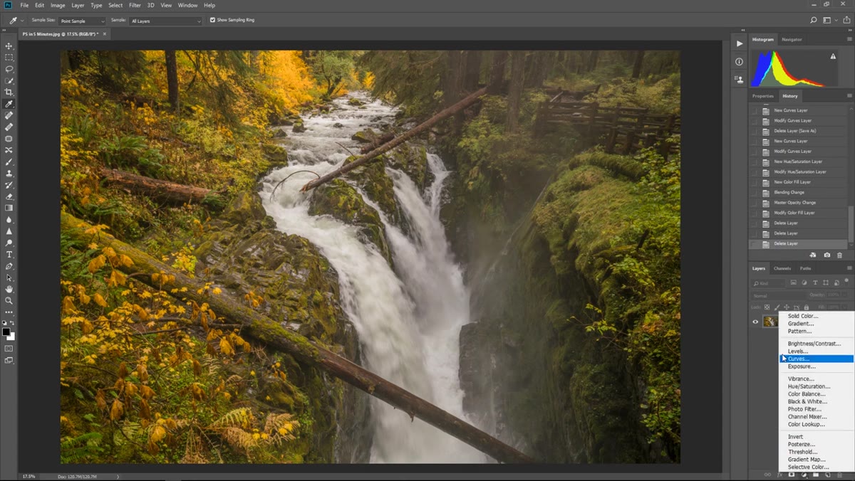 Curves adjustment layer being added from the Layers panel
Rudis reaches for Curves first, every time. You access it by clicking the half-filled circle icon at the bottom of the Layers panel and selecting Curves from the list. The reason to use an adjustment layer rather than Image > Adjustments > Curves is non-destructive editing: the original pixels stay untouched, and you can go back and tweak settings any time.
Curves adjustment layer being added from the Layers panel
Rudis reaches for Curves first, every time. You access it by clicking the half-filled circle icon at the bottom of the Layers panel and selecting Curves from the list. The reason to use an adjustment layer rather than Image > Adjustments > Curves is non-destructive editing: the original pixels stay untouched, and you can go back and tweak settings any time.
Here’s his mental model for reading the Curves grid: the bottom four squares represent shadows, the center square covers midtones, and the top four handle highlights. He pulls the shadow anchor point slightly downward to deepen the dark areas, then nudges the midtone point to add contrast through the middle range. Finally, he lifts the highlights to make the brightest parts of the image pop. His reasoning is straightforward: human eyes are drawn to brighter areas first, so by making the focal point the brightest region in the frame, you’re subtly directing where the viewer looks. The photograph gains depth rather than just sitting flat on the screen.
Step 3: Use Hue/Saturation With the Targeted Adjustment Tool
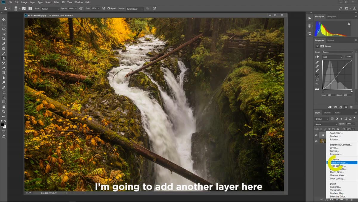 Hue Saturation panel open with Targeted Adjustment tool selected
After tone, Rudis adds a Hue/Saturation adjustment layer. But here’s the part that most beginners skip: instead of dragging the master Saturation slider and blowing up every color in the image equally, he switches to the Targeted Adjustment Tool. It’s the little hand/finger icon inside the Hue/Saturation Properties panel.
Hue Saturation panel open with Targeted Adjustment tool selected
After tone, Rudis adds a Hue/Saturation adjustment layer. But here’s the part that most beginners skip: instead of dragging the master Saturation slider and blowing up every color in the image equally, he switches to the Targeted Adjustment Tool. It’s the little hand/finger icon inside the Hue/Saturation Properties panel.
With that tool active, you click directly on a color in the image and drag left or right to decrease or increase saturation for only that color range. Rudis clicks on the yellows in his autumn landscape and pushes them toward a richer, warmer orange without touching the greens or the sky. This is color editing with a scalpel instead of a sledgehammer. You can also drag up or down to shift the Hue, so you can pull yellows toward orange or toward green depending on the mood you’re after. It gives you color decisions that actually feel intentional.
Step 4: Apply a Solid Color Fill Layer as a Color Grade
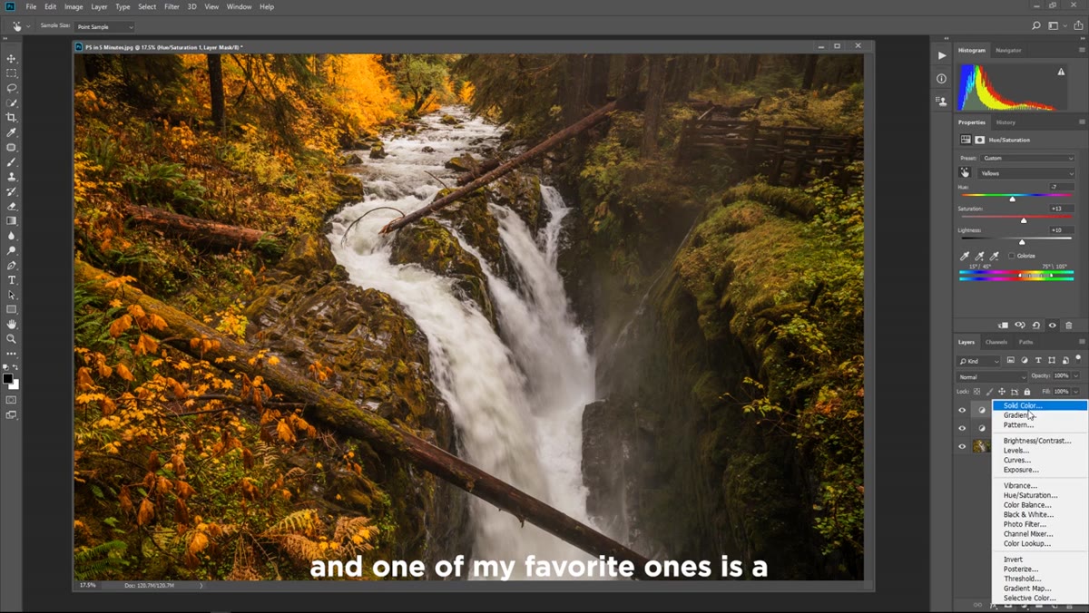 Solid Color fill layer dialog open, orange color selected
This is the step that surprised me the first time I saw it. Rudis doesn’t use a Color Lookup table or a gradient map for his color grade. He creates a Solid Color fill layer, picks a warm orange that matches the undertones already in the image, and then changes the blend mode from Normal to Color in the Layers panel. Then he drops the opacity down, somewhere in the range of 20-40%, so the effect reads as a tint rather than a paint job.
Solid Color fill layer dialog open, orange color selected
This is the step that surprised me the first time I saw it. Rudis doesn’t use a Color Lookup table or a gradient map for his color grade. He creates a Solid Color fill layer, picks a warm orange that matches the undertones already in the image, and then changes the blend mode from Normal to Color in the Layers panel. Then he drops the opacity down, somewhere in the range of 20-40%, so the effect reads as a tint rather than a paint job.
The result is a cohesive color atmosphere across the entire image, the visual equivalent of a warm Instagram filter, except you control every variable. The brilliant part is the edit is completely revisable: double-click the color swatch on the fill layer and the color picker reopens. Want to feel colder and more dramatic? Shift the color toward blue. Want something moodier? Try a deep teal. Rudis demonstrates both options in the video, and the difference in emotional tone between warm orange and cool blue on the same image is immediately obvious. It’s a great reminder that color grading isn’t a technical step. It’s an emotional decision.
My Own Extension: Stack These Adjustments in Order, Always
One habit I’d add to Rudis’s workflow: always keep these three layer types in a consistent order, bottom to top: Curves, then Hue/Saturation, then Solid Color fill. It seems minor until you start working on complex files with a dozen layers and you need to find something fast. A predictable structure means you spend zero mental energy locating your tools.
I’d also suggest naming each layer the moment you create it. Double-click the layer name and type something descriptive. “Warm Curves” instead of “Curves 1.” When you come back to an edit three weeks later for a revision, named layers are the difference between picking up work smoothly and spending fifteen minutes reconstructing what past-you was thinking. Ask me how I know. (Hint: a client revision, a file full of unnamed layers, and one very long afternoon.)
The single biggest takeaway from Rudis’s approach is that every adjustment has a purpose tied to the viewer’s experience, not just the numbers on a histogram. Tone controls where the eye travels. Color amplifies what the image is emotionally about. The artistic grade ties it together into something that feels unified and deliberate. Four minutes of technique, but the thinking behind it is worth way more than that.
Watch the full tutorial on YouTube and follow along with your own image. Landscape or portrait, the same three-layer structure applies, and seeing it applied to a real photo makes each step click in a way that reading about it never quite does.
Comments
Leave a Comment