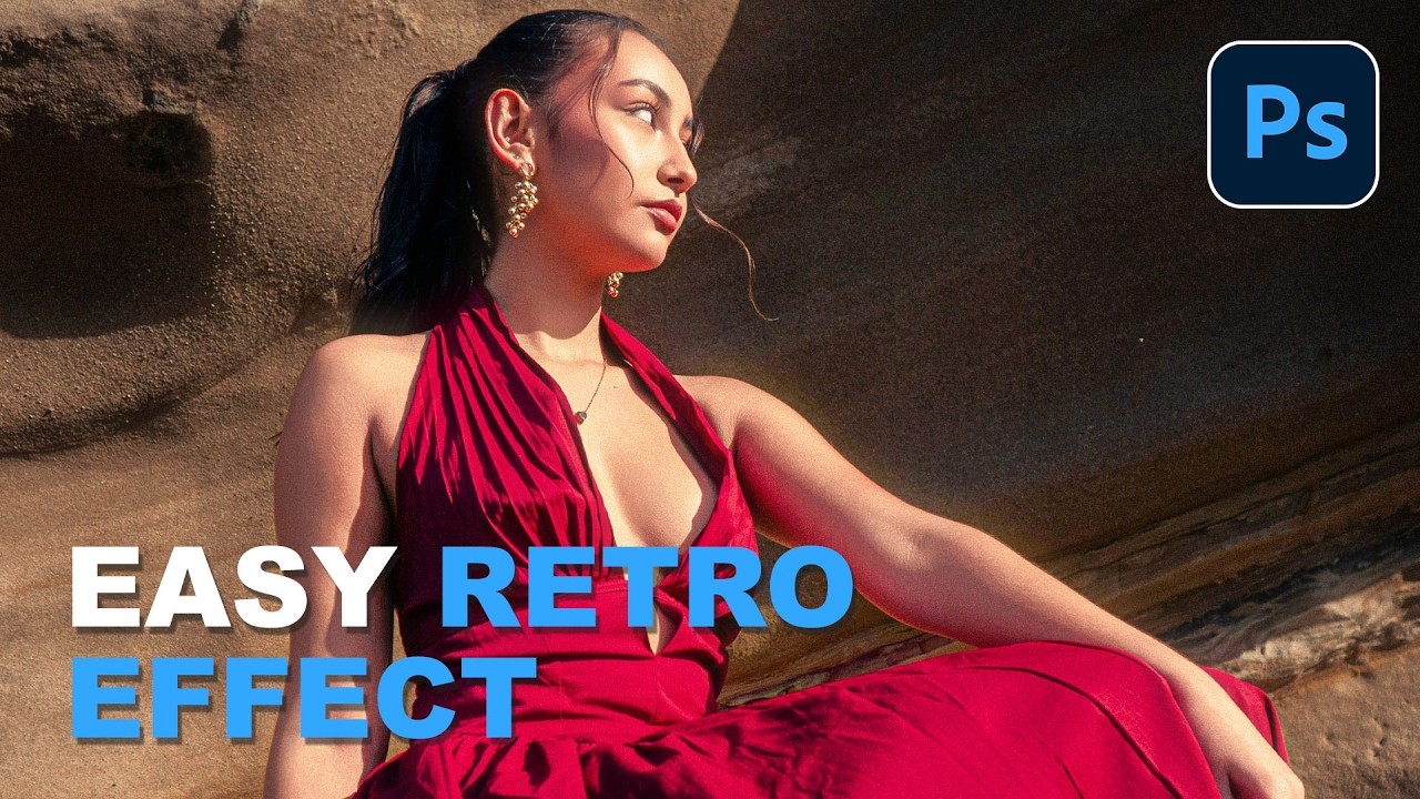
Client work comes in waves. One week everyone wants clean, minimal, modern. The next week, someone slides into your DMs asking for that “y’know, that old digital camera vibe” and you’re suddenly staring at a perfectly exposed, beautifully lit photo wondering how to make it look worse on purpose. It’s a real skill. I mean that without irony.
The digicam look, that punchy, slightly cold, flash-blasted aesthetic from early-2000s point-and-shoot cameras, is everywhere right now. And while you could absolutely hunt down a vintage Casio Exilim on eBay and shoot your own content, that feels like a lot of effort when Photoshop is already open. In this Aaron Nace (PHLEARN) tutorial, Watch the full tutorial on YouTube, Aaron walks through how to nail this look entirely inside Adobe Camera Raw, which means it’s non-destructive, tweakable, and way cheaper than vintage gear. Here’s how it works, step by step.
Step 1: Convert Your Layer to a Smart Object
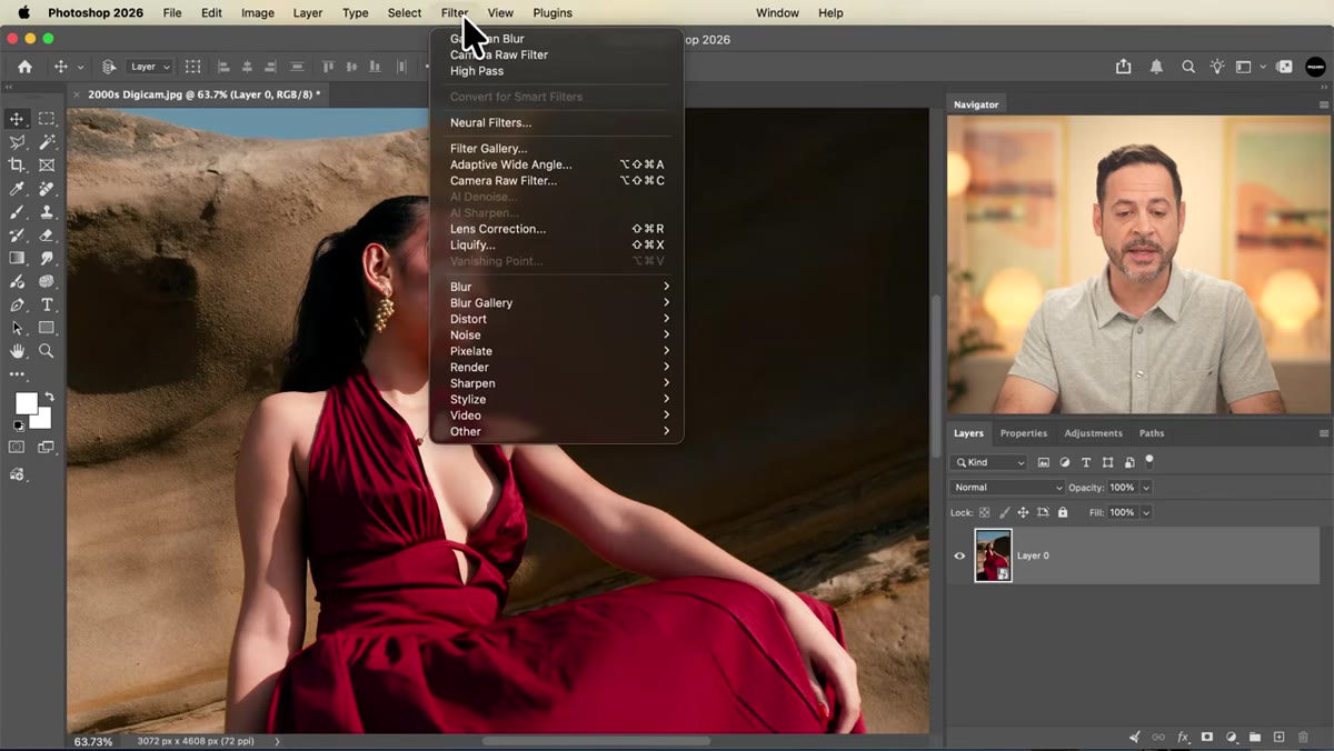
 Convert for Smart Filters option in the Filter menu
Before you touch a single slider, do yourself a favor and convert your background layer into a Smart Object. Go to Filter, then “Convert for Smart Filters.” That’s it. One click, and now everything you do in Camera Raw becomes editable after the fact. You can dial settings back, swap them out, or hand the file to a client who wants “just a little less of that effect” without rebuilding anything from scratch. I learned this the hard way early in my freelance life, and I will never skip this step again. Treat it like buckling your seatbelt before you drive.
Convert for Smart Filters option in the Filter menu
Before you touch a single slider, do yourself a favor and convert your background layer into a Smart Object. Go to Filter, then “Convert for Smart Filters.” That’s it. One click, and now everything you do in Camera Raw becomes editable after the fact. You can dial settings back, swap them out, or hand the file to a client who wants “just a little less of that effect” without rebuilding anything from scratch. I learned this the hard way early in my freelance life, and I will never skip this step again. Treat it like buckling your seatbelt before you drive.
Step 2: Open the Image in Camera Raw
 Camera Raw Filter selected in the Filter dropdown menu
With your Smart Object ready, go to Filter and select “Camera Raw Filter.” If you’ve never spent serious time in here, it’s basically Lightroom living inside Photoshop. The editing panels live on the right side of the interface, and that’s where you’ll be spending most of your time for this effect. Aaron recommends using the side-by-side before/after view inside Camera Raw, which you can toggle with the split-screen icon in the toolbar. It’s genuinely useful for keeping yourself honest when you’re pushing settings into “is this too much” territory.
Camera Raw Filter selected in the Filter dropdown menu
With your Smart Object ready, go to Filter and select “Camera Raw Filter.” If you’ve never spent serious time in here, it’s basically Lightroom living inside Photoshop. The editing panels live on the right side of the interface, and that’s where you’ll be spending most of your time for this effect. Aaron recommends using the side-by-side before/after view inside Camera Raw, which you can toggle with the split-screen icon in the toolbar. It’s genuinely useful for keeping yourself honest when you’re pushing settings into “is this too much” territory.
Step 3: Boost Contrast in the Light Panel
 Light panel open with Contrast slider being raised
Open the Light panel and pull the Contrast slider up significantly. This is the backbone of the digicam look. Those old point-and-shoots had no sophistication about dynamic range, and that’s exactly what made them interesting. The on-camera flash would slam the subject with light while the shadows stayed deep and moody. You’re not going for subtle here. Push contrast until the image feels punchy, and don’t stress about blown highlights or crushed shadows at this stage. That’s part of the aesthetic, not a problem to fix.
Light panel open with Contrast slider being raised
Open the Light panel and pull the Contrast slider up significantly. This is the backbone of the digicam look. Those old point-and-shoots had no sophistication about dynamic range, and that’s exactly what made them interesting. The on-camera flash would slam the subject with light while the shadows stayed deep and moody. You’re not going for subtle here. Push contrast until the image feels punchy, and don’t stress about blown highlights or crushed shadows at this stage. That’s part of the aesthetic, not a problem to fix.
Step 4: Cool Down the Color Temperature and Tint
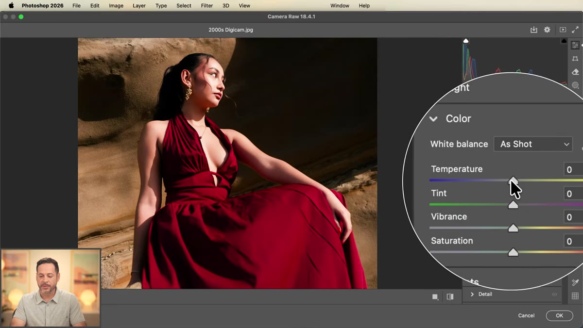 Color panel open showing Temperature and Tint both set to minus 10
Open the Color panel and bring both Temperature and Tint down to around -10. This is one of those details that separates a convincing digicam edit from one that just looks “contrasty.” Those older cameras would go a little haywire with white balance when the flash fired, pushing everything toward a cooler, slightly greenish or magenta-shifted tone depending on the environment. Pulling both sliders down nudges your image into that familiar territory without going so far that it reads as a mistake. The exact values can flex depending on your starting photo, but -10 on both is a solid baseline to work from.
Color panel open showing Temperature and Tint both set to minus 10
Open the Color panel and bring both Temperature and Tint down to around -10. This is one of those details that separates a convincing digicam edit from one that just looks “contrasty.” Those older cameras would go a little haywire with white balance when the flash fired, pushing everything toward a cooler, slightly greenish or magenta-shifted tone depending on the environment. Pulling both sliders down nudges your image into that familiar territory without going so far that it reads as a mistake. The exact values can flex depending on your starting photo, but -10 on both is a solid baseline to work from.
Step 5: Add Texture and Clarity in the Effects Panel
 Effects panel open with Texture and Clarity sliders raised
Here’s where the image starts to feel like it was processed by a cheap JPEG engine. Open the Effects panel and raise both Texture and Clarity. These controls increase micro-contrast and mid-tone sharpness respectively, mimicking the aggressive in-camera sharpening that budget digicams applied to every frame. Aaron’s advice here is worth repeating: zoom into 100% while you adjust these sliders. At full zoom you’ll actually see the effect working on fine details rather than guessing from a thumbnail. Don’t go so heavy that faces look etched, but don’t be shy either. The digicam look was never gentle.
Effects panel open with Texture and Clarity sliders raised
Here’s where the image starts to feel like it was processed by a cheap JPEG engine. Open the Effects panel and raise both Texture and Clarity. These controls increase micro-contrast and mid-tone sharpness respectively, mimicking the aggressive in-camera sharpening that budget digicams applied to every frame. Aaron’s advice here is worth repeating: zoom into 100% while you adjust these sliders. At full zoom you’ll actually see the effect working on fine details rather than guessing from a thumbnail. Don’t go so heavy that faces look etched, but don’t be shy either. The digicam look was never gentle.
Step 6: Zoom In to Check Your Work at 100%
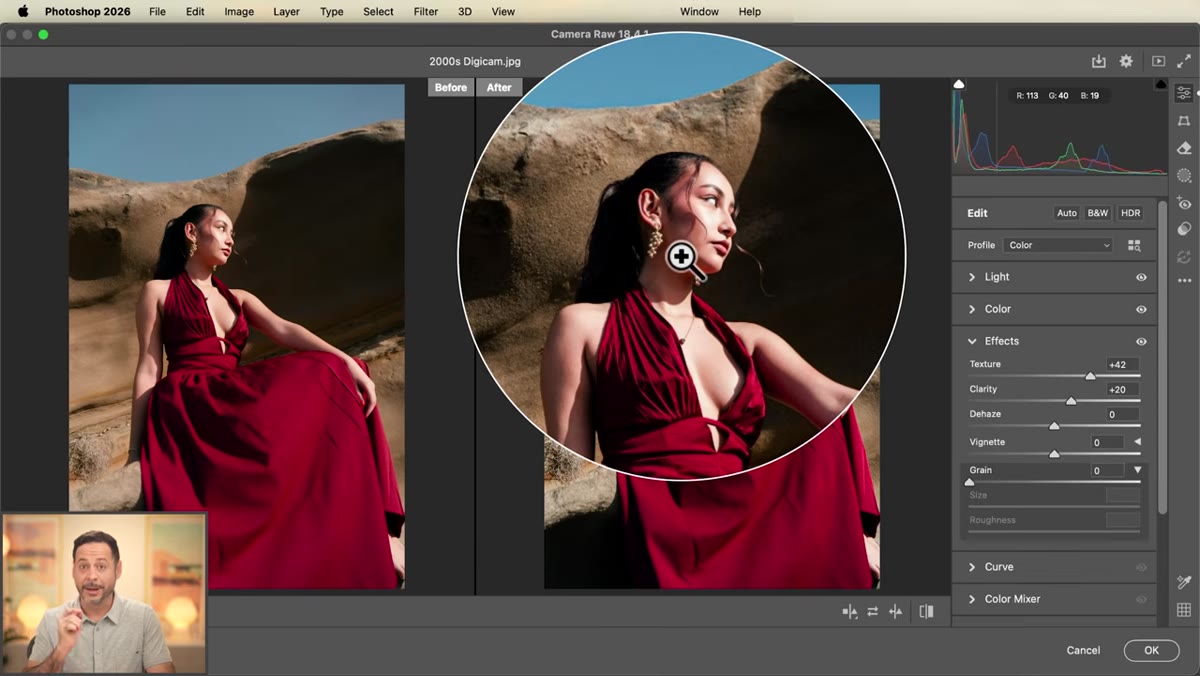 Image zoomed to 100% showing before and after detail comparison
Once you’ve got Texture and Clarity dialed in, zoom to 100% and toggle the before/after view to compare. This is less of a “step” and more of a mandatory checkpoint. Effects that look great at fit-to-screen zoom can look overdone or underdone at full resolution, especially texture-based adjustments. Camera Raw makes this easy with its zoom percentage selector at the bottom of the preview window. Click into the image, choose 100% from the dropdown, and spend thirty seconds actually looking at what you’ve built before clicking OK. Future you will be grateful.
Image zoomed to 100% showing before and after detail comparison
Once you’ve got Texture and Clarity dialed in, zoom to 100% and toggle the before/after view to compare. This is less of a “step” and more of a mandatory checkpoint. Effects that look great at fit-to-screen zoom can look overdone or underdone at full resolution, especially texture-based adjustments. Camera Raw makes this easy with its zoom percentage selector at the bottom of the preview window. Click into the image, choose 100% from the dropdown, and spend thirty seconds actually looking at what you’ve built before clicking OK. Future you will be grateful.
My Addition: A Glow Layer Back in Photoshop
Aaron touches on a glow effect in the full tutorial, and it’s worth doing even if you’re short on time. After you’ve applied your Camera Raw filter, duplicate the Smart Object layer, desaturate the copy, and run a Gaussian Blur set to a fairly wide radius, somewhere around 20-40 pixels depending on your image size. Then set that blurred layer’s blend mode to Screen and drop the opacity to somewhere between 15 and 30 percent. This adds a soft halation around highlights that sells the “cheap lens flare” quality of low-end camera glass. It’s subtle, but it’s the difference between a photo that looks like it was shot on a digicam and one that just looks like you cranked contrast in Camera Raw.
One more thing I’d add: mask your Camera Raw filter. Because it’s applied as a Smart Filter, you can paint on the filter mask to pull the effect back from areas that are getting too crunchy. Skin tones especially can fall apart under heavy Clarity adjustments. A soft brush at low opacity over faces keeps the look intact without sacrificing detail where you actually need it.
The single most important thing this technique taught me is that “degraded” doesn’t mean “sloppy.” Every slider in this workflow is doing a specific job to recreate a specific real-world phenomenon, whether that’s a flash’s color cast, a cheap sensor’s contrast response, or a budget processor’s heavy-handed sharpening. Understanding why each setting exists makes it easier to adapt the look to different photos rather than just pasting a preset and hoping for the best.
Watch the full tutorial on YouTube for Aaron’s complete walkthrough, including the downloadable preset he’s made available at phlearn.com.
Comments
Leave a Comment