There’s a certain kind of photo that stops people mid-scroll. You know the one: shafts of light breaking through trees, or that golden haze pouring through a window like someone hired a cinematographer. Clients ask me for that look constantly, and for a while I was either hunting for the perfect stock photo or spending way too long faking it badly. Then I stumbled onto a Kelvin Designs tutorial that reframed the whole thing for me. Watch the full tutorial on YouTube before or after reading this, because Kelvin’s delivery is quick and worth seeing in motion.
The technique is genuinely simpler than it looks. No plugins, no third-party assets you’ll forget to install. Just a custom brush, a transform, and a layer style doing the heavy lifting. I’ve since used this on client work ranging from album art to real estate photography, and nobody has ever guessed it was added in post. Here’s exactly how it works.
Step 1: Load the Custom Light Ray Brushes
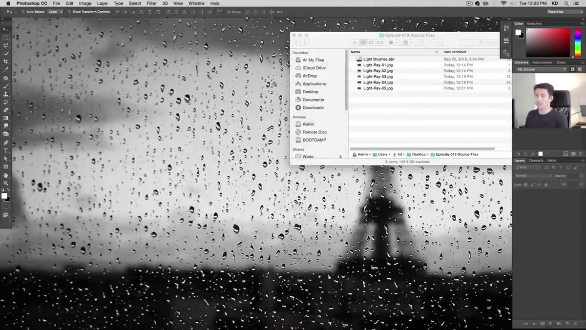 Brush preset menu open, loading custom light brush file
Kelvin provides a set of four custom brushes with the tutorial’s downloadable assets. To load them, open Photoshop, grab the Brush tool (or just hit B), and click the small brush thumbnail in the Options bar to open the Brush Preset Picker. From there, hit the gear or menu icon and choose “Load Brushes.” Navigate to the downloaded files and select the light brushes preset. They’ll appear at the bottom of your brush list, all defaulting to massive sizes around 3,000 pixels. That’s intentional, because these effects need room to breathe.
Brush preset menu open, loading custom light brush file
Kelvin provides a set of four custom brushes with the tutorial’s downloadable assets. To load them, open Photoshop, grab the Brush tool (or just hit B), and click the small brush thumbnail in the Options bar to open the Brush Preset Picker. From there, hit the gear or menu icon and choose “Load Brushes.” Navigate to the downloaded files and select the light brushes preset. They’ll appear at the bottom of your brush list, all defaulting to massive sizes around 3,000 pixels. That’s intentional, because these effects need room to breathe.
If you don’t have the download, you can approximate this with a soft round brush set to a very low hardness, but the custom brushes have a natural falloff that saves you a lot of fiddling. Worth grabbing.
Step 2: Sample Your Light Color From the Image
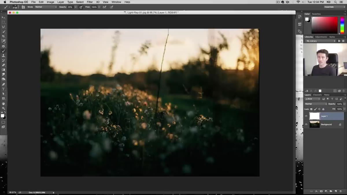 Eyedropper tool sampling warm color near sun area of photo
This is the step most people skip, and it’s why their fake light rays look fake. Kelvin’s move here is smart: instead of defaulting to white, he grabs the Eyedropper tool (hit I) and samples a color directly from the brightest part of the image, right near where the light source sits. In most outdoor shots that’s going to be a warm yellow-orange rather than pure white.
Eyedropper tool sampling warm color near sun area of photo
This is the step most people skip, and it’s why their fake light rays look fake. Kelvin’s move here is smart: instead of defaulting to white, he grabs the Eyedropper tool (hit I) and samples a color directly from the brightest part of the image, right near where the light source sits. In most outdoor shots that’s going to be a warm yellow-orange rather than pure white.
Pure white light rays look like a graphic. Warm, photo-sampled light rays look like they belong. It takes two seconds and makes a noticeable difference. Sample from the hottest, most blown-out area near your light source and you’ll be starting from a believable base.
Step 3: Paint a Single Brush Stroke on a New Layer
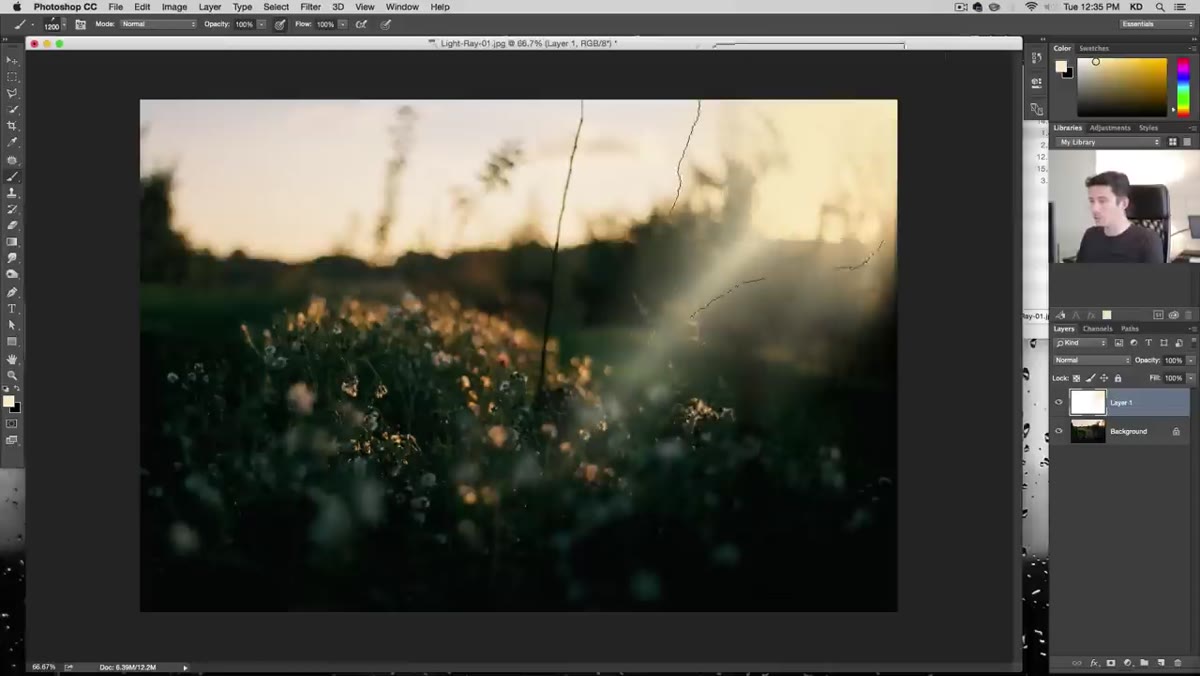 Single brush click placed on new layer above photo
Create a new layer above your photo before you do anything else. Then, with your sampled color set as the foreground, click once with your light brush. Just once. You’re not painting in the traditional sense here, you’re stamping. Kelvin works at around 1,200 pixels for this particular image, which is smaller than the brush default but still substantial.
Single brush click placed on new layer above photo
Create a new layer above your photo before you do anything else. Then, with your sampled color set as the foreground, click once with your light brush. Just once. You’re not painting in the traditional sense here, you’re stamping. Kelvin works at around 1,200 pixels for this particular image, which is smaller than the brush default but still substantial.
If your opacity is sitting low (check the Options bar), crank it to 100% for now. You can dial it back later, but you want to see the full effect first so you’re not second-guessing a result that’s just underexposed. Commit to it, then back off.
Step 4: Resize and Reposition With Free Transform
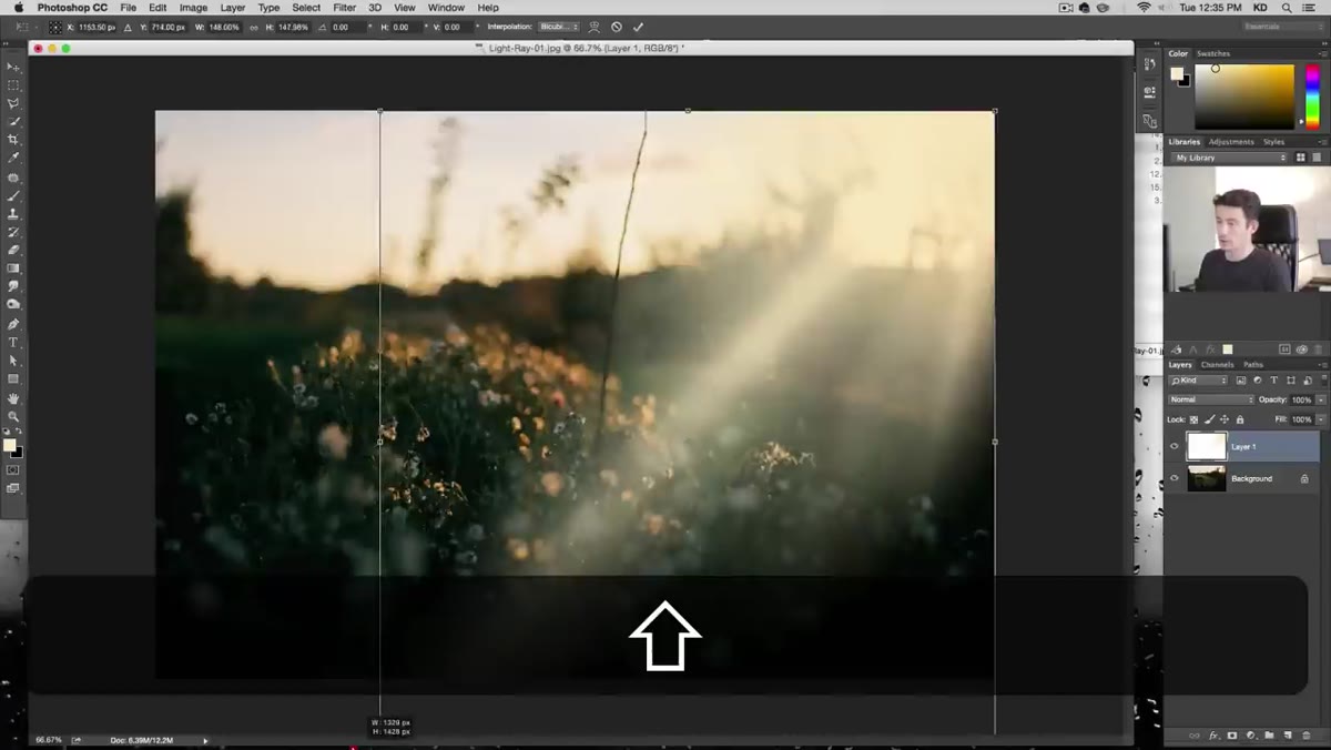 Free Transform handles stretching the light stamp layer
Hit Command+T (Ctrl+T on Windows) to enter Free Transform. Now stretch that stamp out. Light rays are long and directional, so pulling the corners out and angling the layer toward your light source is what sells the illusion. Think about where the sun or light source actually is in the frame and drag the ray toward it, like the light is originating from that point.
Free Transform handles stretching the light stamp layer
Hit Command+T (Ctrl+T on Windows) to enter Free Transform. Now stretch that stamp out. Light rays are long and directional, so pulling the corners out and angling the layer toward your light source is what sells the illusion. Think about where the sun or light source actually is in the frame and drag the ray toward it, like the light is originating from that point.
Don’t be precious about this step. Shove it around until it feels right. The physics of light are pretty forgiving to the eye as long as the direction is roughly consistent with the image.
Step 5: Set Up Your Foreground and Background Colors for the Gradient
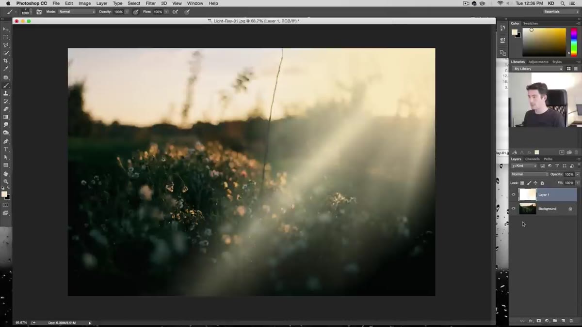 Eyedropper sampling light and dark yellow tones from image
Before you apply the gradient overlay (next step), you need two colors ready. Kelvin samples a very light yellow for the foreground and a slightly darker, more saturated yellow for the background. Hit X to toggle between them as you pick each one. The idea is to create a gradient that goes from light to less-light rather than from color to transparent or color to white.
Eyedropper sampling light and dark yellow tones from image
Before you apply the gradient overlay (next step), you need two colors ready. Kelvin samples a very light yellow for the foreground and a slightly darker, more saturated yellow for the background. Hit X to toggle between them as you pick each one. The idea is to create a gradient that goes from light to less-light rather than from color to transparent or color to white.
This two-tone approach keeps the ray feeling like it’s part of the same color temperature as the rest of the image. It’s one of those micro-decisions that separates “technically correct” from “actually convincing.”
Step 6: Apply a Gradient Overlay via Layer Styles
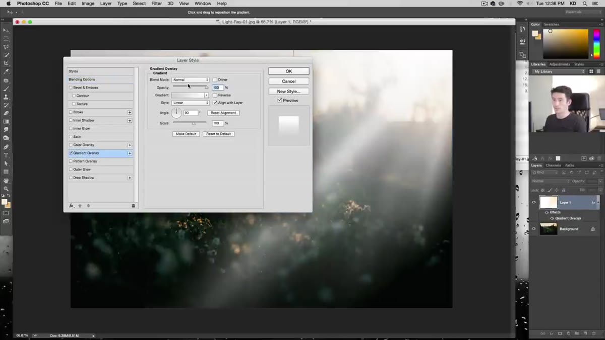 Layer Style dialog open showing Gradient Overlay settings
Double-click the light ray layer’s thumbnail to open Layer Styles, then click into Gradient Overlay. Set the gradient type to Foreground to Background using the two colors you just picked. The critical setting here is the angle: it needs to match the direction your light ray is traveling. If your light source is upper right, the gradient runs upper right to lower left.
Layer Style dialog open showing Gradient Overlay settings
Double-click the light ray layer’s thumbnail to open Layer Styles, then click into Gradient Overlay. Set the gradient type to Foreground to Background using the two colors you just picked. The critical setting here is the angle: it needs to match the direction your light ray is traveling. If your light source is upper right, the gradient runs upper right to lower left.
Use the Invert checkbox if the light and dark ends are reversed. You want the brightest part of the gradient sitting closest to your light source, fading out as the ray extends away from it. Kelvin also mentions you can scale the gradient within the dialog to adjust how abruptly it transitions, so play with that slider until it reads naturally.
One Thing I Do Differently
Kelvin keeps his rays on a single layer per stroke, which gives you a lot of flexibility. I’ve started grouping all my ray layers into a folder and running a Soft Light or Screen blend mode on the group itself rather than on individual layers. Screen, in particular, has a nice way of letting the rays interact with the midtones of the image without blowing out the highlights completely.
I also knock the group’s opacity down to somewhere between 50-70% rather than trying to get each individual layer perfect. Working the whole group as a unit means you can make one opacity adjustment and everything dials back together. Saves the kind of micro-managing that makes you want to close Photoshop and take up watercolors.
The biggest thing this technique taught me is that light is almost never white. I was dropping pure white rays into photos for years and wondering why they felt pasted on. Sampling color directly from your image, the way Kelvin does it here, is the difference between a light ray and a lens flare that wandered in from a bad action movie.
Watch the full tutorial on YouTube to see Kelvin work through five different example images, each with its own lighting scenario. The written steps above will get you started, but watching him adjust on the fly through multiple photos is where the intuition really clicks.
Comments (2)
I keep coming back to this article. It's that useful.
Finally someone explains this in a way that actually makes sense.
Leave a Comment