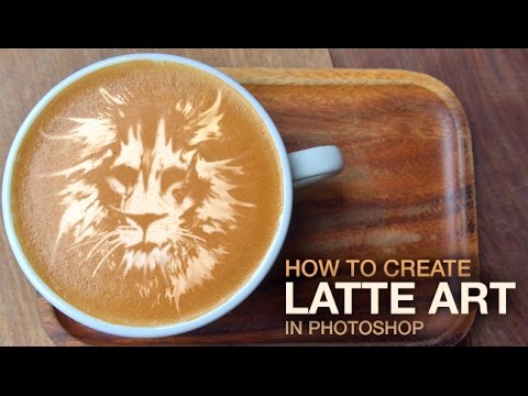
I spend an embarrassing portion of my working life in coffee shops, which means I’ve stared at a lot of latte art. Rosettes, hearts, little fern fronds that the barista clearly spent four seconds on but somehow looks incredible. It never occurred to me that recreating that effect in Photoshop would be this achievable until I stumbled across Aaron Nace’s tutorial over at PHLEARN. Watch the full tutorial on YouTube before or after reading this breakdown.
The technique is actually three techniques stacked together: erase existing art using a custom brush, simplify a source image into a readable graphic, then use the smudge tool to sell the illusion that someone physically dragged a tool through foam. That layered approach is what makes the result look so convincing. Each stage handles a specific visual problem, and understanding why each step exists helps you adapt this to your own images instead of just copying Aaron’s result blindly.
What got me was how transferable the underlying logic is. I’ve had clients ask for product mockups that involve coffee cups, menus, lifestyle shots. Having a workflow that can drop custom art into a latte photo in a believable way is genuinely useful. This isn’t a novelty trick. It’s a compositing skill dressed up in coffee foam.
Step 1: Create a Custom Dot Brush for Erasing Texture
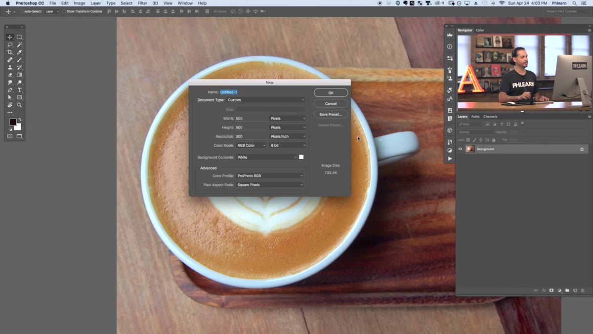 New 800x800 document open, blank white canvas
Start by creating a new document at 800 by 800 pixels. The goal here is to build a custom brush that mimics the natural speckled texture of milk foam. Select a hard round brush, crank the hardness up to around 95%, and keep the size small. Then paint a loose scatter of dots across the canvas, varying the sizes manually by tapping your bracket keys. These dots represent tiny foam bubbles, so they shouldn’t look perfectly uniform. A little randomness in placement and scale is the point.
New 800x800 document open, blank white canvas
Start by creating a new document at 800 by 800 pixels. The goal here is to build a custom brush that mimics the natural speckled texture of milk foam. Select a hard round brush, crank the hardness up to around 95%, and keep the size small. Then paint a loose scatter of dots across the canvas, varying the sizes manually by tapping your bracket keys. These dots represent tiny foam bubbles, so they shouldn’t look perfectly uniform. A little randomness in placement and scale is the point.
Once your dot cluster looks suitably organic, go to Edit and choose Define Brush Preset. Name it something memorable, like “latte,” and you’re done. Aaron actually offers this brush as a download on PHLEARN, so if you’d rather skip the manual creation, grab it there. But building it yourself takes about three minutes and teaches you something about how custom brush shapes work that you’ll use again.
Step 2: Configure Brush Dynamics for Natural Scatter
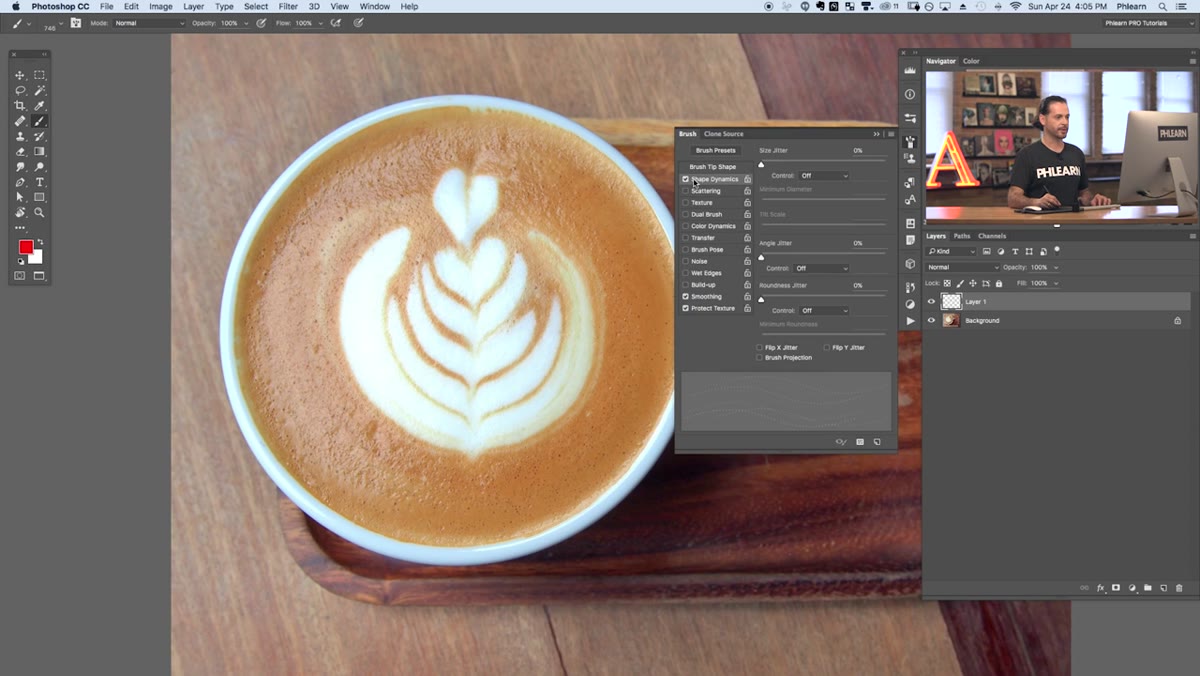 Brush settings panel open, Shape Dynamics and Scatter controls visible
A static dot brush won’t cut it. Open the Brush Settings panel (Window > Brush) and head into Shape Dynamics. Push Size Jitter all the way up so the dots paint at varying scales with every stroke. Then bring Angle Jitter up as well, which randomizes the orientation of each mark and breaks up any mechanical repetition. These two settings together are what give the brush its organic, foam-like quality.
Brush settings panel open, Shape Dynamics and Scatter controls visible
A static dot brush won’t cut it. Open the Brush Settings panel (Window > Brush) and head into Shape Dynamics. Push Size Jitter all the way up so the dots paint at varying scales with every stroke. Then bring Angle Jitter up as well, which randomizes the orientation of each mark and breaks up any mechanical repetition. These two settings together are what give the brush its organic, foam-like quality.
From there, head to Scattering and increase the Spacing slider in the Brush Tip Shape section. You want the brush to lay down more marks per stroke so a single pass covers a wide area with convincing density. The practical goal is to paint over the existing latte art pattern and replace it with a uniform, texture-only surface that looks like undisturbed foam. More dots, more coverage, faster results.
Step 3: Paint Over the Existing Latte Art
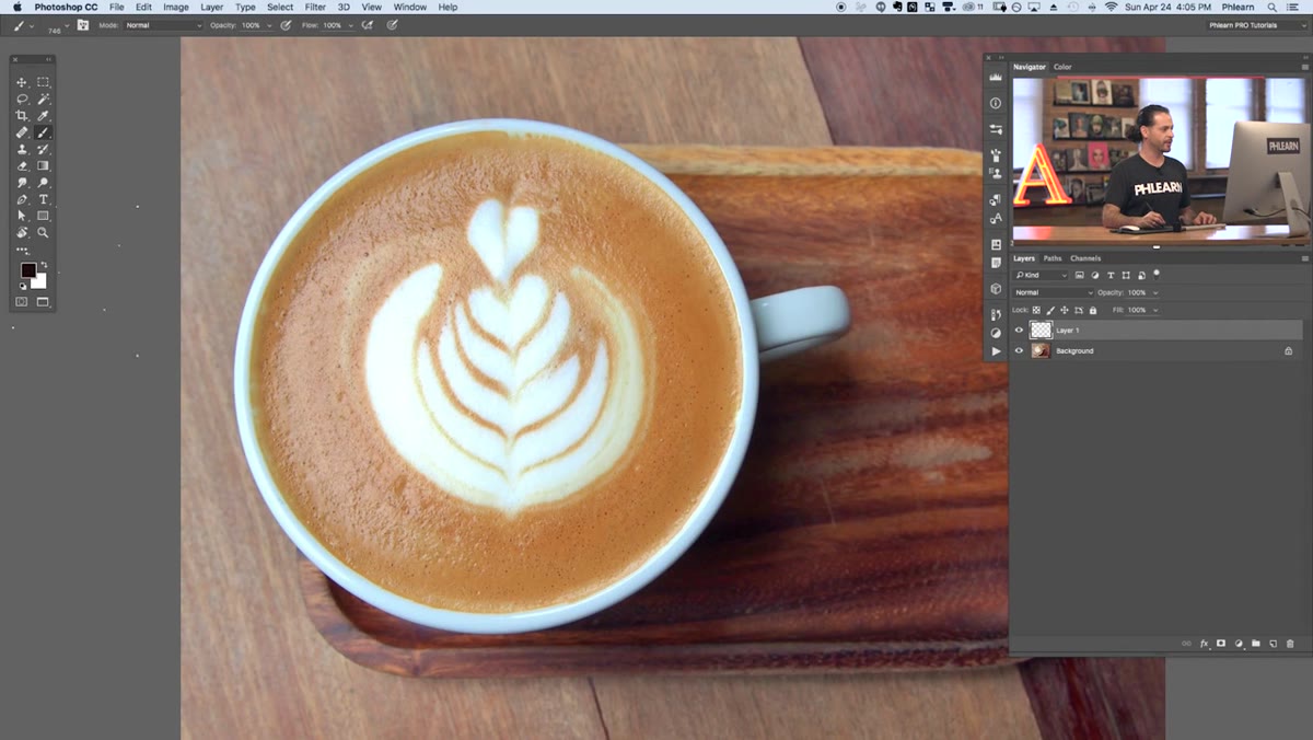 Red brush strokes painted over latte photo to demonstrate coverage
Create a new layer above your base image before you touch the actual photo. Aaron demos this by painting in red first, which is smart because it lets you see exactly what your brush is covering before you commit to matching the foam color. Once you’ve confirmed the scatter pattern looks right, switch to sampling the actual foam color from your image and paint over the existing design.
Red brush strokes painted over latte photo to demonstrate coverage
Create a new layer above your base image before you touch the actual photo. Aaron demos this by painting in red first, which is smart because it lets you see exactly what your brush is covering before you commit to matching the foam color. Once you’ve confirmed the scatter pattern looks right, switch to sampling the actual foam color from your image and paint over the existing design.
The layer-based approach matters here. You’re not destructively editing the original photo, which means if your coverage looks off you can wipe the layer and start over. Paint in multiple passes if needed, adjusting brush size with the bracket keys to reach tighter areas around the cup’s edges. The goal is a clean, smooth foam surface with natural micro-texture but no visible design pattern.
Step 4: Convert Your Source Image Into a High-Contrast Cutout
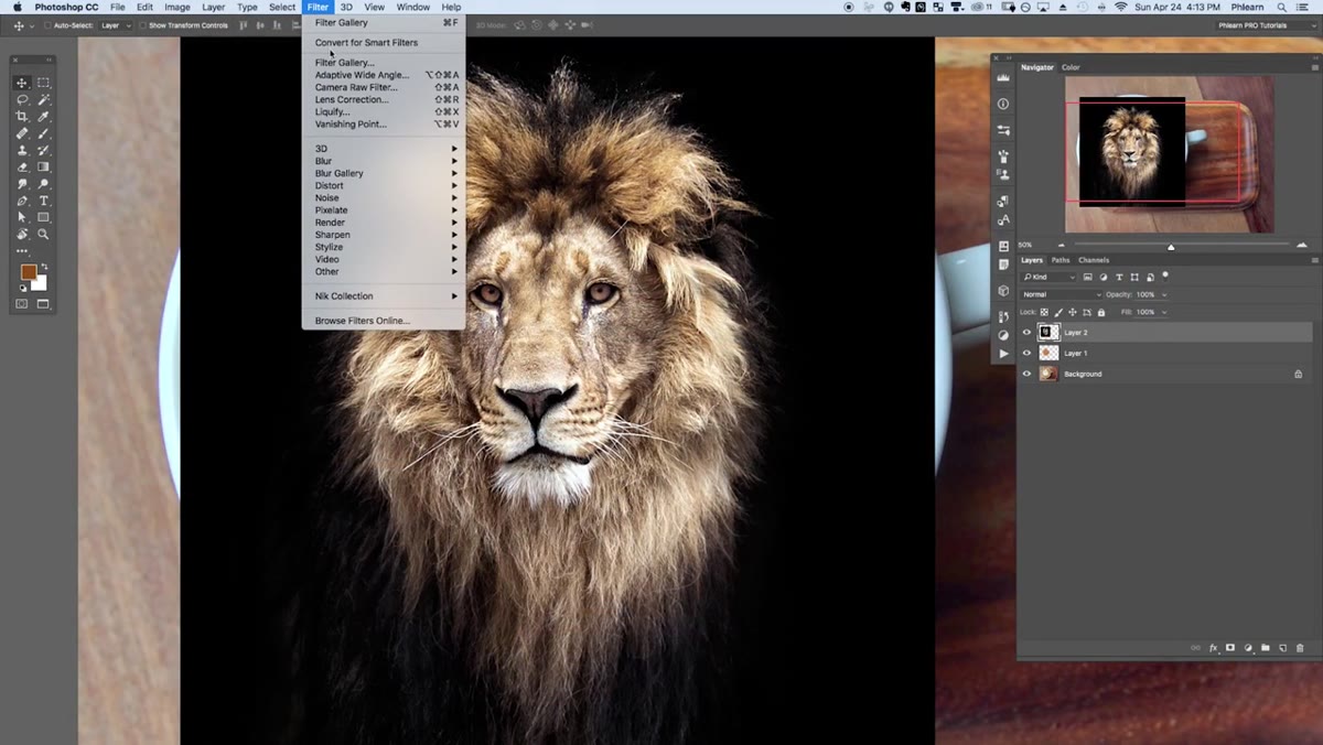 Simplified cutout version of source image showing graphic, two-tone result
Whatever image you want to turn into latte art, it needs to be simplified down to something that reads clearly at small scale in a single color. Aaron’s approach is to reduce the image to a cutout-style graphic with minimal tonal complexity, basically a two-value image that looks like it could have been hand-drawn with a toothpick through milk foam.
Simplified cutout version of source image showing graphic, two-tone result
Whatever image you want to turn into latte art, it needs to be simplified down to something that reads clearly at small scale in a single color. Aaron’s approach is to reduce the image to a cutout-style graphic with minimal tonal complexity, basically a two-value image that looks like it could have been hand-drawn with a toothpick through milk foam.
Use adjustment layers like Threshold or Posterize to strip the image back to its essential shapes. You want clear edges and good contrast between the subject and background. Fine details and gradients won’t survive the translation into foam, so ruthlessly simplify until the core shape reads immediately. Think of it like designing a stamp rather than a painting. If you can’t tell what it is at a glance, simplify further.
Step 5: Apply the Design as a Layer Set to Multiply
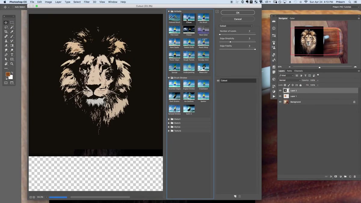 Simplified image placed over latte photo, blend mode panel visible
Place your simplified image over the latte photo and set the blend mode to Multiply. This drops out the white areas and lets only the dark marks interact with the foam layer beneath. Scale and position it to sit inside the cup, and adjust the opacity so it reads as part of the foam rather than sitting on top of it like a sticker. A little transparency goes a long way toward making this feel embedded in the texture.
Simplified image placed over latte photo, blend mode panel visible
Place your simplified image over the latte photo and set the blend mode to Multiply. This drops out the white areas and lets only the dark marks interact with the foam layer beneath. Scale and position it to sit inside the cup, and adjust the opacity so it reads as part of the foam rather than sitting on top of it like a sticker. A little transparency goes a long way toward making this feel embedded in the texture.
If the design looks too sharp or digitally clean, add a small amount of Gaussian blur to soften the edges slightly. Real latte art has a little bleed where the dark espresso meets the milk foam. That softness is what separates a convincing result from something that screams “Photoshop composite.”
Step 6: Use the Smudge Tool to Simulate Drawn Lines
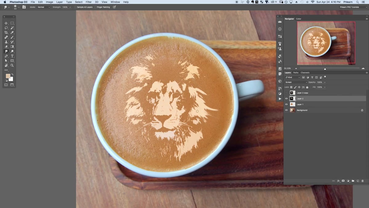 Smudge tool being dragged through the latte design layer
This is the step that makes the whole thing click. Switch to the Smudge Tool and drag it through the edges of your design in short, deliberate strokes. Real latte art is made by pulling a thin tool, a toothpick or the tip of a thermometer, through foam in specific directions. The smudge tool replicates that physical drag convincingly when used with restraint.
Smudge tool being dragged through the latte design layer
This is the step that makes the whole thing click. Switch to the Smudge Tool and drag it through the edges of your design in short, deliberate strokes. Real latte art is made by pulling a thin tool, a toothpick or the tip of a thermometer, through foam in specific directions. The smudge tool replicates that physical drag convincingly when used with restraint.
Keep your smudge strength moderate, somewhere in the 40 to 60% range, so the marks look like they required effort rather than a single aggressive swipe. Follow the natural geometry of your design. If you’re doing a heart or a rosette, smudge outward from the center. The direction of the strokes should feel intentional, like someone actually stood over this cup and worked it.
One Thing I’d Add: Use This on Branded Mockups
I’ve started keeping a folder of “clean foam” latte photos, shots where I’ve already painted out any existing art using this brush technique, specifically so I can drop client logos or custom designs in quickly. The cutout-to-multiply workflow handles logo work surprisingly well, especially for anything with bold shapes and clean edges. Monograms, simple icons, typographic marks. If a client asks for a lifestyle mockup with their branding on a coffee cup, this approach gets you there faster than any mockup template I’ve found.
The one caveat: highly detailed logos with thin strokes or small text will fight you. Simplify or die.
The single most important thing this tutorial taught me is that foam texture is the key to believability, not the design itself. Get the surface right first, and almost anything you layer on top will read as real. Everything else is execution.
Watch the full tutorial on YouTube to see Aaron walk through each stage with his source files. Worth the 20 minutes.
Comments
Leave a Comment