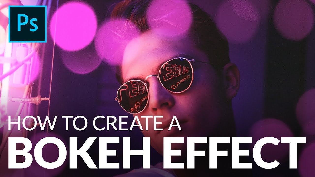
There’s a specific kind of client feedback that haunts me. The photo is sharp, the subject is well-lit, the composition is solid, and then: “Can you make it look more… dreamy?” Dreamy. Great. Super specific. What they almost always mean, even if they don’t know the word, is bokeh. Those soft, glowing orbs of out-of-focus light that make a photo feel expensive and editorial. The problem is you can’t go back and reshoot with a wider aperture, and generating fake depth of field that looks convincing is a whole other ordeal. So when a client sends me a flat, everything-in-focus portrait and asks for “dreamy,” I used to panic a little.
This technique from Aaron Nace over at PHLEARN completely changed how I handle those situations. Watch the full tutorial on YouTube - it’s short, it’s clean, and Aaron makes it look almost unfairly easy. Which, it turns out, it kind of is. The whole thing comes down to layering a bokeh texture over your photo, using a blend mode to kill the dark background, and then colorizing it to match your image’s mood. Done. I’ve since used this on portrait edits, event photos, and once on a product shot for a candle brand that needed “atmosphere.” It works everywhere.
What I want to do here is walk you through each step with enough detail that you can actually execute it without pausing the video every 15 seconds. Let’s get into it.
Step 1: Get Your Bokeh Texture
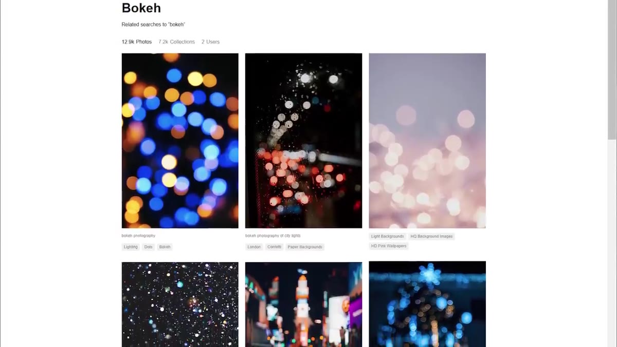 Aaron typing “bokeh” into the Unsplash search bar
You need two images: your base photo and a bokeh texture. If you don’t have a bokeh photo sitting around, Unsplash is your friend - just search “bokeh” and you’ll get dozens of free options. The ideal texture has a black or very dark background with colored or white light circles scattered across it. That dark background is important, and you’ll understand why in Step 3.
Aaron typing “bokeh” into the Unsplash search bar
You need two images: your base photo and a bokeh texture. If you don’t have a bokeh photo sitting around, Unsplash is your friend - just search “bokeh” and you’ll get dozens of free options. The ideal texture has a black or very dark background with colored or white light circles scattered across it. That dark background is important, and you’ll understand why in Step 3.
Bonus option that Aaron mentions: shoot your own. Put your camera in manual focus, point it at any light source (string lights, a window, a streetlamp at night), and crank the focus ring until everything turns into soft blobs. That’s bokeh. Takes about two minutes and the results are often more unique than stock textures.
Step 2: Stack the Bokeh Layer on Your Photo
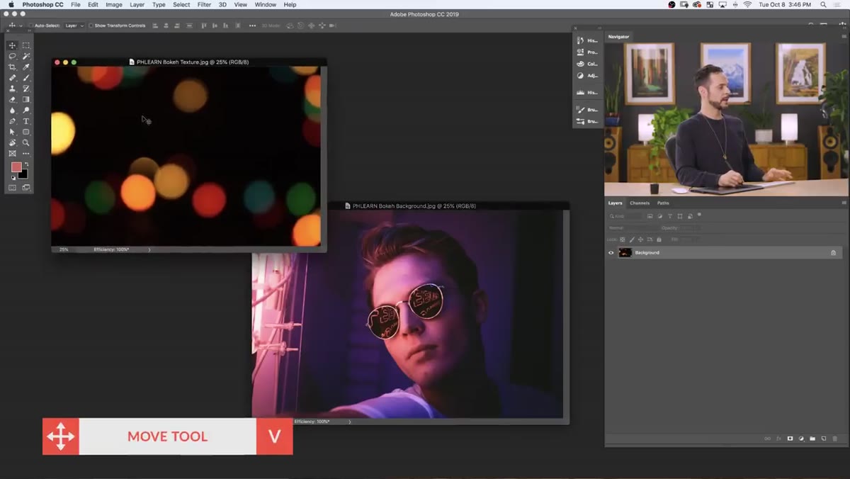 Bokeh image being dragged onto portrait with Move tool
Open both images in Photoshop. Grab the Move tool (V), then click and drag from the bokeh image directly onto your portrait. Photoshop will drop the bokeh as a new layer sitting on top of your subject. Hit F for full-screen view so you can see what you’re actually working with.
Bokeh image being dragged onto portrait with Move tool
Open both images in Photoshop. Grab the Move tool (V), then click and drag from the bokeh image directly onto your portrait. Photoshop will drop the bokeh as a new layer sitting on top of your subject. Hit F for full-screen view so you can see what you’re actually working with.
From here, use Free Transform (Ctrl/Cmd + T) to resize the bokeh layer so it covers your entire canvas. Here’s the thing Aaron points out that removes a lot of anxiety from this step: because this is just a blurry texture, you can stretch it without worrying much about quality loss. Scale it up, pull the corners past the canvas edge if you need to, and don’t stress. Nobody can tell.
Step 3: Apply Screen Blend Mode to Drop the Blacks
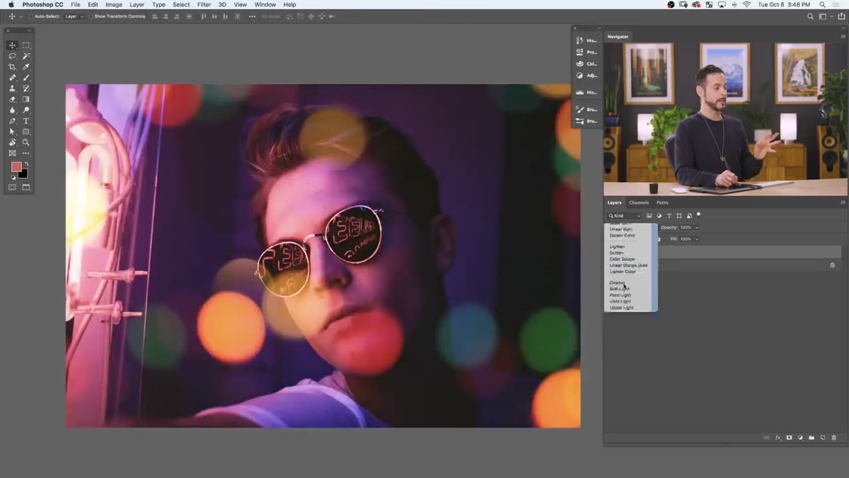 Blend mode dropdown changing from Normal to Screen
This is the step where the magic happens. In the Layers panel, find the blend mode dropdown at the top (it says “Normal” by default). Click it and select “Screen.”
Blend mode dropdown changing from Normal to Screen
This is the step where the magic happens. In the Layers panel, find the blend mode dropdown at the top (it says “Normal” by default). Click it and select “Screen.”
Screen blend mode works by making pure black completely invisible and letting everything lighter than black show through with increasing opacity. That dark background on your bokeh texture? Gone. All that’s left are the glowing light orbs sitting on top of your portrait. If your bokeh texture had a properly dark background, the result at this point looks surprisingly natural already.
Step 4: Colorize the Bokeh to Match Your Image
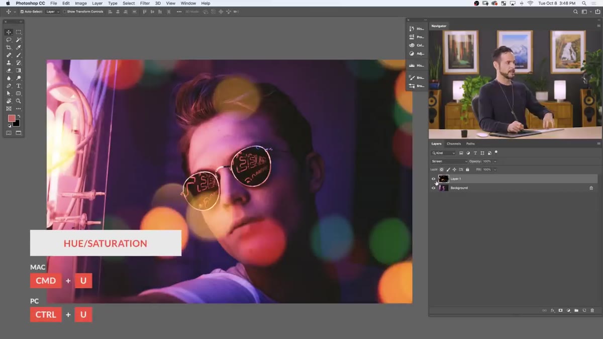 Hue/Saturation dialog open with Colorize checkbox checked
Raw bokeh textures from stock sites are often a grab-bag of random colors, which can look chaotic and cheap. The fix is simple. With your bokeh layer selected, open Hue/Saturation (Ctrl/Cmd + U). Check the “Colorize” checkbox in the bottom right of the dialog.
Hue/Saturation dialog open with Colorize checkbox checked
Raw bokeh textures from stock sites are often a grab-bag of random colors, which can look chaotic and cheap. The fix is simple. With your bokeh layer selected, open Hue/Saturation (Ctrl/Cmd + U). Check the “Colorize” checkbox in the bottom right of the dialog.
Colorize strips all the existing color information from the layer and lets you apply a single unified hue. Drag the Saturation slider up first, maybe to 50-60, so you’re working with a visible color. Then slowly drag the Hue slider until the bokeh matches the dominant color in your photo. Warm golden light in the background? Dial it toward yellow-orange. A cool blue night scene? Shift it left. The difference between randomly colored bokeh and colorized bokeh that matches your image is the difference between looking like an obvious edit and looking like a great photo.
Step 5: Flip and Reposition for Better Placement
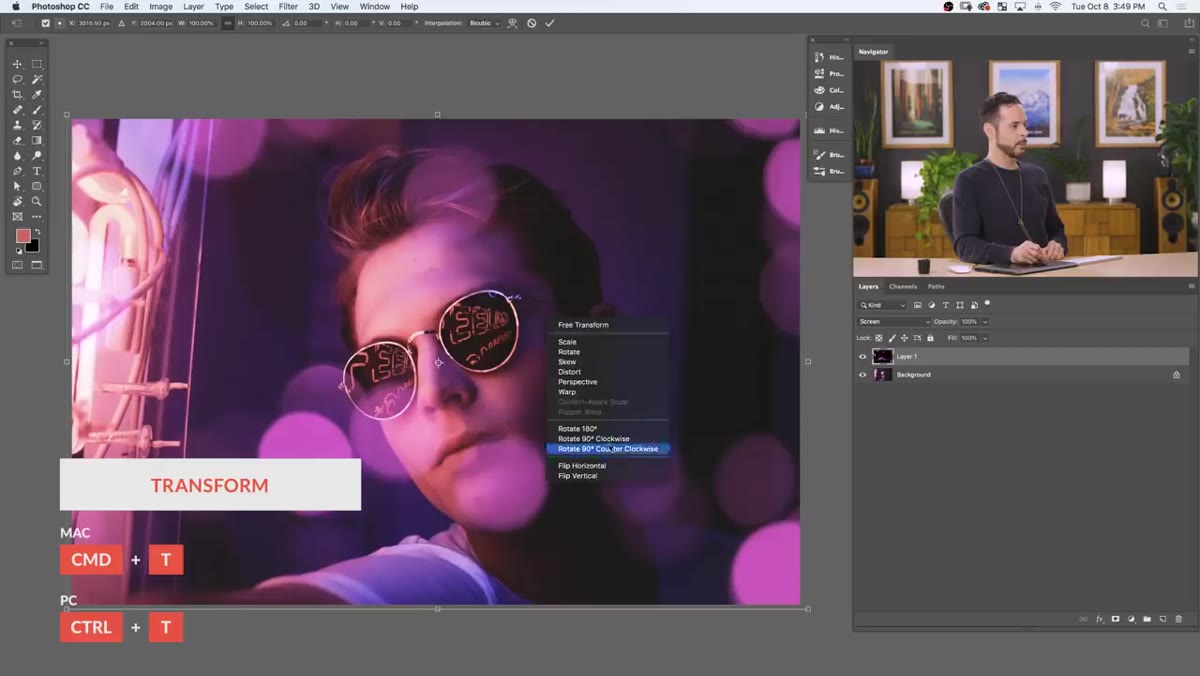 Right-click Free Transform menu showing Flip Horizontal option
With Free Transform still accessible (Ctrl/Cmd + T), right-click inside the bounding box to get a context menu with flip options. Try Flip Horizontal, then Flip Vertical, mixing and matching until the bokeh cluster placement feels natural. You’re basically auditing where the biggest, brightest orbs land on your subject and making sure they’re not doing something annoying like sitting directly over someone’s eyes or nose.
Right-click Free Transform menu showing Flip Horizontal option
With Free Transform still accessible (Ctrl/Cmd + T), right-click inside the bounding box to get a context menu with flip options. Try Flip Horizontal, then Flip Vertical, mixing and matching until the bokeh cluster placement feels natural. You’re basically auditing where the biggest, brightest orbs land on your subject and making sure they’re not doing something annoying like sitting directly over someone’s eyes or nose.
This step takes maybe 30 seconds and it genuinely affects how natural the final result looks. A little repositioning goes a long way.
Step 6: Paint Bokeh Exactly Where You Want It With Clone Stamp
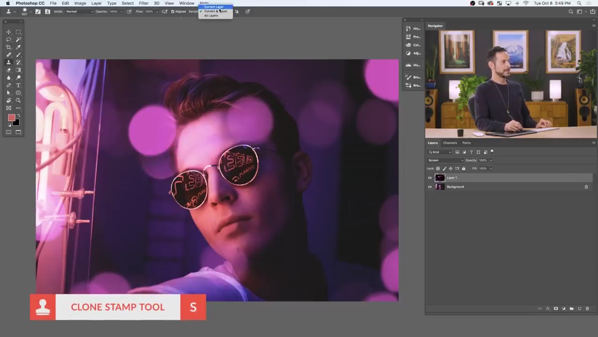 Clone Stamp tool sampling bokeh texture on the layer
This is the step that most tutorials skip, and it’s the one I use most. If you want bokeh in a specific area that the texture doesn’t currently cover, grab the Clone Stamp tool (S). In the options bar at the top, set the Sample dropdown to “Current Layer.” This tells the tool to sample only from your bokeh texture, not from anything below it.
Clone Stamp tool sampling bokeh texture on the layer
This is the step that most tutorials skip, and it’s the one I use most. If you want bokeh in a specific area that the texture doesn’t currently cover, grab the Clone Stamp tool (S). In the options bar at the top, set the Sample dropdown to “Current Layer.” This tells the tool to sample only from your bokeh texture, not from anything below it.
Hold Alt/Option and click on an area of the bokeh texture you like. Then paint over the area where you want those orbs to appear. Want to remove bokeh from a spot? Hold Alt/Option and sample from a dark, empty area of the texture, then paint over what you want to erase. You’re essentially sculpting exactly where the bokeh sits. This level of control is what takes the effect from “good enough” to actually intentional.
One Thing I’d Add From My Own Workflow
After I get the bokeh looking right, I almost always drop the layer opacity slightly, somewhere between 60 and 85 percent depending on the image. Full opacity can make the effect feel heavy-handed, like you’re announcing “I added bokeh to this.” Backing it off just a little integrates the texture more naturally. I also sometimes add a slight Gaussian Blur to the bokeh layer itself (Filter > Blur > Gaussian Blur, around 2-4 pixels) if the orbs feel too crisp relative to the rest of the image. Real bokeh is soft. Blurring the texture slightly sells the illusion better.
The real takeaway here is that blend modes solve problems that seem complicated. Screen mode turning a dark background invisible is the kind of Photoshop behavior that feels like a cheat code the first time you see it - and then you start using it everywhere. Bokeh overlays are just the beginning. If you want to see the whole technique demonstrated in real time with Aaron’s own samples, go watch the full tutorial on YouTube. It’s worth the ten minutes.
Comments (2)
Applied this to my portfolio shots and the improvement is noticeable.
This is exactly what I needed today. Been struggling with this for weeks.
Leave a Comment