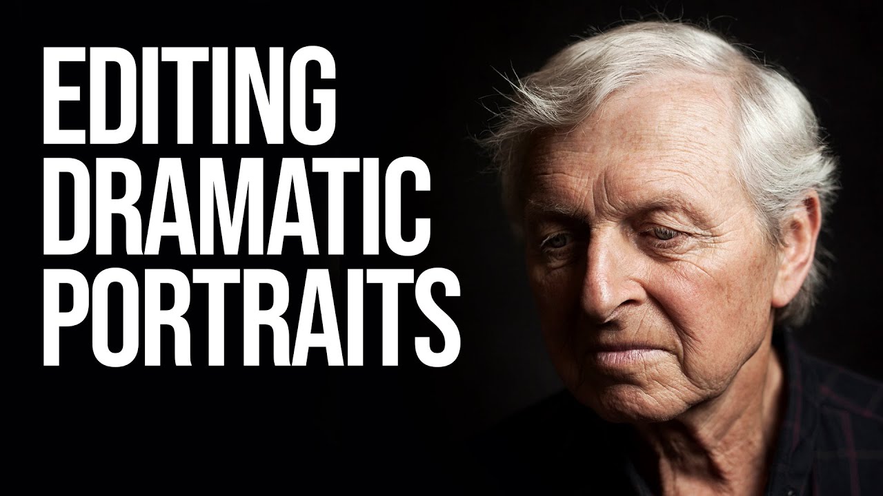
There’s a specific kind of frustration that hits when you look at a portrait you’ve shot and you know the light was right, the subject was great, and somehow the final image still looks flat. Like a photocopy of a feeling rather than the feeling itself. That was me, regularly, until I started paying closer attention to how photographers who think cinematically actually edit. Not just technically, but intentionally.
In this Sean Tucker tutorial on editing dramatic portraits, Tucker walks through his full Photoshop process on a real mentor portrait, moving fast and expecting you to keep up. He’s not wrong to do that. Watching someone work at speed is often more instructive than a slow walkthrough because you see the rhythm of their decisions, not just the steps. Watch the full tutorial on YouTube if you want the uninterrupted version. But if you want each step unpacked with a bit more breathing room, stick with me here.
Tucker’s output has this quality I’d describe as “painted with light” which sounds insufferably artsy, but bear with me. The edits aren’t about fixing problems. They’re about guiding the viewer’s eye toward what matters and letting everything else quietly disappear. That’s the thread running through this entire workflow.
Step 1: Start With a Purposeful Crop
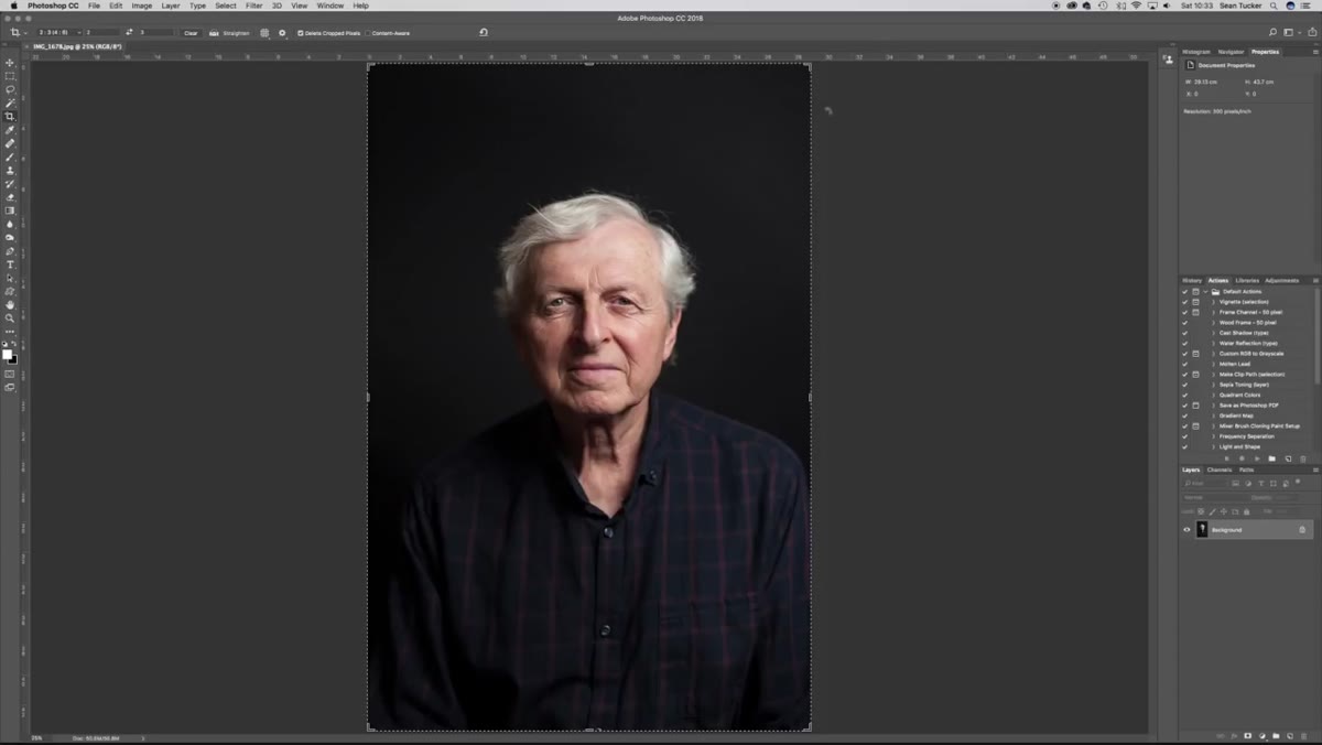 Rule of thirds crop grid over a close-up portrait in Photoshop
Before touching a single slider, Tucker crops. And not casually. He uses a rule-of-thirds grid with a specific formula: the upper horizontal third sits on the eyebrows, the left and right vertical thirds frame the face, and the bottom third pulls up toward the chin for tight portraits. For this particular image he gives a little more room, letting the frame breathe to include some of the neckline.
Rule of thirds crop grid over a close-up portrait in Photoshop
Before touching a single slider, Tucker crops. And not casually. He uses a rule-of-thirds grid with a specific formula: the upper horizontal third sits on the eyebrows, the left and right vertical thirds frame the face, and the bottom third pulls up toward the chin for tight portraits. For this particular image he gives a little more room, letting the frame breathe to include some of the neckline.
The nudge here is to use your arrow keys once you’ve set the crop box, rather than dragging it around. You get much finer control and you can micro-adjust while keeping the composition balanced. Check that the eye-to-edge distances feel equal on both sides before committing.
Step 2: Do Your Healing on a Separate Layer
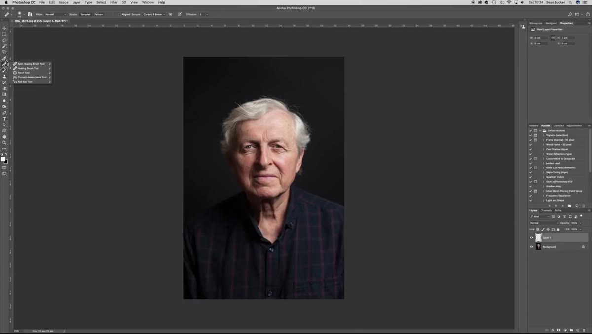 Blank layer added above base image in Layers panel
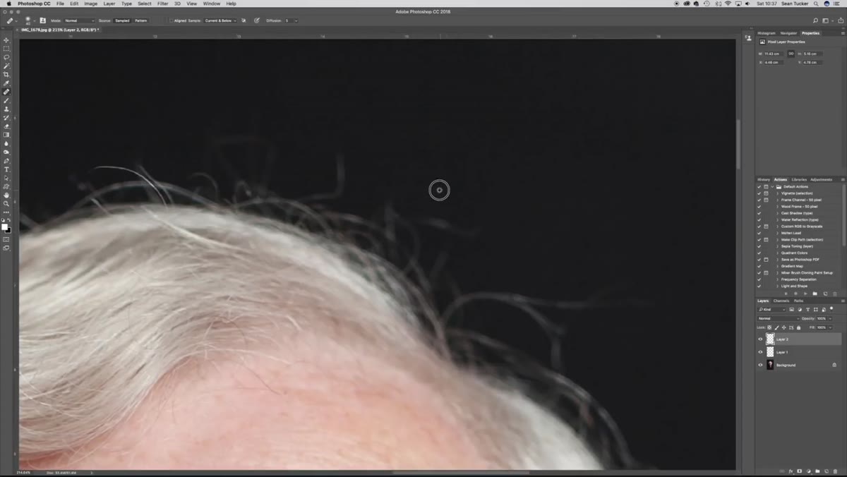
Tucker creates a blank layer above the image and runs his Healing Brush on that, rather than directly on the photo. The key setting to check is the “Sample” dropdown in the tool options bar. Switch it from “Current Layer” to “Current and Below” or the brush will paint from nothing and do absolutely nothing useful. Trust me on this one.
Blank layer added above base image in Layers panel
Tucker creates a blank layer above the image and runs his Healing Brush on that, rather than directly on the photo. The key setting to check is the “Sample” dropdown in the tool options bar. Switch it from “Current Layer” to “Current and Below” or the brush will paint from nothing and do absolutely nothing useful. Trust me on this one.
He keeps the brush hardness at 0% so the edges feather softly into the surrounding skin or background. The goal here isn’t a full beauty retouch. It’s distraction removal. Stray hairs crossing the face, eyebrow hairs that are fighting each other, anything that pulls your eye away from where it should land. The Healing Brush, unlike the Clone Stamp, blends the texture and tone from the sampled area rather than copying it pixel-for-pixel, which makes it far more forgiving on skin and fabric.
Step 3: Use the Clone Stamp for Structured Edges
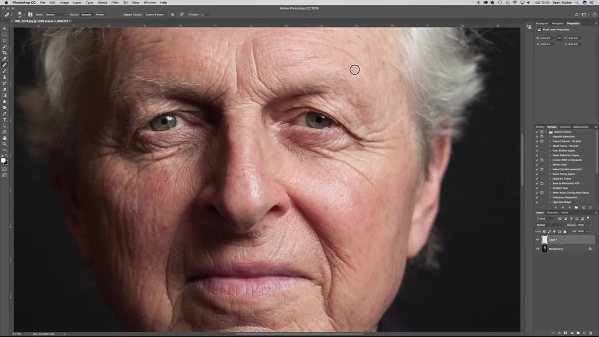 Clone Stamp tool active near a high-contrast edge on the portrait
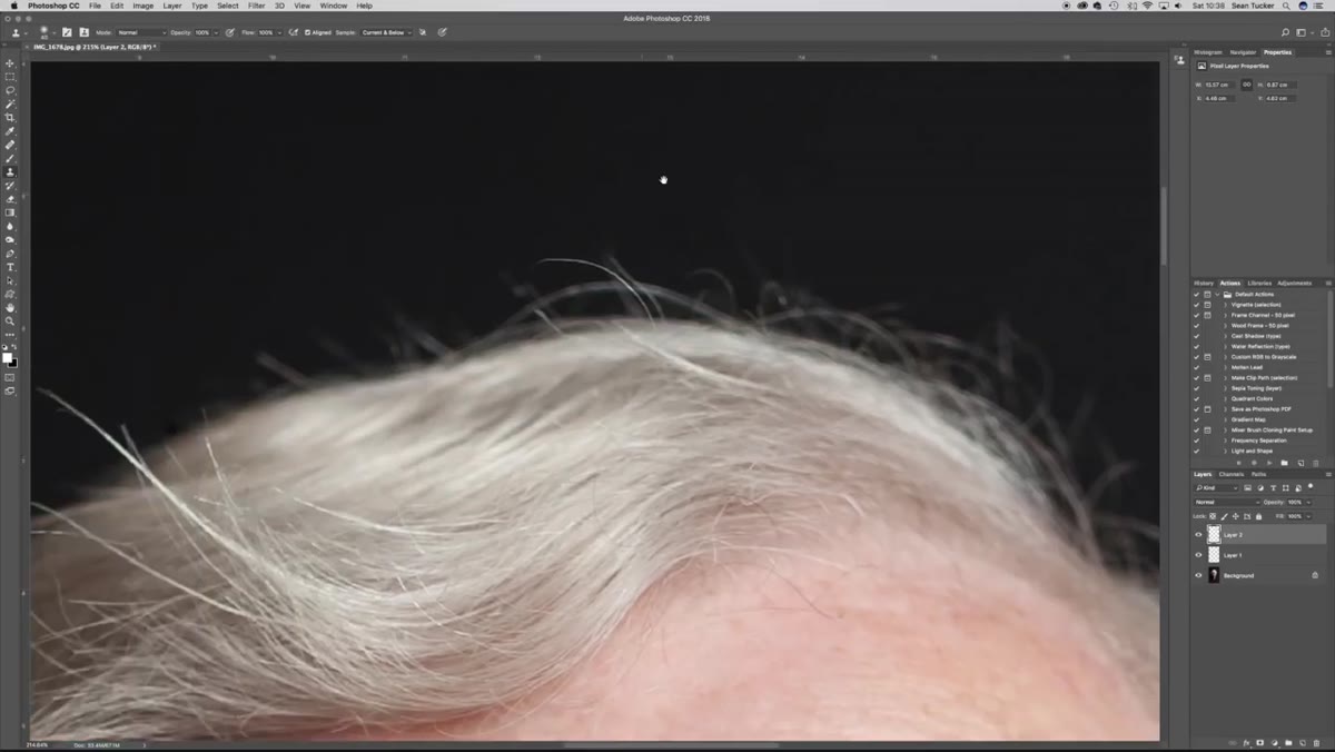
Where the Healing Brush starts to struggle is near hard edges, like where skin meets a dark background. The brush tries to blend everything in its radius and if there’s a strong contrast edge nearby, it pulls that in and creates a smudgy mess. Tucker switches to the Clone Stamp for these areas.
Clone Stamp tool active near a high-contrast edge on the portrait
Where the Healing Brush starts to struggle is near hard edges, like where skin meets a dark background. The brush tries to blend everything in its radius and if there’s a strong contrast edge nearby, it pulls that in and creates a smudgy mess. Tucker switches to the Clone Stamp for these areas.
The Clone Stamp copies exactly what it samples, no blending algorithm involved. It’s less forgiving if your technique is sloppy, but it gives you precise control near edges. Alt-click to set your sample point close to the area you’re fixing, keep your brush small, and work in short strokes rather than long drags.
Step 4: Flatten and Convert to Smart Object Before Tonal Work
 Layers panel showing flattened image converted to Smart Object
Once the cleanup work is done, Tucker flattens his healing and clone layers down and converts the result to a Smart Object before moving into any tonal adjustments. This is the move I wish someone had forced me to learn before I deleted a client’s entire layered file trying to merge things manually and couldn’t undo it. Smart Objects let you apply filters non-destructively. You can double-click back into any filter you’ve applied and change the settings at any point.
Layers panel showing flattened image converted to Smart Object
Once the cleanup work is done, Tucker flattens his healing and clone layers down and converts the result to a Smart Object before moving into any tonal adjustments. This is the move I wish someone had forced me to learn before I deleted a client’s entire layered file trying to merge things manually and couldn’t undo it. Smart Objects let you apply filters non-destructively. You can double-click back into any filter you’ve applied and change the settings at any point.
The conversion is straightforward: right-click the layer in the Layers panel and select “Convert to Smart Object.” It adds a small icon to the layer thumbnail to confirm it worked. From here, any filter you apply sits below the layer as an editable entry rather than baking into the pixels permanently.
Step 5: Apply Camera Raw Filter for Global Tonal Control
 Camera Raw Filter dialog open with tonal sliders visible
With the Smart Object ready, Tucker goes to Filter > Camera Raw Filter to handle global exposure, contrast, and color grading. Working inside Camera Raw from Photoshop gives you the same tools you’d use in Lightroom, including the tone curve, HSL sliders, and the split toning panel, but you’re doing it non-destructively on a layer rather than on the original file.
Camera Raw Filter dialog open with tonal sliders visible
With the Smart Object ready, Tucker goes to Filter > Camera Raw Filter to handle global exposure, contrast, and color grading. Working inside Camera Raw from Photoshop gives you the same tools you’d use in Lightroom, including the tone curve, HSL sliders, and the split toning panel, but you’re doing it non-destructively on a layer rather than on the original file.
For a dramatic portrait look, pay attention to the Blacks and Shadows sliders. Pulling the Blacks down adds depth and separation without destroying midtone detail. Tucker also uses the tone curve to add a slight “S” shape, which increases contrast in the midtones while keeping highlights from blowing out. The effect is that the image starts to feel more three-dimensional.
Step 6: Dodge and Burn to Shape the Light
 Dodge and Burn being applied on a gray overlay layer
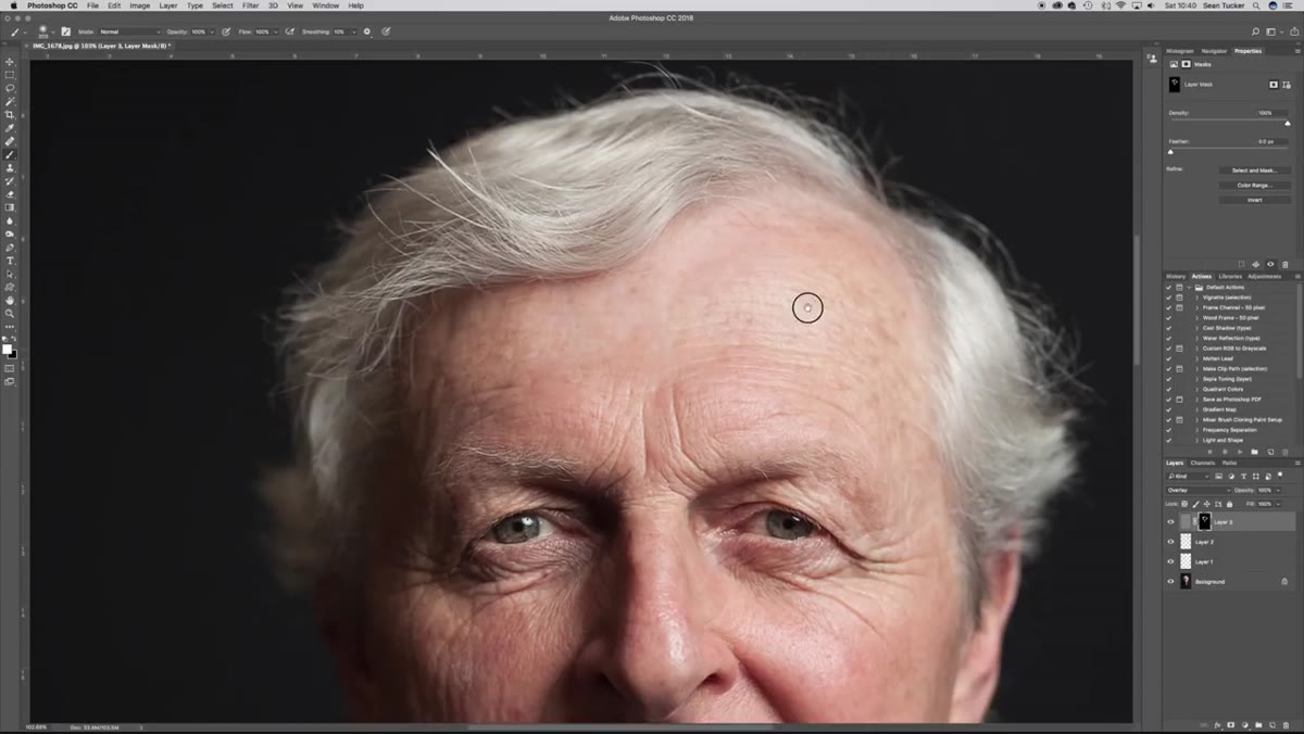
This is where the “painted with light” thing actually happens. Tucker uses a dodge and burn technique on a separate layer filled with 50% gray, set to Overlay blending mode. Overlay ignores pure 50% gray and only renders tones lighter or darker than that neutral point, which means you’re adding light and shadow information without touching the original pixels.
Dodge and Burn being applied on a gray overlay layer
This is where the “painted with light” thing actually happens. Tucker uses a dodge and burn technique on a separate layer filled with 50% gray, set to Overlay blending mode. Overlay ignores pure 50% gray and only renders tones lighter or darker than that neutral point, which means you’re adding light and shadow information without touching the original pixels.
He uses a large, soft brush at very low opacity, somewhere around 10 to 15 percent, and builds up the effect gradually. Dodging (brightening) goes on the forehead, cheekbones, nose bridge, and chin. Burning (darkening) goes on the edges of the face, the neck, and anywhere you want the viewer’s eye to move away from. The result is subtle but the cumulative effect is significant. It’s the difference between a photo and a portrait.
One Caveat From My Own Workflow
Tucker works from JPEGs most of the time and makes no apologies for it. He acknowledges there are situations where he needs to go back for a TIFF when banding shows up in gradients or backgrounds, but for 95% of use cases the JPEG holds up fine. I’ve adopted the same pragmatism. What I’d add is this: if you’re unsure whether a JPEG will hold up through heavy tonal adjustments, do your Camera Raw work first before committing to any destructive edits. The more you push exposure and contrast, the more likely you are to surface compression artifacts, especially in smooth skies or dark backgrounds.
The single biggest thing I took from Tucker’s workflow is that every decision points toward the same goal: where do you want the viewer to look? The crop, the cleanup, the tonal grading, the dodge and burn. None of it is random technique for technique’s sake. It’s all in service of one clear intention.
If you work in portraiture at any level, this tutorial is worth your full attention. Watch the full tutorial on YouTube and come back here when you want to slow any of the steps down.
Comments (3)
Bookmarked. Coming back to this one for sure.
I've watched a dozen tutorials on this and yours is the clearest by far.
Really solid breakdown. This pairs perfectly with the photography work I've been writing about.
Leave a Comment