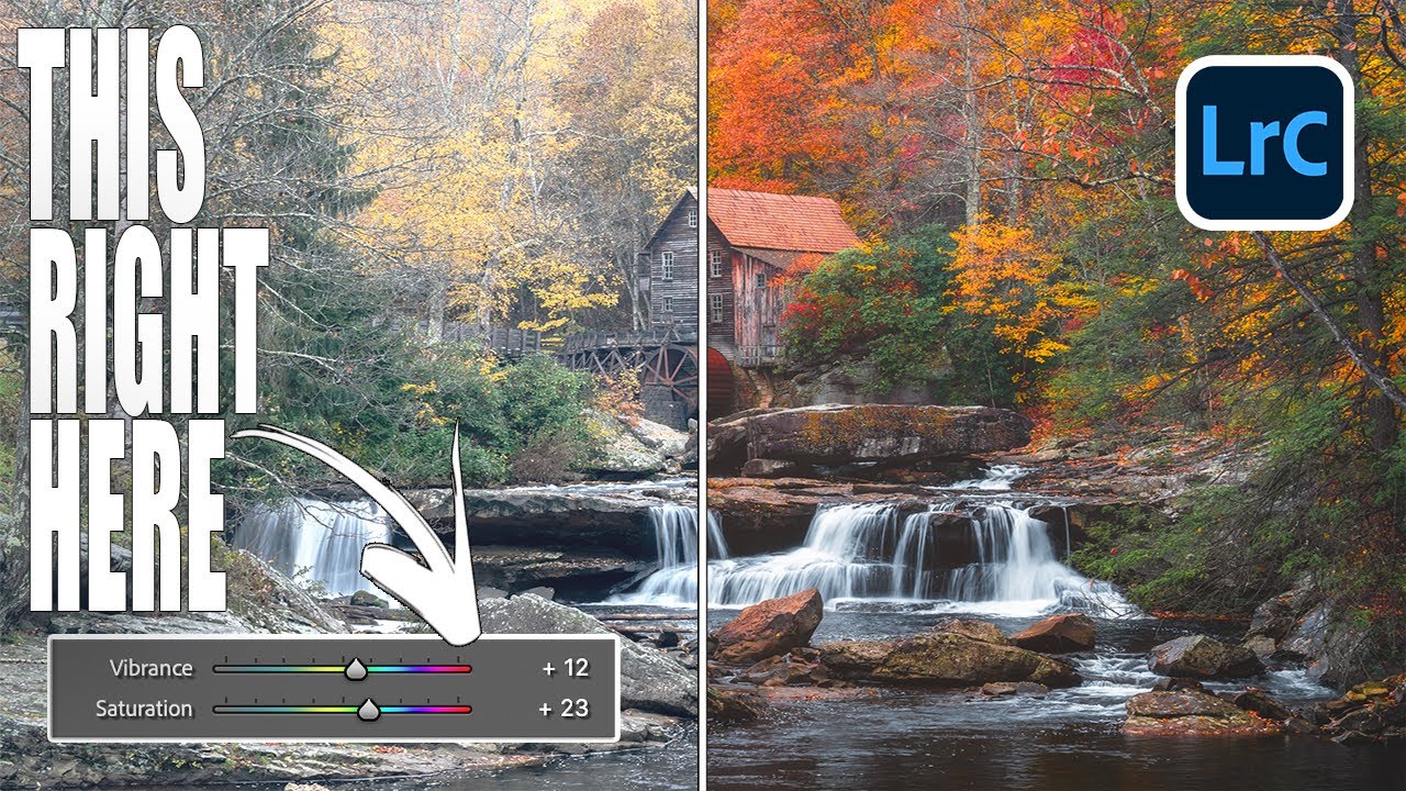
I’ll be honest - for the longest time, my color editing workflow was embarrassingly simple. Photo comes in flat? Drag Saturation up. Still looks dull? Nudge Vibrance. Call it done, collect the paycheck. It worked well enough that I never questioned it, which is exactly the kind of comfortable laziness that keeps you from getting better. Then I watched Mark Denney’s tutorial where he edits the same fall landscape photo twice - once using every color tool in Lightroom except Saturation and Vibrance, and once using only those two sliders - and the results genuinely stopped me mid-sip of my oat milk latte.
Watch the full tutorial on YouTube
The comparison is kind of humbling. The Saturation-and-Vibrance-only edit looks like someone turned up the color on a TV that was already calibrated fine. The version built from profiles, white balance, HSL, and color grading looks like a photograph. The difference isn’t subtle. What follows is a breakdown of the workflow Mark walks through, pulled apart into steps you can actually follow on your own raw files.
Step 1: Swap Your Camera Profile First
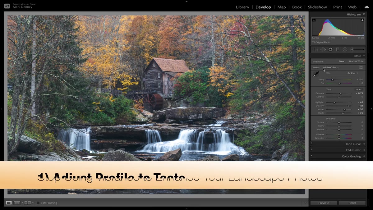 Switching profile from Adobe Color to Adobe Landscape in Lightroom
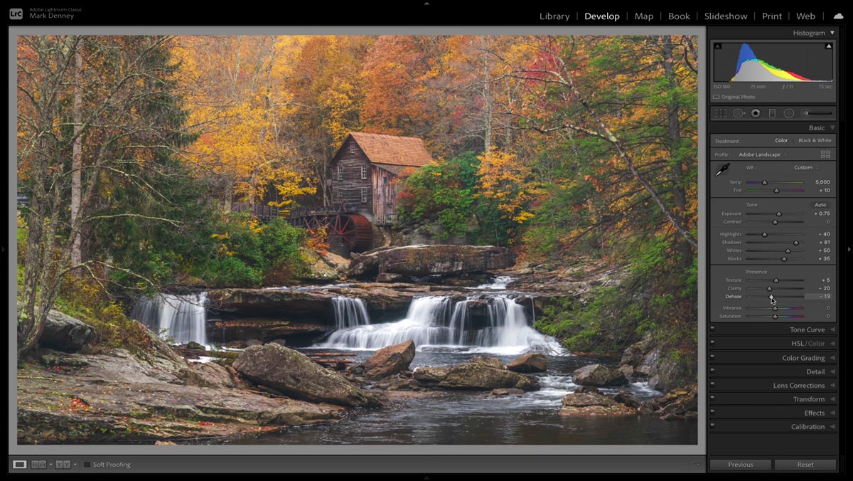
Before you touch a single slider, go up to the Profile section at the top of the Basic panel and change it from Adobe Color to Adobe Landscape. This is one of those moves that feels almost too small to matter until you toggle it back and forth a few times. Adobe Landscape gives you richer, slightly more saturated colors baked into the starting point of your edit, which means every adjustment you make on top of it is working with better raw material. Think of it less like adding color and more like choosing a better canvas before you paint.
Switching profile from Adobe Color to Adobe Landscape in Lightroom
Before you touch a single slider, go up to the Profile section at the top of the Basic panel and change it from Adobe Color to Adobe Landscape. This is one of those moves that feels almost too small to matter until you toggle it back and forth a few times. Adobe Landscape gives you richer, slightly more saturated colors baked into the starting point of your edit, which means every adjustment you make on top of it is working with better raw material. Think of it less like adding color and more like choosing a better canvas before you paint.
It won’t transform a flat photo into a finished edit on its own, but it sets the tone for everything downstream. For fall foliage especially, those warmer, deeper tones in the landscape profile are doing quiet but meaningful work.
Step 2: Dial In White Balance for Warmth
 White balance preset dropdown open showing Cloudy and Daylight options
White balance is where a lot of landscape edits either commit to a mood or stay wishy-washy. Mark’s approach is to use the preset options - Cloudy, Daylight, As Shot - as starting references rather than final answers. Cloudy reads as the warmest preset, which can easily tip into orange soup territory for some shots. Daylight is slightly cooler but still warm enough to flatter golden-hour or fall foliage tones.
White balance preset dropdown open showing Cloudy and Daylight options
White balance is where a lot of landscape edits either commit to a mood or stay wishy-washy. Mark’s approach is to use the preset options - Cloudy, Daylight, As Shot - as starting references rather than final answers. Cloudy reads as the warmest preset, which can easily tip into orange soup territory for some shots. Daylight is slightly cooler but still warm enough to flatter golden-hour or fall foliage tones.
Rather than landing on a preset and moving on, the move here is to treat the presets as ballpark suggestions and then dial the temperature manually to taste. In the tutorial, Mark settles around 5000K - warm enough to feel like autumn light, cool enough that the image doesn’t look like it was shot through a jar of honey. Round numbers only, apparently. I respect the commitment to a preference.
Step 3: Skip Saturation and Vibrance Entirely
 Basic panel with Vibrance and Saturation sliders untouched at zero
This is the one that requires some willpower. The Saturation and Vibrance sliders are right there, they’re familiar, and your muscle memory wants to grab them. The whole point of this exercise is to prove you can build richer, more nuanced color without them - and that by reaching for them first, you’re actually short-circuiting tools that give you far more control.
Basic panel with Vibrance and Saturation sliders untouched at zero
This is the one that requires some willpower. The Saturation and Vibrance sliders are right there, they’re familiar, and your muscle memory wants to grab them. The whole point of this exercise is to prove you can build richer, more nuanced color without them - and that by reaching for them first, you’re actually short-circuiting tools that give you far more control.
Saturation globally cranks every color in the image by the same amount, which sounds useful until your greens go radioactive and your skin tones turn into a Halloween mask. Vibrance is smarter - it boosts less-saturated colors more than already-saturated ones - but it still operates as a blunt instrument compared to what HSL and color grading can do. Leaving both at zero here isn’t a gimmick. It’s a forcing function that makes you actually learn the more surgical tools.
Step 4: Use the HSL Panel to Target Individual Colors
 HSL panel open with individual color hue and saturation sliders visible
The HSL (Hue, Saturation, Luminance) panel is where the real color work happens. Instead of pushing all colors up together, you can target specific ones independently. For a fall scene, that means you can deepen the reds and oranges in the foliage, shift the yellows toward gold rather than lime, and pull back the saturation on any colors that are competing with the main palette.
HSL panel open with individual color hue and saturation sliders visible
The HSL (Hue, Saturation, Luminance) panel is where the real color work happens. Instead of pushing all colors up together, you can target specific ones independently. For a fall scene, that means you can deepen the reds and oranges in the foliage, shift the yellows toward gold rather than lime, and pull back the saturation on any colors that are competing with the main palette.
The Hue sliders let you actually move a color along the spectrum - so if your oranges are reading slightly too red, you can nudge them toward a truer orange without affecting anything else. Luminance controls how bright or dark each color range appears, which is an underrated way to add depth without touching exposure. Spending five minutes in HSL on a fall photo will do more for the richness of the image than dragging Saturation to 40 ever could.
Step 5: Finish with Color Grading
 Color Grading panel showing shadow, midtone, and highlight wheels
Color grading - the panel that replaced Split Toning in newer versions of Lightroom - lets you push different color casts into your shadows, midtones, and highlights independently. For landscape work, a subtle warm push in the midtones and highlights reinforces that golden autumn feeling, while a very slight cool or neutral tone in the shadows keeps the image from going entirely monochromatic-warm and losing contrast.
Color Grading panel showing shadow, midtone, and highlight wheels
Color grading - the panel that replaced Split Toning in newer versions of Lightroom - lets you push different color casts into your shadows, midtones, and highlights independently. For landscape work, a subtle warm push in the midtones and highlights reinforces that golden autumn feeling, while a very slight cool or neutral tone in the shadows keeps the image from going entirely monochromatic-warm and losing contrast.
The key word is subtle. Color grading is the kind of tool that looks incredible at 10% and looks like a Wes Anderson parody at 40%. Start with smaller adjustments than you think you need, check your work by toggling the panel on and off, and resist the urge to make the wheels look dramatic in the interface. The image is the output, not the panel.
What I’d Add: This Works in Photoshop Too
Lightroom is the focus of Mark’s tutorial, but if your workflow runs through Photoshop, most of this translates directly. Camera Raw (which uses the same engine as Lightroom) has identical Profile options, HSL controls, and Color Grading panels. You can apply the same workflow there before you ever bring a file into a Photoshop document. And if you’re doing composites or more involved retouching, running a Hue/Saturation adjustment layer with individual color channel targeting gets you to the same HSL logic natively inside Photoshop - just with layer masking control on top of it.
The saturation slider in Photoshop’s Hue/Saturation panel has the same blunt-instrument problem as Lightroom’s version. It’s not broken, it’s just the wrong tool for precision color work. Use it for rough global adjustments and then refine with individual channels.
The single most important thing I took from this tutorial: the Saturation and Vibrance sliders aren’t bad, they’re just low-resolution. When you want a photograph that looks genuinely rich rather than obviously boosted, the path runs through profiles, white balance, HSL, and color grading - in that order, with Saturation as a minor finishing touch if it’s even needed at all. The before and after in Mark’s video makes this impossible to argue with.
Watch the full tutorial on YouTube - the side-by-side comparison alone is worth three minutes of your time.
Comments
Leave a Comment