
Here’s a workflow problem I used to solve the dumbest way possible. Client wants to see their book cover design on three different book mockups. Old me would place the design manually on each mockup, flatten everything, then realize I wanted to tweak the title font, and start the whole process over from scratch. Three times. I did this for longer than I’m willing to admit before someone pointed me toward smart objects and linked files. The combination of those two things is genuinely one of the most time-saving moves in Photoshop, and I wish someone had just sat me down and walked me through a concrete example years earlier.
That concrete example now exists. In this Aaron Nace (PHLEARN) tutorial, he walks through building a book cover design template from scratch, placing it onto multiple book photos, and then showing how updating the original template cascades automatically across every single mockup. If you do any kind of product design, book covers, packaging, or client presentation work, this one is worth your full attention. Watch the full tutorial on YouTube
The setup he uses is clean and transferable to basically any product mockup scenario. Here’s how it works, step by step.
Step 1: Create a New Document Sized to Match Your Book
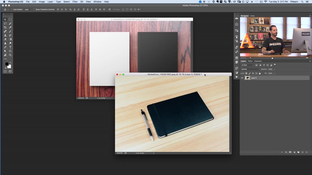 New document dialog open, width 2000 height 3000 pixels
Hit Ctrl/Cmd + N and create a new document at 2000 x 3000 pixels. That ratio loosely matches a standard book cover, which is what you’re designing for. After creating the document, Aaron trims a little off the height with the Crop tool (press C) to better match the proportions of the specific book photos he’s working with. You don’t need to be pixel-perfect here because you’ll be scaling the template into place later, but getting close makes positioning easier.
New document dialog open, width 2000 height 3000 pixels
Hit Ctrl/Cmd + N and create a new document at 2000 x 3000 pixels. That ratio loosely matches a standard book cover, which is what you’re designing for. After creating the document, Aaron trims a little off the height with the Crop tool (press C) to better match the proportions of the specific book photos he’s working with. You don’t need to be pixel-perfect here because you’ll be scaling the template into place later, but getting close makes positioning easier.
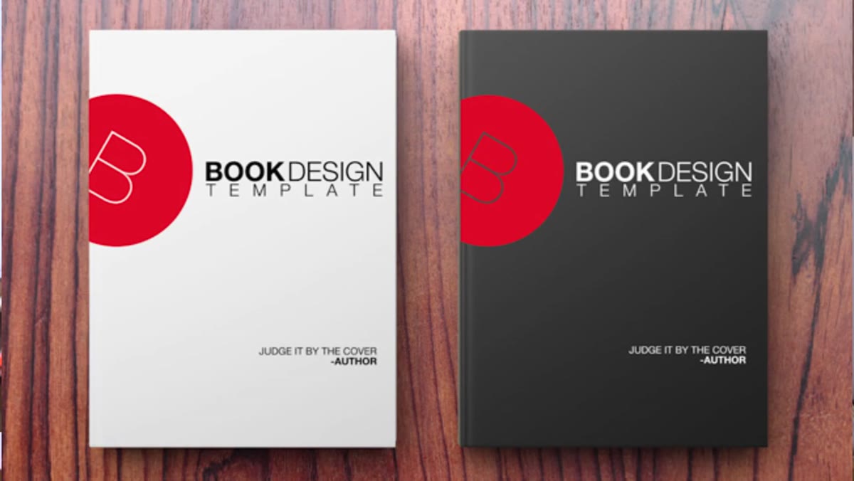
Quick note on the sketch step: Aaron mentions he drew a rough layout by hand before opening Photoshop. Simple circle logo at top, title text in the middle, a short quote near the bottom. This is a habit worth stealing. Five minutes of pencil-and-paper thinking saves you from spinning in Photoshop trying to make design decisions at the same time you’re learning tools.
Step 2: Build the Circle Logo Shape
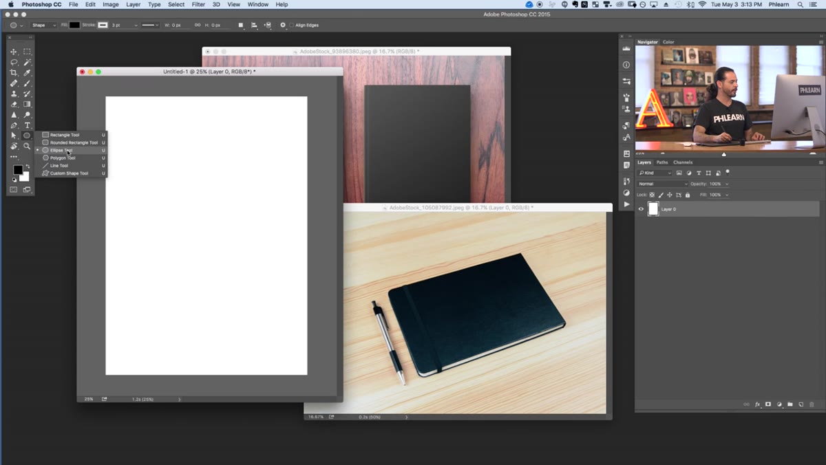 Ellipse tool selected, large black circle on canvas
Grab the Ellipse tool from the shape tools panel (press and hold U to cycle through shape options, or click and hold the shape tool icon in the toolbar). Hold Shift while dragging to constrain it to a perfect circle. Set the fill to black. For the stroke, Aaron clicks the stroke swatch and sets it to “no stroke” so the shape stays clean. The goal is a bold, solid circle that will anchor the logo element in the center of the cover.
Ellipse tool selected, large black circle on canvas
Grab the Ellipse tool from the shape tools panel (press and hold U to cycle through shape options, or click and hold the shape tool icon in the toolbar). Hold Shift while dragging to constrain it to a perfect circle. Set the fill to black. For the stroke, Aaron clicks the stroke swatch and sets it to “no stroke” so the shape stays clean. The goal is a bold, solid circle that will anchor the logo element in the center of the cover.
Step 3: Add and Style a Text Layer Inside the Circle
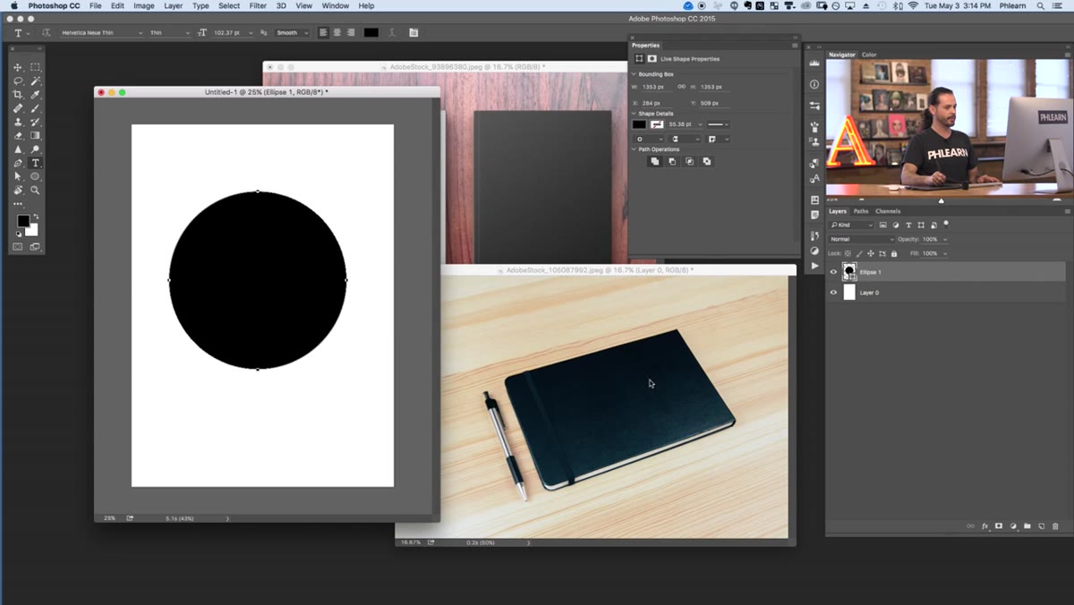 White capital B centered on black circle, Character panel open
Press T for the Type tool, click in the center of the circle, and type your letter or text element. By default the type will probably be black, which is invisible against the black circle, so immediately go up to the color swatch in the options bar and switch it to white. Then open the Character panel (Window > Character) to refine the font. Aaron goes with Helvetica Neue Ultra Light, which gives the letter a delicate, editorial feel against the heavy circle. Bump the size up until the letter fills the circle generously.
White capital B centered on black circle, Character panel open
Press T for the Type tool, click in the center of the circle, and type your letter or text element. By default the type will probably be black, which is invisible against the black circle, so immediately go up to the color swatch in the options bar and switch it to white. Then open the Character panel (Window > Character) to refine the font. Aaron goes with Helvetica Neue Ultra Light, which gives the letter a delicate, editorial feel against the heavy circle. Bump the size up until the letter fills the circle generously.
To center the text precisely on the circle, hold Shift and click both the text layer and the ellipse layer in the Layers panel to select them both. Then use the alignment options in the options bar (with the Move tool active) to center them horizontally and vertically. This is faster and more accurate than eyeballing it.
Step 4: Add Title and Subtitle Text Blocks
 Multiple text layers with title and quote text on cover
With the Type tool, click on the canvas and type your main title. Keep the font consistent with the logo text for a cohesive look. Aaron uses the same thin sans-serif family throughout the design. Add a second text block lower on the canvas for a tagline or quote. Use the Character panel to adjust tracking (letter-spacing) and leading (line-height) so the text breathes properly. A tight, well-spaced block of text at the bottom reads as intentional design. A blob of default-spaced type reads as placeholder content.
Multiple text layers with title and quote text on cover
With the Type tool, click on the canvas and type your main title. Keep the font consistent with the logo text for a cohesive look. Aaron uses the same thin sans-serif family throughout the design. Add a second text block lower on the canvas for a tagline or quote. Use the Character panel to adjust tracking (letter-spacing) and leading (line-height) so the text breathes properly. A tight, well-spaced block of text at the bottom reads as intentional design. A blob of default-spaced type reads as placeholder content.
For the layout, aim to create three clear zones: the circle logo at the top, the title in the middle third, and the smaller text anchoring the bottom. This gives the cover a natural visual hierarchy that holds up at thumbnail size, which is exactly how book buyers see it online.
Step 5: Save the Template and Place It Into a Book Mockup as a Linked Smart Object
 Book mockup photos open in Photoshop workspace
Save your cover template as its own PSD file. Then open one of your book mockup photos. Instead of using File > Place Embedded, go to File > Place Linked. Navigate to your template PSD and place it. This is the key move. A linked smart object references the external file rather than copying it into the document, so any changes you make to the source file will propagate back to every document that links to it.
Book mockup photos open in Photoshop workspace
Save your cover template as its own PSD file. Then open one of your book mockup photos. Instead of using File > Place Embedded, go to File > Place Linked. Navigate to your template PSD and place it. This is the key move. A linked smart object references the external file rather than copying it into the document, so any changes you make to the source file will propagate back to every document that links to it.
Once placed, use Free Transform (Ctrl/Cmd + T) to scale and position the template so it aligns with the book cover in the photo. You can also warp the layer (right-click inside the transform box and choose Warp) to match any perspective or curvature in the cover surface.
Step 6: Repeat the Placement Across All Mockup Photos
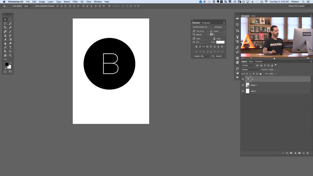
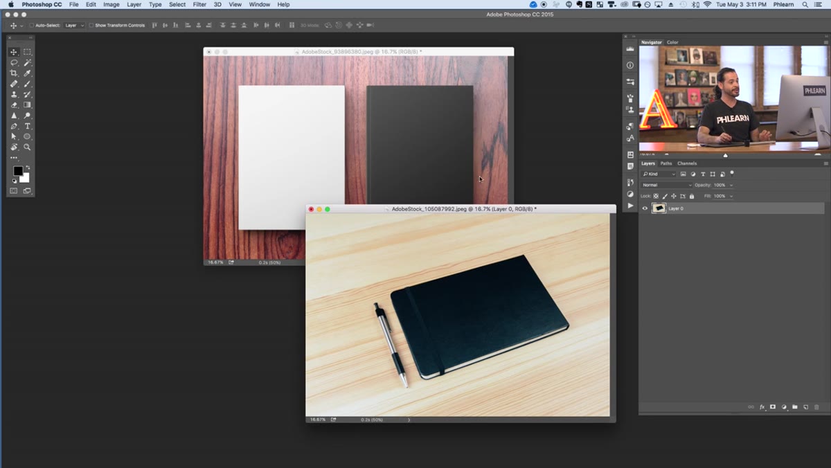 Three book mockup images showing white, dark gray, and black books
Open each remaining book mockup photo and repeat the Place Linked step, pointing to the same source template PSD each time. Scale and warp each instance to fit its specific book. Now you have three documents, all pulling design data from a single source file. Update the source, and every mockup updates automatically when you open those documents. That’s the payoff.
Three book mockup images showing white, dark gray, and black books
Open each remaining book mockup photo and repeat the Place Linked step, pointing to the same source template PSD each time. Scale and warp each instance to fit its specific book. Now you have three documents, all pulling design data from a single source file. Update the source, and every mockup updates automatically when you open those documents. That’s the payoff.
What I’d Add From My Own Work
The technique Aaron demonstrates here is honestly most powerful when you standardize the template dimensions across your mockup library. When I started building product mockups for client presentations, every file had slightly different dimensions and I wasted time rescaling the linked object every single time.
Now I set a fixed canvas size for all templates before starting, 2000 x 3000 for books, 2000 x 2000 for square products, and all my mockup files are prepped to expect that ratio. The linked object drops in, fits cleanly, and I’m done. It sounds like unnecessary upfront work. It saves hours over the course of a real project.
The single most valuable thing in this workflow is the Place Linked step. Placed embedded is what most people default to, and it means every mockup is an island. Placed linked turns your whole mockup set into a live system. Change the design once, everything updates. That’s the move.
Go watch the full thing yourself to see the live update happen in real time: Watch the full tutorial on YouTube
Comments (2)
I've watched a dozen tutorials on this and yours is the clearest by far.
I tried this on a client project yesterday and the results were way better than expected.
Leave a Comment