Video Tutorials
Stop Boring Photos: The Ultimate Guide to Making Colors Pop in Photoshop
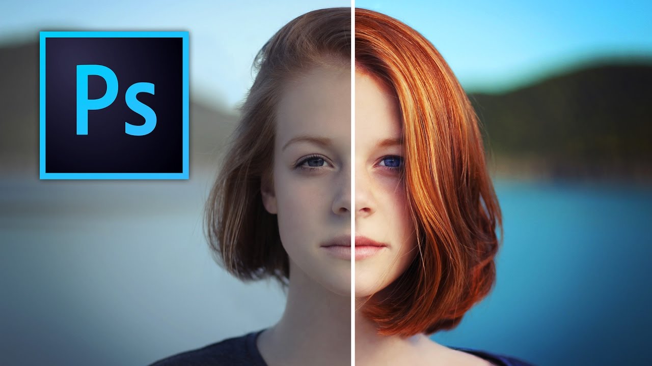
There’s a specific kind of client photo that fills me with quiet dread. You know the one. Shot on a decent camera, decent light, decent composition, but the colors look like they were run through a beige filter. Nothing is technically wrong with it, but nothing pops either. It just sits there, looking fine. Fine doesn’t close clients. Fine doesn’t get shared. Fine is the enemy. I’ve spent more time than I’d like to admit trying to fix these kinds of photos with increasingly complicated methods, stacking adjustment layers like I’m building a sandwich, wondering why the result still looks flat.