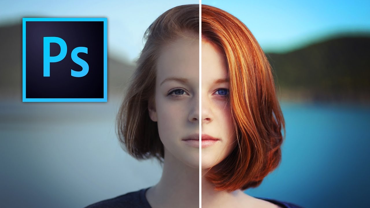
Stop Boring Photos: The Ultimate Guide to Making Colors Pop in Photoshop

Stop Boring Photos: The Ultimate Guide to Making Colors Pop in Photoshop

There’s a specific kind of client photo that fills me with quiet dread. You know the one. Shot on a decent camera, decent light, decent composition, but the colors look like they were run through a beige filter. Nothing is technically wrong with it, but nothing pops either. It just sits there, looking fine. Fine doesn’t close clients. Fine doesn’t get shared. Fine is the enemy. I’ve spent more time than I’d like to admit trying to fix these kinds of photos with increasingly complicated methods, stacking adjustment layers like I’m building a sandwich, wondering why the result still looks flat.
Photoshop Filters: The Good, The Bad, and The Why Did I Do That

Photoshop Filters: The Good, The Bad, and The Why Did I Do That

Photoshop Filters: The Good, The Bad, and The “Why Did I Do That?” Look, I’m going to be honest with you. Filters in Photoshop are like hot sauce—a little bit transforms your dish into something amazing, but one wrong squeeze and you’ve ruined everything. I’ve been using Photoshop for longer than I care to admit, and I’ve learned that filters aren’t about applying the flashiest effect you can find. They’re about knowing which ones actually serve your image and how to use them without making your clients ask why their photo looks like a video game cutscene.