Stop Letting Color Lookup Tables Wreck Your Highlights (Use This Blend Mode Instead)

Stop Letting Color Lookup Tables Wreck Your Highlights (Use This Blend Mode Instead)

There’s a specific kind of frustration that hits when you find a color effect you love, apply it to a photo, and watch the highlights completely blow out. The vibe you wanted is there, buried under a contrast spike that makes your image look like it was shot through a car windshield at noon. I’ve been there more times than I want to admit, usually sitting in a coffee shop trying to color grade a batch of photos while my third Americano goes cold.

Stop Ignoring Blend Modes: The Photoshop Feature That Changed How I Work

Stop Ignoring Blend Modes: The Photoshop Feature That Changed How I Work

The Friend Who Wrecked My Confidence in 20 Minutes A few years back, I spent three days on a composite. Three full days, multiple coffee shop sessions, probably a combined 18 hours of masking and color grading. I was proud of it. Sent it to a designer friend for feedback and he came back with, “cool, took me about 20 minutes to do something similar.” He’d used a workflow built almost entirely around blend modes that I had never seriously explored.

Fake Bokeh That Actually Looks Real: A Photoshop Trick You'll Use On Every Portrait

Fake Bokeh That Actually Looks Real: A Photoshop Trick You'll Use On Every Portrait

There’s a specific kind of client feedback that haunts me. The photo is sharp, the subject is well-lit, the composition is solid, and then: “Can you make it look more… dreamy?” Dreamy. Great. Super specific. What they almost always mean, even if they don’t know the word, is bokeh. Those soft, glowing orbs of out-of-focus light that make a photo feel expensive and editorial. The problem is you can’t go back and reshoot with a wider aperture, and generating fake depth of field that looks convincing is a whole other ordeal.

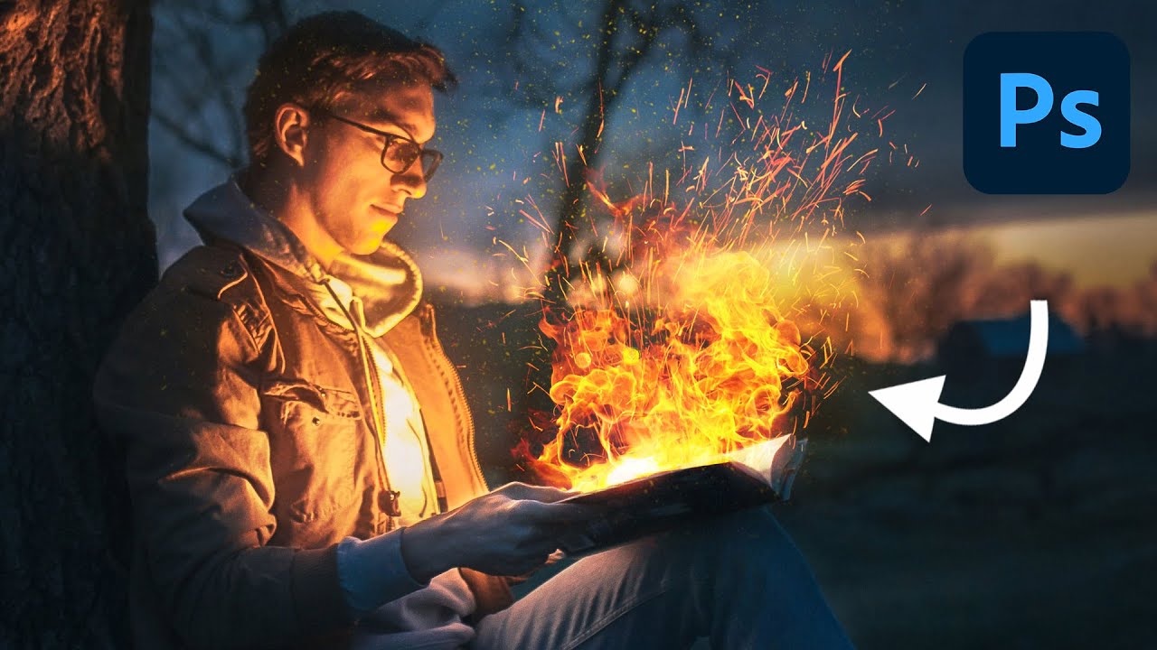
Fake Fire That Actually Looks Real: A Photoshop Compositing Trick Worth Stealing

Fake Fire That Actually Looks Real: A Photoshop Compositing Trick Worth Stealing

I’ve spent embarrassing amounts of time trying to manufacture drama in composite images. Explosions, sparks, light leaks — you name it, I’ve probably botched it. Fire especially has this reputation for being one of those effects that either looks jaw-dropping or immediately screams “I found a free brush pack on DeviantArt.” So when I stumbled on this Aaron Nace (PHLEARN) tutorial on creating realistic fire in Photoshop, I fully expected another overcomplicated mess of filters and adjustment layers.

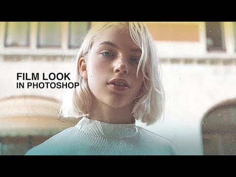
Give Your Photos That Gritty Film Look Using Photoshop Blend Modes and Dust Textures

Give Your Photos That Gritty Film Look Using Photoshop Blend Modes and Dust Textures

I shoot a lot of product and lifestyle work, and somewhere between “clean and sharp” and “actually interesting,” there’s a sweet spot that analog film textures can unlock. Not because it looks like real film – it doesn’t, and anyone who tells you otherwise is lying – but because a little grain, a little dust, a little edge color does something to a photo that no amount of contrast sliders can replicate.

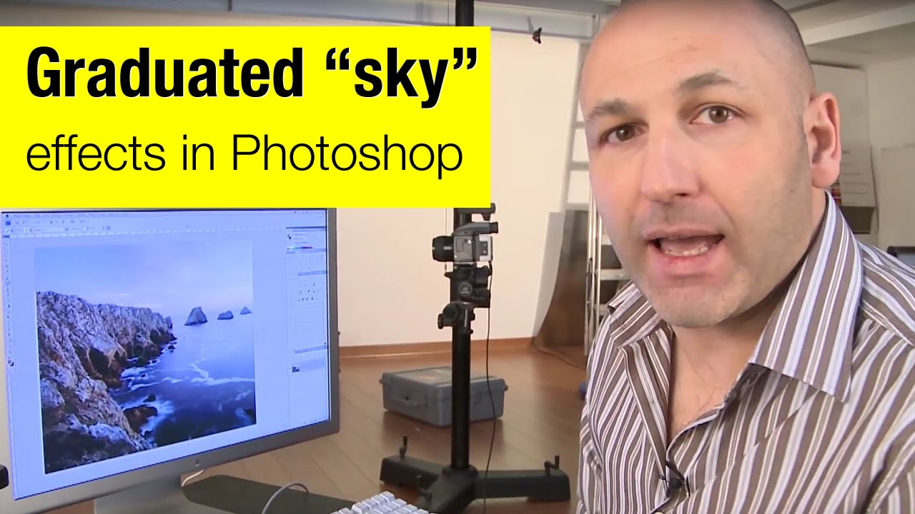
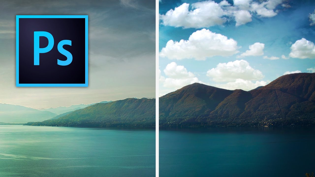
How to Fake a Graduated Sky Filter in Photoshop (Without Touching a Single Slider)

How to Fake a Graduated Sky Filter in Photoshop (Without Touching a Single Slider)

There’s a specific kind of frustration that hits when you’ve got a genuinely great shot — good composition, interesting foreground, strong light — and the sky is just… beige. Flat, washed-out, completely uninspiring. You know the image has something, but the sky is dragging it down. I’ve been there more times than I’d like to admit, and my usual instinct was to reach for Hue/Saturation or start messing with Curves until something looked vaguely better.

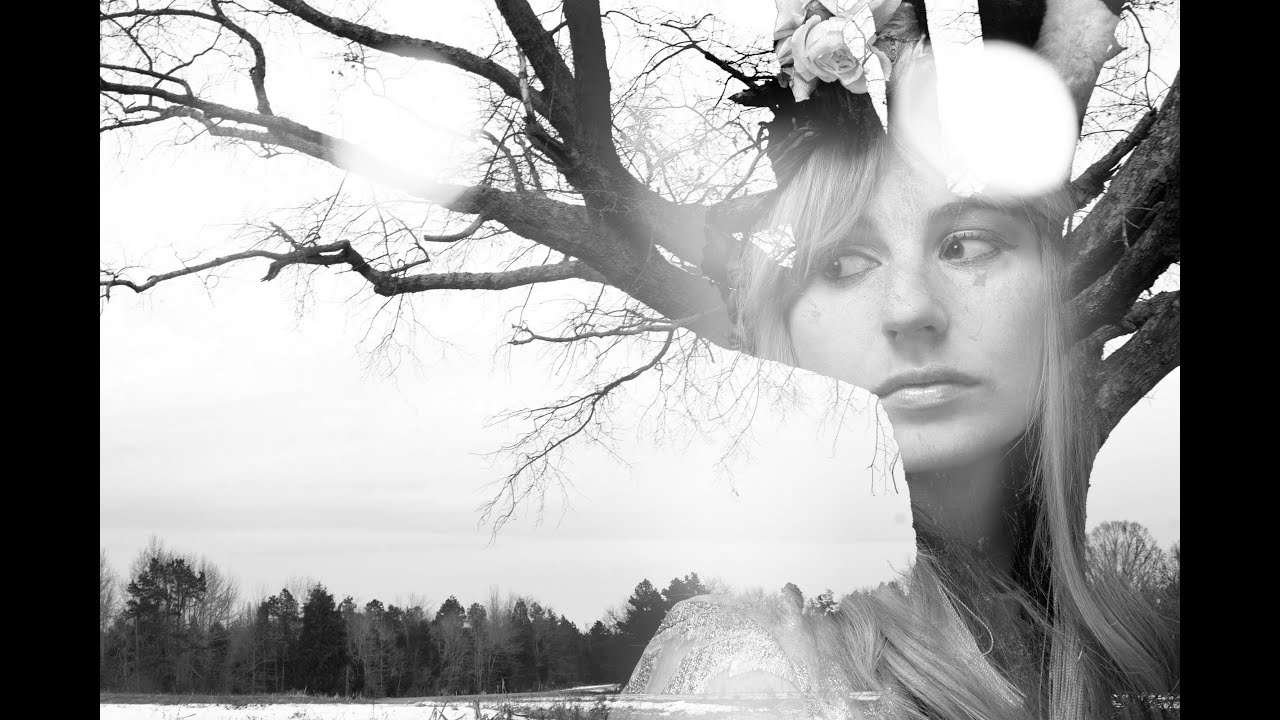
Double Exposure in Photoshop: How to Blend a Portrait and a Landscape Into One Striking Image

Double Exposure in Photoshop: How to Blend a Portrait and a Landscape Into One Striking Image

There’s a specific kind of client brief that used to make me freeze up: “Make it look artistic. You know, like a double exposure thing.” Vague enough to mean anything, specific enough that they definitely had a Pinterest reference they weren’t showing me. I’d cobble something together using Screen mode and hope for the best, and it would look… fine. Not great. The kind of result that gets approved but doesn’t end up in anyone’s portfolio.

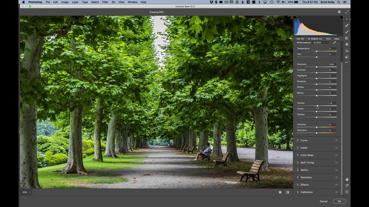
The 5-Minute Dreamy Photo Effect That Actually Works (No Orton Effect Required)

The 5-Minute Dreamy Photo Effect That Actually Works (No Orton Effect Required)

There’s a certain kind of client request that used to make me quietly groan into my coffee. “Can you make it look… softer? Like dreamy? You know, that look?” I did not always know that look. And my first instinct was usually to reach for some overcomplicated multi-layer Orton effect tutorial I’d bookmarked three years ago and never fully understood. Twenty minutes later I’d have something that looked like a fever dream, not a photograph.

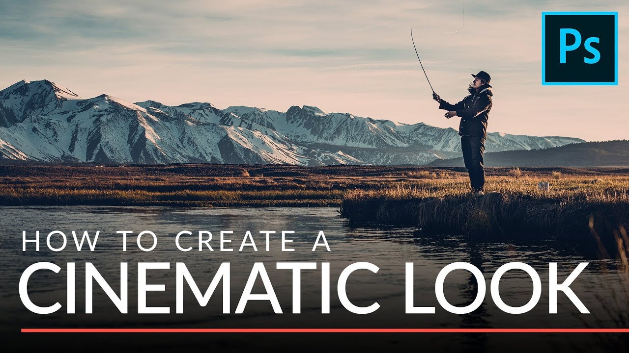
The Two-Minute Cinematic Color Grade That's Been in My Toolkit Ever Since

The Two-Minute Cinematic Color Grade That's Been in My Toolkit Ever Since

I used to spend an embarrassing amount of time trying to make my photos look like they came from a film set. We’re talking curves adjustments stacked on top of hue/saturation layers, color lookup tables I didn’t fully understand, the whole mess. The results were inconsistent, and my clients could always tell when I’d been “experimenting.” Then I watched this tutorial from Aaron Nace over at PHLEARN and felt that specific mix of relief and annoyance that comes with realizing you’ve been doing something the hard way for years.

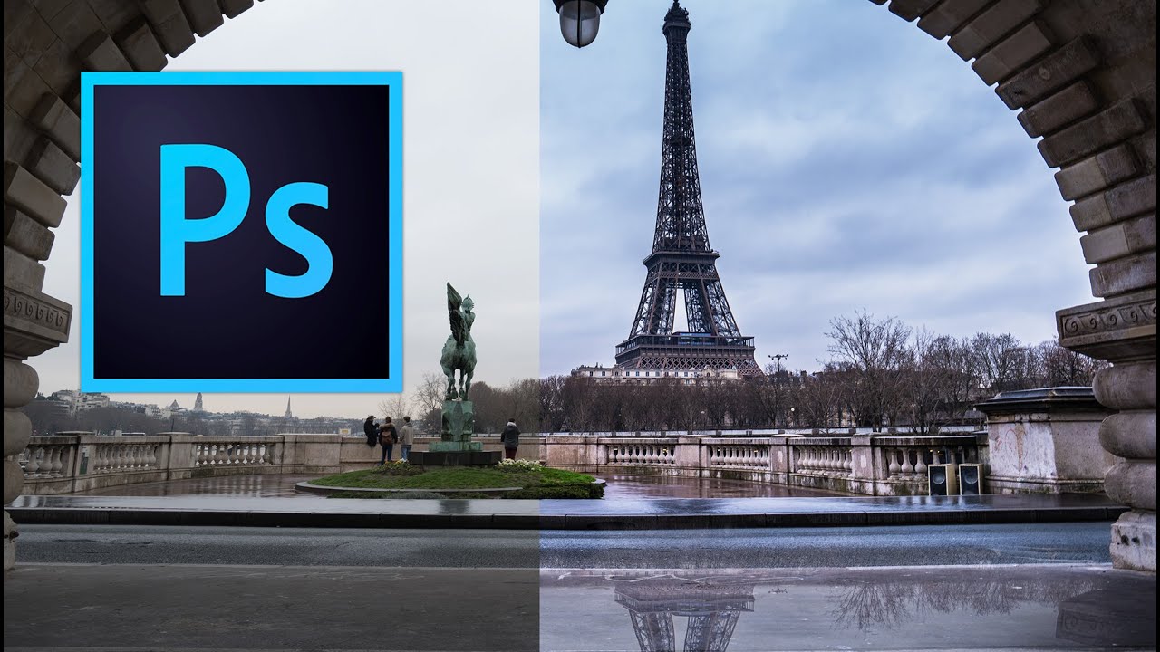
Fake Rain, Real Reflections: How to Add a Water Reflection in Photoshop

Fake Rain, Real Reflections: How to Add a Water Reflection in Photoshop

There’s a certain kind of photo that looks fine on its own but becomes genuinely cinematic with one extra ingredient: a puddle reflection. You’ve seen it. The city street shot where the skyline doubles itself in a millimeter of rainwater. The architecture photo that suddenly has atmosphere. That effect used to feel like something only people with actual rain and actual puddles could pull off. Turns out, you can fake it entirely in Photoshop, and fake it convincingly.

Stop Settling for Boring Skies: A Practical Photoshop Sky Swap Walkthrough

Stop Settling for Boring Skies: A Practical Photoshop Sky Swap Walkthrough

A few years back I spent the better part of a Tuesday stressing over a landscape composite for a client. The photo was solid — good light, interesting subject — but the sky was that flat, washed-out grey that makes everything look like it was shot in a Walmart parking lot. I knew the fix existed somewhere in Photoshop. I just didn’t know the clean way to do it without spending three hours masking individual clouds by hand like some kind of caffeinated monk.

Understanding Blend Modes: A Visual Guide

Understanding Blend Modes: A Visual Guide

Blend modes are one of those features where people either know them cold or just randomly click through the dropdown hoping something looks good. Let’s fix that. Photoshop’s blend modes control how a layer interacts with layers below it. There are 27 of them, but they fall into logical groups, and once you understand the groups, the individual modes make sense. Group 1: Normal Normal — No blending. The top layer covers the bottom layer completely (at 100% opacity).