Stop Letting Color Lookup Tables Wreck Your Highlights (Use This Blend Mode Instead)

Stop Letting Color Lookup Tables Wreck Your Highlights (Use This Blend Mode Instead)

There’s a specific kind of frustration that hits when you find a color effect you love, apply it to a photo, and watch the highlights completely blow out. The vibe you wanted is there, buried under a contrast spike that makes your image look like it was shot through a car windshield at noon. I’ve been there more times than I want to admit, usually sitting in a coffee shop trying to color grade a batch of photos while my third Americano goes cold.
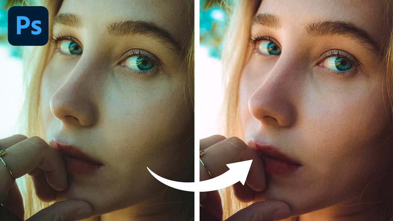

Stop Guessing With Color: How to Fix Portrait Color Casts in Photoshop Using Color Balance

Stop Guessing With Color: How to Fix Portrait Color Casts in Photoshop Using Color Balance

There’s a particular kind of frustration that comes from delivering a portrait to a client and having them come back with “something looks a little off with the skin tones.” You squint at it. You zoom in. You compare it to the original. And then you see it: a subtle green cast, or a magenta tint, or some muddy yellow lurking in the shadows that’s making your subject look vaguely unwell.

Light Adjustment Layer: Why Adobe's Latest Photoshop Feature Is a Game-Changer

Light Adjustment Layer: Why Adobe's Latest Photoshop Feature Is a Game-Changer

Adobe’s Latest Gift to Photoshop Users Adobe’s been on a mission lately, and I’m here for it. They’ve started migrating some of Lightroom and Camera Raw’s most beloved features straight into Photoshop, and honestly? It’s making my workflow significantly smoother. The headliner in this round of updates is the new Light Adjustment layer, and it’s exactly the kind of feature that makes you wonder why it took this long to arrive.

Stop Cranking Saturation on Portraits (Use This Instead)

Stop Cranking Saturation on Portraits (Use This Instead)

Every working designer has done it. You’ve got a portrait that feels a little flat, so you drag Saturation up and suddenly your subject looks like they’ve been marinaded in Hawaiian Punch. You dial it back, feel vaguely guilty, and move on. I did this for longer than I care to admit before I finally took the time to understand what Vibrance actually does differently, and why it’s almost always the better choice when people are in the frame.

Selective Color in Photoshop: The Adjustment Layer That Actually Changes How Your Photos Feel

Selective Color in Photoshop: The Adjustment Layer That Actually Changes How Your Photos Feel

There’s a specific kind of frustration that hits when you’ve finished retouching a photo and it looks technically correct but somehow emotionally flat. The exposure is fine. The skin tones are clean. But the image has no mood, no atmosphere, nothing pulling you in. For years I was reaching for Hue/Saturation or Curves to fix this, and while those tools are great, they’re blunt instruments when what you actually need is a scalpel.

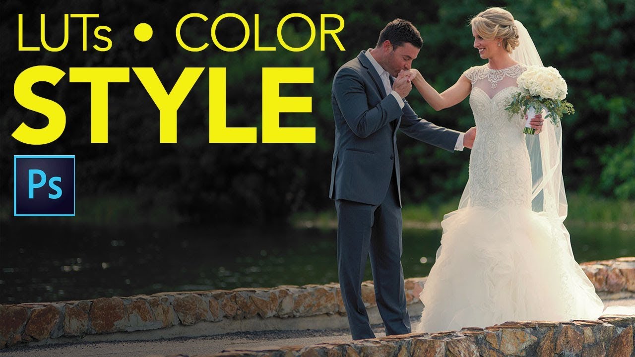
Photoshop Color Lookup Tables Are the Fastest Color Grade You're Not Using

Photoshop Color Lookup Tables Are the Fastest Color Grade You're Not Using

I have spent embarrassing amounts of time manually dragging Curves, nudging Hue/Saturation sliders, and stacking three or four adjustment layers just to get a color grade that feels intentional. Then a client asks for a revision and I get to do it all over again. The whole process is fine, but it’s slow, and it compounds every time you’re working with a batch of images that need a consistent look.

Photoshop's New Light Adjustment Layer Is Here to Replace Brightness/Contrast — Here's How to Actually Use It

Photoshop's New Light Adjustment Layer Is Here to Replace Brightness/Contrast — Here's How to Actually Use It

I’ll be honest — I never really used Brightness/Contrast. It always felt like the adjustment layer Adobe included just so the list didn’t look short. The algorithm was weak, the results were flat, and anyone doing serious work had already migrated to Curves or was living inside Camera Raw. So when Photoshop 27.10 quietly swapped it out for a brand new tool called the Light adjustment layer, my reaction was less “how dare they” and more “finally.

Levels vs. Curves in Photoshop: When to Use Each (And Why You've Probably Been Guessing)

Levels vs. Curves in Photoshop: When to Use Each (And Why You've Probably Been Guessing)

For an embarrassingly long time, I picked between Levels and Curves the same way I pick a parking spot — just grabbed whatever felt right and hoped for the best. Both tools live in the same neighborhood, both mess with tonal values, and neither one comes with a sign that says “use me for THIS.” So I’d open Curves when I felt fancy, open Levels when I felt lazy, and pretend I had a system.

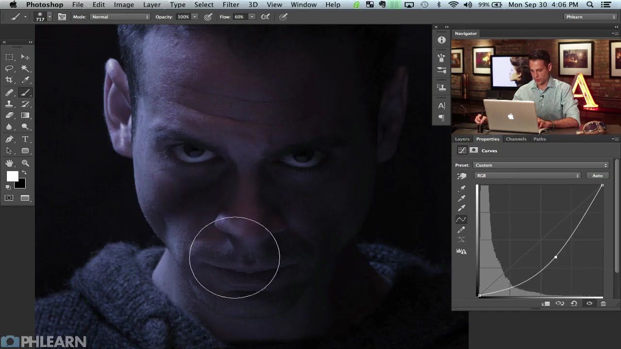
How to Build a Cinematic Movie Poster Look in Photoshop (Riddick Style)

How to Build a Cinematic Movie Poster Look in Photoshop (Riddick Style)

Client work has a funny way of humbling you. I’ve lost count of the number of times someone has handed me a photo and said something like “make it look cinematic” with zero other direction, like I’m supposed to telepathically decode what “cinematic” means to them. After enough of those requests, I started reverse-engineering actual movie posters to build a mental library of techniques I could reach for. That’s what pulled me into this tutorial.

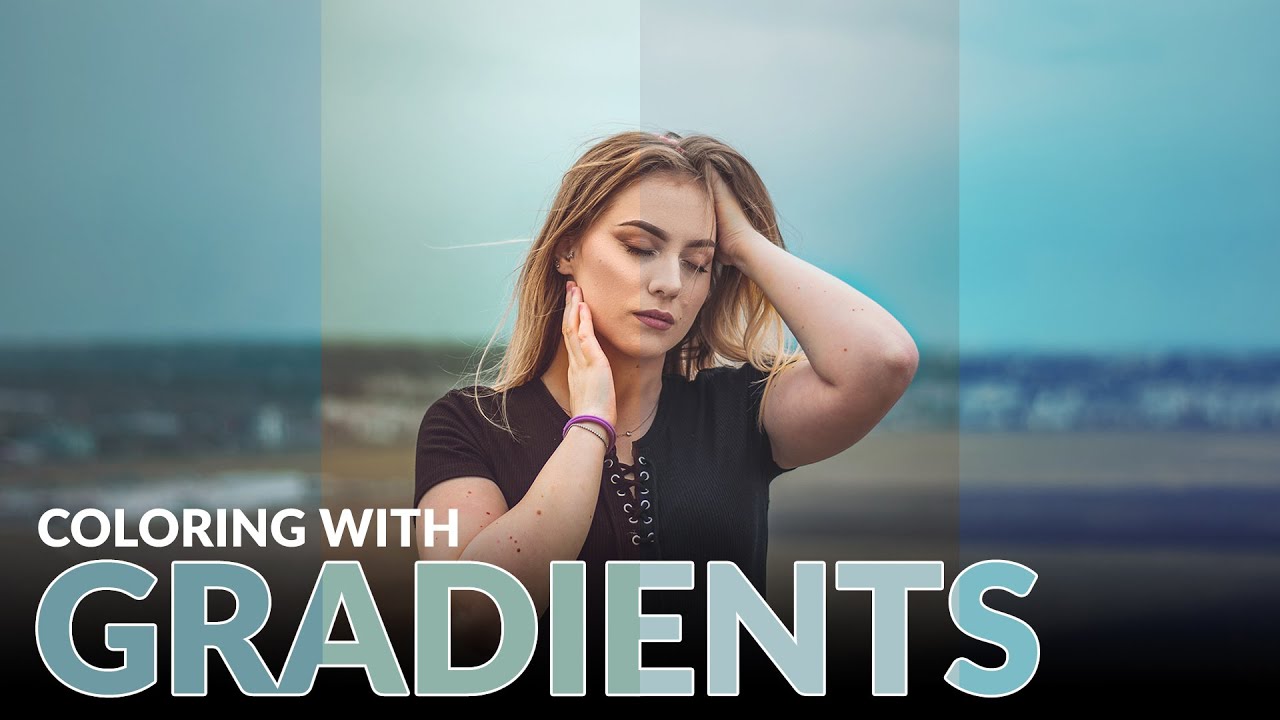
Stop Guessing at Color Grades: How Gradient Maps Give You Actual Control

Stop Guessing at Color Grades: How Gradient Maps Give You Actual Control

Color grading used to be the part of my workflow where I’d just… vibe and hope for the best. I’d push a Curves layer around, add some Color Balance on top of that, and then wonder why everything looked like a bruised peach. It worked out maybe half the time, and the other half I’d just tell the client “it’s a stylistic choice” and pray they didn’t push back. The real problem was I had no meaningful control over shadows, midtones, and highlights independently, at least not in any way that felt intuitive.

Color Grading Video in Photoshop: Local vs. Global Adjustments (And Why It Actually Works)

Color Grading Video in Photoshop: Local vs. Global Adjustments (And Why It Actually Works)

Most of my work lives in still images. Composites, retouching, the occasional logo a client describes as “clean but also edgy.” Video always felt like someone else’s problem. Then a client handed me raw footage and asked me to “make it look cinematic,” and suddenly it was very much my problem. I didn’t want to learn Premiere for one project, and After Effects felt like jumping into the deep end wearing a backpack full of bricks.

How to Recolor Plants and Foliage in Photoshop (Without Making a Mess of Everything Else)

How to Recolor Plants and Foliage in Photoshop (Without Making a Mess of Everything Else)

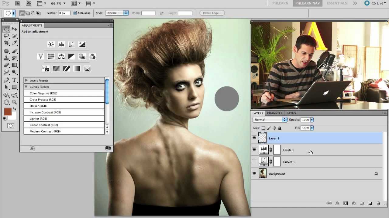
There’s a certain kind of photo edit that looks incredibly complex but is actually embarrassingly simple once someone shows you the right approach. Changing the color of plants and foliage in Photoshop is one of those edits. I used to do it the hard way, making selections, painting on separate layers, swearing at my screen in a coffee shop while the person next to me slowly edged their chair away. Then I watched this tutorial from Aaron Nace over at PHLEARN and felt that particular mix of relief and mild personal insult that comes from realizing you’ve been overcomplicating something for years.