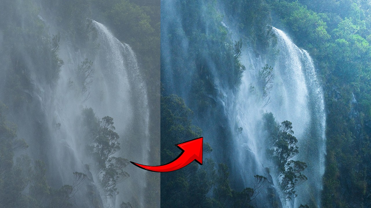
There’s a specific kind of disappointment that hits when you open a photo that felt incredible to shoot and it just… sits there on your screen looking lifeless. No drama, no depth, nothing pulling you in. I’ve been there more times than I’d like to admit, and for a long time I blamed the light, or the lens, or some vague cosmic unfairness. Turns out the problem was usually in how I was processing the file, specifically the fact that I was treating the whole image as one flat thing instead of a scene with actual distance in it.
This is exactly what William Patino breaks down in a recent tutorial on landscape editing, and it’s one of those videos that reframes something fundamental. Watch the full tutorial on YouTube before or after reading this, but either way, I’m going to walk you through the technique step by step so you can apply it immediately.
The core idea is something painters have understood forever: atmospheric perspective. Things close to you have the deepest shadows and the highest contrast. As distance increases, the tonal range compresses, darks lift, and the overall value gets lighter and hazier. When we process a RAW file and push everything into a similar range of midtones, we accidentally erase that natural depth cue, and the brain stops reading the image as three-dimensional. The fix isn’t a global contrast slider. It’s local adjustments, applied with intention, from foreground to background.
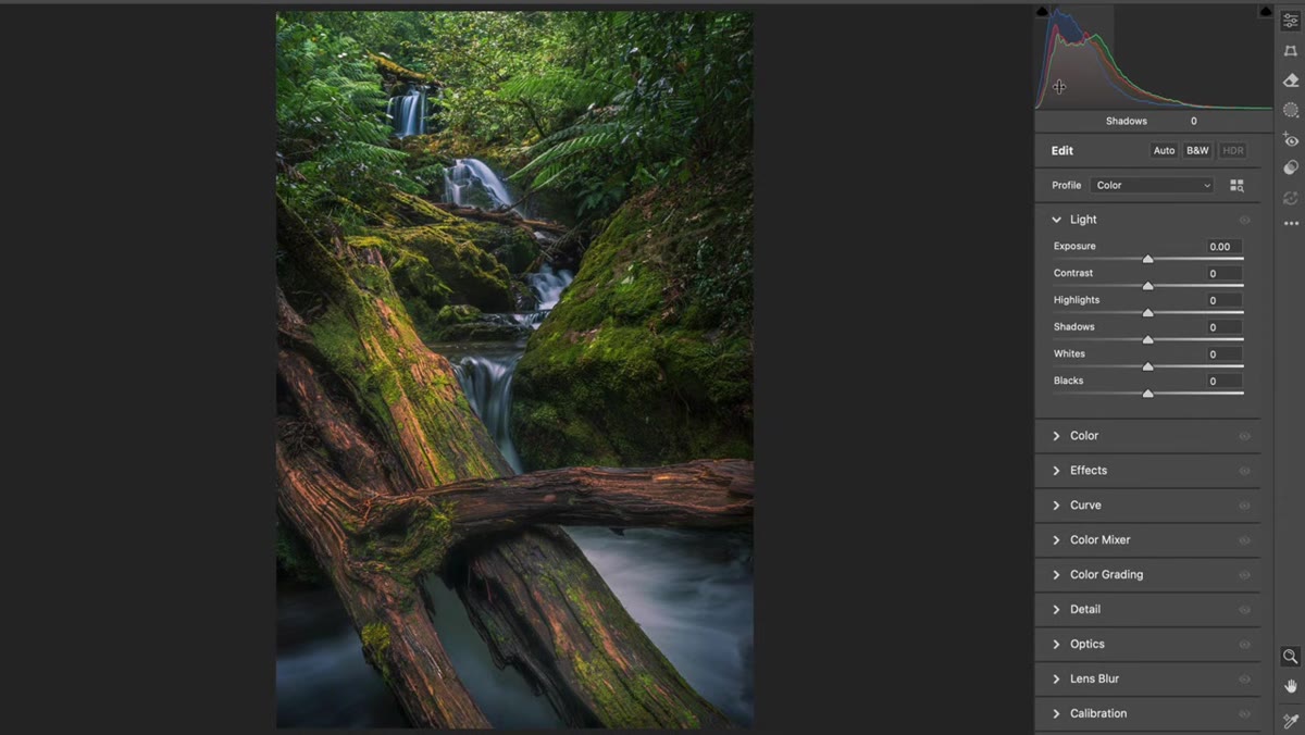
Step 1: Read Your Histogram Before Touching Anything
 Histogram showing a large cluster of midtones with few darks
Pull up your image and look at the histogram before you do anything. If you see a big hump of midtones without much spread into the shadows, that’s your problem right there. It doesn’t mean the exposure is wrong. It means the tonal range is too compressed. The image lacks the darker darks in the foreground that signal “this is close to you” to the viewer’s eye. Once you can see the problem in the data, you know what you’re solving for.
Histogram showing a large cluster of midtones with few darks
Pull up your image and look at the histogram before you do anything. If you see a big hump of midtones without much spread into the shadows, that’s your problem right there. It doesn’t mean the exposure is wrong. It means the tonal range is too compressed. The image lacks the darker darks in the foreground that signal “this is close to you” to the viewer’s eye. Once you can see the problem in the data, you know what you’re solving for.
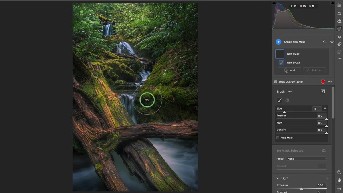
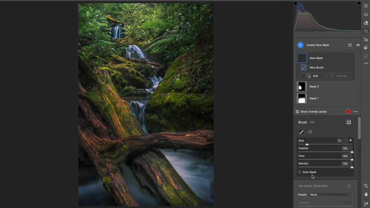
Step 2: Open the Adjustment Brush (Camera Raw, Lightroom, or Capture One)
 Adjustment brush panel open in Camera Raw interface
In Camera Raw, press K to bring up the adjustment brush. In Lightroom, it’s the same tool in your local adjustments panel. Capture One users have their equivalent. The specific app doesn’t matter here, what matters is that you’re working locally, not globally. Reset all the sliders to zero before you start painting so you’re not carrying over any previous settings. You’re about to paint adjustments onto specific zones of the image, so a clean brush is essential.
Adjustment brush panel open in Camera Raw interface
In Camera Raw, press K to bring up the adjustment brush. In Lightroom, it’s the same tool in your local adjustments panel. Capture One users have their equivalent. The specific app doesn’t matter here, what matters is that you’re working locally, not globally. Reset all the sliders to zero before you start painting so you’re not carrying over any previous settings. You’re about to paint adjustments onto specific zones of the image, so a clean brush is essential.
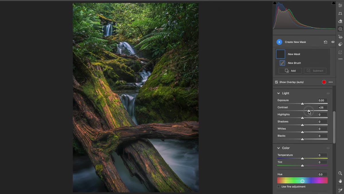
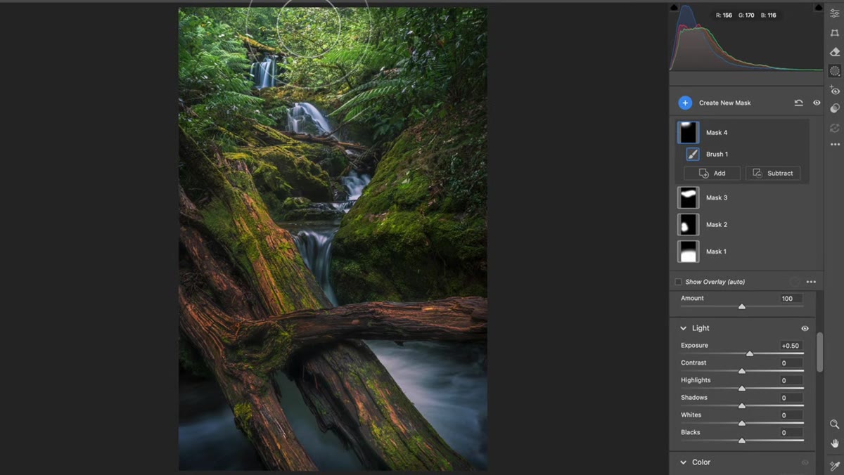
Step 3: Darken the Foreground With Contrast, Not Just Blacks
 Adjustment brush painted over foreground rocks with contrast increased
Paint over the foreground elements, rocks, logs, any objects in the nearest focal plane. Once you’ve masked the area, pull the Contrast slider up rather than reaching straight for Blacks. Here’s why that matters: boosting contrast drops the darks lower while leaving the highlights relatively intact. So if you’ve got a bright patch of light catching the edge of a rock, it stays bright while the shadowed parts get genuinely dark. This preserves texture and keeps the foreground from looking muddy. Patino demonstrates this clearly with a log in the foreground of the image he’s editing, and the difference is immediate.
Adjustment brush painted over foreground rocks with contrast increased
Paint over the foreground elements, rocks, logs, any objects in the nearest focal plane. Once you’ve masked the area, pull the Contrast slider up rather than reaching straight for Blacks. Here’s why that matters: boosting contrast drops the darks lower while leaving the highlights relatively intact. So if you’ve got a bright patch of light catching the edge of a rock, it stays bright while the shadowed parts get genuinely dark. This preserves texture and keeps the foreground from looking muddy. Patino demonstrates this clearly with a log in the foreground of the image he’s editing, and the difference is immediate.
After boosting contrast, consider pulling the Highlights slider down slightly on any bright foreground elements that are competing for attention. The goal in the foreground is weight, not brightness. You want the eye to register it, feel its presence, and then move back into the scene.
Step 4: Lift the Shadows in the Middle Ground
 New brush stroke painted over mid-frame area, shadows lifted
Create a new brush stroke (make sure you’re starting fresh and not painting on the same pin) and work the middle section of the frame. Here you’re doing the opposite of what you did in the foreground. Lift the Shadows and Blacks slightly. Not aggressively, just enough to start that gradual transition toward lighter values as the eye moves deeper into the scene. Think of it as the middle chapter of a story: not the dark opening, not the bright horizon, just a transition zone that keeps things moving.
New brush stroke painted over mid-frame area, shadows lifted
Create a new brush stroke (make sure you’re starting fresh and not painting on the same pin) and work the middle section of the frame. Here you’re doing the opposite of what you did in the foreground. Lift the Shadows and Blacks slightly. Not aggressively, just enough to start that gradual transition toward lighter values as the eye moves deeper into the scene. Think of it as the middle chapter of a story: not the dark opening, not the bright horizon, just a transition zone that keeps things moving.
The amount is subtle. You’re not trying to wash out the midground, just nudge it so it reads as further away than the foreground. Even a small shift here makes a measurable difference in how the image reads as three-dimensional.
Step 5: Brighten the Background to Pull the Eye Through
 Exposure lifted on distant background area of the scene
Add one more brush stroke and paint the background, whatever sits furthest from the camera. Here you’ll raise the Exposure slightly. The background becomes the lightest zone in the scene, which is exactly how atmospheric perspective works in real life. Distant objects scatter more light, lose contrast, and read as brighter and less defined. By lifting exposure in the back, you’re essentially telling the viewer’s brain “this is far away” without them having to consciously process why.
Exposure lifted on distant background area of the scene
Add one more brush stroke and paint the background, whatever sits furthest from the camera. Here you’ll raise the Exposure slightly. The background becomes the lightest zone in the scene, which is exactly how atmospheric perspective works in real life. Distant objects scatter more light, lose contrast, and read as brighter and less defined. By lifting exposure in the back, you’re essentially telling the viewer’s brain “this is far away” without them having to consciously process why.
Together, these three zones, dark foreground, transitional midground, bright background, give the image a depth gradient that the eye follows naturally from front to back.
Step 6: Check the Before and After
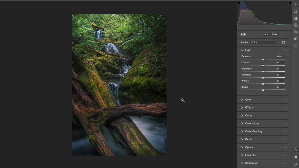 Before and after comparison showing flat versus depth-enhanced version
Toggle the preview off and on to compare. What you’re looking for isn’t a dramatic transformation. This technique is subtle by design. What you should notice is that the image now has a sense of pull, something that draws you from the foreground into the distance rather than letting your eye sit flatly on the whole frame at once. If the before version felt like a photograph of a scene, the after version should start to feel like you’re actually inside it.
Before and after comparison showing flat versus depth-enhanced version
Toggle the preview off and on to compare. What you’re looking for isn’t a dramatic transformation. This technique is subtle by design. What you should notice is that the image now has a sense of pull, something that draws you from the foreground into the distance rather than letting your eye sit flatly on the whole frame at once. If the before version felt like a photograph of a scene, the after version should start to feel like you’re actually inside it.
My Take: This Works on More Than Landscapes
I started applying this same logic to product shots and editorial composites, and it holds up. Any time you’re building an image with foreground and background elements, even in a studio context, mimicking atmospheric perspective through local tonal adjustments adds believability. I once spent three days on a composite that looked unconvincing, and the fix was embarrassingly simple: the background elements were the same tonal range as the foreground. A few targeted shadow lifts in the back and it suddenly looked like the subject was actually standing in the space rather than pasted onto it.
The technique also plays well with luminosity masks if you want to get more precise about which tones you’re affecting, rather than painting freehand. But for quick, practical results, the adjustment brush approach Patino demonstrates is fast, reversible, and doesn’t require any plugins.
The single biggest thing I took from this tutorial: contrast adjustment is not one thing you do to an image. It’s something you sculpt across space, lighter in the distance, heavier up front, the same way light actually works in the physical world. Stop treating your photos like flat surfaces and start treating them like environments.
Watch the full tutorial on YouTube and pay attention to how Patino talks through the histogram at the start. That framing alone is worth the watch time.
Comments
Leave a Comment