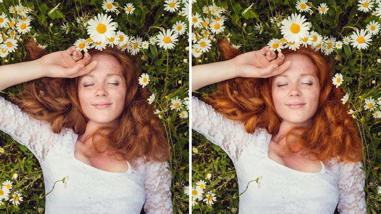
Portrait retouching has a way of exposing every gap in your workflow. I’ve handed off photos where everything looked great, the skin, the background, the lighting, and then a client comes back asking why the hair looks flat and kind of muddy. Turns out I’d been ignoring it entirely. Hair color is one of those things that reads as “fine” until you see it done right, and then you can’t unsee the difference. A few weeks back I was working through Watch the full tutorial on YouTube by Aaron Nace over at PHLEARN, and it clicked immediately why my hair retouching had always felt incomplete.
The technique Aaron walks through is genuinely practical. It’s three moves stacked on top of each other: a Color Balance adjustment to push the existing hair color further, a solid color layer to tint the highlights, and dodge and burn to add dimension and shine. None of these tools are exotic. The smart part is how they’re sequenced and how each one targets a different aspect of what makes hair look vivid and alive. I work mostly on portrait commissions out of coffee shops in Austin, so I’m always hunting for techniques that are fast, non-destructive, and easy to revisit when a client changes their mind at 9pm. This one checks all three boxes.
The example image in the tutorial is a redhead against a green background, which is a beautiful setup because that complementary contrast already has energy. But Aaron makes the point early that the same logic applies to brown hair, blonde hair, anything. You’re just adjusting which direction you push the sliders.
Step 1: Add a Color Balance Adjustment Layer
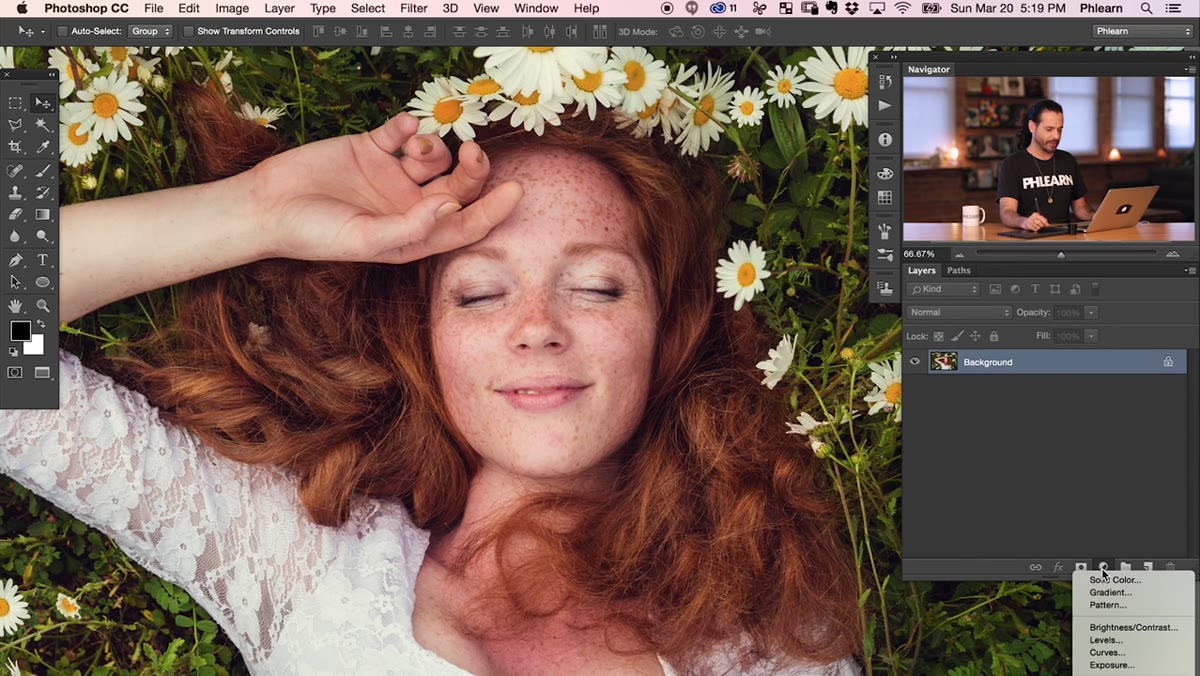 Color Balance panel open showing midtone sliders
Go to your Adjustments panel and add a Color Balance layer. When the panel opens, stay in Midtones first. This is where most of the actual color information in hair lives, and it’s the safest place to start before touching shadows or highlights.
Color Balance panel open showing midtone sliders
Go to your Adjustments panel and add a Color Balance layer. When the panel opens, stay in Midtones first. This is where most of the actual color information in hair lives, and it’s the safest place to start before touching shadows or highlights.
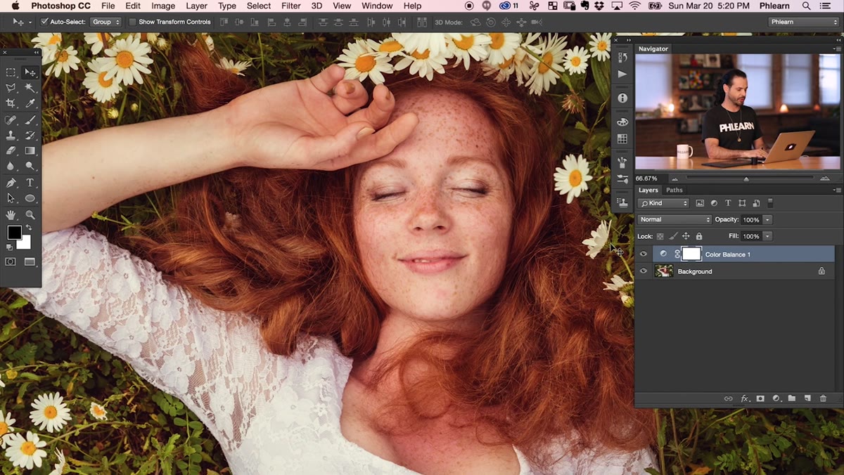
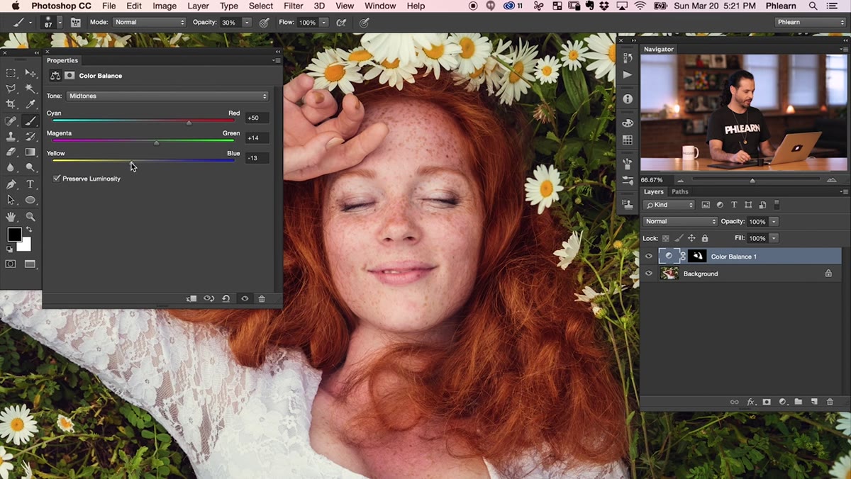
For red hair specifically, Aaron pushes the red slider to the right, pulls yellow toward the left, and nudges green up slightly. The red and yellow move together because red hair isn’t just red, it has warm golden undertones, and pulling yellow down separately lets the red feel cleaner without going orange. If you’re working on brown hair, the approach shifts slightly: you’d bring red and green up in closer proportion to each other, which gives you a richer, more saturated brown rather than pushing it toward auburn.
Step 2: Invert the Layer Mask and Paint Hair In
 Inverted black mask with white brush strokes over hair
Once you’ve got your Color Balance settings dialed in, click on the layer mask thumbnail in the Layers panel and hit Command+I (or Ctrl+I on Windows). This flips the mask to black, which hides the adjustment everywhere. Now you’re painting it back in with a white brush only where you want it.
Inverted black mask with white brush strokes over hair
Once you’ve got your Color Balance settings dialed in, click on the layer mask thumbnail in the Layers panel and hit Command+I (or Ctrl+I on Windows). This flips the mask to black, which hides the adjustment everywhere. Now you’re painting it back in with a white brush only where you want it.
The key here is restraint. Aaron drops his brush opacity to around 30% (hit the number 3 on your keyboard while the brush tool is active) before going anywhere near the eyebrows. The eyebrows need the same color treatment as the hair or they’ll look disconnected, but they’re smaller and more delicate, so a lower opacity gives you control without blowing them out. Paint over the main hair area first at a higher opacity, then switch to 30% for the brows. Toggle the layer visibility on and off as you work so you can actually see what you’re changing.
Step 3: Dial in the Color Balance Settings
 Comparing before and after with Color Balance layer toggled
After you’ve masked the layer in, go back and look at the actual color values again. What looks right in the dialog doesn’t always hold up once you’ve painted the mask into the full image context. Aaron goes back at this stage and pushes the red a bit further and pulls yellow down more, because seeing the adjustment in isolation versus against the full photo are two different experiences.
Comparing before and after with Color Balance layer toggled
After you’ve masked the layer in, go back and look at the actual color values again. What looks right in the dialog doesn’t always hold up once you’ve painted the mask into the full image context. Aaron goes back at this stage and pushes the red a bit further and pulls yellow down more, because seeing the adjustment in isolation versus against the full photo are two different experiences.
Don’t be precious about this step. The whole point of using an adjustment layer is that nothing is committed. If you toggle the layer off and the hair looks noticeably more flat in comparison, you haven’t pushed far enough. If toggling it off feels like a relief, you’ve gone too far. Find the point where off looks like something is missing.
Step 4: Add a Solid Color Layer to Tint the Highlights
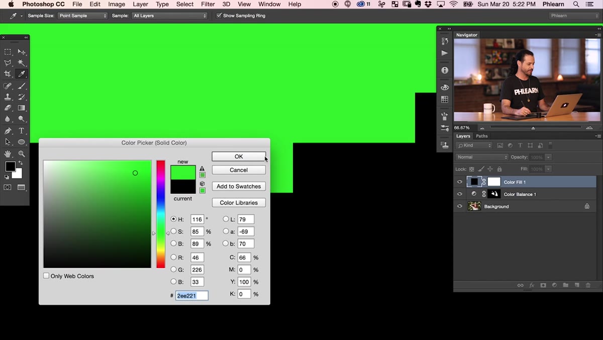 Solid Color picker dialog open over portrait image
This is the move I hadn’t seen done quite this way before. Add a Solid Color adjustment layer above everything else. When the color picker opens, you’re not trying to match the hair exactly. You’re choosing a tone that you want to live in the highlights specifically.
Solid Color picker dialog open over portrait image
This is the move I hadn’t seen done quite this way before. Add a Solid Color adjustment layer above everything else. When the color picker opens, you’re not trying to match the hair exactly. You’re choosing a tone that you want to live in the highlights specifically.
Aaron picks a warm, slightly golden-red. The idea is that highlights in hair don’t read the same hue as the midtones. Real hair has variation, and adding a distinct highlight color is what gives it that glossy, dimensional look rather than a flat color fill. After choosing your color, you’ll blend this layer using a blending mode and mask it to the bright areas of the hair. The combination of the Color Balance layer below and this solid color on top starts to feel like the hair is actually catching light rather than just being painted.
Step 5: Dodge and Burn for Shine and Depth
 Before and after showing hair with added sheen from dodge and burn
Dodge and burn is the finishing layer on top of everything. Create a new blank layer, fill it with 50% gray (Edit > Fill > 50% Gray), and set its blending mode to Overlay. Now paint with a soft white brush at low opacity to dodge (brighten) and a soft black brush to burn (darken).
Before and after showing hair with added sheen from dodge and burn
Dodge and burn is the finishing layer on top of everything. Create a new blank layer, fill it with 50% gray (Edit > Fill > 50% Gray), and set its blending mode to Overlay. Now paint with a soft white brush at low opacity to dodge (brighten) and a soft black brush to burn (darken).
On hair, you’re looking for the natural flow of light. Where would a strand catch the light source? Paint white there, gently. Where does the hair go into shadow between strands? A soft black stroke adds depth. Done lightly, this is what separates a retouch that looks like the photographer nailed the lighting from one that looks like someone messed with a slider.
What I’d Add From My Own Experience
The masking step in this workflow is where most people will lose time. If your subject has flyaway hairs or a complex hairline, painting a freehand mask can get messy fast. My workaround is to run a quick Select > Subject selection first, refine the edge to catch the fine hairs, and then use that as a starting point for the mask rather than painting from scratch. It’s not perfectly clean either, but it gets you 80% there in a fraction of the time, and you’re only hand-painting the tricky bits.
Also worth noting: these adjustments stack, so order matters. If you put the solid color layer below the Color Balance layer you’ll get a different result than if it sits above. Aaron keeps it above, and that’s the right call because you want the highlight tint to be the last color statement the eye reads.
The biggest takeaway from this tutorial is simple: hair color isn’t one thing. It’s midtones, highlights, and dimensional light, and treating each separately is what gets you from “looks fine” to “looks like a magazine cover.” Each of these three layers handles a different part of that problem, which is why the technique works even when the underlying hair color isn’t that interesting to begin with.
Watch the full tutorial on YouTube and see Aaron work through the full technique in real time. Seeing the before and after on an actual portrait makes the logic of each step a lot clearer than any written breakdown can.
Comments
Leave a Comment