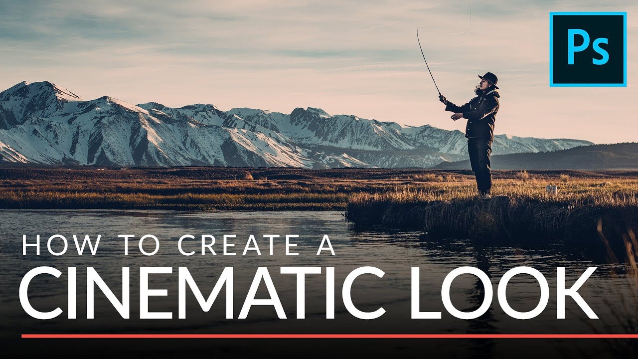
I used to spend an embarrassing amount of time trying to make my photos look like they came from a film set. We’re talking curves adjustments stacked on top of hue/saturation layers, color lookup tables I didn’t fully understand, the whole mess. The results were inconsistent, and my clients could always tell when I’d been “experimenting.” Then I watched this tutorial from Aaron Nace over at PHLEARN and felt that specific mix of relief and annoyance that comes with realizing you’ve been doing something the hard way for years.
Watch the full tutorial on YouTube
The technique Aaron walks through takes about two minutes to execute. It uses a single Solid Color adjustment layer, one blend mode you’ve probably ignored your whole career, and a small opacity tweak. That’s genuinely it. What makes it work isn’t complexity, it’s understanding what the Exclusion blend mode actually does to an image, which Aaron explains clearly and concisely. I’ve since added this to my standard portrait workflow and it’s saved me more time than I’d like to admit.
Step 1: Add a Solid Color Adjustment Layer
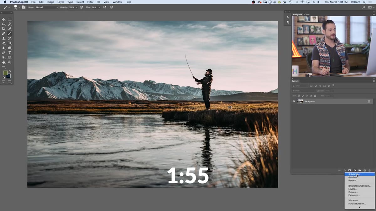 Solid Color option being selected from adjustment layers menu
Go to Layer > New Fill Layer > Solid Color, or hit the adjustment layer icon at the bottom of your Layers panel and choose Solid Color. A color picker will pop up immediately. At this stage, don’t overthink the color choice too much, you can change it at any time later by double-clicking the layer thumbnail. Aaron’s recommendation, and one I’ve found works well in practice, is to pick something in the cool color range. Think deep blues, cool cyans, or desaturated purples. Choose something reasonably saturated so you can actually see the effect when you start adjusting. Hit OK.
Solid Color option being selected from adjustment layers menu
Go to Layer > New Fill Layer > Solid Color, or hit the adjustment layer icon at the bottom of your Layers panel and choose Solid Color. A color picker will pop up immediately. At this stage, don’t overthink the color choice too much, you can change it at any time later by double-clicking the layer thumbnail. Aaron’s recommendation, and one I’ve found works well in practice, is to pick something in the cool color range. Think deep blues, cool cyans, or desaturated purples. Choose something reasonably saturated so you can actually see the effect when you start adjusting. Hit OK.
Step 2: Switch the Blend Mode to Exclusion
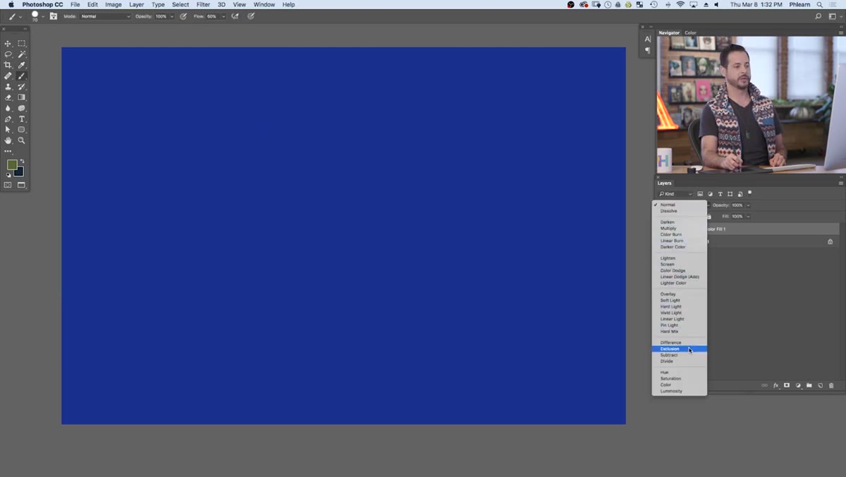 Blend mode dropdown open with Exclusion being selected
This is the step where the magic happens, and also the step where most people have never ventured before. With your Solid Color layer selected, open the blend mode dropdown at the top of the Layers panel (it defaults to Normal) and scroll down to Exclusion. It’s tucked in the same group as Difference, which you’ve also probably never used.
Blend mode dropdown open with Exclusion being selected
This is the step where the magic happens, and also the step where most people have never ventured before. With your Solid Color layer selected, open the blend mode dropdown at the top of the Layers panel (it defaults to Normal) and scroll down to Exclusion. It’s tucked in the same group as Difference, which you’ve also probably never used.
Here’s why Exclusion is interesting: it doesn’t apply your chosen color uniformly across the image. Instead, it pushes that color into the shadows while simultaneously applying its complement to the highlights. So if you chose a cool blue, your shadows will shift blue and your highlights will shift warm. This split-tone behavior is exactly what gives film footage its characteristic look, and it happens automatically based on your single color choice. No separate highlight and shadow adjustments needed.
Step 3: Reduce Opacity to Around 30%
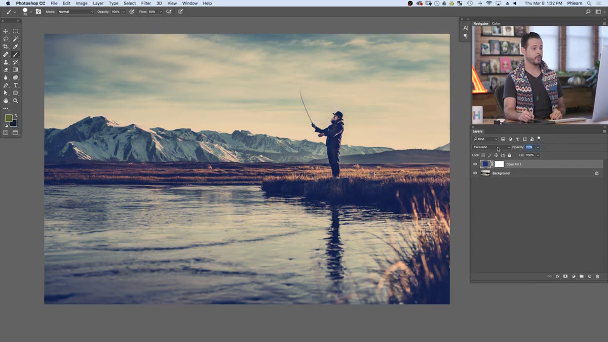 Opacity slider being dragged down toward 30 percent
At full opacity, Exclusion mode looks absolutely unhinged. Dial the opacity down using the slider at the top right of the Layers panel. Aaron lands at around 30%, and from my own testing, that range of 25-35% is where the effect stops reading as a filter and starts reading as a color grade. Below 20% it tends to disappear on most monitors. Above 40% and people will ask if your photo is okay.
Opacity slider being dragged down toward 30 percent
At full opacity, Exclusion mode looks absolutely unhinged. Dial the opacity down using the slider at the top right of the Layers panel. Aaron lands at around 30%, and from my own testing, that range of 25-35% is where the effect stops reading as a filter and starts reading as a color grade. Below 20% it tends to disappear on most monitors. Above 40% and people will ask if your photo is okay.
The exact percentage will vary slightly depending on the image. Photos with a lot of contrast in the shadows may need a touch less. Flat, overexposed images might benefit from pushing closer to 35%. Adjust by eye, but use 30% as your anchor point.
Step 4: Fine-Tune the Color by Double-Clicking the Layer
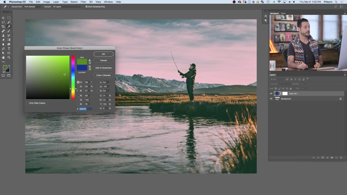 Color picker reopening after double-clicking adjustment layer thumbnail
One of the most useful things about this method is how non-destructive and adjustable it is. Double-click the color swatch on your Solid Color layer and the color picker reopens. From here you can shift your color slightly warmer or cooler, push the saturation up or down, or try something completely different like a teal or a muted olive.
Color picker reopening after double-clicking adjustment layer thumbnail
One of the most useful things about this method is how non-destructive and adjustable it is. Double-click the color swatch on your Solid Color layer and the color picker reopens. From here you can shift your color slightly warmer or cooler, push the saturation up or down, or try something completely different like a teal or a muted olive.
Aaron’s general guidance is to stay in the cool range for portraits specifically because of how the complement interacts with skin tones. Cool shadows and warm highlights is a flattering combination for almost any complexion. That said, if you’re working on a moody landscape or a gritty urban shot, warmer shadow tones with cooler highlights can work surprisingly well. The underlying logic stays the same, the Exclusion mode handles the split automatically.
Step 5: Add Cinematic Black Bars (Optional but Effective)
 Black bars PNG being dragged onto the photo from a separate document
If you want to push the cinematic feel further, Aaron suggests adding letterbox bars to crop the image to a 16:9 aspect ratio. His downloadable pack includes a PNG with transparency baked in, so the black bars sit at the top and bottom of the frame with no background to deal with. Open the PNG via File > Open, grab the Move tool, and drag the bars directly onto your working document.
Black bars PNG being dragged onto the photo from a separate document
If you want to push the cinematic feel further, Aaron suggests adding letterbox bars to crop the image to a 16:9 aspect ratio. His downloadable pack includes a PNG with transparency baked in, so the black bars sit at the top and bottom of the frame with no background to deal with. Open the PNG via File > Open, grab the Move tool, and drag the bars directly onto your working document.
If the bars don’t scale perfectly to your image dimensions, use Free Transform (Ctrl/Cmd + T) and hold Shift while dragging a corner handle to resize proportionally. The goal is to have the bars mask just enough of the top and bottom to change the perceived framing of the shot. It’s a small thing but it reads immediately as “cinematic” to a viewer’s eye, the same way a widescreen ratio signals “film” before a single frame of story has played.
What I’d Add: Try This on Multiple Layers for More Control
The technique Aaron teaches works perfectly as a one-layer solution. But when I’m working on images with a wide tonal range, like a backlit portrait with deep shadows and blown-out sky, I sometimes duplicate the Solid Color layer and clip a luminosity mask to it so the effect hits the shadows harder than the midtones. It adds maybe two minutes to the workflow and gives you more surgical control over where the color shift lands.
You can also group the Solid Color layer and add a Group mask to pull the effect away from areas where it’s getting heavy, like someone’s face when the shadow tones are going a bit too dramatic. The core technique stays identical, you’re just giving yourself a safety valve.
The most important thing I took from this tutorial isn’t even the specific settings. It’s the reminder that Exclusion is a blend mode that actually does something interesting and useful. Most Photoshop users cycle through Normal, Multiply, Screen, and Overlay and call it a day. Exclusion has been sitting there the whole time doing a job that would otherwise require multiple adjustment layers and a color theory degree to replicate manually.
Watch Aaron walk through the full technique himself here: Watch the full tutorial on YouTube
Comments (3)
Love how you break down complex stuff into manageable steps.
The tip about the two minute cinematic color was the missing piece for me. Thank you.
Excellent tutorial. I'd add that from a lighting standpoint, this technique is incredibly versatile.
Leave a Comment