There’s a specific kind of design you’ve seen a hundred times on t-shirts and gig posters. A bold graphic, but instead of sitting on a clean background, it looks like someone painted wildly around it. The shape itself is defined by what’s missing — the negative space. The paint exists everywhere except where the graphic is. It’s a technique that reads as handmade and energetic, and the first time I saw it I assumed it required some elaborate workflow involving stock textures and a lot of swearing.
Turns out, Photoshop has almost everything you need already built in, and the setup takes about three minutes. In this KelbyOne tutorial from Photoshop User TV, host Cory Barker demonstrates how to pull this off using a tool that most people walk right past: the Custom Shape Tool. Watch the full tutorial on YouTube — but here’s a full breakdown you can follow without pausing and rewinding every 10 seconds.
Step 1: Open the Custom Shape Tool
 Custom Shape Tool selected at bottom of shape tools flyout
Grab the Shape Tool from your toolbar (keyboard shortcut: U), then hold Shift+U or right-click the icon to get the full flyout menu. At the very bottom of that list is the Custom Shape Tool. Most people never scroll down that far, which is honestly a shame because there’s a surprisingly deep library hiding there.
Custom Shape Tool selected at bottom of shape tools flyout
Grab the Shape Tool from your toolbar (keyboard shortcut: U), then hold Shift+U or right-click the icon to get the full flyout menu. At the very bottom of that list is the Custom Shape Tool. Most people never scroll down that far, which is honestly a shame because there’s a surprisingly deep library hiding there.
Once you’ve selected it, head up to the Options Bar at the top of the screen. You’ll see a shape picker dropdown. Click it.
Step 2: Load All Shape Presets
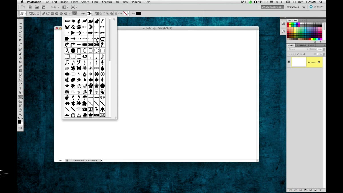 Shape preset picker open in Options Bar showing category list
By default, Photoshop shows you one category of shapes at a time. Cory’s move here is to load everything at once so you can actually browse what exists. Click the gear icon inside the shape picker panel, then choose “All” from the list of categories. Photoshop will ask if you want to replace the current shapes or append – choose Append so you keep what was already there.
Shape preset picker open in Options Bar showing category list
By default, Photoshop shows you one category of shapes at a time. Cory’s move here is to load everything at once so you can actually browse what exists. Click the gear icon inside the shape picker panel, then choose “All” from the list of categories. Photoshop will ask if you want to replace the current shapes or append – choose Append so you keep what was already there.
Now scroll through the full library. Yes, a lot of it is clip-art-era nonsense. Yes, there are feet. Left and right feet, separately. But buried in there are some genuinely useful geometric and symbolic shapes. Cory reaches for the yin-yang, which is a great candidate for this technique because it has strong visual contrast and a recognizable silhouette.
Step 3: Draw the Shape as a Path
 Yin-yang path being drawn on canvas with Shift key held
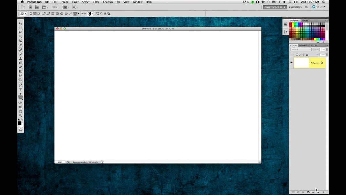
Before you draw anything, make sure you’re set to draw a Path, not a Shape or Pixels. This is the toggle in the top-left section of the Options Bar, and it’s the single most important setting in this whole workflow. You want a path outline, not a filled vector shape sitting on its own layer.
Yin-yang path being drawn on canvas with Shift key held
Before you draw anything, make sure you’re set to draw a Path, not a Shape or Pixels. This is the toggle in the top-left section of the Options Bar, and it’s the single most important setting in this whole workflow. You want a path outline, not a filled vector shape sitting on its own layer.
Create a new blank layer first, then hold Shift while dragging to draw your shape out proportionally. Drop it somewhere central on your canvas. The size depends on your comp, but bigger tends to read better with this effect. You should see the marching ants of a path outline once you release – no fill, no stroke, just the path.
Step 4: Paint Around the Shape
 Shape path on canvas showing negative space painting concept
Here’s where the actual effect happens. With your path still active, you’re going to paint around the shape rather than inside it. The path acts as a boundary that you’ll use as a mask, so that any paint you apply only shows up in the areas surrounding the graphic, not inside it.
Shape path on canvas showing negative space painting concept
Here’s where the actual effect happens. With your path still active, you’re going to paint around the shape rather than inside it. The path acts as a boundary that you’ll use as a mask, so that any paint you apply only shows up in the areas surrounding the graphic, not inside it.
You can load the path as a selection first (Ctrl+Enter / Cmd+Enter), then invert the selection (Ctrl+Shift+I / Cmd+Shift+I) so everything outside the shape is selected. Now grab a large, textured brush – something with rough edges works best for that hand-painted t-shirt feel – and paint over the whole canvas. Only the area outside your shape gets covered. The shape itself stays clean, defined purely by the space around it.
Step 5: Vary the Brush Application for a Handmade Look
 Painted strokes surrounding shape creating negative space effect
A single flat coat of paint kills the effect. The whole point is that it looks like someone attacked a canvas with a brush, not like someone used the Paint Bucket tool. Use a few different brush sizes. Lower the opacity on some passes to around 60-70%. Let some edges be heavy and some trail off. Leave a few gaps near the shape’s outline so the boundary feels discovered rather than designed.
Painted strokes surrounding shape creating negative space effect
A single flat coat of paint kills the effect. The whole point is that it looks like someone attacked a canvas with a brush, not like someone used the Paint Bucket tool. Use a few different brush sizes. Lower the opacity on some passes to around 60-70%. Let some edges be heavy and some trail off. Leave a few gaps near the shape’s outline so the boundary feels discovered rather than designed.
If you have a graphics tablet, this is a great place to use it. Pressure-sensitive strokes add a lot to the organic feel. If you’re working with a mouse, try reducing flow to around 40% and building up the paint in overlapping strokes rather than one single drag.
Step 6: Refine the Edges and Adjust Contrast
 Final painted negative space shape result on screen
Step back and look at your shape. The negative space effect works when the boundary between painted and unpainted areas reads clearly at a glance. If the edge of your shape is getting lost, add a subtle drop shadow or inner glow to the shape layer – not to add fanciness, but just to punch the separation slightly. Keep any shadow tight and low-opacity, around 20-30%.
Final painted negative space shape result on screen
Step back and look at your shape. The negative space effect works when the boundary between painted and unpainted areas reads clearly at a glance. If the edge of your shape is getting lost, add a subtle drop shadow or inner glow to the shape layer – not to add fanciness, but just to punch the separation slightly. Keep any shadow tight and low-opacity, around 20-30%.
You can also duplicate the paint layer and set the duplicate to Multiply to deepen the color without repainting. If you want the unpainted area to have some texture too, add a noise layer clipped below the paint – it keeps the whole thing from feeling too digital.
One Thing I’d Add: Save the Path Before You Do Anything Else
I’ve rebuilt paths from scratch more times than I want to admit because I forgot to save them before moving on. Paths in Photoshop are ephemeral by default – they live in the Paths panel as a “Work Path” until you name and save them, and if you accidentally create a new path, the old one is gone.
Once you’ve drawn your shape, go to the Paths panel (Window > Paths), double-click on “Work Path,” and give it a name. Takes four seconds. Saves you from rebuilding the shape when you want to try the effect with a different brush or a different color. You can also reuse that saved path later on other projects, which is useful if you’re doing a series of pieces with the same graphic.
The core lesson from this tutorial is something Photoshop keeps teaching over and over: the most powerful techniques often start with the most overlooked tools. The Custom Shape Tool sits there at the bottom of a flyout menu, mostly ignored, while people pay for stock vectors to do the exact same thing.
The negative space painting effect is fast, it scales to tons of design contexts – apparel, posters, social graphics – and once you understand that the shape is functioning as a mask rather than a visible element, you can apply the same logic across dozens of other workflows.
Watch the full tutorial on YouTube and follow along with Cory Barker’s original demonstration – the show covers several other techniques in the same episode worth your time.
Comments
Leave a Comment