If you’ve ever pulled down the black point on a Curves adjustment and watched your greens go full radioactive swamp, congratulations - you’ve met one of the most quietly frustrating quirks in Lightroom and Camera Raw. You want punchy shadows. You get a photo that looks like it was color-graded by someone who really, really loves saturated tones. The fix used to be a compromise: back off the curve until the colors calm down and accept a softer black point, or sit with the over-saturation and pretend it’s a creative choice.
Adobe snuck a small but genuinely useful control into the Tone Curve panel around mid-2023 that addresses this directly. Watch the full tutorial on YouTube from Matt Kloskowski, who spotted it and broke it down clearly. In this Matt Kloskowski tutorial, he walks through exactly what the new “Refine Saturation” slider does, why it exists, and how it replicates something that Photoshop users could previously only pull off using blend modes on a Curves layer. It’s a short video with a high usefulness-to-runtime ratio, which is my favorite kind.
The technique is relevant whether you’re doing portrait work, landscapes, or any edit where you’re sculpting tonal contrast with a curve. Let me walk you through it.
Step 1: Make Sure You’re on the Right Version
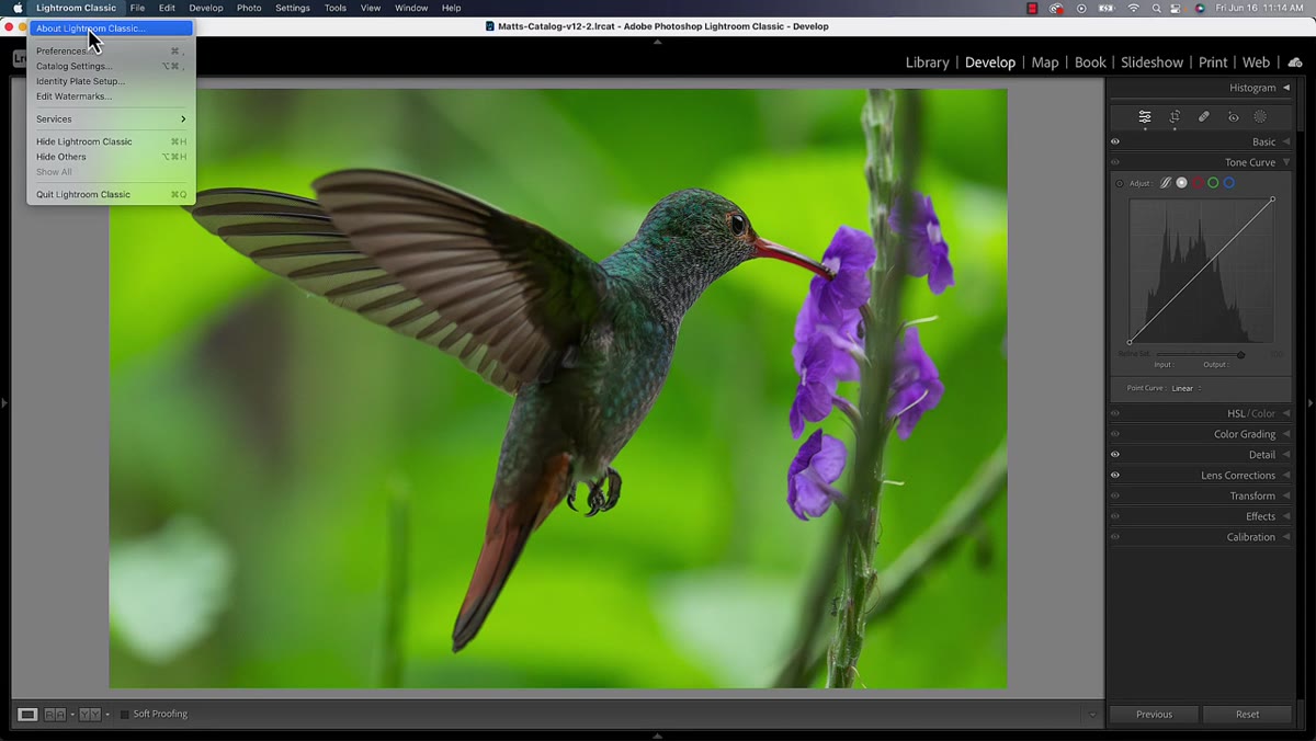 Lightroom Classic version number shown in panel
Before anything else, check your software version. This feature requires Lightroom Classic 12.4 or later. If you’re working in Camera Raw - either by opening a raw file or running the Camera Raw Filter from inside Photoshop - you need Camera Raw 15.4 or later. These are separate updates, so having a current Photoshop doesn’t automatically mean your Camera Raw is up to date. Go check. I’ll wait.
Lightroom Classic version number shown in panel
Before anything else, check your software version. This feature requires Lightroom Classic 12.4 or later. If you’re working in Camera Raw - either by opening a raw file or running the Camera Raw Filter from inside Photoshop - you need Camera Raw 15.4 or later. These are separate updates, so having a current Photoshop doesn’t automatically mean your Camera Raw is up to date. Go check. I’ll wait.
If you’re not on those versions, none of the rest of this matters. Adobe handles support questions, not YouTube comment sections, so if your update isn’t showing up, that’s where to go.
Step 2: Open the Tone Curve Panel
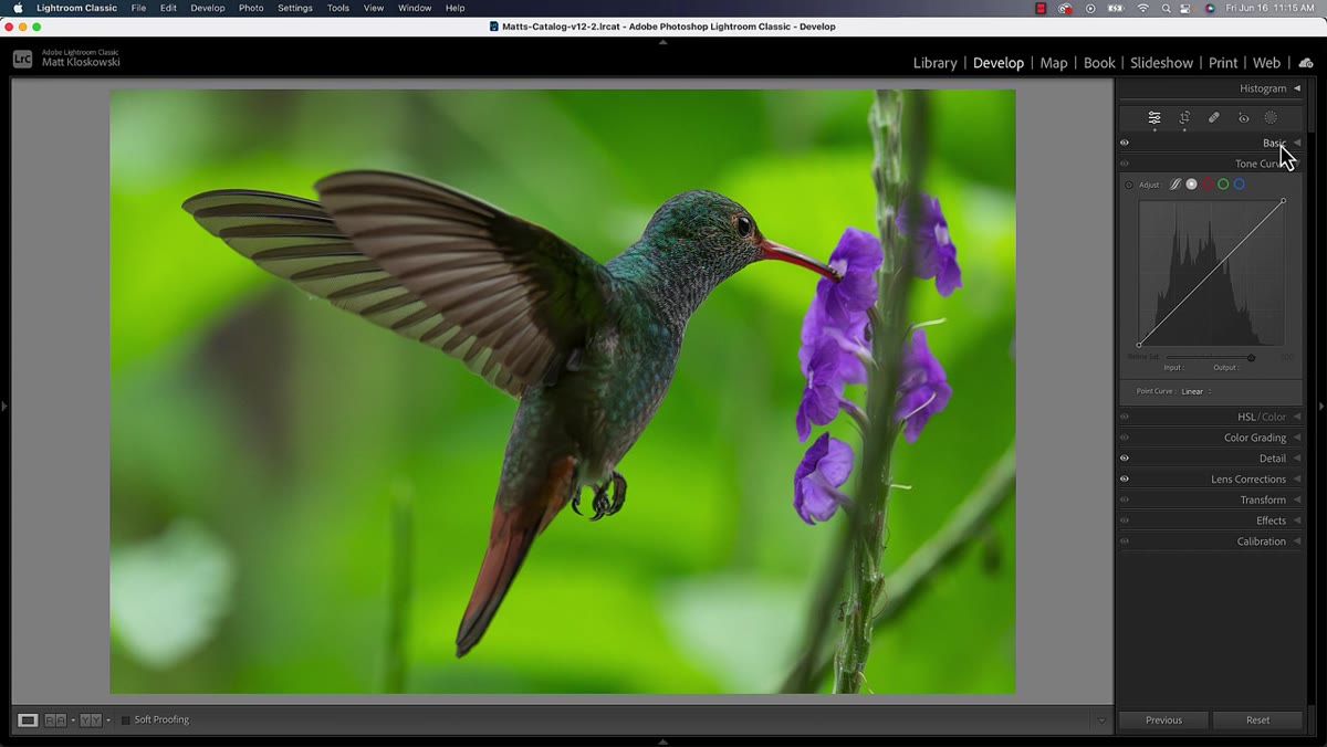 Tone Curve panel open in Lightroom Classic
In Lightroom Classic, head to the Tone Curve panel in the Develop module. In Camera Raw, the Curves panel lives in the same general neighborhood and works identically. This feature isn’t hidden or buried - once you’re on the right version, you’ll see it sitting right there in the panel. The layout will look familiar if you’ve used curves at all before.
Tone Curve panel open in Lightroom Classic
In Lightroom Classic, head to the Tone Curve panel in the Develop module. In Camera Raw, the Curves panel lives in the same general neighborhood and works identically. This feature isn’t hidden or buried - once you’re on the right version, you’ll see it sitting right there in the panel. The layout will look familiar if you’ve used curves at all before.
Step 3: Apply a Typical S-Curve or Black Point Adjustment
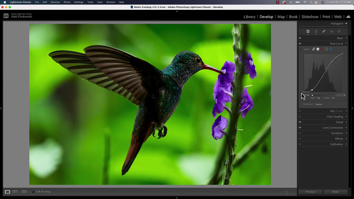
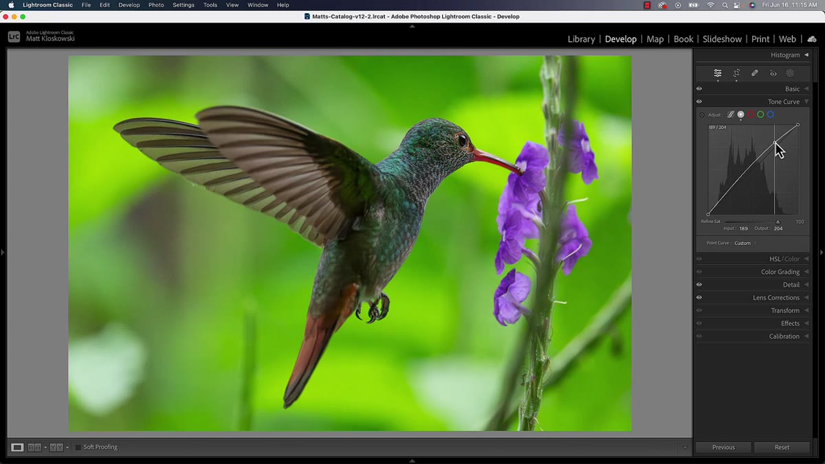 Curve being adjusted with shadow point pulled down
This is where the problem gets introduced, so it’s important to actually recreate it. Pull the lower-left anchor point of the curve downward to deepen the blacks and add contrast in the shadows. This is a completely normal, widely used adjustment - boosting highlights and midtones slightly, pulling shadows down. The tonal result can look great. The color result, especially in areas with strong greens or other saturated hues, often looks cooked.
Curve being adjusted with shadow point pulled down
This is where the problem gets introduced, so it’s important to actually recreate it. Pull the lower-left anchor point of the curve downward to deepen the blacks and add contrast in the shadows. This is a completely normal, widely used adjustment - boosting highlights and midtones slightly, pulling shadows down. The tonal result can look great. The color result, especially in areas with strong greens or other saturated hues, often looks cooked.
What’s happening physically is that increasing contrast this way also increases color saturation as a byproduct. It’s not a bug exactly - it’s just how RGB curves math works. The shadows get richer in tone and in chroma simultaneously. For some images that’s fine. For others, especially landscapes with heavy foliage or portraits with complex skin tones, it becomes a real problem fast.
Step 4: Observe the Over-Saturation Problem
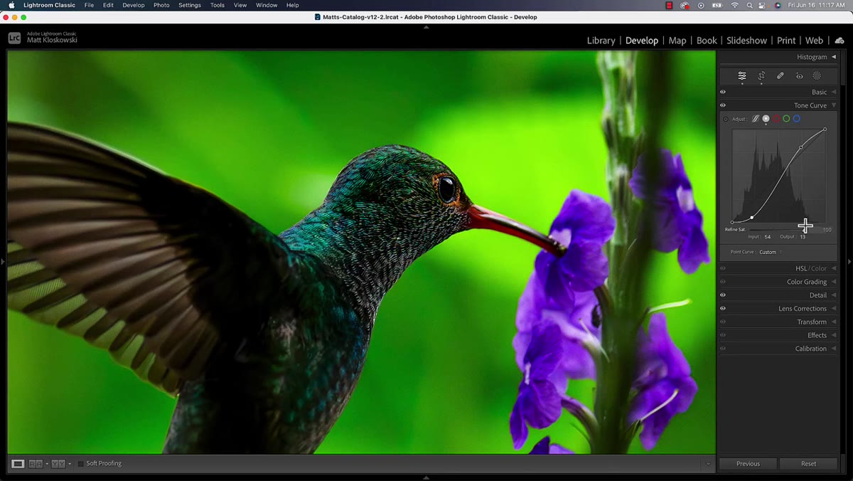
 Zoomed-in view showing oversaturated greens and purples
Zoom in to around 100% so you can actually see what the curve is doing to your colors. In the tutorial, Matt zooms into a section of the image where greens and purples sit next to each other - a classic trouble zone. The greens in particular go lurid in a way that no amount of “that’s my style” can justify. This step isn’t just instructional theater. You genuinely need to train your eye to spot this problem, because at a zoomed-out view it can read as “vibrant” rather than “wrong.”
Zoomed-in view showing oversaturated greens and purples
Zoom in to around 100% so you can actually see what the curve is doing to your colors. In the tutorial, Matt zooms into a section of the image where greens and purples sit next to each other - a classic trouble zone. The greens in particular go lurid in a way that no amount of “that’s my style” can justify. This step isn’t just instructional theater. You genuinely need to train your eye to spot this problem, because at a zoomed-out view it can read as “vibrant” rather than “wrong.”
Step 5: Locate the Refine Saturation Slider
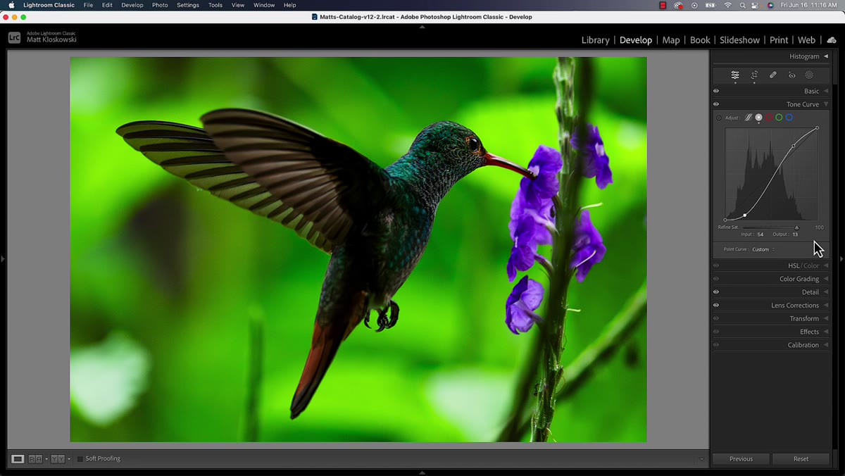 Refine Saturation slider visible below the Tone Curve
Once you’ve made your curve adjustment, look below the curve graph in the panel. The Refine Saturation slider is new to this version and appears directly in the Tone Curve section. It’s not inside HSL, it’s not in Color Grading - it lives right with the curve itself, which makes sense because it’s designed to counteract a side effect of the curve you just made.
Refine Saturation slider visible below the Tone Curve
Once you’ve made your curve adjustment, look below the curve graph in the panel. The Refine Saturation slider is new to this version and appears directly in the Tone Curve section. It’s not inside HSL, it’s not in Color Grading - it lives right with the curve itself, which makes sense because it’s designed to counteract a side effect of the curve you just made.
The slider ranges from 0 to 100. At zero, you see the full saturation impact of the curve. At 100, the saturation effect of the curve is heavily suppressed. Matt demonstrates this by toggling it between the two extremes so you can see exactly what it controls - the color intensity that the curve introduces, without affecting the tonal adjustment itself.
Step 6: Dial In the Refine Saturation to Taste
 Slider being adjusted to balance saturation
Drag the Refine Saturation slider upward until the colors in the affected areas look natural again. You’re not going for zero color impact - you’re going for the saturation level you’d want if you’d made that tonal adjustment in a way that didn’t drag color along with it. For most images, you won’t need to push this to 100. Something in the 30-70 range tends to be where it clicks into place.
Slider being adjusted to balance saturation
Drag the Refine Saturation slider upward until the colors in the affected areas look natural again. You’re not going for zero color impact - you’re going for the saturation level you’d want if you’d made that tonal adjustment in a way that didn’t drag color along with it. For most images, you won’t need to push this to 100. Something in the 30-70 range tends to be where it clicks into place.
The key thing Matt emphasizes is that this lets you keep your black point exactly where you set it. You’re not compromising the curve to fix the color. You’re fixing the color independently of the curve. That’s the actual win here.
A Note From Someone Who Over-Saturates Everything
I’ve had a long and embarrassing relationship with over-saturated edits. Early in my freelance work I thought pumping saturation was just “making the colors pop,” which, sure, technically, but also you can pop colors right off a cliff. The move I used to use in Photoshop was setting a Curves layer to Luminosity blend mode, which strips out the color impact entirely and only applies the tonal change. It works well but it’s a Photoshop-only trick and not everyone lives in Photoshop.
This Refine Saturation slider is more nuanced than the Luminosity blend mode approach because it’s a spectrum rather than a binary on/off. You might actually want some of the saturation the curve adds - just not all of it. Having a slider means you can find that exact point rather than choosing between full color impact or none. For landscapes especially, where I’m often pushing contrast pretty hard, this is the kind of control that makes the editing feel less like a negotiation between things you can’t fully control.
The single most important thing to take away from this tutorial is simple: when your Curves adjustment makes your colors look overcooked, you no longer have to choose between the tones you want and the colors you want. The Refine Saturation slider in Lightroom 12.4 and Camera Raw 15.4 handles that separation for you, cleanly, in the same panel where you made the curve.
Watch the full tutorial on YouTube - Matt runs through it with a portrait and a landscape example, and seeing the slider toggle in real time is worth three minutes of your day.
Comments (2)
Bookmarked. Coming back to this one for sure.
Applied this to my portfolio shots and the improvement is noticeable.
Leave a Comment