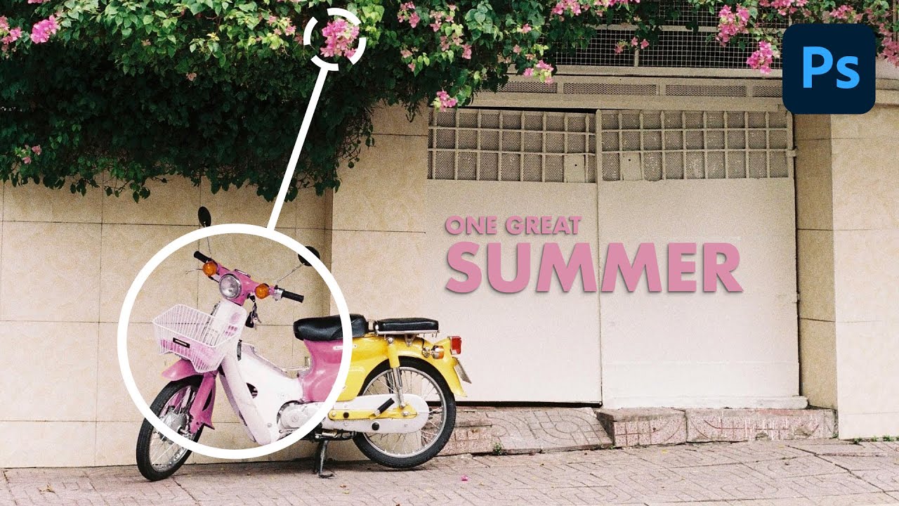
Client sends you a product photo. The widget is blue. They want it pink. You open Photoshop, grab the Brush tool, and spend forty minutes hand-painting over it like some kind of digital house painter. The result looks okay at 50% zoom and terrible at 100%. I’ve been there more times than I’d like to admit, and for a while I thought that was just the job. Turns out there’s a smarter way, and it takes about five minutes once you know the workflow.
In this Aaron Nace (PHLEARN) tutorial, Watch the full tutorial on YouTube, Aaron walks through how to match the color of a yellow moped to a set of pink flowers in the same scene. It’s a deceptively simple use case that hides a genuinely useful technique: combining the Object Selection tool, a masked Hue/Saturation adjustment layer, and a scrappy little color reference trick that I immediately started using in client work. The whole thing is non-destructive, editable, and fast.
The real reason this matters isn’t just the moped. It’s every time a client wants a product in a different colorway, or you’re building a composite and one element reads as a completely different color temperature than everything else. Color harmony is the difference between a design that feels intentional and one that looks assembled from mismatched stock photos. This workflow gives you a repeatable way to close that gap.
Step 1: Select Your Object with the Object Selection Tool
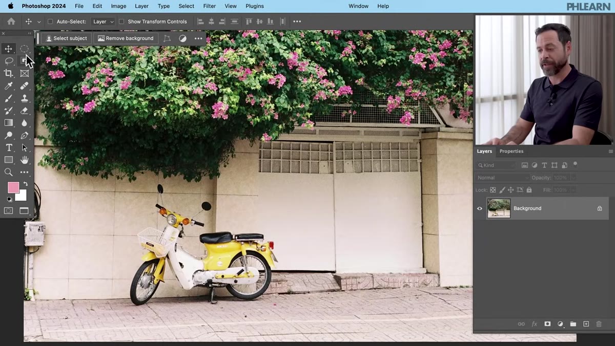 Object Selection tool highlighted in Photoshop toolbar
Hit W to grab the Object Selection tool, which lives in the toolbar nested alongside the Quick Selection tool and the Magic Wand. This is one of those tools that feels like cheating the first time you use it. Hover over the object you want to select and Photoshop’s AI engine will outline it automatically. Click, and you’ve got a working selection. For something like a vehicle or a distinct product with clear edges, it tends to nail it on the first try. If your selection needs cleanup, use the Quick Selection tool to paint in any missed areas or hold Alt/Option and paint to subtract.
Object Selection tool highlighted in Photoshop toolbar
Hit W to grab the Object Selection tool, which lives in the toolbar nested alongside the Quick Selection tool and the Magic Wand. This is one of those tools that feels like cheating the first time you use it. Hover over the object you want to select and Photoshop’s AI engine will outline it automatically. Click, and you’ve got a working selection. For something like a vehicle or a distinct product with clear edges, it tends to nail it on the first try. If your selection needs cleanup, use the Quick Selection tool to paint in any missed areas or hold Alt/Option and paint to subtract.
The quality of your selection here matters more than you’d think. A sloppy selection means your color change bleeds into the background or misses sections of the object. Take an extra thirty seconds to zoom in and verify the selection edges before moving on.
Step 2: Create a Hue/Saturation Adjustment Layer
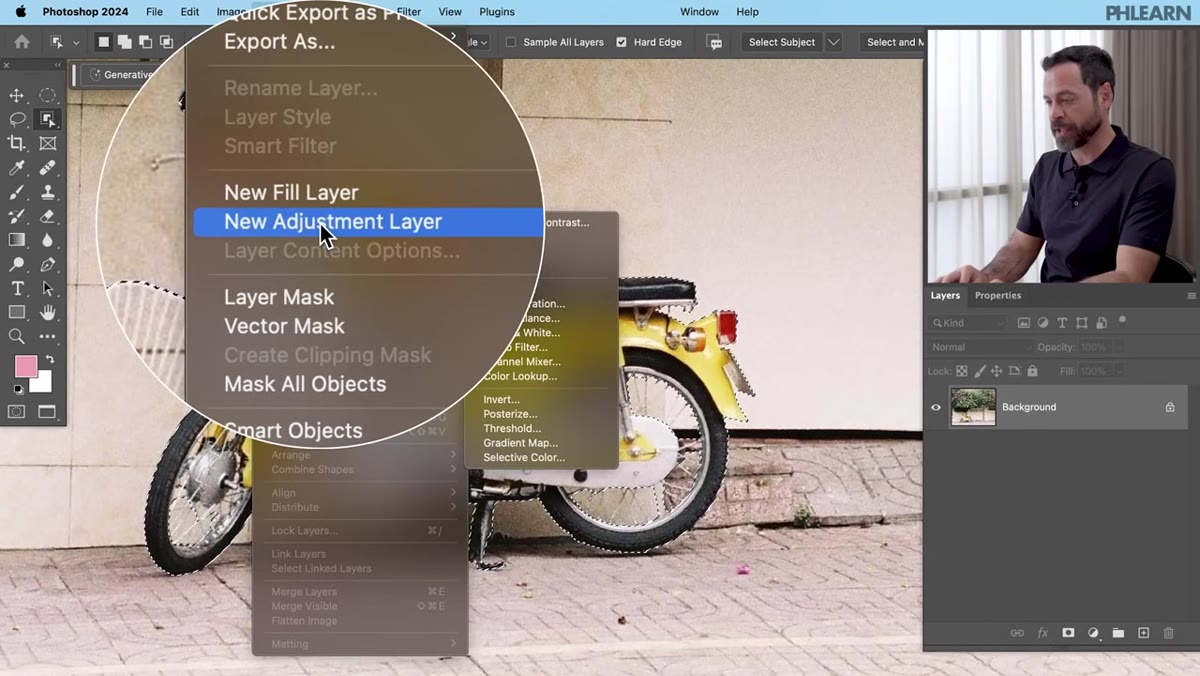 New Hue/Saturation adjustment layer added in Layers panel
With your selection active, go to Layer > New Adjustment Layer > Hue/Saturation. Here’s the part that saves you a step: because you had an active selection when you created the adjustment layer, Photoshop automatically loads that selection as the layer mask. You’ll see a black-and-white mask thumbnail in your Layers panel where the white area is exactly the shape of your object. The adjustment will only affect that region. No clipping masks, no manual masking required.
New Hue/Saturation adjustment layer added in Layers panel
With your selection active, go to Layer > New Adjustment Layer > Hue/Saturation. Here’s the part that saves you a step: because you had an active selection when you created the adjustment layer, Photoshop automatically loads that selection as the layer mask. You’ll see a black-and-white mask thumbnail in your Layers panel where the white area is exactly the shape of your object. The adjustment will only affect that region. No clipping masks, no manual masking required.
This is why adjustment layers are worth understanding deeply. They’re non-destructive, they’re maskable, and they respect whatever selection you had active at the time of creation. If you ever want to revisit the color change later, you just double-click the adjustment layer and tweak. Nothing is baked in.
Step 3: Target Only the Relevant Color Channel
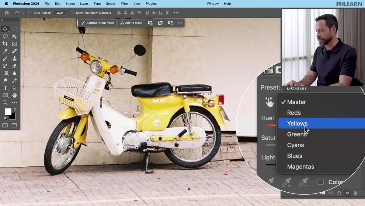 Hue/Saturation properties panel with Yellows channel selected
Open the Properties panel for your Hue/Saturation layer. By default it’s set to Master, which means any hue shift you apply will hit every color in the affected area. That’s usually not what you want. A moped isn’t pure yellow from bumper to bumper. There’s a red tail light, maybe some chrome, some shadow tones. If you shift Master, all of those shift too.
Hue/Saturation properties panel with Yellows channel selected
Open the Properties panel for your Hue/Saturation layer. By default it’s set to Master, which means any hue shift you apply will hit every color in the affected area. That’s usually not what you want. A moped isn’t pure yellow from bumper to bumper. There’s a red tail light, maybe some chrome, some shadow tones. If you shift Master, all of those shift too.
Drop the channel selector down from Master to the color that dominates your object. In this case, Yellows. Then use the eyedropper icon inside the Properties panel to click directly on the specific yellow area of the moped in the canvas. That samples the exact shade and fine-tunes which range of yellows the adjustment will target. Now when you move the Hue slider, only those yellows respond.
Step 4: Drag the Hue Slider to Rough in the New Color
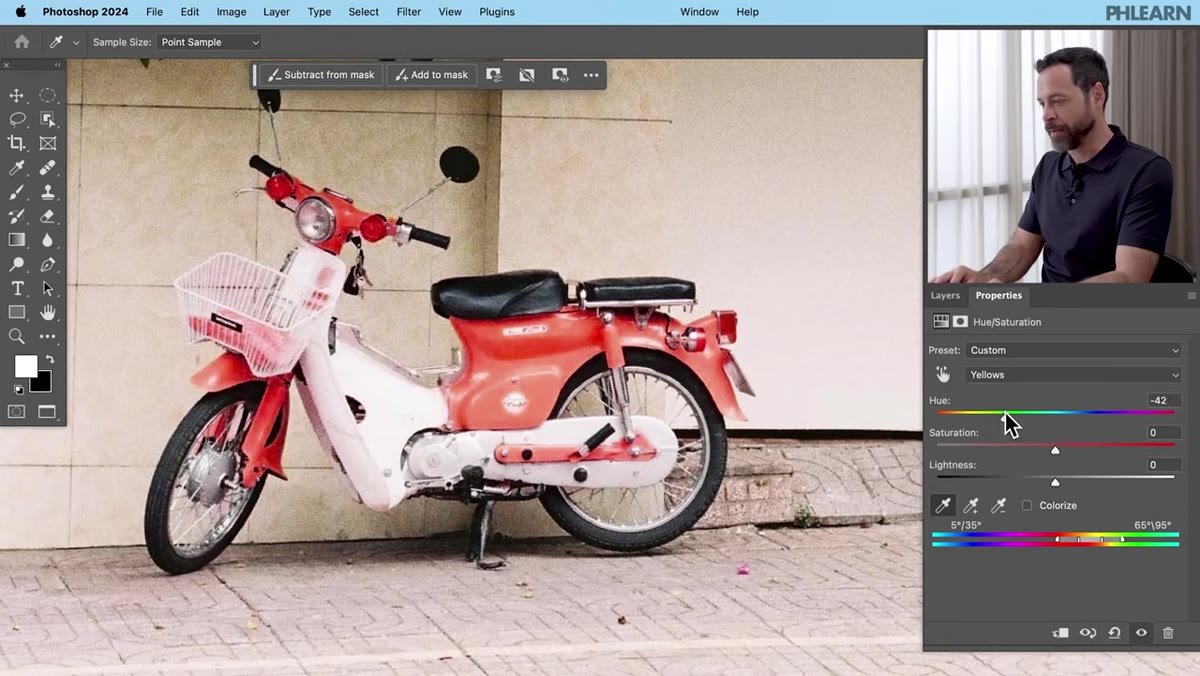 Hue slider being dragged, moped color changing in real time
This is the satisfying part. Click and drag the Hue slider left or right and watch the object’s color shift in real time. You’re rotating around the color wheel, so dragging far enough will take yellow all the way through green, cyan, blue, magenta, and red before looping back. For a yellow-to-pink shift you’ll drag to the right, past the greens, into the pinks and magentas.
Hue slider being dragged, moped color changing in real time
This is the satisfying part. Click and drag the Hue slider left or right and watch the object’s color shift in real time. You’re rotating around the color wheel, so dragging far enough will take yellow all the way through green, cyan, blue, magenta, and red before looping back. For a yellow-to-pink shift you’ll drag to the right, past the greens, into the pinks and magentas.
Get it in the general neighborhood of your target color. Don’t obsess about precision here because the next step is specifically about dialing that in more accurately. A rough match is fine for now.
Step 5: Build a Color Reference Swatch on a New Layer
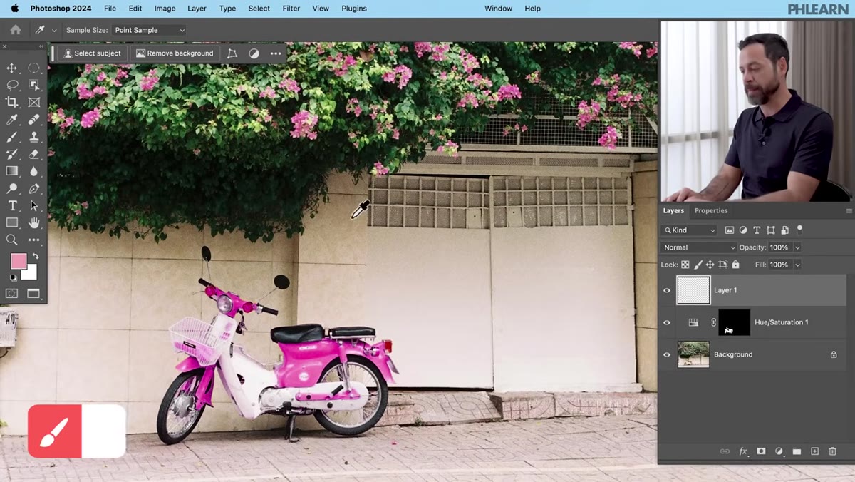 Color swatches painted on new layer next to the moped
This is the trick I immediately added to my own workflow. Create a new blank layer, hit B for the Brush tool, then hold Alt (Windows) or Option (Mac) to temporarily switch to the eyedropper. Sample a few different tones from your target color source, then paint rough splotches on the blank layer right next to the object you’re recoloring.
Color swatches painted on new layer next to the moped
This is the trick I immediately added to my own workflow. Create a new blank layer, hit B for the Brush tool, then hold Alt (Windows) or Option (Mac) to temporarily switch to the eyedropper. Sample a few different tones from your target color source, then paint rough splotches on the blank layer right next to the object you’re recoloring.
The point is proximity. Instead of flicking your eyes across the entire canvas to compare your recolored object against small, distant flowers, you now have a chunky color reference sitting right alongside it. It’s the visual equivalent of holding a paint chip up to a wall. Your eyes compare colors much more reliably when they’re close together. Delete the layer when you’re done.
Step 6: Fine-Tune Hue and Saturation Against Your Reference
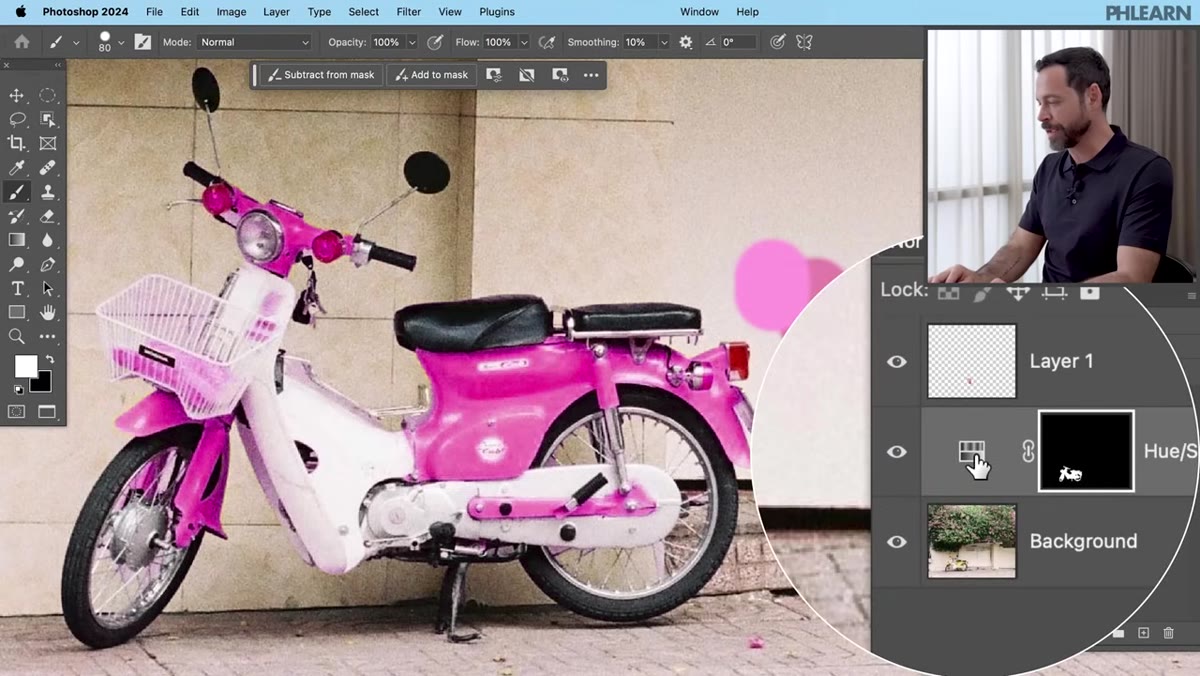 Hue and Saturation sliders being adjusted with color swatches visible
Go back to your Hue/Saturation adjustment layer, confirm you’re still on the correct channel (Yellows, in this case), and now use your painted swatches as a guide to refine the Hue slider position. You’ll likely find you were slightly off in one direction. Nudge it until it reads as a convincing match.
Hue and Saturation sliders being adjusted with color swatches visible
Go back to your Hue/Saturation adjustment layer, confirm you’re still on the correct channel (Yellows, in this case), and now use your painted swatches as a guide to refine the Hue slider position. You’ll likely find you were slightly off in one direction. Nudge it until it reads as a convincing match.
Then bring the Saturation slider down a touch. Real-world objects rarely look as punchy as a fully saturated color adjustment, and pulling saturation back slightly usually makes the result feel more photographic and less like a Hue/Saturation adjustment layer, which is the goal.
A Note on Lighting and Realism
Getting the hue right is step one. The thing that tends to trip people up, myself included, is ignoring the lightness variation across the object. A moped has highlights, shadows, and midtones. If your reference color is a single flat pink, the adjustment will technically match the midtones but the highlights might read as washed out and the shadows might look off. For jobs where accuracy matters, I’ll sometimes add a second Hue/Saturation layer targeting just the lighter or darker range of the same color, or I’ll bring in a Color Balance adjustment to nudge the shadows and highlights separately. It adds maybe three minutes and the result looks significantly more convincing.
The other thing worth testing is blend modes. If you ever need to match a color under tricky lighting, try setting your adjustment layer to Color blend mode instead of Normal. It preserves the original luminosity of the object and only swaps the hue and saturation, which can look far more natural in complex lighting situations.
Color matching doesn’t have to be a grind. A clean selection, a masked Hue/Saturation layer, and a quick color reference swatch will get you 90% of the way there in a fraction of the time. Watch the full tutorial on YouTube to see Aaron walk through the whole thing live, especially if you want to see how the Object Selection tool handles a complex subject in one click.
Comments (1)
Just subscribed. If the rest of your content is this good, I'm in.
Leave a Comment