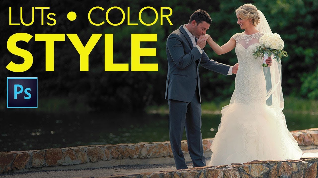
There’s a specific kind of frustration that hits when you find a color effect you love, apply it to a photo, and watch the highlights completely blow out. The vibe you wanted is there, buried under a contrast spike that makes your image look like it was shot through a car windshield at noon. I’ve been there more times than I want to admit, usually sitting in a coffee shop trying to color grade a batch of photos while my third Americano goes cold. The fix, it turns out, was sitting in the Layers panel the whole time.
In this Matt Kloskowski tutorial, Matt covers two things: Color Lookup Tables as a fast, practical tool for styling and color toning photos, and a specific blend mode trick that makes those LUTs play nicely with your image instead of bulldozing the exposure. I’d used LUTs before but always written them off when they got too aggressive. Turns out I was just using them wrong.
Step 1: Open the Adjustments Panel and Find Color Lookup
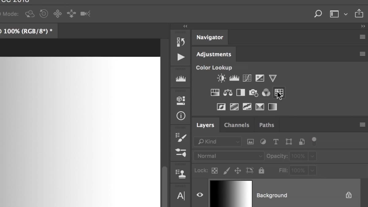 Adjustments panel open with Color Lookup icon highlighted
Go to Window, then Adjustments to open the Adjustments panel if it isn’t already visible. Inside, you’re looking for the Color Lookup icon, which looks like a small grid. Click it. This adds a Color Lookup adjustment layer directly above your current layer, non-destructively, which means you can turn it on and off or swap the LUT at any point without touching the original image.
Adjustments panel open with Color Lookup icon highlighted
Go to Window, then Adjustments to open the Adjustments panel if it isn’t already visible. Inside, you’re looking for the Color Lookup icon, which looks like a small grid. Click it. This adds a Color Lookup adjustment layer directly above your current layer, non-destructively, which means you can turn it on and off or swap the LUT at any point without touching the original image.
This is already better than the “flatten and apply” workflow I used to run when I first started freelancing. Adjustment layers are your friend. Burn that into your brain.
Step 2: Choose a LUT - Matt’s Pick is “Crisp Warm”
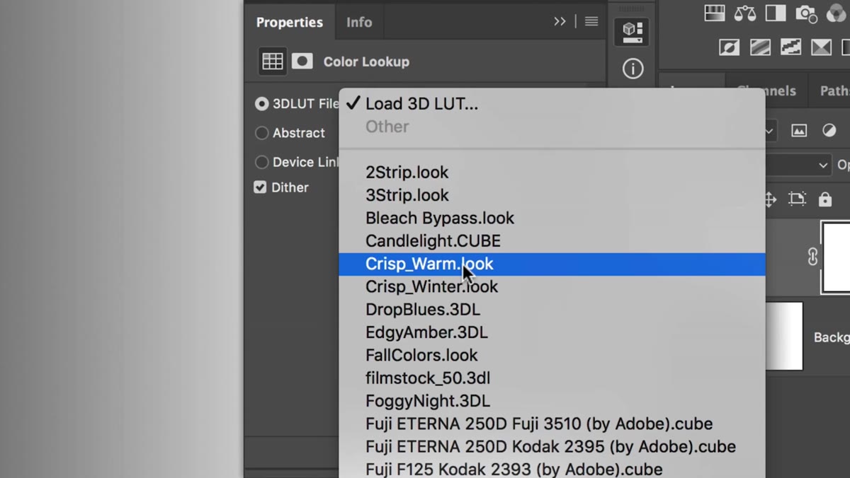 Color Lookup properties panel showing 3DLUT File dropdown menu
In the Color Lookup properties panel, click the dropdown under “3D LUT File” and scroll through the options. There are a lot of them, and yes, most of them sound like rejected perfume names. Matt’s go-to here is “Crisp Warm,” and it’s a solid choice for portraits and lifestyle photography. It pulls the midtones toward a warm golden tone that looks flattering on skin and gives outdoor shots a golden-hour feel even when the actual lighting was closer to “overcast Tuesday.”
Color Lookup properties panel showing 3DLUT File dropdown menu
In the Color Lookup properties panel, click the dropdown under “3D LUT File” and scroll through the options. There are a lot of them, and yes, most of them sound like rejected perfume names. Matt’s go-to here is “Crisp Warm,” and it’s a solid choice for portraits and lifestyle photography. It pulls the midtones toward a warm golden tone that looks flattering on skin and gives outdoor shots a golden-hour feel even when the actual lighting was closer to “overcast Tuesday.”
Try a few presets before you commit. Moonlight, FoggyNight, and Kodak options are all worth a look depending on your subject. The point is that these are starting points, not final answers.
Step 3: Notice What the LUT Is Actually Doing to Your Image
 Before/after comparison showing blown highlights and crushed shadows
Before you do anything else, toggle the adjustment layer on and off a few times and actually look at what changes. Pay specific attention to your highlights and your shadows. In Matt’s demo, the Crisp Warm LUT does a nice job with color tone but also pushes the highlights much brighter and deepens the shadows significantly. The image gets more contrasty, sometimes too contrasty.
Before/after comparison showing blown highlights and crushed shadows
Before you do anything else, toggle the adjustment layer on and off a few times and actually look at what changes. Pay specific attention to your highlights and your shadows. In Matt’s demo, the Crisp Warm LUT does a nice job with color tone but also pushes the highlights much brighter and deepens the shadows significantly. The image gets more contrasty, sometimes too contrasty.
Whether that bothers you depends on your style. But if you’re working with photos that already have strong contrast, or you want a lighter, airier feel, that extra punch is going to fight you. That’s the problem this next step solves.
Step 4: Change the Blend Mode of the Adjustment Layer to “Color”
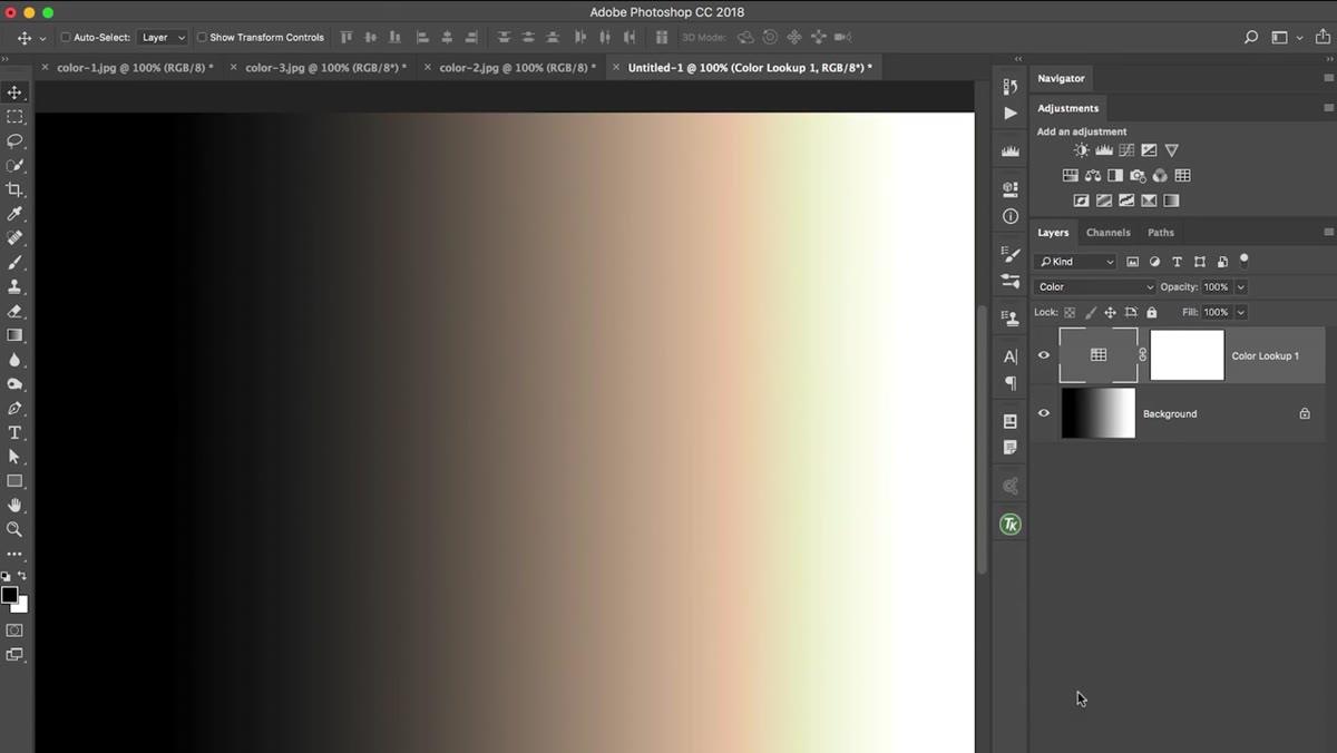 Layers panel showing blend mode dropdown switching to Color
With the Color Lookup adjustment layer selected, go to the blend mode dropdown at the top left of the Layers panel. It defaults to “Normal.” Click it and choose “Color” from the list. It’s in the middle grouping of blend modes.
Layers panel showing blend mode dropdown switching to Color
With the Color Lookup adjustment layer selected, go to the blend mode dropdown at the top left of the Layers panel. It defaults to “Normal.” Click it and choose “Color” from the list. It’s in the middle grouping of blend modes.
Here’s what that does in plain language: the Color blend mode tells Photoshop to take the hue and saturation information from the adjustment layer and apply it to the image, while completely ignoring luminosity. No changes to brightness, no changes to contrast, no changes to shadow depth or highlight intensity. Just the color. The exposure you spent time dialing in stays exactly where you left it, and the LUT’s color character gets layered on top cleanly.
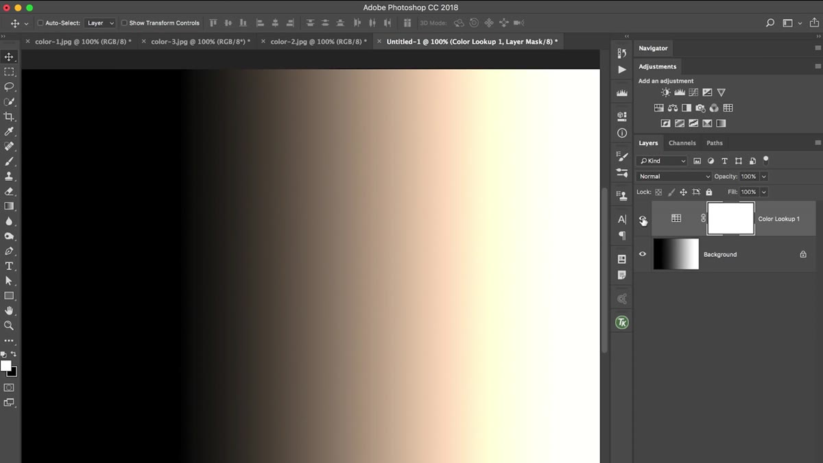
Step 5: Toggle the Layer On and Off to Compare
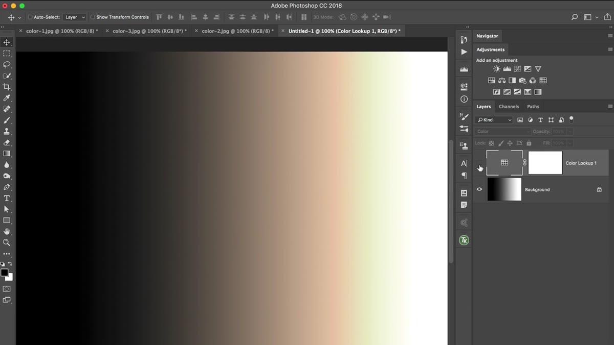 Layer visibility being toggled to show color-only change
Click the eye icon next to the adjustment layer to toggle it on and off. What you’re looking for now is a comparison where the structure and brightness of the image stays identical, and only the color tone shifts. If you’re seeing brightness changes when you toggle, double-check that your blend mode is set to Color and not something like Soft Light or Overlay.
Layer visibility being toggled to show color-only change
Click the eye icon next to the adjustment layer to toggle it on and off. What you’re looking for now is a comparison where the structure and brightness of the image stays identical, and only the color tone shifts. If you’re seeing brightness changes when you toggle, double-check that your blend mode is set to Color and not something like Soft Light or Overlay.
In Matt’s example, the before-and-after with Color mode active shows a clean, controlled warm shift across the midtones with the highlights staying crisp and the shadows holding their detail. That’s exactly what you want: flavor without collateral damage.
Step 6: Adjust Opacity to Dial in the Intensity
 Layers panel with opacity slider being adjusted on Color Lookup layer
If the effect feels too strong even in Color mode, the opacity slider on that adjustment layer is your best friend. Pull it down to somewhere between 50 and 80 percent and the color toning becomes more of a suggestion than a statement. This is especially useful for portraits where skin tones can shift in a way that reads as unnatural if the LUT is running at full strength.
Layers panel with opacity slider being adjusted on Color Lookup layer
If the effect feels too strong even in Color mode, the opacity slider on that adjustment layer is your best friend. Pull it down to somewhere between 50 and 80 percent and the color toning becomes more of a suggestion than a statement. This is especially useful for portraits where skin tones can shift in a way that reads as unnatural if the LUT is running at full strength.
This two-step combination, Color blend mode plus reduced opacity, gives you a ridiculous amount of control over something that used to feel all-or-nothing to me. One adjustment layer, two settings, done in about thirty seconds.
What I’d Add From My Own Experience
The first time I used LUTs seriously I applied them at full Normal opacity and then spent twenty minutes manually trying to claw back the exposure with additional adjustment layers. Classic overcorrection behavior. The Color blend mode eliminates that whole detour.
One thing Matt doesn’t dig into here but is worth knowing: this exact blend mode trick works on any adjustment layer, not just Color Lookup. Got a Color Balance layer that’s shifting your blacks? Throw it in Color mode. Using a Gradient Map for a stylized tone? Same move. The principle generalizes. Once you understand that Color mode strips out the luminosity component of whatever you’re applying, you can use it as a safety net for any tonal adjustment that’s getting too heavy-handed. I now run most of my stylistic adjustment layers in Color mode and then push the opacity up until the effect earns its keep.
The single most useful thing this tutorial showed me is that the blend mode on an adjustment layer isn’t just a creative option, it’s a precision tool. “Normal” is the default, not the correct setting. Changing an adjustment layer to Color mode is how you add a color grade without accidentally becoming your own worst enemy in the process.
Watch the full tutorial on YouTube to see Matt walk through both the LUT selection and the blend mode trick on an actual photo. Worth the ten minutes.
Comments (3)
Finally someone explains this in a way that actually makes sense.
This saved me so much time on my last edit. Wish I'd found this sooner.
Would love to see a follow-up going deeper into this topic.
Leave a Comment