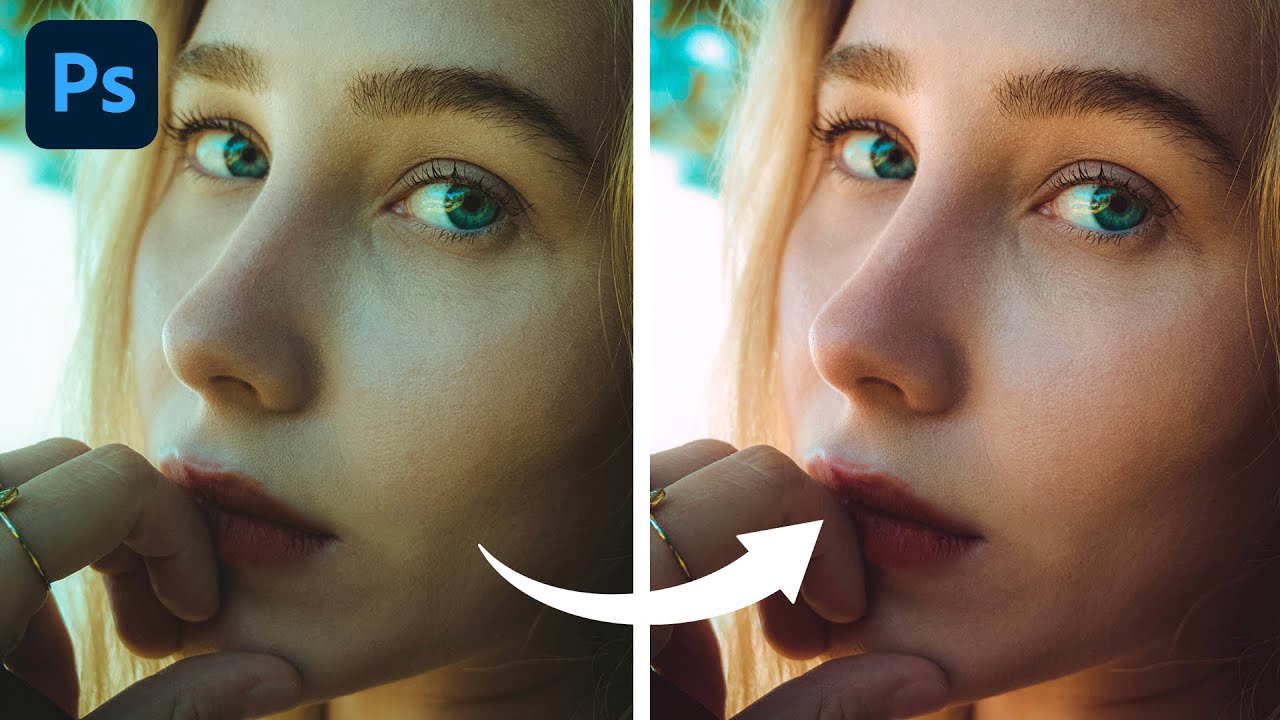
There’s a particular kind of frustration that comes from delivering a portrait to a client and having them come back with “something looks a little off with the skin tones.” You squint at it. You zoom in. You compare it to the original. And then you see it: a subtle green cast, or a magenta tint, or some muddy yellow lurking in the shadows that’s making your subject look vaguely unwell. I’ve been there more times than I’d like to admit, usually sitting in a coffee shop with my laptop brightness cranked up and absolutely no idea whether the problem is the photo or the screen.
Color correction in portraiture is one of those skills that sounds scarier than it is, and I found a tutorial that cuts straight through the noise. In this Aaron Nace (PHLEARN) tutorial, Aaron walks through four real portrait examples using a single tool: the Color Balance adjustment layer. No curves wizardry, no Hue/Saturation rabbit holes. Just a focused, repeatable workflow that actually works. Watch the full tutorial on YouTube if you want to follow along with the source images, or work through the steps below with any portrait you have handy.
The thing I appreciated most about Aaron’s approach is that it’s built around your eyes, not your sliders. That sounds obvious until you realize how often most of us stare at numbers and values instead of the actual image. Let’s get into it.
Step 1: Open Your Portrait and Create a Color Balance Adjustment Layer
 Color Balance selected in the New Adjustment Layer menu
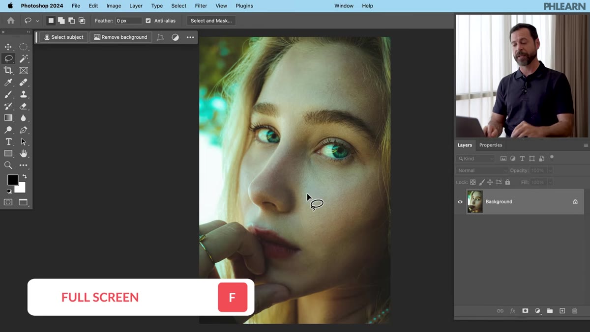
With your portrait open in Photoshop, go to Layer > New Adjustment Layer > Color Balance and click OK. This drops a non-destructive adjustment layer above your image, which means you’re not touching your original pixels at all. The Color Balance properties panel will open automatically. If it doesn’t, double-click the layer thumbnail to bring it up. This one layer is going to do all the heavy lifting for your color correction.
Color Balance selected in the New Adjustment Layer menu
With your portrait open in Photoshop, go to Layer > New Adjustment Layer > Color Balance and click OK. This drops a non-destructive adjustment layer above your image, which means you’re not touching your original pixels at all. The Color Balance properties panel will open automatically. If it doesn’t, double-click the layer thumbnail to bring it up. This one layer is going to do all the heavy lifting for your color correction.
Step 2: Start With Highlights
 Highlights selected in Color Balance properties panel
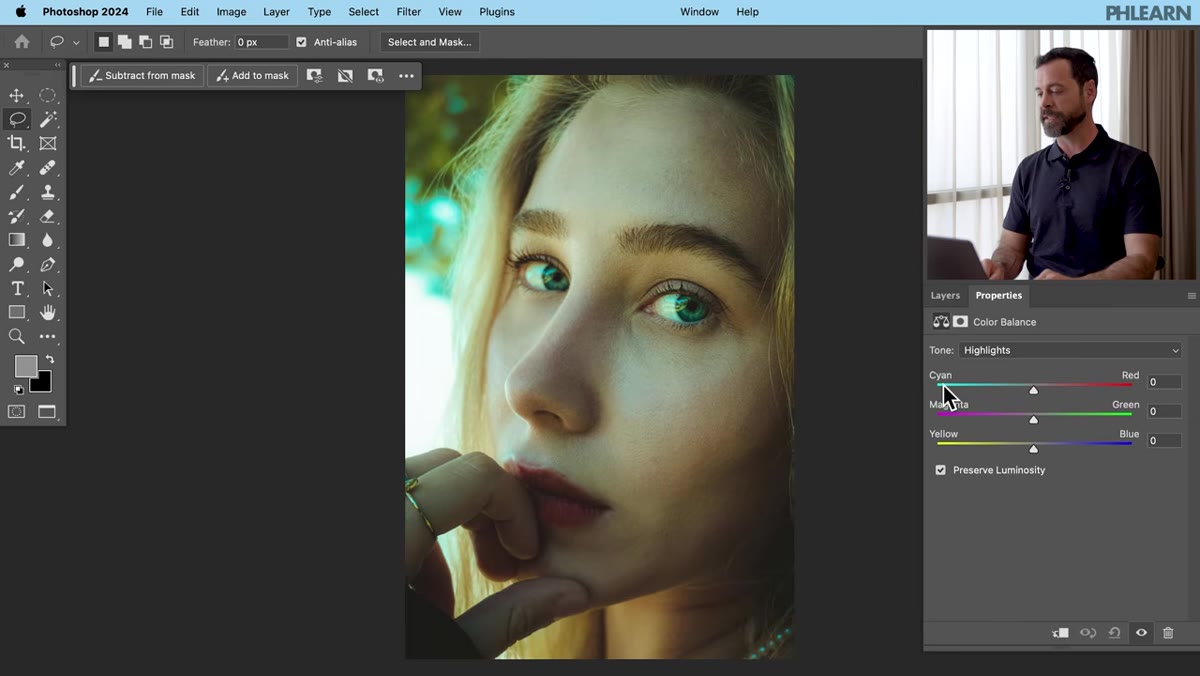
In the Properties panel, you’ll see a dropdown that lets you choose between Shadows, Midtones, and Highlights. Start with Highlights. Aaron’s reasoning here is solid: highlights in a portrait, especially on skin, tend to reveal color casts most clearly because they’re the brightest and most visible areas. You’ll see three sliders: Cyan/Red, Magenta/Green, and Yellow/Blue. Don’t touch them yet.
Highlights selected in Color Balance properties panel
In the Properties panel, you’ll see a dropdown that lets you choose between Shadows, Midtones, and Highlights. Start with Highlights. Aaron’s reasoning here is solid: highlights in a portrait, especially on skin, tend to reveal color casts most clearly because they’re the brightest and most visible areas. You’ll see three sliders: Cyan/Red, Magenta/Green, and Yellow/Blue. Don’t touch them yet.
Step 3: Move the Sliders While Looking at Your Subject (Not the Numbers)
 Cyan/Red slider being dragged while subject’s skin is in focus
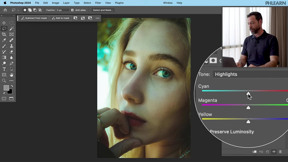
Here’s the core technique and honestly the best piece of advice in the whole tutorial: click on the Cyan/Red slider and drag it left and right slowly, but keep your eyes on your subject’s skin, not on the slider or the value readout. You’re looking for the point where the skin tone looks natural and neutral. Too far left and you’ll see a cyan wash. Too far right and everyone looks sunburned. Find that sweet spot and let go.
Cyan/Red slider being dragged while subject’s skin is in focus
Here’s the core technique and honestly the best piece of advice in the whole tutorial: click on the Cyan/Red slider and drag it left and right slowly, but keep your eyes on your subject’s skin, not on the slider or the value readout. You’re looking for the point where the skin tone looks natural and neutral. Too far left and you’ll see a cyan wash. Too far right and everyone looks sunburned. Find that sweet spot and let go.
Then do the same for the Magenta/Green slider and the Yellow/Blue slider, in that order. Each time, eyes on the subject. The values you land on will be different for every photo because every photo has a different cast. That’s fine. You’re correcting by sight, which is exactly how it should work.
Step 4: Switch to Midtones and Repeat
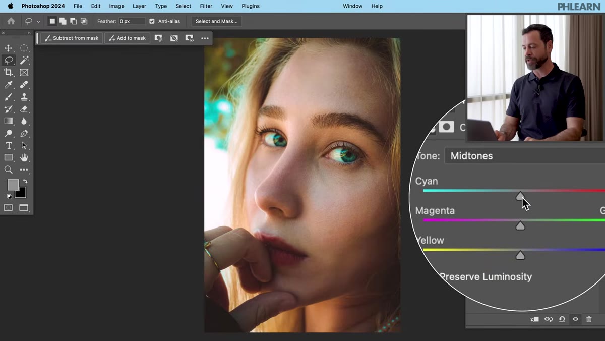 Midtones selected in Color Balance dropdown
Once you’re happy with the highlights, switch the dropdown to Midtones and run through all three sliders again using the same method. Midtones carry a lot of the color information in a portrait, especially in the face, so this pass often makes the biggest visible difference. Take your time here. The adjustments you make in midtones can shift the overall mood of the image, so if you want something warmer or cooler, this is where you’ll feel that most.
Midtones selected in Color Balance dropdown
Once you’re happy with the highlights, switch the dropdown to Midtones and run through all three sliders again using the same method. Midtones carry a lot of the color information in a portrait, especially in the face, so this pass often makes the biggest visible difference. Take your time here. The adjustments you make in midtones can shift the overall mood of the image, so if you want something warmer or cooler, this is where you’ll feel that most.
Step 5: Finish With Shadows
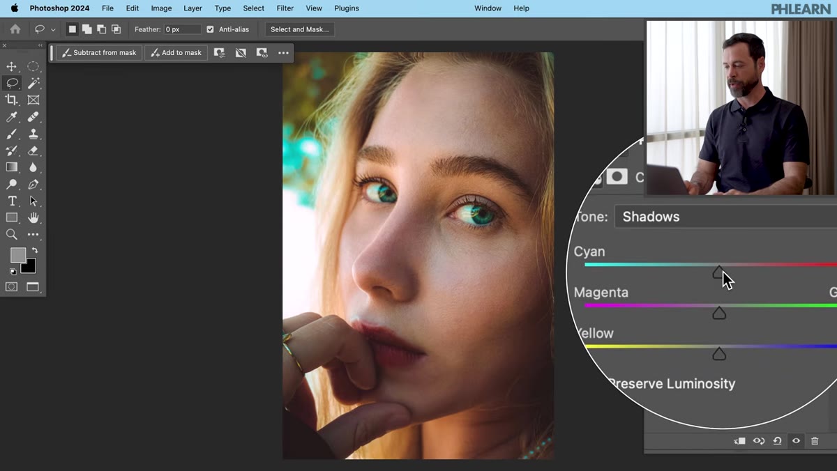 Shadows selected, cyan/red slider being adjusted
Switch to Shadows and work through the three sliders one more time. Shadows are easy to overlook in portraiture because they’re dark, but color casts in shadows can make backgrounds look weird or give your subject an unflattering underlit tint. The adjustments here are usually subtler than in highlights or midtones, but they matter. A green or blue shadow cast is surprisingly common depending on your shooting environment, especially if there was any mixed lighting involved.
Shadows selected, cyan/red slider being adjusted
Switch to Shadows and work through the three sliders one more time. Shadows are easy to overlook in portraiture because they’re dark, but color casts in shadows can make backgrounds look weird or give your subject an unflattering underlit tint. The adjustments here are usually subtler than in highlights or midtones, but they matter. A green or blue shadow cast is surprisingly common depending on your shooting environment, especially if there was any mixed lighting involved.
Step 6: Toggle the Layer On and Off to Check Your Work
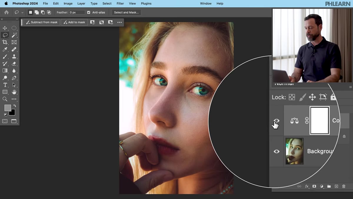 Eyeball icon toggled off and on in the Layers panel
Hit the eyeball icon on your Color Balance adjustment layer in the Layers panel to flip between your before and after. Do this a few times. Your eyes adapt quickly to whatever they’re looking at, so toggling forces a genuine comparison. If something looks overcorrected, go back to whichever tonal range is causing the problem and dial it back. Because this is a non-destructive adjustment layer, nothing you’ve done is permanent until you choose to flatten or export.
Eyeball icon toggled off and on in the Layers panel
Hit the eyeball icon on your Color Balance adjustment layer in the Layers panel to flip between your before and after. Do this a few times. Your eyes adapt quickly to whatever they’re looking at, so toggling forces a genuine comparison. If something looks overcorrected, go back to whichever tonal range is causing the problem and dial it back. Because this is a non-destructive adjustment layer, nothing you’ve done is permanent until you choose to flatten or export.
One Thing I’d Add: Watch Out for Mixed Lighting in Multiple Subjects
Aaron’s examples in the tutorial use single subjects shot in reasonably controlled lighting, which is where this workflow shines. But I’ve run into situations shooting group portraits where one person is lit by a window and another is under tungsten overhead lights, and a single Color Balance layer ends up fixing one face while making the other look worse.
If you’re in that situation, the fix is simple but adds a step: create separate Color Balance adjustment layers and use layer masks to paint corrections selectively over each subject. It’s the same technique, just applied per-region. You can use a soft brush at around 50-60% opacity on the mask to blend the transitions so you’re not creating obvious edges between your corrected zones. Takes a bit more time, but the result holds up to scrutiny much better than a one-size-fits-all global adjustment.
The single biggest takeaway from this tutorial is one you’ll want to actually practice, not just read: stop looking at your sliders and start looking at your subject. It sounds almost too simple, but it reframes the entire correction process from a technical exercise into a visual one. Your numbers don’t matter. Your subject’s skin looking right is the only metric that counts.
If portrait color has been a weak spot in your workflow, this technique is fast enough to apply on every single edit without it becoming a burden. Give it a run on a problem photo you’ve been avoiding and see how far one adjustment layer takes you.
Watch the full tutorial on YouTube to see Aaron work through all four portrait examples from start to finish.
Comments
Leave a Comment