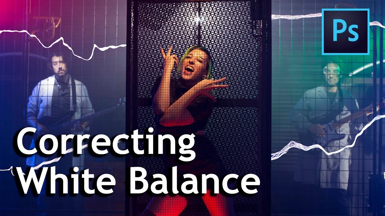
There’s a specific kind of misery that comes from getting back to your desk after a shoot, opening your RAW files, and realizing every single image has a different color cast. You shot under mixed light, you didn’t account for it, and now you’re staring down a folder of 300 photos that all need individual attention. I’ve been there more times than I’d like to admit. The fix isn’t always in Photoshop’s sliders. Sometimes it starts on set, before you ever take the camera off your shoulder.
In this Watch the full tutorial on YouTube by The Slanted Lens, photographer Jay P. Morgan breaks down a dead-simple but genuinely powerful workflow for locking in accurate color when you’re shooting under chaotic, mixed lighting conditions. The shoot itself is wild. He’s photographing a band called Arc Attack, who perform with giant Tesla coils that shoot actual lightning. There are strobes, LEDs, colored gels, shop lights, a smoke machine, and a Faraday cage. It’s basically the worst-case scenario for consistent color rendering. And his solution is elegant precisely because it’s so low-tech.
The core idea: place a color reference chart in your first frame whenever your lighting setup changes. Photograph it. Then in post, sample from it to instantly correct white balance and color for the entire sequence. No guessing. No eye-balling. Just math you never have to do yourself.
Step 1: Understand Why Mixed Lighting Kills Your White Balance
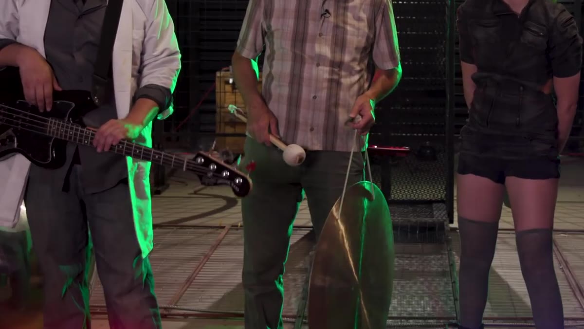 Jay explains multiple light sources creating color challenges on set
Before you even think about Photoshop, you have to appreciate what you’re actually dealing with on a complex set. Different light sources, strobes, LEDs, colored gels, practical shop lights, all emit light at different color temperatures. Your camera’s auto white balance will try to average them and fail. A custom white balance set in-camera will be accurate for one light source and wrong for everything else. When Jay describes his setup, with blue-gelled bullhorns, red and green stage lights, and bare LED shop lights all firing at once, he’s describing a situation where no single in-camera setting wins. The solution isn’t to fight this in camera. It’s to create a reliable reference point that travels with every lighting change.
Jay explains multiple light sources creating color challenges on set
Before you even think about Photoshop, you have to appreciate what you’re actually dealing with on a complex set. Different light sources, strobes, LEDs, colored gels, practical shop lights, all emit light at different color temperatures. Your camera’s auto white balance will try to average them and fail. A custom white balance set in-camera will be accurate for one light source and wrong for everything else. When Jay describes his setup, with blue-gelled bullhorns, red and green stage lights, and bare LED shop lights all firing at once, he’s describing a situation where no single in-camera setting wins. The solution isn’t to fight this in camera. It’s to create a reliable reference point that travels with every lighting change.
Step 2: Photograph the Color Chart at the Start of Each Lighting Setup
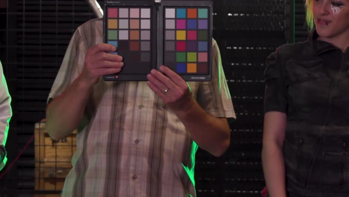 Jay places the Spydercheckr color chart into the shot
Jay uses the Datacolor Spydercheckr, a color reference chart with a range of neutral gray patches and color swatches. The brand matters less than the principle: you need a chart with known color values, especially accurate neutral grays. At the start of each new lighting configuration, you drop the chart into the frame and shoot a reference image. It needs to be lit by the same light sources hitting your subject. Don’t tuck it in a shadow, and don’t hold it at a different angle than your subject’s face or scene. You want the chart to tell you what that exact light is actually doing. One frame is all you need. Then the chart comes out, and you shoot your session normally.
Jay places the Spydercheckr color chart into the shot
Jay uses the Datacolor Spydercheckr, a color reference chart with a range of neutral gray patches and color swatches. The brand matters less than the principle: you need a chart with known color values, especially accurate neutral grays. At the start of each new lighting configuration, you drop the chart into the frame and shoot a reference image. It needs to be lit by the same light sources hitting your subject. Don’t tuck it in a shadow, and don’t hold it at a different angle than your subject’s face or scene. You want the chart to tell you what that exact light is actually doing. One frame is all you need. Then the chart comes out, and you shoot your session normally.
Step 3: Open the Reference Frame in Photoshop (or Camera Raw)
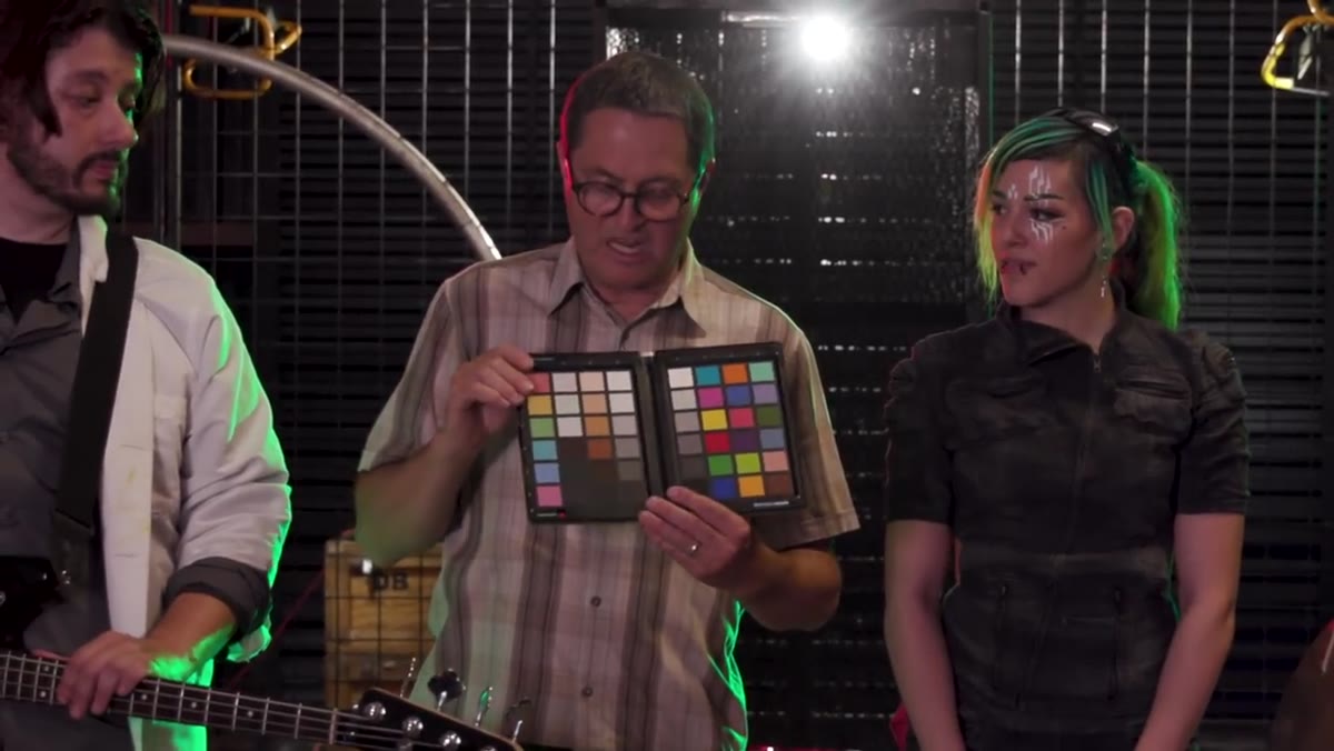 Jay discusses returning to studio and sampling the color chart
Back in post, open your reference image first. If you’re working in Camera Raw or Lightroom, this is where the real magic happens cleanly, because you can sync corrections across an entire batch. In Photoshop, you’re going to use the color chart image as your ground truth. The goal here is simple: use the neutral gray patches on the chart to tell Photoshop what “correct” color looks like, and let the software reverse-engineer the correction from there. Think of it like handing a translator a dictionary. You’re giving Photoshop something it can compare against known values.
Jay discusses returning to studio and sampling the color chart
Back in post, open your reference image first. If you’re working in Camera Raw or Lightroom, this is where the real magic happens cleanly, because you can sync corrections across an entire batch. In Photoshop, you’re going to use the color chart image as your ground truth. The goal here is simple: use the neutral gray patches on the chart to tell Photoshop what “correct” color looks like, and let the software reverse-engineer the correction from there. Think of it like handing a translator a dictionary. You’re giving Photoshop something it can compare against known values.
Step 4: Use the White Balance Eyedropper on a Neutral Gray Patch
 Sampling the color chart to establish accurate white balance
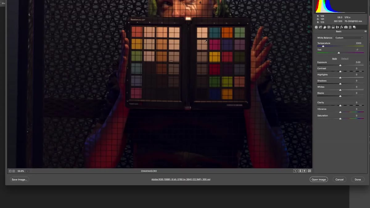
In Camera Raw, grab the White Balance tool (the eyedropper, keyboard shortcut W) and click directly on a neutral gray patch on the chart. Not the white patch, not the black one. A mid-tone neutral gray gives the tool the most accurate read. When you click, Camera Raw adjusts the Temperature and Tint sliders automatically to neutralize any color cast. If your chart has multiple gray patches, try a couple and compare. You’ll see the color temperature value shift as Camera Raw compensates for whatever the mixed lighting was actually doing to your scene. This single click is doing work that would otherwise take you five to fifteen minutes of manual slider adjustment per image.
Sampling the color chart to establish accurate white balance
In Camera Raw, grab the White Balance tool (the eyedropper, keyboard shortcut W) and click directly on a neutral gray patch on the chart. Not the white patch, not the black one. A mid-tone neutral gray gives the tool the most accurate read. When you click, Camera Raw adjusts the Temperature and Tint sliders automatically to neutralize any color cast. If your chart has multiple gray patches, try a couple and compare. You’ll see the color temperature value shift as Camera Raw compensates for whatever the mixed lighting was actually doing to your scene. This single click is doing work that would otherwise take you five to fifteen minutes of manual slider adjustment per image.
Step 5: Sync the Correction Across Your Entire Sequence
 Multiple light sources shown requiring consistent correction across shots
Here’s where the time savings stack up. Once you’ve dialed in the correction from your reference frame, select all the images shot under that same lighting setup in Camera Raw or Lightroom and sync the white balance settings across the batch. Every image from that sequence now shares the same correction. If you changed the lighting between setups (different gels, different LED colors, different practical sources), you use the reference frame you shot at the start of that new setup to generate a fresh correction, then sync that one to its own batch. You’re never correcting 300 images one at a time. You’re correcting maybe five or six lighting setups, total.
Multiple light sources shown requiring consistent correction across shots
Here’s where the time savings stack up. Once you’ve dialed in the correction from your reference frame, select all the images shot under that same lighting setup in Camera Raw or Lightroom and sync the white balance settings across the batch. Every image from that sequence now shares the same correction. If you changed the lighting between setups (different gels, different LED colors, different practical sources), you use the reference frame you shot at the start of that new setup to generate a fresh correction, then sync that one to its own batch. You’re never correcting 300 images one at a time. You’re correcting maybe five or six lighting setups, total.
Step 6: Fine-Tune in Photoshop for Individual Images if Needed
 Jay’s complex set with multiple colored light sources visible
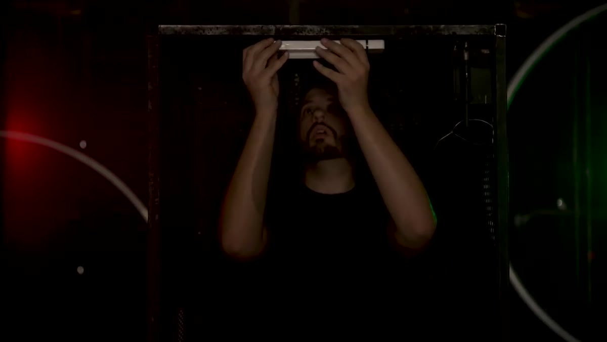
The color chart gets you 90% of the way there instantly. The remaining 10% is for images where something shifted slightly, the smoke moved, someone’s face caught a colored reflection from a gel, a strobe fired differently. For these, open the corrected file in Photoshop and use Curves or Color Balance for targeted tweaks. At this point you’re nudging, not rebuilding from scratch. The chart correction means your baseline is already accurate, so any manual adjustment is fast and doesn’t require you to trust your eye against a calibrated zero-point.
Jay’s complex set with multiple colored light sources visible
The color chart gets you 90% of the way there instantly. The remaining 10% is for images where something shifted slightly, the smoke moved, someone’s face caught a colored reflection from a gel, a strobe fired differently. For these, open the corrected file in Photoshop and use Curves or Color Balance for targeted tweaks. At this point you’re nudging, not rebuilding from scratch. The chart correction means your baseline is already accurate, so any manual adjustment is fast and doesn’t require you to trust your eye against a calibrated zero-point.
What I Do Differently With This Technique
I don’t always have a proper color chart on hand, especially when I’m doing quick-turnaround work at a coffee shop between client calls. What I’ve started doing is keeping a cheap gray card in my camera bag at all times. It’s not as robust as a full Spydercheckr with multiple swatches, but shooting a reference frame with a known neutral gives me the same basic anchor point. For any job where color fidelity actually matters, though, the full chart is worth it. The post-production time you save on a 200-image shoot will more than justify the cost of the chart within your first real job.
The single biggest lesson here is that accurate color correction isn’t about being clever in Photoshop. It’s about giving yourself a reliable reference to work from. A color chart is a physical calibration tool, and using it means your color decisions are based on fact rather than memory or guesswork. Jay shot this in one of the most visually chaotic environments you could design on purpose, and the workflow still holds up cleanly.
Watch the full tutorial on YouTube to see the full set, the Tesla coils, and the complete walkthrough from Jay P. Morgan at The Slanted Lens.
Comments
Leave a Comment