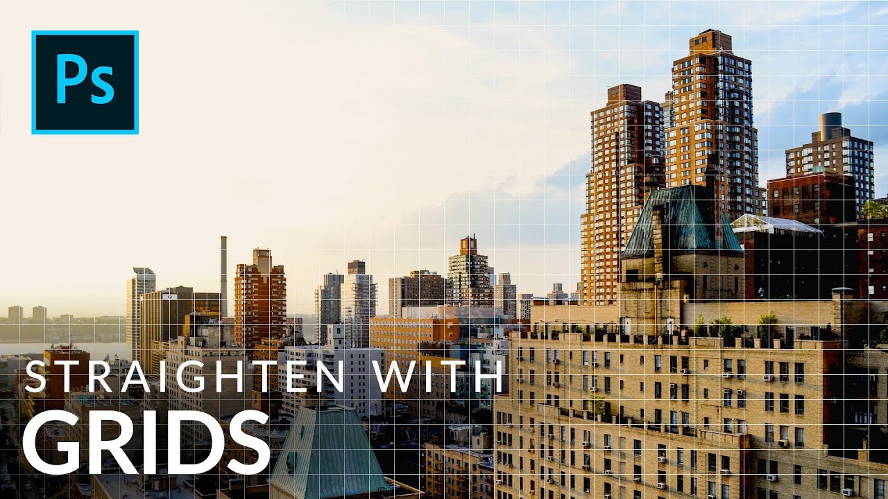
Architectural photography has this sneaky way of making you feel like everything looks fine until you slap a straight line next to it and realize your building is leaning like it lost a fight. I’ve handed off composites with slightly tilted structures more times than I’d like to admit, usually because I was eyeballing it and convinced myself it was “close enough.” Spoiler: clients notice. So when I came across this Aaron Nace (PHLEARN) tutorial on using Photoshop’s grid system to analyze and correct building lines, I sat up a little straighter in my coffee shop booth and paid attention.
Watch the full tutorial on YouTube
The core idea here is deceptively simple: before you try to fix a perspective problem, you need to actually see it clearly. Grids and guides give you objective reference lines so you’re not arguing with your own eyeballs. Aaron walks through two methods for getting those reference lines on screen, then shows how to customize them so they’re actually useful rather than visual noise. Here’s how to do it.
Step 1: Turn On Your Rulers
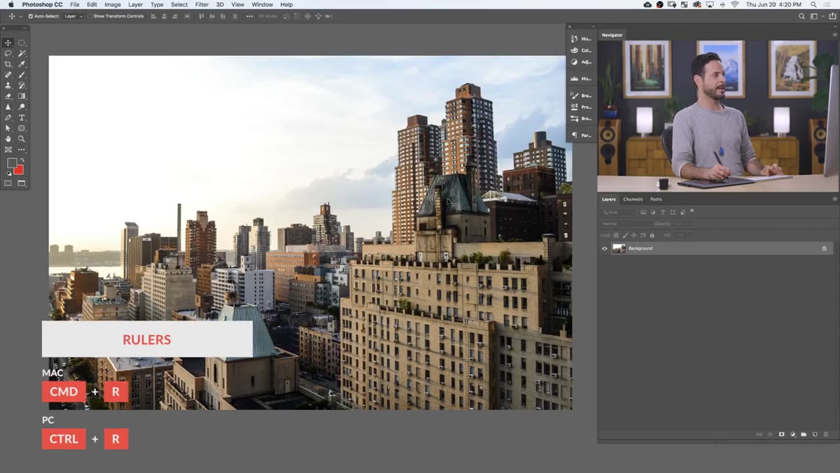 Rulers appearing along top and left edge of canvas
Hit Ctrl+R on Windows or Cmd+R on Mac. That’s it. Rulers appear along the top and left edges of your canvas, giving you a permanent anchor for everything that follows. If you’re the kind of person who has strong opinions about keyboard shortcuts (guilty), this one earns its place in muscle memory fast. The rulers themselves don’t do much on their own, but they unlock the next step.
Rulers appearing along top and left edge of canvas
Hit Ctrl+R on Windows or Cmd+R on Mac. That’s it. Rulers appear along the top and left edges of your canvas, giving you a permanent anchor for everything that follows. If you’re the kind of person who has strong opinions about keyboard shortcuts (guilty), this one earns its place in muscle memory fast. The rulers themselves don’t do much on their own, but they unlock the next step.
Step 2: Drag Out Guides to Analyze Your Lines
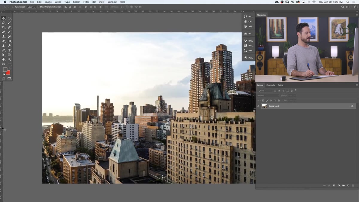 Green guide being dragged from left ruler onto canvas
Click anywhere on the left ruler and drag toward your canvas. A green guide line appears and you can position it next to any vertical element in your photo. Do the same from the top ruler for horizontal reference lines. Place a guide next to a window frame, a wall edge, a door. If that architectural element isn’t parallel to your guide, you’ve just identified your problem visually without any guesswork.
Green guide being dragged from left ruler onto canvas
Click anywhere on the left ruler and drag toward your canvas. A green guide line appears and you can position it next to any vertical element in your photo. Do the same from the top ruler for horizontal reference lines. Place a guide next to a window frame, a wall edge, a door. If that architectural element isn’t parallel to your guide, you’ve just identified your problem visually without any guesswork.
To temporarily hide the guides without deleting them, press Ctrl+H (Cmd+H on Mac). The first time you use this shortcut, Photoshop will ask whether you want to hide Photoshop or hide extras. Choose “Hide Extras.” To bring them back, press the same shortcut again. When you’re done with a guide entirely, just click and drag it back off the canvas edge and it disappears.
Step 3: Enable the Full Grid
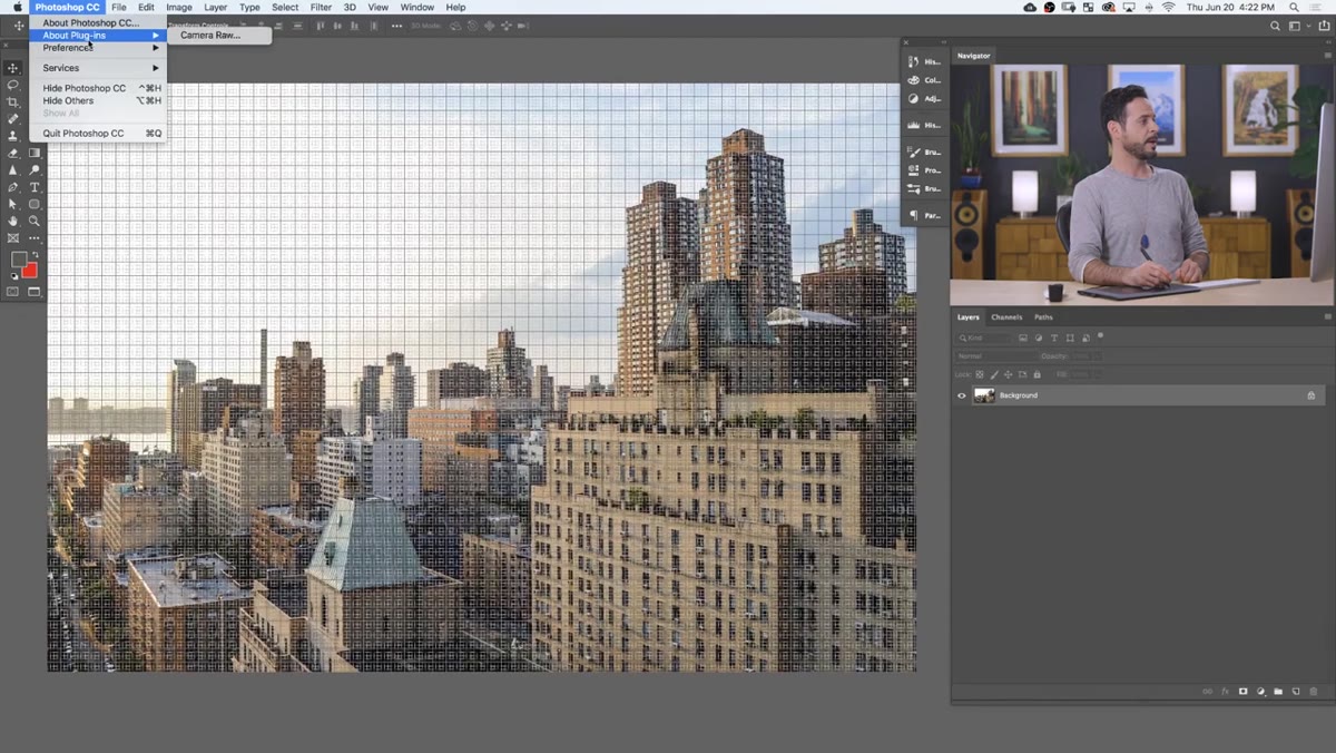
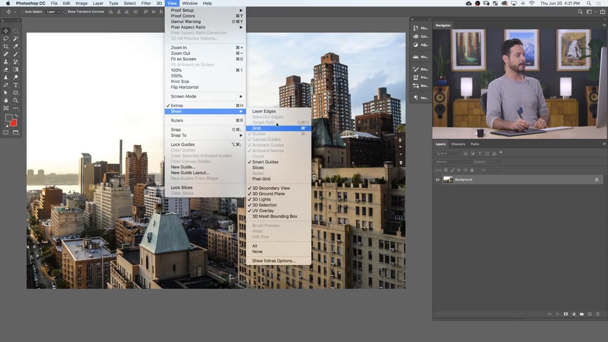 Default grid overlaid on architectural photo in Photoshop
Guides are great for spot-checking specific lines, but if you want a comprehensive view of how your whole image sits, go to View, then Show, then Grid. Check that box and a grid overlays your entire canvas. Out of the box, the default grid is fairly dense and the lines can be visually overwhelming, especially on a detailed photo. Don’t bail on it yet though – the next step is where it actually becomes useful.
Default grid overlaid on architectural photo in Photoshop
Guides are great for spot-checking specific lines, but if you want a comprehensive view of how your whole image sits, go to View, then Show, then Grid. Check that box and a grid overlays your entire canvas. Out of the box, the default grid is fairly dense and the lines can be visually overwhelming, especially on a detailed photo. Don’t bail on it yet though – the next step is where it actually becomes useful.
Step 4: Customize the Grid in Preferences
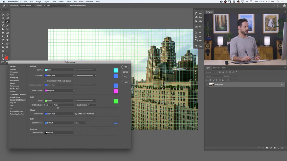
 Guides, Grids and Slices panel open in Photoshop Preferences
Go to Edit, then Preferences, then Guides, Grid and Slices (on Mac it’s Photoshop, then Preferences). This panel is where you take control. Under the Grid section, change the unit to Pixels and set the gridline interval to something workable for your image size. Aaron uses every 10 pixels as an example, which at full zoom shows you each square as an individual pixel. For a typical high-resolution photo where you’re working at a normal zoom level, something like every 100 or 200 pixels gives you clear reference lines without turning your canvas into graph paper.
Guides, Grids and Slices panel open in Photoshop Preferences
Go to Edit, then Preferences, then Guides, Grid and Slices (on Mac it’s Photoshop, then Preferences). This panel is where you take control. Under the Grid section, change the unit to Pixels and set the gridline interval to something workable for your image size. Aaron uses every 10 pixels as an example, which at full zoom shows you each square as an individual pixel. For a typical high-resolution photo where you’re working at a normal zoom level, something like every 100 or 200 pixels gives you clear reference lines without turning your canvas into graph paper.
Also set Subdivisions to 1. The default subdivides each grid square into 4 smaller sections, which adds even more visual clutter. Unless you specifically need sub-divisions for pixel-level work, drop that number down.
Step 5: Adjust Grid Color and Style
 Custom color picker open for grid color in Preferences
Still inside Preferences, you can change the grid color by clicking the color swatch next to “Custom.” The default can be a little aggressive depending on the tones in your photo. A light gray or soft green usually reads clearly without competing with the image underneath. Aaron demonstrates a few options here, including switching from solid lines to dotted lines, which are gentler on the eye while still giving you accurate reference. There’s even a “Points” option that reduces the grid to tiny dots at each intersection – minimal visual interference, still useful for alignment checks.
Custom color picker open for grid color in Preferences
Still inside Preferences, you can change the grid color by clicking the color swatch next to “Custom.” The default can be a little aggressive depending on the tones in your photo. A light gray or soft green usually reads clearly without competing with the image underneath. Aaron demonstrates a few options here, including switching from solid lines to dotted lines, which are gentler on the eye while still giving you accurate reference. There’s even a “Points” option that reduces the grid to tiny dots at each intersection – minimal visual interference, still useful for alignment checks.
The right setting depends on your image. A bright, busy photo might need a high-contrast grid color to be readable. A dark or muted image might look best with a lighter, more subtle style.
Step 6: Zoom In to Verify Pixel-Level Accuracy
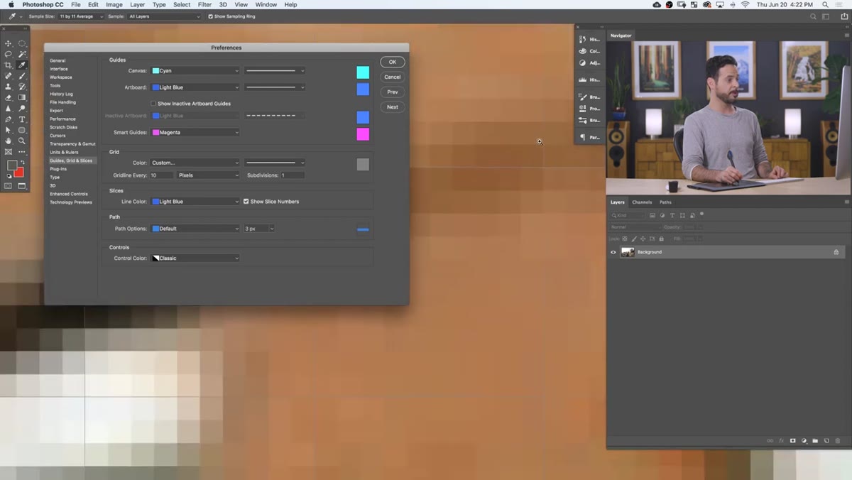 Zoomed-in view showing individual pixel squares within grid
Once your grid is configured, zoom in significantly on a critical edge in your photo, like where a building wall meets the sky. At high zoom with a pixel-based grid, you can see exactly how the architectural line tracks against the grid squares. This is where you get an honest assessment of how much correction you actually need. Sometimes the lean is smaller than you thought. Sometimes it’s worse. Either way, now you know.
Zoomed-in view showing individual pixel squares within grid
Once your grid is configured, zoom in significantly on a critical edge in your photo, like where a building wall meets the sky. At high zoom with a pixel-based grid, you can see exactly how the architectural line tracks against the grid squares. This is where you get an honest assessment of how much correction you actually need. Sometimes the lean is smaller than you thought. Sometimes it’s worse. Either way, now you know.
One Thing I’d Add: Use This Before Transforms, Not After
Here’s where my workflow differs slightly from just using the grid as a diagnostic tool. I set my grid up before I apply any Free Transform or Warp corrections, not after. That way I’m transforming with live feedback rather than transforming blind and then checking. If you go to Edit, then Free Transform, your grid stays visible while you drag handles. You can watch the building edge track toward vertical in real time rather than making a change, stepping back, squinting, and repeating.
This saved me probably an hour on a real estate composite last year where I had a wide-angle exterior shot with converging verticals on both sides of the frame. Having the grid visible during the transform meant I got it dialed in on the first attempt instead of the usual six rounds of undo-redo.
The grids and guides system in Photoshop is one of those features that sounds almost too basic to bother with, but it solves a real problem: the human eye is bad at judging “perfectly straight” without a reference. Give it a reference. Your clients and your future self will thank you.
Watch the full tutorial on YouTube to see Aaron walk through the full perspective correction workflow, including the methods he uses after the grid analysis to actually fix the lines.
Comments (3)
Never thought of approaching it this way. Really creative.
Been doing this wrong for years apparently. Thanks for the wake-up call.
Couldn't agree more. I've seen this make a huge difference in lighting work specifically.
Leave a Comment