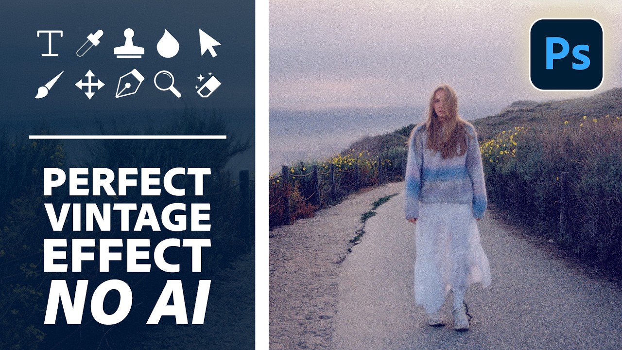
There’s a particular flavor of client request that shows up in my inbox every few weeks: “Can you make it look more… cinematic? Like old film?” And for a long time, I’d reach for the same handful of tired presets, cross my fingers, and deliver something that looked okay but felt hollow. Presets are fast, sure, but you’re basically just renting someone else’s creative decisions. The moment a client asks you to tweak it, you’re stuck staring at sliders you don’t fully understand.
That’s why this tutorial from Aaron Nace over at PHLEARN caught my attention. In it, he builds a cinematic vintage glow completely from scratch inside Photoshop 2026 – no AI filters, no neural shortcuts, no mystery black box eating your resolution. Just deliberate, manual technique that you actually understand and can adjust. Watch the full tutorial on YouTube if you want to follow along with the source material, but I’ve broken down every step below so you can work through it without pausing and rewinding every 30 seconds.
The thing I appreciated most is how the technique is built on a logical foundation. You’re not just slapping a gradient map on your photo and calling it a day. Every step has a reason behind it, and once you understand the reasoning, you can adapt it to almost any image.
Step 1: Select Your Highlights Using Color Range
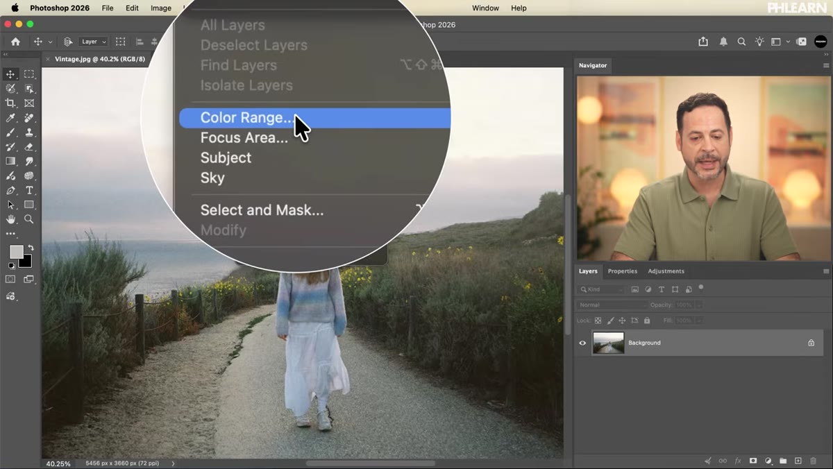 Color Range dialog open with grayscale preview active
Before you touch a single adjustment layer or blend mode, you need to isolate the brightest parts of your image. Go to Select > Color Range. When the dialog opens, switch the Selection Preview dropdown (at the bottom of the panel) from None to Grayscale. This is the move that makes everything legible – you’ll see a live black-and-white preview showing exactly what’s selected as bright areas versus unselected dark areas.
Color Range dialog open with grayscale preview active
Before you touch a single adjustment layer or blend mode, you need to isolate the brightest parts of your image. Go to Select > Color Range. When the dialog opens, switch the Selection Preview dropdown (at the bottom of the panel) from None to Grayscale. This is the move that makes everything legible – you’ll see a live black-and-white preview showing exactly what’s selected as bright areas versus unselected dark areas.
Grab the eyedropper inside the dialog and click on the brightest part of your photo – the sky, a light source, a window, whatever holds your highlights. Then use the Fuzziness slider to dial in how broadly the selection spreads. Too low and you’ll get a stingy, patchy selection. Too high and you’re grabbing half the image. Somewhere in the middle range works well for most photos. The goal is to select the luminous areas that will carry the bloom. Hit OK when you’re happy with the preview.
Step 2: Duplicate the Highlights to a New Layer
 Layers panel showing isolated highlights on a new layer
With your highlight selection still active, make sure your Background layer is selected in the Layers panel. Then hit Ctrl+J (Windows) or Cmd+J (Mac). This lifts only the selected pixels – your highlights – onto a brand new layer above the background. Nothing else moves. Nothing gets flattened.
Layers panel showing isolated highlights on a new layer
With your highlight selection still active, make sure your Background layer is selected in the Layers panel. Then hit Ctrl+J (Windows) or Cmd+J (Mac). This lifts only the selected pixels – your highlights – onto a brand new layer above the background. Nothing else moves. Nothing gets flattened.
Here’s what’s clever about this: if you grab the Move tool and nudge that new layer around, you’ll see it’s literally just the bright areas of the image, floating free. It looks a bit strange on its own, but that’s exactly what you want. Move it back to its original position before continuing. Toggling the layer’s visibility on and off should show zero visible change when it’s sitting precisely where it came from.
Step 3: Convert the Layer to a Smart Object
 Smart Object icon visible on highlight layer in Layers panel
Before you apply any blur, convert this highlights layer to a Smart Object. Right-click the layer and choose Convert to Smart Object, or go to Filter > Convert for Smart Filters. You’ll see a small icon appear in the layer thumbnail corner confirming the conversion.
Smart Object icon visible on highlight layer in Layers panel
Before you apply any blur, convert this highlights layer to a Smart Object. Right-click the layer and choose Convert to Smart Object, or go to Filter > Convert for Smart Filters. You’ll see a small icon appear in the layer thumbnail corner confirming the conversion.
This single step is the difference between a destructive edit you can’t change and a flexible one you can tweak six months later when a client comes back asking for “just a little less glow.” I learned about Smart Objects the hard way – after accidentally flattening a layered file I’d been building for hours and losing everything. Smart Objects are non-destructive by design, which means every filter you apply sits on top of the layer as an editable entry rather than burning directly into the pixels.
Step 4: Apply Gaussian Blur to Create the Bloom
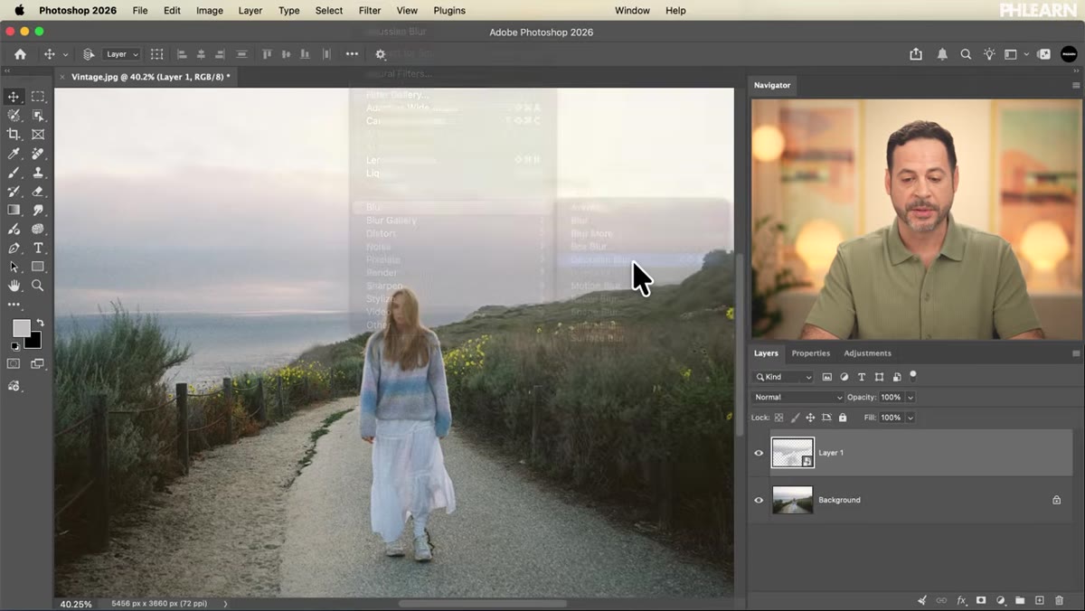 Gaussian Blur dialog with blur applied to highlight layer
Now you’re ready for the actual bloom effect. With your Smart Object layer selected, go to Filter > Blur > Gaussian Blur. The dialog is simple – just a single radius slider – but the visual impact is immediate and satisfying. As you drag the slider up, the highlights start to bleed and glow outward, exactly the way light blooms on analog film or an overexposed photograph.
Gaussian Blur dialog with blur applied to highlight layer
Now you’re ready for the actual bloom effect. With your Smart Object layer selected, go to Filter > Blur > Gaussian Blur. The dialog is simple – just a single radius slider – but the visual impact is immediate and satisfying. As you drag the slider up, the highlights start to bleed and glow outward, exactly the way light blooms on analog film or an overexposed photograph.
The right value depends entirely on your image size and how strong you want the effect. A subtle bloom feels elegant and cinematic. A heavy bloom starts to feel dreamy or atmospheric, almost like shooting through a soft-focus filter. Because this is applied as a Smart Filter, you can double-click the Gaussian Blur entry beneath the layer in your Layers panel at any point in your workflow and change the value. That flexibility is the whole reason for the Smart Object conversion in Step 3.
One Thing I’d Add: Blend Mode Experimentation
Aaron’s technique gives you a clean bloom layer sitting above your background, and by default it’ll be set to Normal blend mode. But honestly, that’s just the starting point. My habit is to try Screen mode first on the highlight bloom layer – it intensifies the glow without darkening the rest of the image. For a warmer, more vintage-tinted bloom, I’ll sometimes drop a Hue/Saturation adjustment clipped directly to the bloom layer and pull the highlights slightly toward amber or gold. It mimics the way old film stocks shifted warm in the highlights without requiring a separate color grading step.
The beauty of the whole stack is that everything stays editable. You can return to any layer, adjust the blur radius, tweak the color, change the blend mode, or mask parts of the glow off entirely. It’s not a one-click preset. It’s a technique you actually own.
The single most important thing Aaron demonstrates here is the logic of selection-first editing. By starting with a precise highlight selection rather than applying a global filter, you get a bloom effect that responds intelligently to the actual light information in your photo. That’s what separates a handcrafted vintage look from something that just looks like a filter happened to a picture.
Watch the full tutorial on YouTube for the complete walkthrough, including the grain and color channel work that Aaron covers later in the video. PHLEARN also has the sample PSD and image available as a free download so you can follow along with the exact same file.
Comments (2)
The tip about steal the highlights how to bu was the missing piece for me. Thank you.
This should be required reading for anyone starting out.
Leave a Comment