
I’ll be honest with you. I spent a solid chunk of my early freelance career working against Photoshop instead of with it. Burning time on exports, hitting the undo wall at the worst possible moment, wondering why my colors looked slightly off every time I posted something online. Not huge problems individually, but they compound fast when you’re juggling client deadlines from a corner table at your local coffee shop.
That’s why this tutorial from Aaron Nace over at PHLEARN hit differently. It’s not about fancy techniques or dramatic before-and-afters. It’s about the boring, behind-the-scenes settings that quietly determine how much friction you’re fighting every single session. Watch the full tutorial on YouTube if you want to see Aaron walk through it himself. But if you want the breakdown with a little extra context, keep reading.
These six tweaks take maybe ten minutes to set up. The payoff is every project after that running a little smoother.
Step 1: Increase Your History States
 Performance preferences panel with History States field visible
Go to Photoshop > Preferences > Performance. On the right side of that panel you’ll see a “History States” field. This number controls how many steps back you can undo. The default sits somewhere between 20 and 30, which sounds reasonable until you’re deep in a complex edit and you need to go back 45 steps.
Aaron recommends bumping this up to somewhere in the 50-100 range. You can go all the way to 1,000, but there’s a real tradeoff: every history state gets stored temporarily in memory, so cranking it too high on an older machine will slow things down noticeably. I keep mine at 100. It’s enough of a safety net without turning my laptop into a space heater.
Step 2: Set Up Quick Export Format
 Export preferences panel showing Quick Export format dropdown
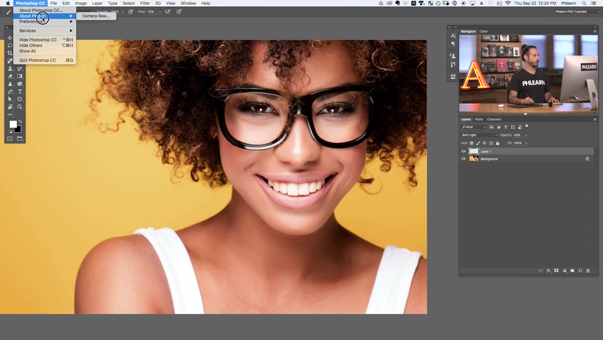
Head to Photoshop > Preferences > Export. This is where you tell Photoshop what format to use when you hit Quick Export, which we’ll get to in a moment. The two formats you’ll realistically choose between are JPEG and PNG.
The rule is simple: if your image needs transparency, use PNG. If it doesn’t, use JPEG. Aaron’s recommendation is a JPEG quality setting of 80, and I’d back that up completely. The difference between 80 and 100 is basically invisible to the human eye at screen resolution, but the file size difference is significant. Smaller files mean faster uploads, happier clients, and a site that doesn’t crawl.
Step 3: Configure Export Location and Metadata
 Export preferences showing metadata and location options
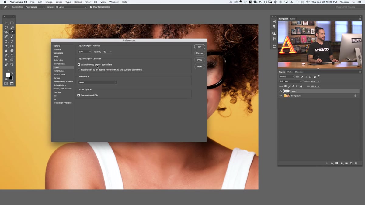
Still inside that Export preferences panel, you’ve got a couple more decisions to make. First, set the export location to “Ask where to export each time.” It’s one extra click per export, but it stops you from hunting through folders trying to remember where Photoshop silently dropped your file.
For metadata, Aaron suggests keeping copyright and contact info. This is the kind of thing that feels like housekeeping until someone uses your image without credit and you have no trail. It takes zero extra effort once the preference is set, so just leave it on.
Step 4: Enable Convert to sRGB on Export
 Export preferences panel with Convert to sRGB checkbox highlighted
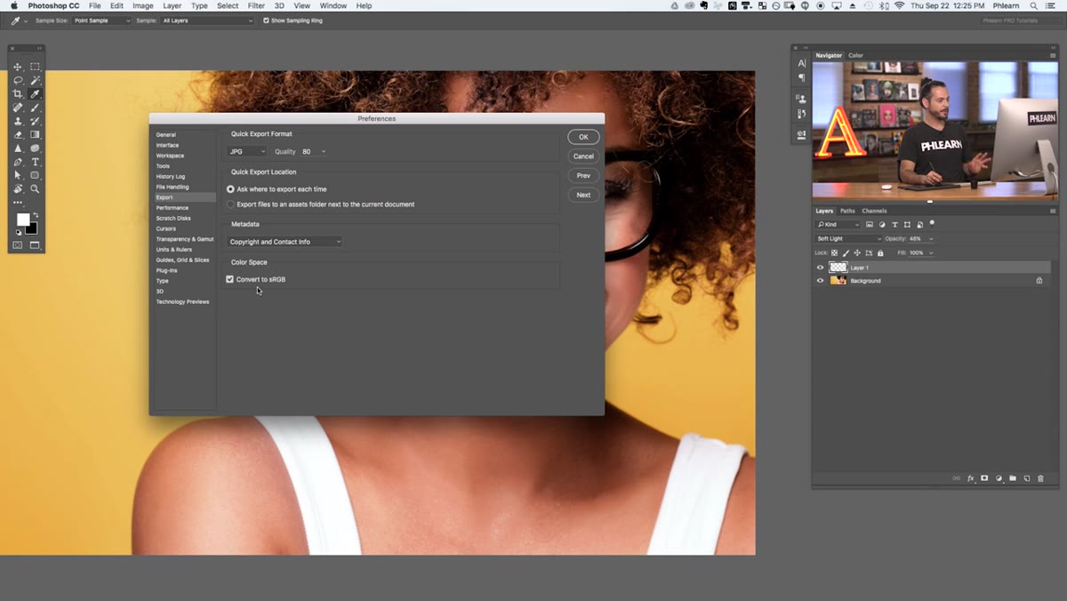
This one is still in the Export preferences panel, right at the bottom, and it’s the setting most people skip right past. Make sure “Convert to sRGB” is checked.
sRGB is the color space that web browsers use to display images. If you shoot in a wide-gamut color space like Adobe RGB or ProPhoto RGB and export without converting, your colors will look dull or slightly off in Chrome, Safari, and pretty much every browser. This is one of those problems that makes you question everything about your edit when the fix is a single checkbox. Check it. Leave it checked. Move on.
Step 5: Use Quick Export to Get Images Out Fast
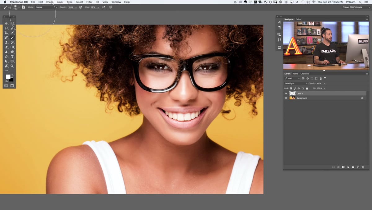 File menu showing Export submenu with Quick Export option
Now that your export settings are dialed in, actually using Quick Export is refreshingly fast. Go to File > Export > Quick Export as JPEG (or PNG, depending on what you set). That’s it. No “Save for Web” dialog. No fumbling through quality sliders you’ve already configured. Just a file picker and you’re done.
For anyone who exports a lot of web assets or client previews, this alone saves a surprising amount of time over the course of a week. The old “Save for Web” workflow wasn’t painful exactly, but it had enough steps to break your focus. Quick Export keeps you in the zone.
Step 6: Learn the Keyboard Shortcut for Quick Export
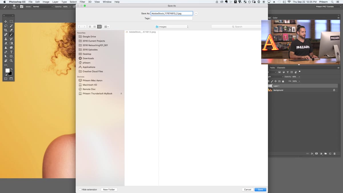 File Export menu showing keyboard shortcut next to Quick Export
Once you’ve used Quick Export a few times from the menu, it’s worth burning the keyboard shortcut into muscle memory. On Mac it’s Shift + Option + Command + W. On Windows it’s Shift + Alt + Ctrl + W. Yes, it uses four keys. No, that’s not ideal. But you’ll hit it enough times that your hand figures it out pretty quickly.
Keyboard shortcuts are genuinely one of the highest-return investments in Photoshop. I’ve watched people work who don’t use them and it’s like watching someone type with two fingers. Everything works, it’s just slower than it needs to be.
One Thing Aaron Doesn’t Mention (That I’d Add)
If you’re switching between documents that have different color profiles, the sRGB export setting alone won’t save you from surprises. I’d also recommend going to Edit > Color Settings and making sure your working color space is set to sRGB if you’re primarily doing web work. That way everything is consistent from the moment you open a file to the moment you export it. I learned this the annoying way after a client asked why their logo looked different on their website versus their print materials. Spoiler: it was a color space thing, and it was entirely preventable.
None of these tips are flashy. You’re not going to screenshot your History States setting and post it to Instagram. But that’s kind of the point. The best workflow improvements are the ones that disappear into the background and just make everything feel a little less like a slog.
If one thing sticks, let it be the sRGB export setting. Silent file-size and color errors are genuinely the most annoying kind because they don’t announce themselves. They just quietly make your work look worse.
Watch the full tutorial on YouTube to see Aaron walk through all six tips with live demos in Photoshop.
Comments (3)
I keep coming back to this article. It's that useful.
Clear and practical. No fluff. Appreciate that.
Well explained. I think my audience would really benefit from this — mind if I link to it?
Leave a Comment