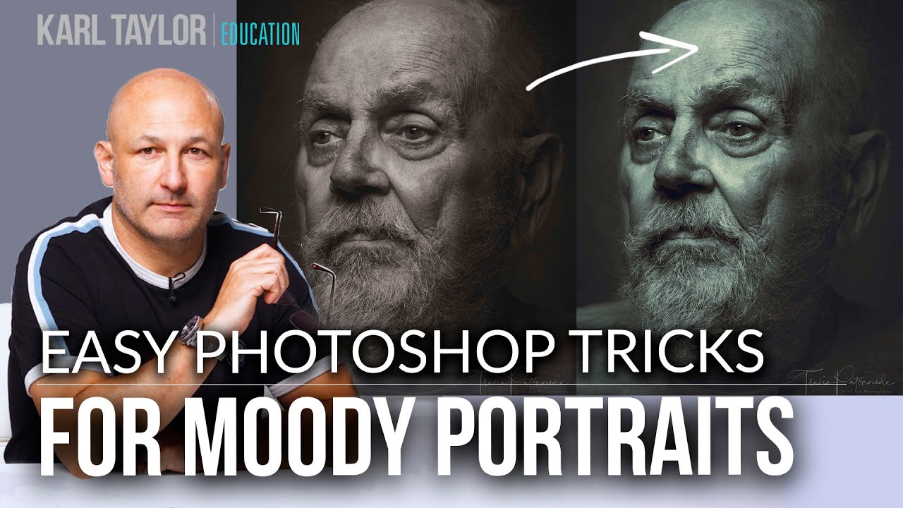
Client portraits are where I earn my keep, and “moody black and white” is one of those requests that sounds simple until you actually sit down and try to nail it. Crushing the blacks and calling it a day gives you a flat, muddy mess. Trying to hand-paint a vignette looks fake the second anyone zooms in. I’ve wasted real billable hours chasing that rich, atmospheric look that separates a compelling character study from a snapshot with a black-and-white filter slapped on top.
This Visual Education tutorial, part of their “Fix the Photo” series where they rework community-submitted images, cracked open a workflow I hadn’t fully thought through: combining split contrast adjustments with stacked color lookup tables in different blend modes. The source image is a beautifully shot, low-contrast monochrome portrait with a slight warm tone. The goal is to deepen it, focus the viewer’s eye on the face, and apply a selenium-style color treatment without it looking like an Instagram preset. Watch the full tutorial on YouTube if you want to follow along visually, but everything you need to actually execute this is right here.
The whole edit runs in under ten minutes, which is either impressive or humbling depending on how long your last portrait retouch took. Mine took three hours. Let’s just move on.
Step 1: Duplicate Your Layer First
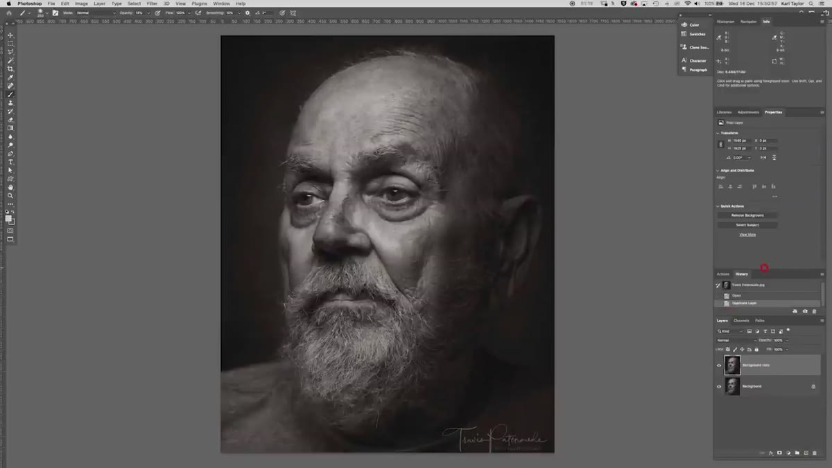 Duplicate layer panel showing background copy layer
Before touching anything, duplicate your background layer. Ctrl+J (Cmd+J on Mac). Every time. Yes, you know this. No, I’m not going to stop saying it. Non-destructive editing is the difference between a smooth client revision and a 2am panic. Once that’s done, take stock of what you’re working with: contrast levels, tonal range, any existing color cast. On this portrait, the image reads as soft and low-contrast, which works as a starting point rather than a finished look.
Duplicate layer panel showing background copy layer
Before touching anything, duplicate your background layer. Ctrl+J (Cmd+J on Mac). Every time. Yes, you know this. No, I’m not going to stop saying it. Non-destructive editing is the difference between a smooth client revision and a 2am panic. Once that’s done, take stock of what you’re working with: contrast levels, tonal range, any existing color cast. On this portrait, the image reads as soft and low-contrast, which works as a starting point rather than a finished look.
Step 2: Make a Loose Selection Around the Face and Key Features
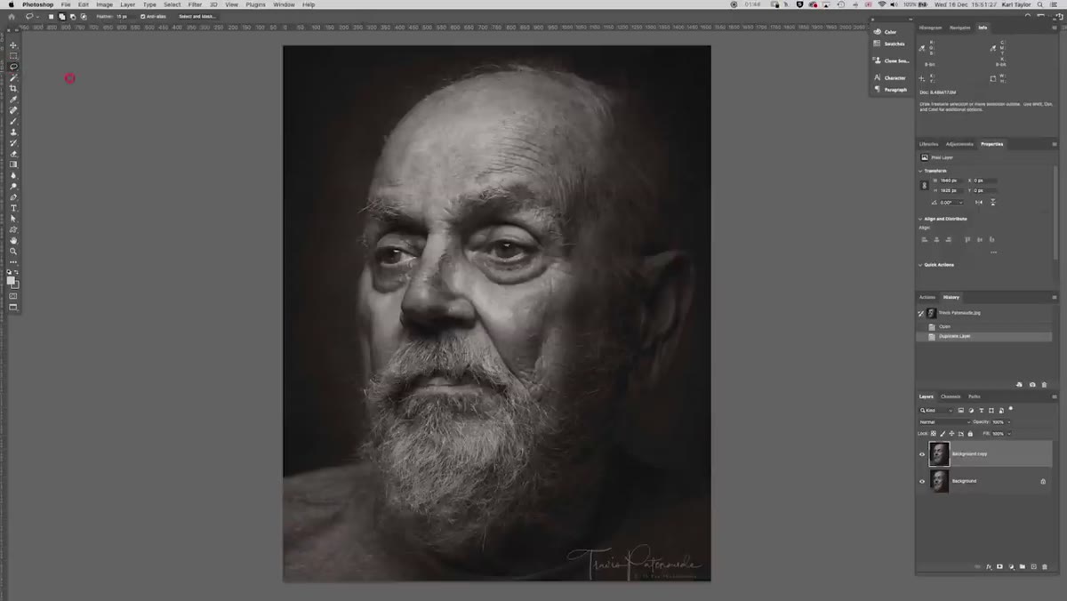 Rough lasso selection drawn around face, beard, and eyes
Using the Lasso tool, draw a rough, imperfect selection around the face - specifically the eyes, beard, and the core of the portrait where you want the viewer to land. Don’t stress about precision here. This isn’t a cutout, it’s a mask for a tonal adjustment, so a relaxed, organic selection is actually preferable to a surgical one. You want the transition between affected and unaffected areas to feel natural, not like someone drew a circle around the subject’s head.
Rough lasso selection drawn around face, beard, and eyes
Using the Lasso tool, draw a rough, imperfect selection around the face - specifically the eyes, beard, and the core of the portrait where you want the viewer to land. Don’t stress about precision here. This isn’t a cutout, it’s a mask for a tonal adjustment, so a relaxed, organic selection is actually preferable to a surgical one. You want the transition between affected and unaffected areas to feel natural, not like someone drew a circle around the subject’s head.
Step 3: Add a Curves or Levels Adjustment Layer to Boost Contrast in the Face
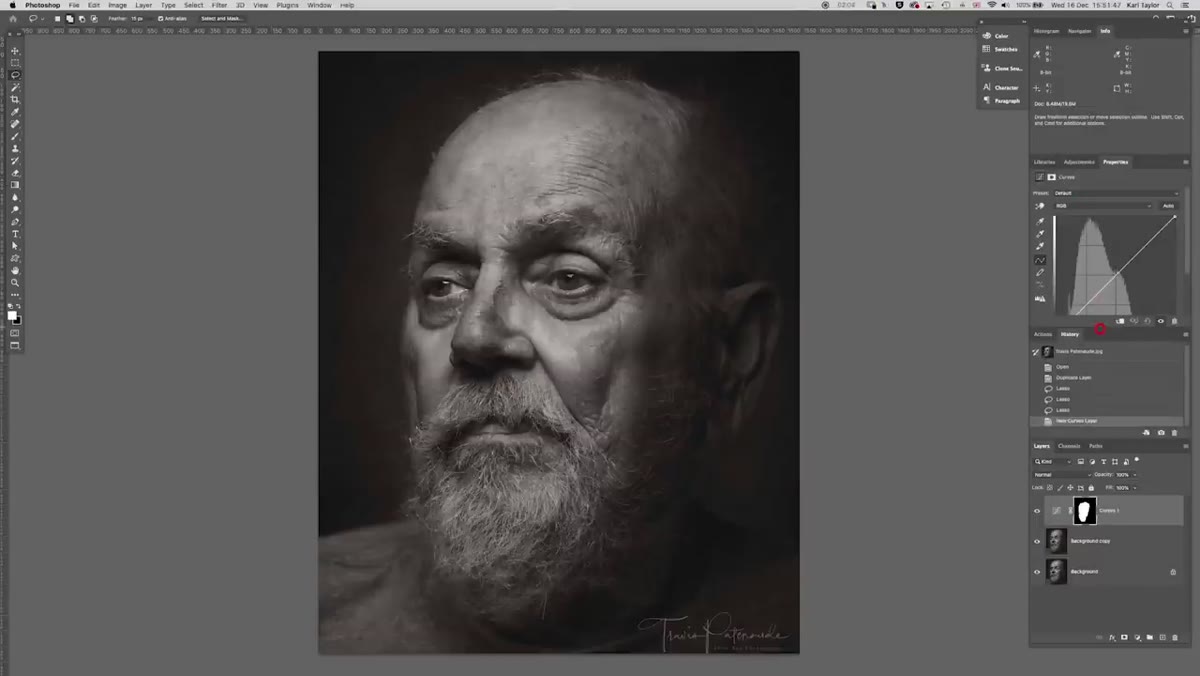 Levels adjustment layer with blacks pulled deeper and highlights lifted
With your selection active, add a Levels or Curves adjustment layer. Photoshop will automatically convert your selection into a layer mask. Now pull the blacks deeper and lift the highlights - you’re increasing the contrast specifically within that face region. On a moody portrait, the eyes and beard especially benefit from this. The mask means you’re only hitting the areas you selected, so the rest of the image stays untouched for now. If the effect feels too strong, drop the adjustment layer’s opacity rather than fighting with the sliders.
Levels adjustment layer with blacks pulled deeper and highlights lifted
With your selection active, add a Levels or Curves adjustment layer. Photoshop will automatically convert your selection into a layer mask. Now pull the blacks deeper and lift the highlights - you’re increasing the contrast specifically within that face region. On a moody portrait, the eyes and beard especially benefit from this. The mask means you’re only hitting the areas you selected, so the rest of the image stays untouched for now. If the effect feels too strong, drop the adjustment layer’s opacity rather than fighting with the sliders.
Step 4: Invert the Mask and Reduce Contrast in the Background Areas
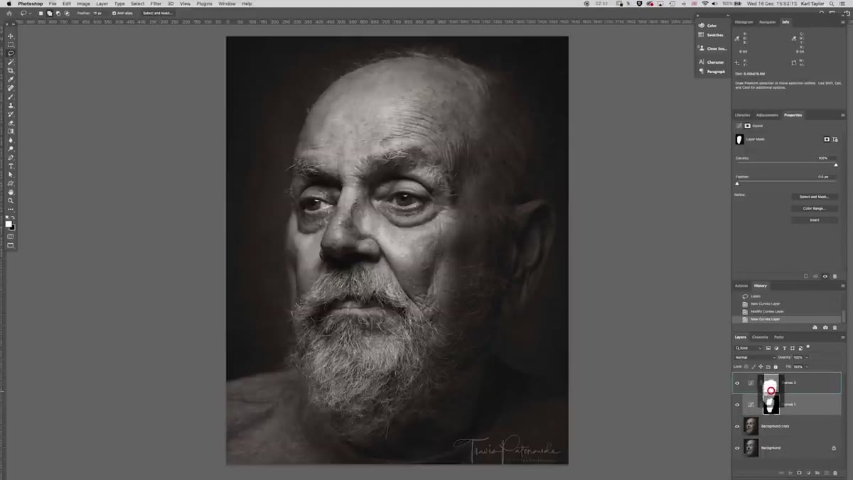 Second adjustment layer with inverted mask affecting outer areas of frame
Here’s the part that actually makes this technique work as a system rather than a one-off tweak. Add a second Levels adjustment layer, then copy the mask from your first adjustment layer onto this one. Once it’s there, invert it (Ctrl+I / Cmd+I). Now you’re targeting the exact opposite region - everything outside the face selection. Instead of boosting contrast here, you’re doing the reverse: lifting the shadows and softening the tonal range. This creates a subtle solarized quality in the peripheral areas that starts to feel almost painterly. The face punches forward, the background recedes. That’s the whole game with moody portraits.
Second adjustment layer with inverted mask affecting outer areas of frame
Here’s the part that actually makes this technique work as a system rather than a one-off tweak. Add a second Levels adjustment layer, then copy the mask from your first adjustment layer onto this one. Once it’s there, invert it (Ctrl+I / Cmd+I). Now you’re targeting the exact opposite region - everything outside the face selection. Instead of boosting contrast here, you’re doing the reverse: lifting the shadows and softening the tonal range. This creates a subtle solarized quality in the peripheral areas that starts to feel almost painterly. The face punches forward, the background recedes. That’s the whole game with moody portraits.
Experiment with how far you push the shadow lift on this outer mask. Go too far and it gets strange. But “a little strange” is sometimes exactly right for a character-driven portrait, so trust your eye rather than any specific slider value.
Step 5: Stack Two Color Lookup Tables in Opposing Blend Modes
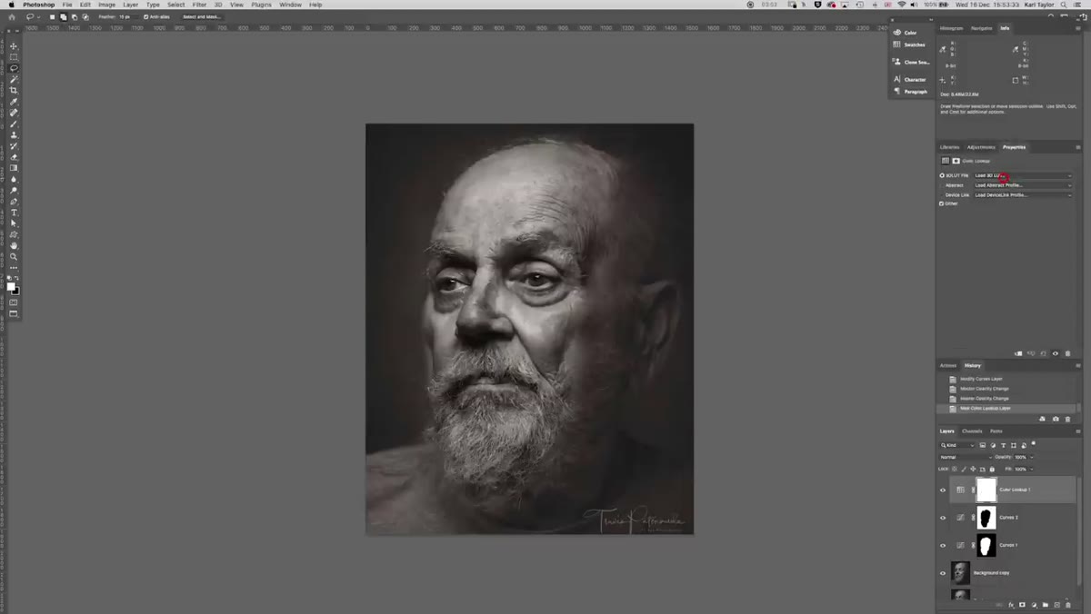 Color lookup adjustment layer set to Darken blend mode with Futuristic Bleak LUT
This is where the color treatment happens, and it’s genuinely clever. Add a Color Lookup adjustment layer and select “Futuristic Bleak” from the 3DLUT File dropdown. Then change the blend mode of this adjustment layer from Normal to Darken. The Darken blend mode means this LUT only affects pixels darker than what’s underneath - it deepens the tones without flattening the highlights, which is exactly what you want for a selenium-style effect.
Color lookup adjustment layer set to Darken blend mode with Futuristic Bleak LUT
This is where the color treatment happens, and it’s genuinely clever. Add a Color Lookup adjustment layer and select “Futuristic Bleak” from the 3DLUT File dropdown. Then change the blend mode of this adjustment layer from Normal to Darken. The Darken blend mode means this LUT only affects pixels darker than what’s underneath - it deepens the tones without flattening the highlights, which is exactly what you want for a selenium-style effect.
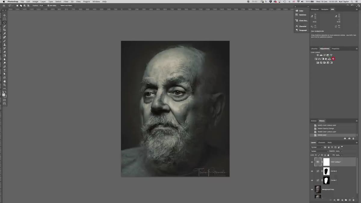 Second color lookup layer set to Lighten blend mode with Horror Blue LUT
Now add a second Color Lookup adjustment layer, this time selecting “Horror Blue.” Set this one to Lighten blend mode instead. Lighten only affects pixels brighter than what’s beneath, so it’s working on the upper tonal range. What you’ve now built is a two-layer color treatment where one LUT is pulling the shadows toward that cool, metallic selenium feel, and the other is nudging the highlights in a complementary direction. Neither one is overpowering the image on its own.
Second color lookup layer set to Lighten blend mode with Horror Blue LUT
Now add a second Color Lookup adjustment layer, this time selecting “Horror Blue.” Set this one to Lighten blend mode instead. Lighten only affects pixels brighter than what’s beneath, so it’s working on the upper tonal range. What you’ve now built is a two-layer color treatment where one LUT is pulling the shadows toward that cool, metallic selenium feel, and the other is nudging the highlights in a complementary direction. Neither one is overpowering the image on its own.
Step 6: Balance the Opacity on Both LUT Layers
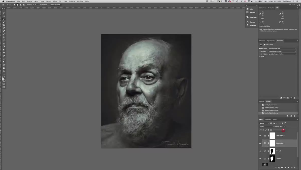 Opacity sliders being adjusted on both color lookup layers
The Horror Blue LUT tends to run strong, so pull its opacity back - somewhere in the 30-50% range is a reasonable starting point, but use your own judgment based on your image. Dial in the Futuristic Bleak layer’s opacity separately. Toggle each one on and off to see its individual contribution before settling on the combined result. The goal is a color treatment that reads as an intentional photographic choice rather than a digital filter. You want someone to look at this and think “darkroom,” not “preset.”
Opacity sliders being adjusted on both color lookup layers
The Horror Blue LUT tends to run strong, so pull its opacity back - somewhere in the 30-50% range is a reasonable starting point, but use your own judgment based on your image. Dial in the Futuristic Bleak layer’s opacity separately. Toggle each one on and off to see its individual contribution before settling on the combined result. The goal is a color treatment that reads as an intentional photographic choice rather than a digital filter. You want someone to look at this and think “darkroom,” not “preset.”
Where I’d Take This Further
The split-mask contrast technique translates well beyond black-and-white portraits. I’ve used a version of it on editorial color work where I needed to keep a subject’s skin tones rich while cooling down a blown-out background. The inverted mask approach is just good thinking - instead of building two separate selections from scratch, you’re doing the work once and flipping it. That’s the kind of efficiency that actually adds up across a long editing session.
On the LUT stacking side: Photoshop ships with a limited set of built-in LUTs, but you can load any .cube or .3dl file as a Color Lookup adjustment layer. If you’re buying or downloading cinematic LUT packs for video work, those same files work here. Mixing blend modes across two LUT layers opens up a combinatorial space that’s worth spending a Saturday exploring, because you’ll land on some genuinely interesting treatments that no single preset would give you.
The single most important idea in this whole workflow is the split contrast logic: push contrast where you want attention, pull it back everywhere else. It’s not a Photoshop trick so much as a compositional decision made in post. Photoshop is just the tool you’re using to execute an intention. Once you internalize that, the adjustment layers and layer masks become obvious - they’re just how you draw the viewer’s eye to where it belongs.
Watch the full tutorial on YouTube to see the before and after and catch any details in the LUT selections that are easier to follow visually.
Comments
Leave a Comment