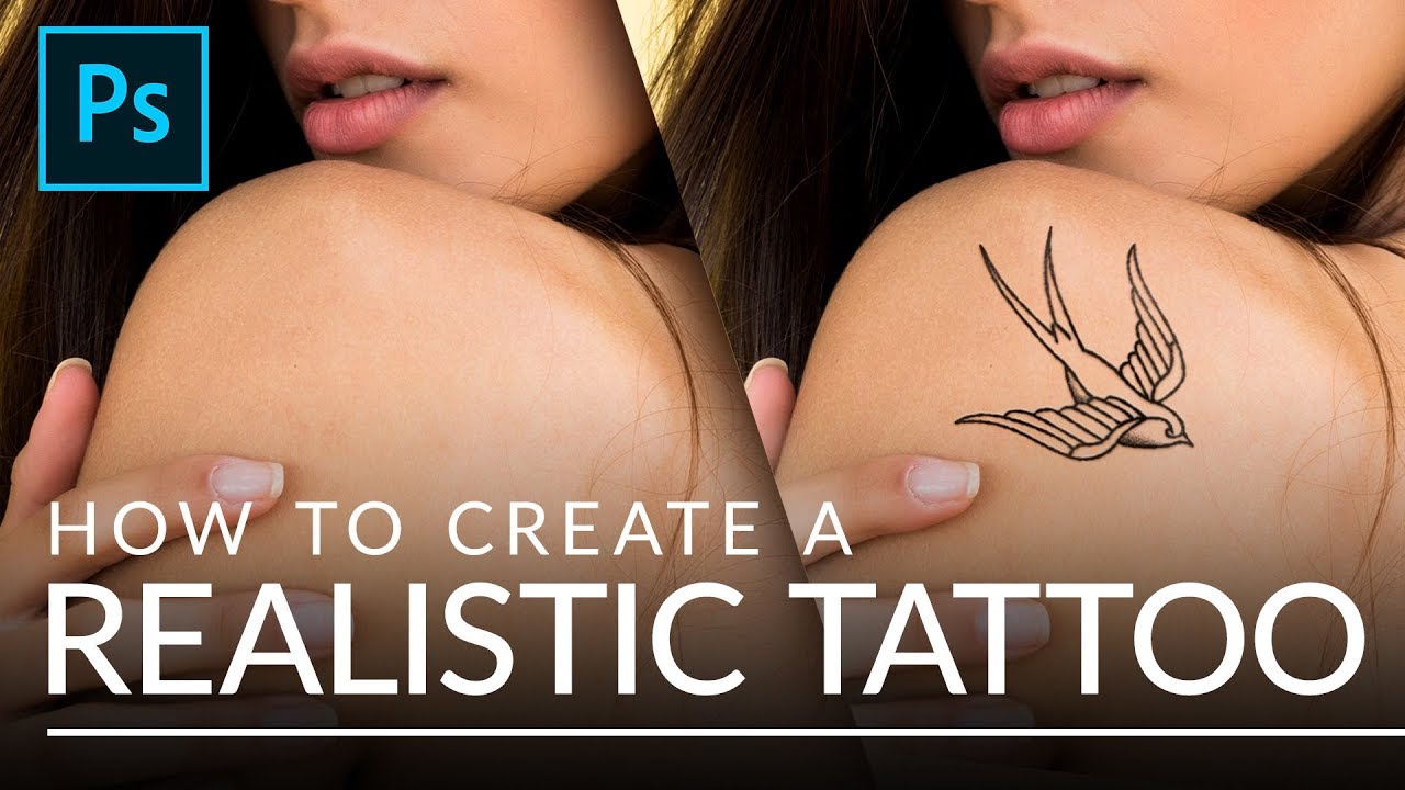
Client work has a way of throwing curveballs you didn’t see coming. I’ve had more than a few people slide into my DMs asking for a “quick” tattoo mockup, usually with a logo they made in Illustrator, a reference photo of someone’s arm, and the energy of someone who thinks this takes about four minutes. The truth is, slapping a design onto skin and calling it done looks terrible. The lines are too perfect, the contrast is wrong, and it screams “I copied and pasted this.” Getting it to look like actual ink under actual skin is a different problem entirely, and for a while I was cobbling together my own hacky solutions with blend modes and crossed fingers.
Then I came across Watch the full tutorial on YouTube, where Aaron Nace of PHLEARN walks through a method for turning any design into a convincing tattoo. What hooked me wasn’t the blending part, which most people focus on, but the step before it: making the design itself look like it was done by a human hand, not a piece of software. That distinction is where most people’s tattoo composites fall apart, and it’s exactly what Aaron nails here.
The technique works on anything with clean linework: vector art, illustrations, even scanned drawings. Here’s how it breaks down.
Step 1: Set Up Your Design with a White Background
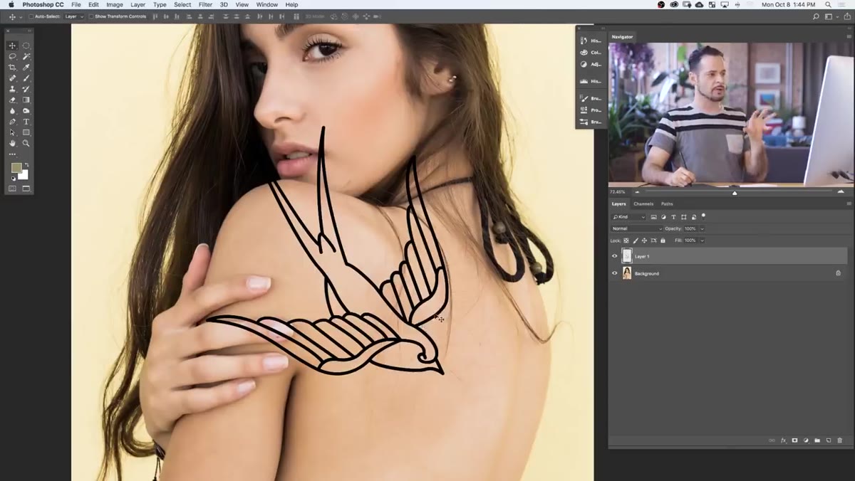 Clean illustrator-style design placed over photo background
Before any filters touch your design, you need to prep it properly. If your artwork is on a transparent background, draw a rectangular selection around it using the Marquee tool, create a new layer, and fill that layer with white. Move that white layer below your design layer in the stack, then merge the two together with Cmd/Ctrl + E. This gives you a flat, white-background image of your design, which is exactly what the Glass filter needs to do its job. Working with transparency at this stage causes problems down the line, so flatten it out now and save yourself the headache.
Clean illustrator-style design placed over photo background
Before any filters touch your design, you need to prep it properly. If your artwork is on a transparent background, draw a rectangular selection around it using the Marquee tool, create a new layer, and fill that layer with white. Move that white layer below your design layer in the stack, then merge the two together with Cmd/Ctrl + E. This gives you a flat, white-background image of your design, which is exactly what the Glass filter needs to do its job. Working with transparency at this stage causes problems down the line, so flatten it out now and save yourself the headache.
One more thing: don’t resize your design down to its final tattoo size yet. Keep it large. You’re about to apply filters that add organic variation to the edges, and those effects need room to breathe. A filter applied to a tiny image looks completely different than one applied to a large image that you then scale down. Trust the process and leave it big.
Step 2: Load a Selection from the Design Layer
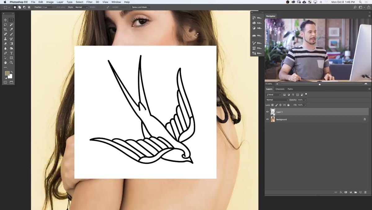 Ctrl-clicking layer thumbnail to load selection
Hold Cmd (Mac) or Ctrl (PC) and click directly on the layer thumbnail in the Layers panel. This loads a selection based on the actual pixels in your design. You want this selection active before you open the Filter Gallery, because it keeps the distortion effects anchored to the shape of your artwork rather than bleeding out into the white background. It’s a small step that makes a big difference in keeping your edges clean and intentional.
Ctrl-clicking layer thumbnail to load selection
Hold Cmd (Mac) or Ctrl (PC) and click directly on the layer thumbnail in the Layers panel. This loads a selection based on the actual pixels in your design. You want this selection active before you open the Filter Gallery, because it keeps the distortion effects anchored to the shape of your artwork rather than bleeding out into the white background. It’s a small step that makes a big difference in keeping your edges clean and intentional.
Step 3: Open the Filter Gallery and Apply the Glass Filter
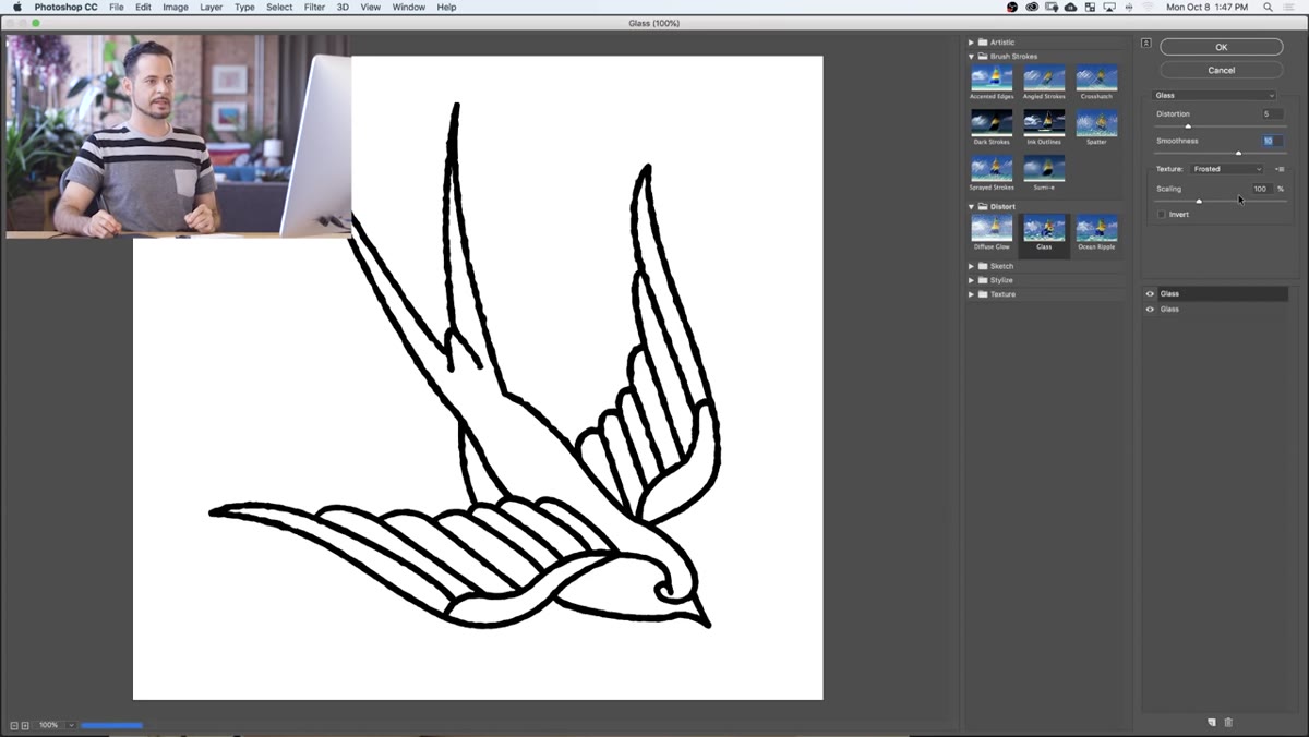
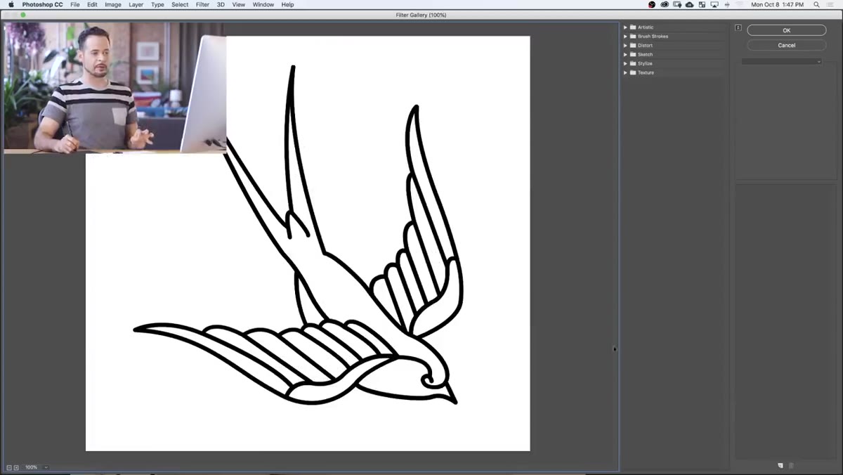 Filter Gallery open with Distort Glass filter selected
Go to Filter, then Filter Gallery. Inside the gallery, open the Distort folder and choose Glass. Out of the box, the Glass filter is going to look extreme and weird. That’s fine. The goal isn’t to use the default settings, it’s to dial it into something subtle. Bring the Smoothness value up to reduce the harshness of the distortion. What you’re after is a gentle wavering on the edges of your lines, the kind of imperfection you’d see in real tattooed skin where ink settles differently across texture. Think of it less as a distortion and more as a humanizer.
Filter Gallery open with Distort Glass filter selected
Go to Filter, then Filter Gallery. Inside the gallery, open the Distort folder and choose Glass. Out of the box, the Glass filter is going to look extreme and weird. That’s fine. The goal isn’t to use the default settings, it’s to dial it into something subtle. Bring the Smoothness value up to reduce the harshness of the distortion. What you’re after is a gentle wavering on the edges of your lines, the kind of imperfection you’d see in real tattooed skin where ink settles differently across texture. Think of it less as a distortion and more as a humanizer.
Step 4: Stack Multiple Glass Filters at Different Scales
 Multiple filter layers stacked in Filter Gallery panel
Here’s the part of Aaron’s technique that genuinely changed how I think about this effect. Don’t stop at one Glass filter. Click the new filter icon at the bottom of the Filter Gallery to add a second instance, and adjust it to a different Scaling percentage than the first. Then add a third, and a fourth, each at a different scale. The idea is that real tattoo line variation doesn’t come from one uniform kind of wobble. It comes from tiny inconsistencies layered on top of each other. Small-scale variation creates fine texture. Large-scale variation creates broader, more visible wavering. Together they produce something that reads as genuinely organic rather than artificially roughed up.
Multiple filter layers stacked in Filter Gallery panel
Here’s the part of Aaron’s technique that genuinely changed how I think about this effect. Don’t stop at one Glass filter. Click the new filter icon at the bottom of the Filter Gallery to add a second instance, and adjust it to a different Scaling percentage than the first. Then add a third, and a fourth, each at a different scale. The idea is that real tattoo line variation doesn’t come from one uniform kind of wobble. It comes from tiny inconsistencies layered on top of each other. Small-scale variation creates fine texture. Large-scale variation creates broader, more visible wavering. Together they produce something that reads as genuinely organic rather than artificially roughed up.
You’ll want to exaggerate the effect slightly more than looks right at this large size. When you scale the design down to its final tattoo dimensions, those imperfections shrink with it, and what felt like too much at full size becomes exactly right at final size.
Step 5: Scale Down and Position the Design
 Resizing design with transform tool over the arm
Once your filters are applied, use Cmd/Ctrl + T to transform and scale the design down to the size it’ll actually appear on the skin. Roughly position it over the area where the tattoo will sit. At this point you’re not worrying about blending into skin texture yet. You’re just checking that the scale and placement make visual sense, and that the distorted linework still reads clearly at the smaller size. If it looks too clean, go back and bump your filter settings. If it looks too chaotic, dial them back.
Resizing design with transform tool over the arm
Once your filters are applied, use Cmd/Ctrl + T to transform and scale the design down to the size it’ll actually appear on the skin. Roughly position it over the area where the tattoo will sit. At this point you’re not worrying about blending into skin texture yet. You’re just checking that the scale and placement make visual sense, and that the distorted linework still reads clearly at the smaller size. If it looks too clean, go back and bump your filter settings. If it looks too chaotic, dial them back.
A Note on What Comes After (And Where People Get Stuck)
Aaron’s tutorial continues into the blending and shading phase, which is where the tattoo actually gets married to the skin. That involves changing the design layer’s blend mode, using a custom brush to add shading that follows the contours of the body, and adjusting color to match the natural tone of the skin. That part is worth watching in full because the brush work especially requires seeing the actual strokes in motion.
What I’d add from my own experience: the blend mode step is often where people make their second-most-common mistake, the first being skipping the filter work entirely. Multiply is the go-to for this kind of effect, but the opacity is everything. Go too low and it looks faded and sad. Go too high and it looks like a transfer sticker from a gumball machine. I usually land somewhere between 70 and 85 percent, then nudge it after I’ve added the shading layer so I’m looking at the full picture rather than guessing in isolation.
The single biggest takeaway from this technique is the one most people skip: make the design look hand-drawn before you ever try to composite it onto skin. All the blending tricks in the world won’t save a tattoo effect that has perfectly mechanical vector edges. The Glass filter stack is the move, and it’s fast once you understand what you’re building toward.
Watch the full tutorial on YouTube to see Aaron walk through the shading and final blending steps, which complete the effect in a way that screenshots can’t fully capture.
Comments
Leave a Comment