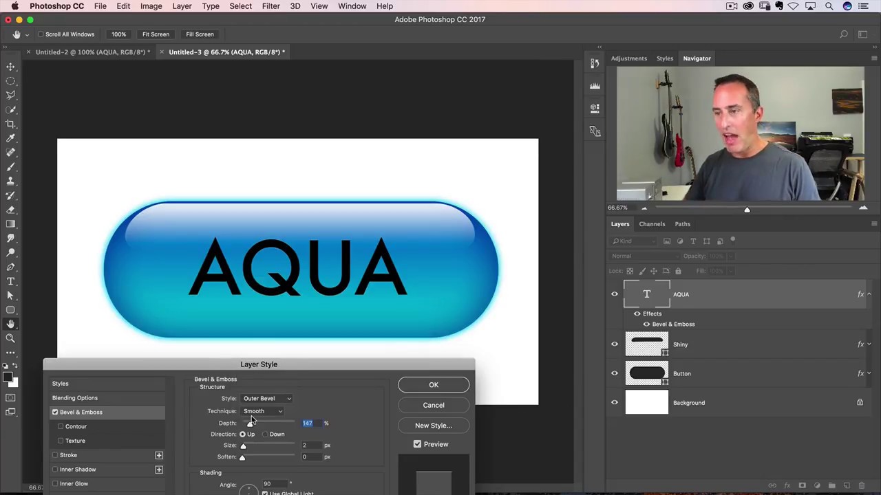
I got my start making terrible graphics in MS Paint for anyone who’d sit still long enough to watch. Buttons, badges, fake logos – I thought I was a genius. Then I discovered Photoshop and realized I had been finger-painting while other people were doing oil portraits. One of the first effects that genuinely made my jaw drop was the aqua button – that glassy, pill-shaped thing that was everywhere during the early Mac OS era. It looked like something you could reach into the screen and press with your thumb. I had no idea how it was made, and that mystery was basically the reason I fell down the Photoshop rabbit hole in the first place.
In this Matt Kloskowski tutorial from his Photoshop Throwback Thursday series, he rebuilds that classic aqua button from scratch – and the technique is surprisingly relevant for anyone doing UI mockups, web graphics, or just wanting to stretch their layer styles muscles. Watch the full tutorial on YouTube if you want to follow along with Matt directly. But if you want a written breakdown you can work through step by step without bouncing between tabs, keep reading.
The whole thing is built on a vector shape and a stack of layer styles – which means it scales infinitely and takes about ten minutes once you know what you’re doing. Here’s how it works.
Step 1: Create a New Document and Grab the Rounded Rectangle Tool
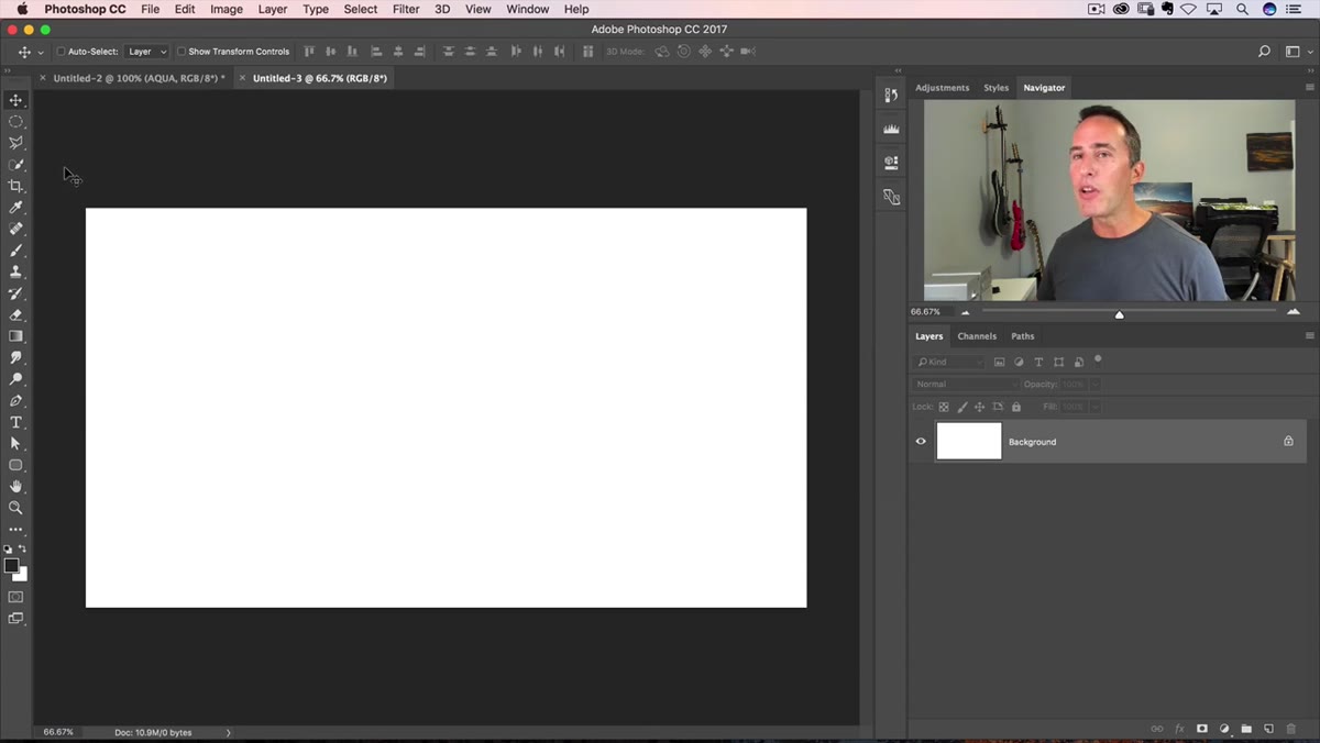 Rounded Rectangle Tool selected in Photoshop toolbar
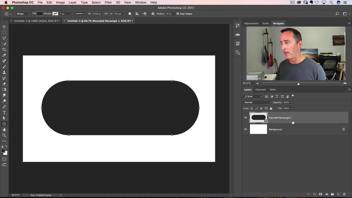
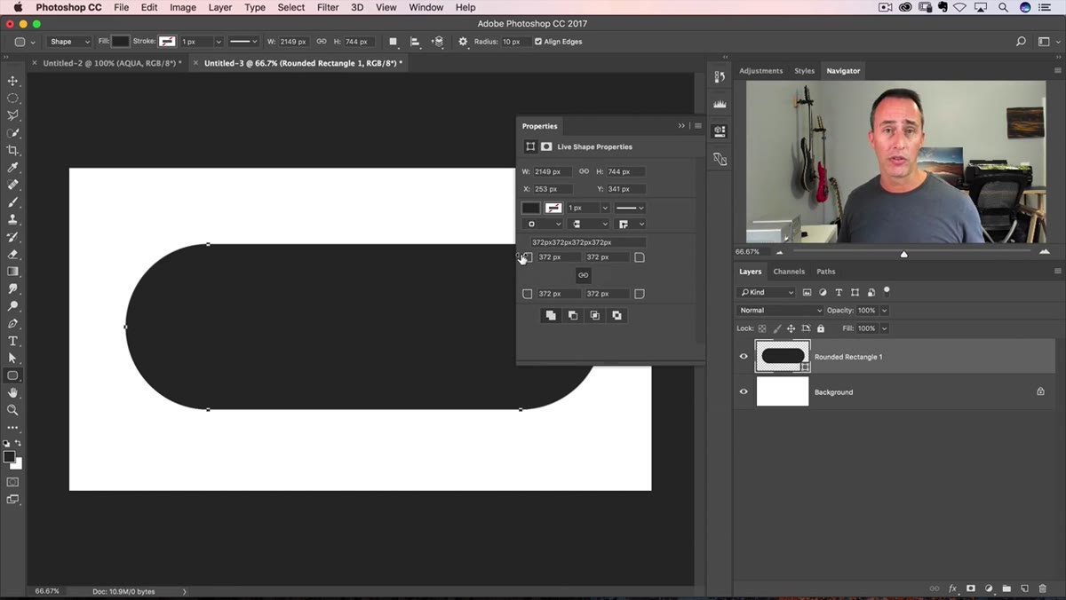
Open a new document – the size doesn’t matter too much since everything here is vector-based and will scale without quality loss. Grab the Rounded Rectangle Tool from the toolbar (it lives in the shape tools group, shortcut U). Click and drag out a wide, pill-style button shape on your canvas. Think less “rectangle with soft corners” and more “a shape that looks like a Tic Tac box from the front.” That elongated pill proportion is what gives the aqua button its classic look.
Rounded Rectangle Tool selected in Photoshop toolbar
Open a new document – the size doesn’t matter too much since everything here is vector-based and will scale without quality loss. Grab the Rounded Rectangle Tool from the toolbar (it lives in the shape tools group, shortcut U). Click and drag out a wide, pill-style button shape on your canvas. Think less “rectangle with soft corners” and more “a shape that looks like a Tic Tac box from the front.” That elongated pill proportion is what gives the aqua button its classic look.
Once you’ve drawn the shape, the Properties panel will appear. This is where the modern version of Photoshop really earns its keep – you can live-drag the corner radius values while seeing the changes happen on screen. Make sure the link icon in the Properties panel is active so all four corners adjust together. Crank the radius up until those corners are fully rounded into a smooth pill shape.
Step 2: Open the Layer Styles Dialog
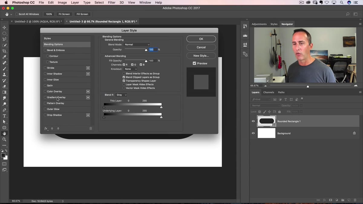
 Layer Style dialog box opening from Layers panel
With your shape layer selected in the Layers panel, double-click on the gray area to the right of the layer thumbnail – not on the thumbnail itself, and not on the layer name. That precise click target opens the Layer Style dialog without renaming the layer or doing something else annoying. This dialog is where nearly the entire aqua effect is built, so get comfortable in here.
Layer Style dialog box opening from Layers panel
With your shape layer selected in the Layers panel, double-click on the gray area to the right of the layer thumbnail – not on the thumbnail itself, and not on the layer name. That precise click target opens the Layer Style dialog without renaming the layer or doing something else annoying. This dialog is where nearly the entire aqua effect is built, so get comfortable in here.
You’ll be adding multiple layer styles on top of each other, which is one of those Photoshop workflows that feels like cheating once you understand it. Each style stacks and compounds, turning a flat blue shape into something that looks three-dimensional and glossy without a single manual brush stroke.
Step 3: Add a Gradient Overlay
 Gradient Overlay option selected in Layer Style panel
Click on “Gradient Overlay” in the left-side list of the Layer Style dialog. Then click on the gradient preview bar itself to open the Gradient Editor. You’re building a two-stop gradient using two different shades of blue – a lighter aqua on one end and a slightly deeper blue on the other. These two colors working together are what give the button that sense of depth and translucency.
Gradient Overlay option selected in Layer Style panel
Click on “Gradient Overlay” in the left-side list of the Layer Style dialog. Then click on the gradient preview bar itself to open the Gradient Editor. You’re building a two-stop gradient using two different shades of blue – a lighter aqua on one end and a slightly deeper blue on the other. These two colors working together are what give the button that sense of depth and translucency.
For the hex values, Matt pulls from an old tutorial file he had buried on a drive – a nice reminder that good reference files are worth hoarding. A solid starting point for the lighter aqua stop is around #3CC9xx (you’ll dial in the exact shade visually). The gradient should run vertically, lighter at the top transitioning to a richer blue toward the bottom. Set the style to Linear and the angle to 90 degrees. Don’t finalize yet – there are more styles to layer on top.
Step 4: Build the Highlight Gloss Shape
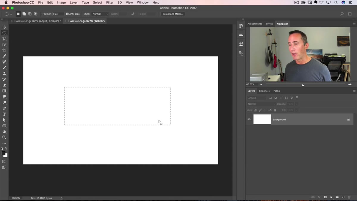 Elliptical selection being drawn over the top half of button
Here’s where the old-school Photoshop history gets fun. Matt briefly walks through how people used to fake rounded shapes before the Rounded Rectangle Tool was reliable – drawing rectangles, then adding elliptical marquee selections in Add mode using Shift. Nobody misses that workflow, but it’s a good reminder of how far the tools have come.
Elliptical selection being drawn over the top half of button
Here’s where the old-school Photoshop history gets fun. Matt briefly walks through how people used to fake rounded shapes before the Rounded Rectangle Tool was reliable – drawing rectangles, then adding elliptical marquee selections in Add mode using Shift. Nobody misses that workflow, but it’s a good reminder of how far the tools have come.
For the gloss highlight, you need a soft white ellipse sitting on the upper portion of the button, creating the illusion that light is hitting a curved glass surface. The highlight shape should cover roughly the top third to top half of the button and be feathered or opacity-reduced so it blends smoothly. This is the detail that separates an aqua button from just a blue pill – without that highlight, it reads as flat.
Step 5: Refine with Additional Layer Styles
 Multiple layer styles listed as active in the Layer Style panel
Back in the Layer Style dialog, the gradient alone isn’t enough. A subtle inner glow and a drop shadow finish off the depth effect. The inner glow should use a light, semi-transparent white and be set to a small size – just enough to soften the edge of the shape and suggest the light wrapping around the form. The drop shadow should be soft and short, not dramatic. You want the button to look like it’s sitting slightly above the surface, not like it’s falling off a cliff.
Multiple layer styles listed as active in the Layer Style panel
Back in the Layer Style dialog, the gradient alone isn’t enough. A subtle inner glow and a drop shadow finish off the depth effect. The inner glow should use a light, semi-transparent white and be set to a small size – just enough to soften the edge of the shape and suggest the light wrapping around the form. The drop shadow should be soft and short, not dramatic. You want the button to look like it’s sitting slightly above the surface, not like it’s falling off a cliff.
The real trick here is keeping the shadow opacity low – somewhere in the 30-40% range – and using a spread of zero so it stays diffuse. Heavy shadows kill the glassy aesthetic immediately.
What I’d Do Differently: Save It as a Style
Matt builds this in a clear, linear way that’s perfect for learning the individual components. If I were setting this up for actual client work or a design system, I’d immediately save the completed layer style as a preset once everything was dialed in. Right-click the effects list on the layer, hit “Save Layer Style,” and give it a name. From that point forward, any shape you draw – any size, any proportion – gets the full aqua treatment in two clicks.
I learned this the hard way after rebuilding a drop shadow setup from scratch about six times on the same project before someone told me presets existed. Don’t be me. Save your styles.
The biggest takeaway from this tutorial is that layer styles are criminally underused by anyone who spends most of their time in Photoshop doing photo work. If your muscle memory goes straight to adjustment layers and masks, exercises like this are worth doing just to remind yourself that Photoshop is also a fully functional design tool. The aqua button is retro, sure – but the layer style stacking technique behind it applies to anything: modern flat UI elements, badges, icons, you name it.
Watch the full tutorial on YouTube to see Matt walk through every style and color value in real time – his commentary on what these effects meant to the early Photoshop community is genuinely worth watching on its own.
Comments (1)
Tried this technique this morning. Game changer for real.
Leave a Comment