Client work has a way of humbling you fast. I can’t count the number of times someone has asked me for a “simple” video overlay and I’ve spent way too long fussing with positioning, scaling, and trying to make two video clips sit together without looking like a mid-2000s sports broadcast. The picture-in-picture format is one of those things that looks deceptively easy until you’re actually doing it and the inset clip is either the wrong size, sitting in a weird spot, or has that raw, unfinished edge that screams “I just dragged this here and hoped for the best.”
That’s exactly why I was glad I stumbled on this CreativeLive tutorial from Lesa Snider. Watch the full tutorial on YouTube. In it, she walks through creating a picture-in-picture video effect directly inside Photoshop’s timeline, and more importantly, she shows the one finishing step most people skip that separates a polished inset from a sloppy one. It’s a short lesson but it’s dense with useful technique, so I’ve broken it down here into steps you can follow without pausing and rewinding every 20 seconds.
The whole workflow lives inside Photoshop’s video timeline, which is still underused by a lot of designers who think of Photoshop as purely a static image tool. If you’ve ever needed to put together a quick product demo, a tutorial overlay, or even a reaction-style clip without jumping into Premiere, this is worth knowing.
Step 1: Get Both Clips Into the Same Timeline
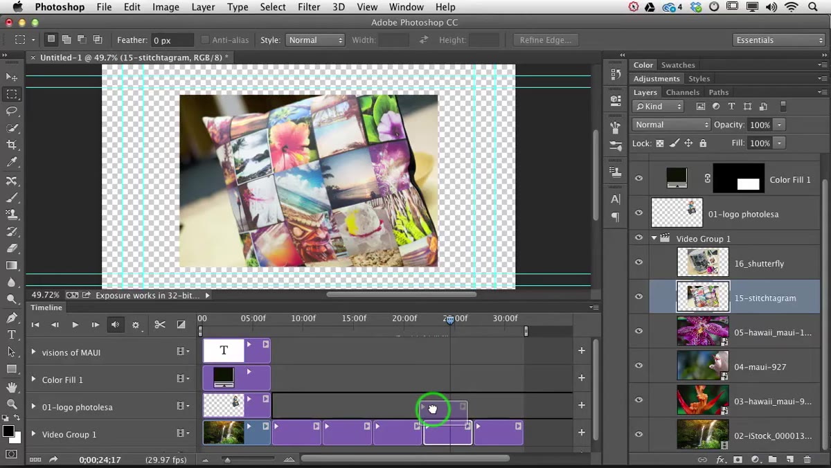 Dragging a video clip into an existing timeline panel
Start with your base video already open in the Photoshop timeline. Then, with your second clip active, click and drag it directly into that timeline. You’re not opening it as a new document. You’re pulling the clip into the existing timeline so it sits as its own layer above the base footage. Once it’s there, you can slide it left or right along the timeline to control exactly when it appears in the video. Position it at whatever point makes sense for your edit.
Dragging a video clip into an existing timeline panel
Start with your base video already open in the Photoshop timeline. Then, with your second clip active, click and drag it directly into that timeline. You’re not opening it as a new document. You’re pulling the clip into the existing timeline so it sits as its own layer above the base footage. Once it’s there, you can slide it left or right along the timeline to control exactly when it appears in the video. Position it at whatever point makes sense for your edit.
Think of this the same way you’d drag a new image layer into a regular Photoshop document. The logic is identical. The timeline just adds the time dimension on top of the standard layer stack.
Step 2: Resize the Inset with Free Transform
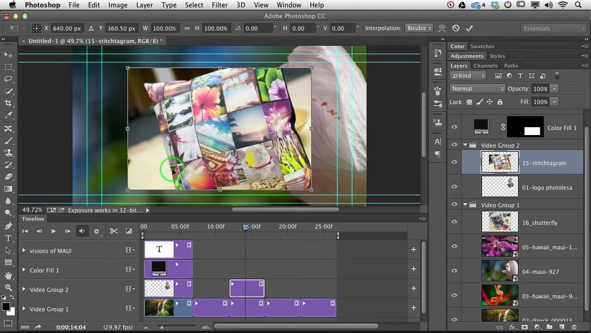 Free Transform handles active around the inset video clip
Click on the inset clip’s layer to make it active, then hit Command+T (Mac) or Control+T (Windows) to bring up Free Transform. You’ll see the familiar corner and edge handles appear around the clip. Hold Shift while dragging any corner handle inward to scale it down proportionally. Once it’s roughly the size you want, you can release Shift and then click and drag from inside the bounding box to reposition the clip anywhere on the frame. When you’re happy with the placement, press Return to commit the transformation.
Free Transform handles active around the inset video clip
Click on the inset clip’s layer to make it active, then hit Command+T (Mac) or Control+T (Windows) to bring up Free Transform. You’ll see the familiar corner and edge handles appear around the clip. Hold Shift while dragging any corner handle inward to scale it down proportionally. Once it’s roughly the size you want, you can release Shift and then click and drag from inside the bounding box to reposition the clip anywhere on the frame. When you’re happy with the placement, press Return to commit the transformation.
A word on sizing: smaller doesn’t always mean less distracting. I usually aim for something in the 20-30% range of the overall frame, tucked into a lower corner. It needs to be readable without competing with whatever’s happening in the main clip.
Step 3: Open the Layer Style Dialog and Add a Stroke
 Layer Styles dialog open with Stroke option selected
With the inset layer still active, scroll to the bottom of the Layers panel and click the fx button. That’s the “Add a layer style” button, and from the menu that pops up, choose Stroke. This is just Photoshop’s word for an outline. The dialog opens and by default you’ll get a thin black stroke, which honestly looks pretty harsh against most footage. Don’t click OK yet. There’s a better way to pick the color.
Layer Styles dialog open with Stroke option selected
With the inset layer still active, scroll to the bottom of the Layers panel and click the fx button. That’s the “Add a layer style” button, and from the menu that pops up, choose Stroke. This is just Photoshop’s word for an outline. The dialog opens and by default you’ll get a thin black stroke, which honestly looks pretty harsh against most footage. Don’t click OK yet. There’s a better way to pick the color.
Step 4: Sample a Color Directly from the Image
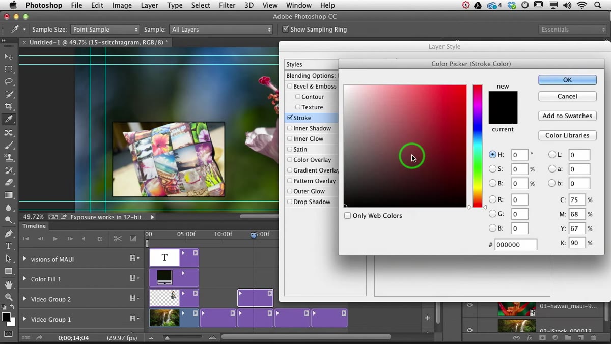 Eyedropper cursor sampling color from the background video frame
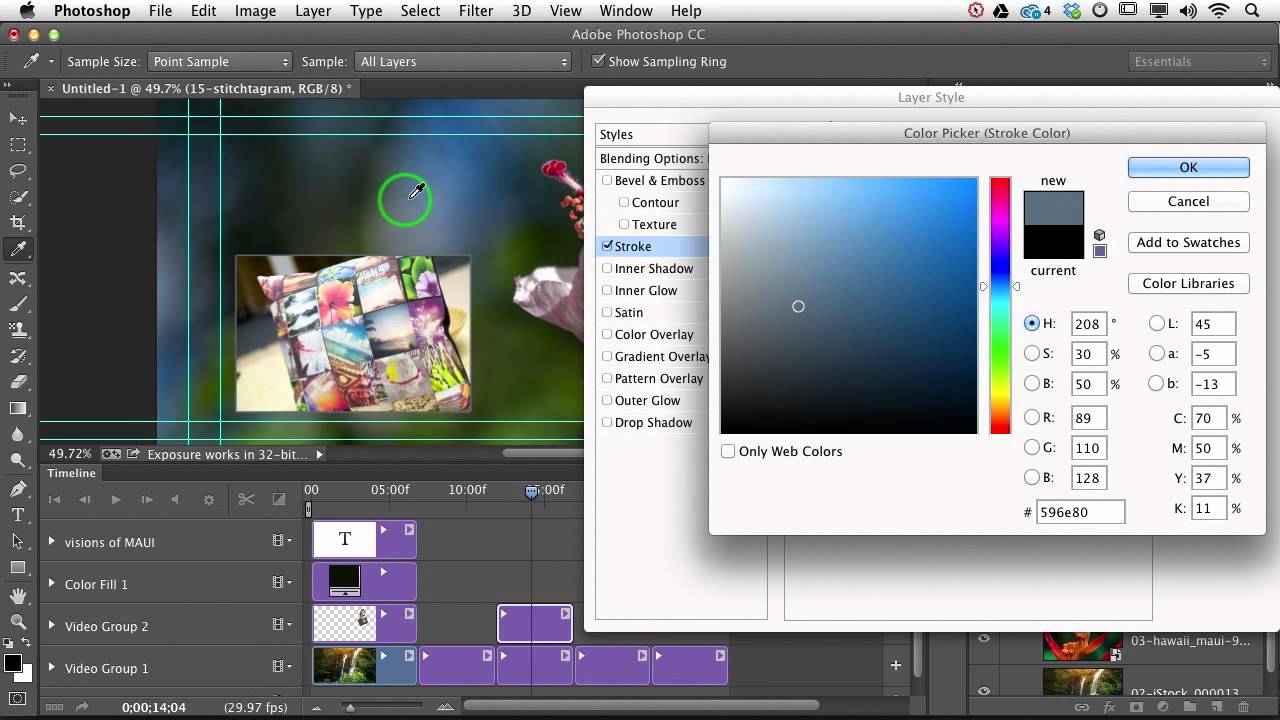
Here’s the move that makes this feel intentional rather than slapped together. Inside the Layer Style dialog, click the color swatch next to the stroke color option. The Color Picker opens. Now, instead of typing in a hex code or dragging sliders, simply move your cursor away from the dialog and onto the image itself. Your cursor automatically switches to the eyedropper tool, and you can click anywhere on the frame to sample a color.
Eyedropper cursor sampling color from the background video frame
Here’s the move that makes this feel intentional rather than slapped together. Inside the Layer Style dialog, click the color swatch next to the stroke color option. The Color Picker opens. Now, instead of typing in a hex code or dragging sliders, simply move your cursor away from the dialog and onto the image itself. Your cursor automatically switches to the eyedropper tool, and you can click anywhere on the frame to sample a color.
Lesa’s advice here is solid: pull a color from either the inset clip or the background footage. A color that already exists in the image reads as purposeful and cohesive. A color you invented from nowhere reads as clip art. I’ve started doing this with every stroke or border I add to anything, and it’s made a real difference in how finished work looks when it lands in a client’s inbox.
Step 5: Dial In the Stroke Size and Position
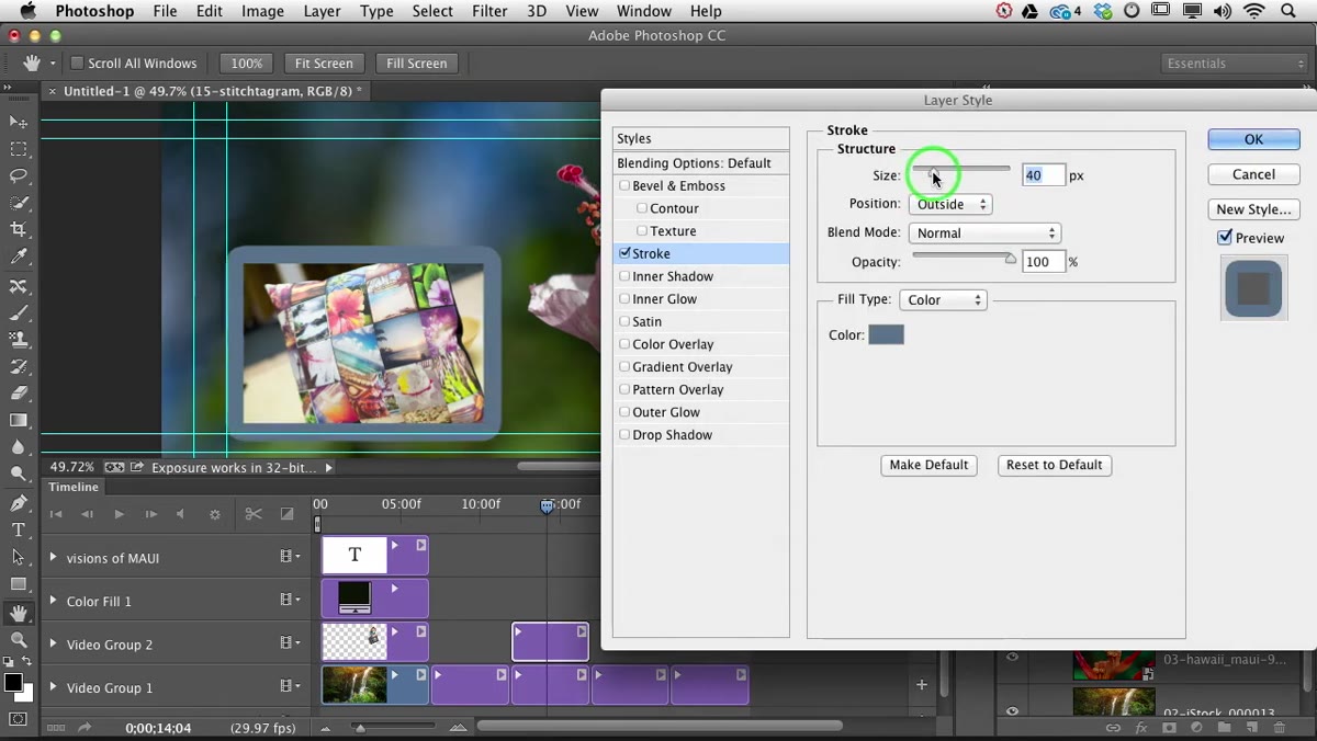 Stroke size slider being adjusted in the Layer Style dialog
Back in the dialog, use the Size slider to set the width of the stroke. For a subtle, professional edge, Lesa keeps it around 3 pixels. That’s a good baseline. You can go wider if you want more of a design statement, but thin tends to age better and works across more contexts.
Stroke size slider being adjusted in the Layer Style dialog
Back in the dialog, use the Size slider to set the width of the stroke. For a subtle, professional edge, Lesa keeps it around 3 pixels. That’s a good baseline. You can go wider if you want more of a design statement, but thin tends to age better and works across more contexts.
The Position dropdown gives you three choices: Outside, Inside, or Center. Outside gives you slightly rounded corners on the stroke, which tends to look softer. Inside gives you crisp, sharp corners. Center splits the difference. For most inset work, Outside at a small size is the safe call. If you want to dial back the visibility even more, drop the Opacity of the stroke in that same dialog. You’re not touching the layer opacity, just the stroke itself. It’s a subtle move but it can take the edge off without removing the stroke entirely.
My Own Take: Drop Shadow Makes It Pop Even More
This isn’t in the tutorial, but once I started using this workflow I found that adding a small drop shadow on top of the stroke made the inset feel like it was sitting on top of the frame rather than just floating. Back in the Layer Style dialog (just double-click the layer to reopen it), add a Drop Shadow and keep the distance and size both low, around 4-6 pixels. Set the opacity somewhere between 30-50%. It adds just enough depth that the inset reads as a distinct element, which matters most when the inset and background clips have similar tones or colors.
Also, if you plan to do this more than once, save this combination as a Layer Style preset. Right-click the fx label on the layer, choose Copy Layer Style, and then paste it onto future inset clips. Same professional finish, zero repeated work.
The single biggest lesson from Lesa’s tutorial is this: the stroke color matters more than the stroke itself. Getting the sizing and positioning right is mechanical. Sampling the color from within the existing imagery is the creative decision that determines whether the result looks designed or just assembled. It’s a 10-second step that most people skip, and it shows.
Watch the full tutorial on YouTube to see Lesa walk through the whole thing in real time. It’s short, it’s clear, and it’s the kind of tutorial that actually changes how you approach a task going forward.
Comments
Leave a Comment