There’s a certain kind of Photoshop tutorial that makes you feel like you’ve been doing everything wrong. Not in a crushing way, but in a “oh, so there’s no secret formula and everyone is just winging it with taste” kind of way. That’s exactly the feeling I got watching Watch the full tutorial on YouTube from photographer and retoucher Jessica Kobeissi, specifically the third part of her fashion photo coloring and editing series. If you’ve been staring at your adjustment layers waiting for divine inspiration, this one’s for you.
What makes Kobeissi’s approach interesting isn’t that she’s working from some locked-in recipe. She’s explicit about the fact that she experiments for hours, toggles values back and forth, and lands on something by feel rather than formula. Coming from someone whose early “workflow” was slapping gradients on meme templates in exchange for pizza, I found that genuinely reassuring. Color grading fashion images has always felt like the most subjective and therefore terrifying part of a retouch job. Watching a pro embrace the ambiguity makes the whole process feel a lot more approachable.
Here’s a step-by-step breakdown of her process so you can follow along without pausing and rewinding every thirty seconds.
Step 1: Start With a Curves Adjustment Layer
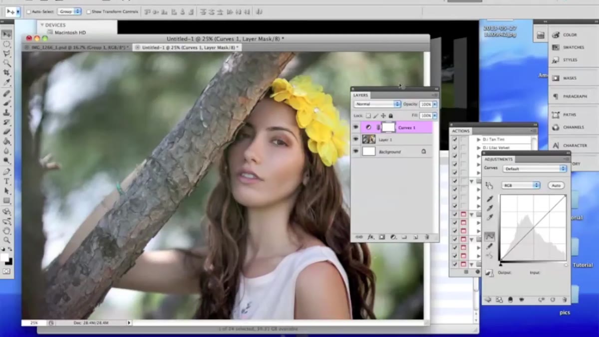 Curves adjustment layer panel open in Photoshop
The first thing Kobeissi reaches for is a Curves adjustment layer, which she opens via the New Adjustment Layer menu at the bottom of the Layers panel. If you’re not already comfortable with Curves, the short version is this: dragging the curve upward brightens the image, pulling it down darkens it. She makes a subtle downward adjustment on the overall RGB channel first, just to dial in the exposure a touch before she starts playing with color.
Curves adjustment layer panel open in Photoshop
The first thing Kobeissi reaches for is a Curves adjustment layer, which she opens via the New Adjustment Layer menu at the bottom of the Layers panel. If you’re not already comfortable with Curves, the short version is this: dragging the curve upward brightens the image, pulling it down darkens it. She makes a subtle downward adjustment on the overall RGB channel first, just to dial in the exposure a touch before she starts playing with color.
The more interesting move happens when she switches the channel dropdown from RGB to Blue. This is where Curves goes from “useful” to “dangerously fun.” Dragging the blue curve down strips blue tones from the image and introduces warm, yellow-amber hues. Pulling it up pushes the image cool and blue. She adds a second point to the curve and shapes it so different tonal ranges get different treatment, warmer shadows, for instance, while the highlights stay more neutral. The exact values will depend entirely on your image, so the real instruction here is: play with it. Drag both points around and watch what happens to the mood.
Step 2: Layer On a Selective Color Adjustment
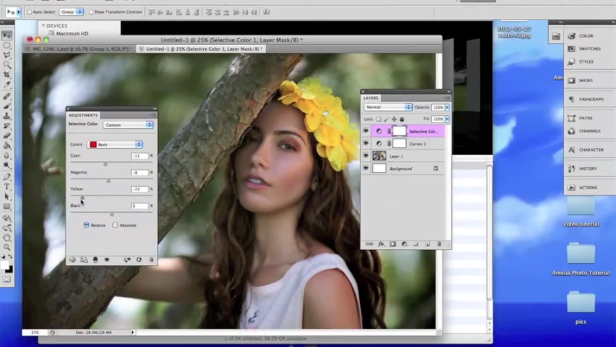 Selective Color panel with Yellows channel selected
Once she’s happy with the Curves foundation, Kobeissi adds a Selective Color adjustment layer. This tool lets you target specific color ranges in the image and shift the cyan, magenta, yellow, and black within that range independently. It’s one of those tools that sounds intimidating and then turns out to be incredibly precise once you start poking at it.
Selective Color panel with Yellows channel selected
Once she’s happy with the Curves foundation, Kobeissi adds a Selective Color adjustment layer. This tool lets you target specific color ranges in the image and shift the cyan, magenta, yellow, and black within that range independently. It’s one of those tools that sounds intimidating and then turns out to be incredibly precise once you start poking at it.
In her image, she dials up the yellow a bit and pulls the black slider down slightly (around negative five). The key insight here is using the color channel dropdown at the top of the panel. It defaults to Reds, but you can switch it to Yellows, Whites, Neutrals, and so on. Each one is its own mini color grade. She cycles through a few, making small adjustments to steer the overall palette toward the warm, golden feel she’s going for. Small moves go a long way here. Think in increments of five to ten, not fifty.
Step 3: Use Blend Modes to Rescue Obnoxious Adjustments
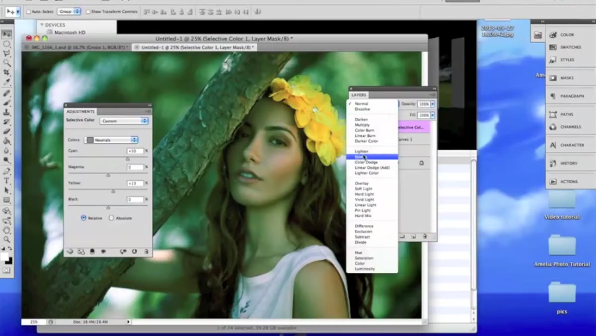 Layer blend mode dropdown showing Luminosity selected
Here’s a trick I genuinely hadn’t thought to use this deliberately. Kobeissi pushes a Selective Color layer to a pretty extreme setting, something that looks garish at full Normal blend mode, and then changes the layer’s blend mode to Luminosity (or Soft Light). Suddenly the over-the-top adjustment becomes something usable, even interesting.
Layer blend mode dropdown showing Luminosity selected
Here’s a trick I genuinely hadn’t thought to use this deliberately. Kobeissi pushes a Selective Color layer to a pretty extreme setting, something that looks garish at full Normal blend mode, and then changes the layer’s blend mode to Luminosity (or Soft Light). Suddenly the over-the-top adjustment becomes something usable, even interesting.
The logic is sound. Luminosity applies only the brightness information from the adjustment, ignoring the hue and saturation changes. Soft Light adds contrast and color in a much more gentle, blended way than Normal. So if you’ve ever cranked an adjustment layer and thought “this is almost right but too much,” try flipping through the blend modes before you throw it out. You might land on something you’d never have arrived at intentionally.
Step 4: Add Temperature Control With Color Balance
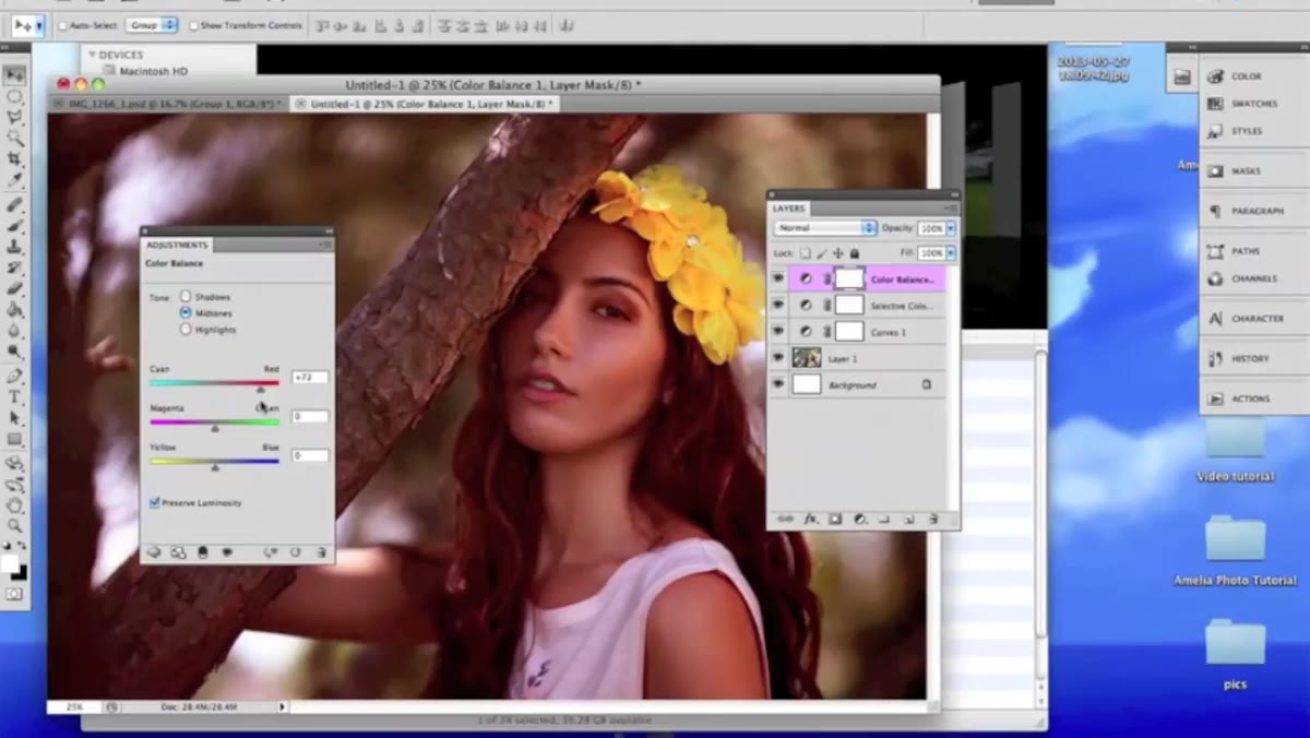 Color Balance panel with Midtones selected
Color Balance is Kobeissi’s next stop, and she describes it as the tool to reach for when you know with confidence which temperature direction you want the image to go. It has sliders for the three major color axes (Cyan to Red, Magenta to Green, Yellow to Blue) and separate controls for Shadows, Midtones, and Highlights.
Color Balance panel with Midtones selected
Color Balance is Kobeissi’s next stop, and she describes it as the tool to reach for when you know with confidence which temperature direction you want the image to go. It has sliders for the three major color axes (Cyan to Red, Magenta to Green, Yellow to Blue) and separate controls for Shadows, Midtones, and Highlights.
In her pass, she reduces the cyan slightly and nudges yellow upward in the midtones. Then she checks the highlights separately and makes another small adjustment there. The power of working with each tonal range independently is that you can, for example, keep highlights slightly cool while pushing midtones warm. That kind of contrast between tonal zones is often what separates a “nice” grade from one that actually has character. Keep your adjustments conservative here unless you’re going for a very deliberate stylized look.
Step 5: Drop In a Gradient Layer for Light Effects
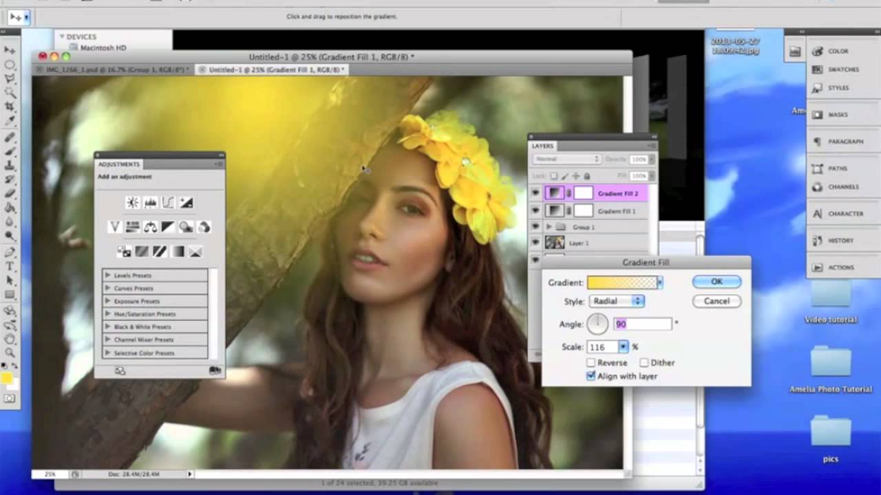
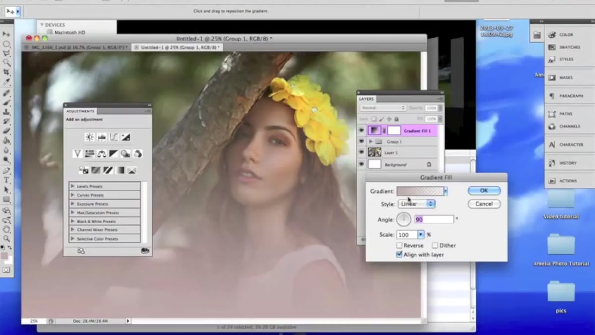 Gradient tool applied as transparent overlay on image
The final touch in her workflow is a gradient layer. She uses the Gradient Tool to draw a transparent-to-color gradient across part of the image, then lowers the opacity significantly. It functions less as a color correction and more as a way to simulate a light source or add a subtle glow to one area of the frame.
Gradient tool applied as transparent overlay on image
The final touch in her workflow is a gradient layer. She uses the Gradient Tool to draw a transparent-to-color gradient across part of the image, then lowers the opacity significantly. It functions less as a color correction and more as a way to simulate a light source or add a subtle glow to one area of the frame.
The key is using a transparent gradient rather than a solid-to-color one. That way it integrates naturally rather than looking like a color block was dropped on the image. She drags it in, drops the opacity until it feels like atmosphere rather than effect, and treats it as a finishing touch rather than a structural element. It’s the kind of move that’s almost invisible to a viewer but adds a sense of depth that you’d notice if it were taken away.
What I’d Add From My Own Experience
Kobeissi mentions she often works from a base of pre-bought actions, then modifies each layer. I’ve done something similar, building a starting template of adjustment layers with neutral settings that I can switch on and modify per image. The benefit isn’t speed, honestly. It’s consistency. When you work from a familiar stack of tools, you start to develop muscle memory for which layer handles which problem. That’s how you stop spending four hours on a grade and start spending forty minutes.
One thing I’d add to her gradient step: try setting that gradient layer to Screen or Color Dodge blend mode if you want it to feel more like a lens flare or practical light source. At low opacity with Screen mode, you can simulate warm window light hitting a corner of the frame in a way that looks surprisingly organic.
The single biggest takeaway from this tutorial is permission. Permission to not have a perfect system, to toggle sliders for an hour, to push something too far and then use a blend mode to pull it back. Kobeissi is a working professional with a genuinely great eye, and her process is iterative and instinctive, not algorithmic.
Watch her work through it yourself, because seeing the image transform in real time is more instructive than any screenshot:
Watch the full tutorial on YouTube
Comments
Leave a Comment