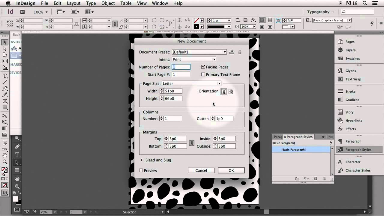
There’s a specific kind of frustration that comes from scanning a drawing you’re actually proud of, opening it in Illustrator, running Image Trace, and watching it turn into a muddy blob of grey noise. I’ve been there. The culprit, almost every time, isn’t the drawing. It’s the prep work, or the lack of it. Getting a clean vector trace out of a hand-drawn scan is less about Illustrator and more about what you do in Photoshop before you ever open Illustrator.
Watch the full tutorial on YouTube
In this CreativeLive tutorial, the instructor walks through how she creates product covers using hand-drawn artwork, starting with a scanned JPEG she sketched while watching TV. Low-key, zero pretension, genuinely useful. The Photoshop portion is brief, almost suspiciously so, but that’s kind of the point. The prep is simple. The payoff in Illustrator is huge. Here’s the full breakdown so you can follow along without pausing every ten seconds.
Step 1: Bring Your Scanned Drawing Into Photoshop
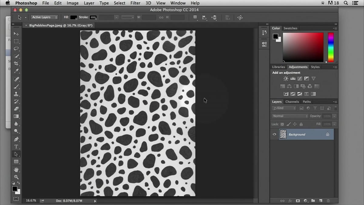 Hand-drawn scanned JPEG open in Photoshop workspace
Your starting point is a scanned hand-drawn image, ideally saved as a JPEG. The quality of the original scan matters more than most people think. If you haven’t scanned it yet, use white paper, not cream or recycled. And use the darkest ink you have. A fine-tip black marker or a technical drawing pen is ideal. The higher the contrast in the original, the less cleanup you’ll need to do in Photoshop. If your scanner has a “black and white document” mode, use it.
Hand-drawn scanned JPEG open in Photoshop workspace
Your starting point is a scanned hand-drawn image, ideally saved as a JPEG. The quality of the original scan matters more than most people think. If you haven’t scanned it yet, use white paper, not cream or recycled. And use the darkest ink you have. A fine-tip black marker or a technical drawing pen is ideal. The higher the contrast in the original, the less cleanup you’ll need to do in Photoshop. If your scanner has a “black and white document” mode, use it.
Open the file in Photoshop like you would anything else. File > Open, find your scan, done. Nothing fancy here yet.
Step 2: Open the Adjustments Panel
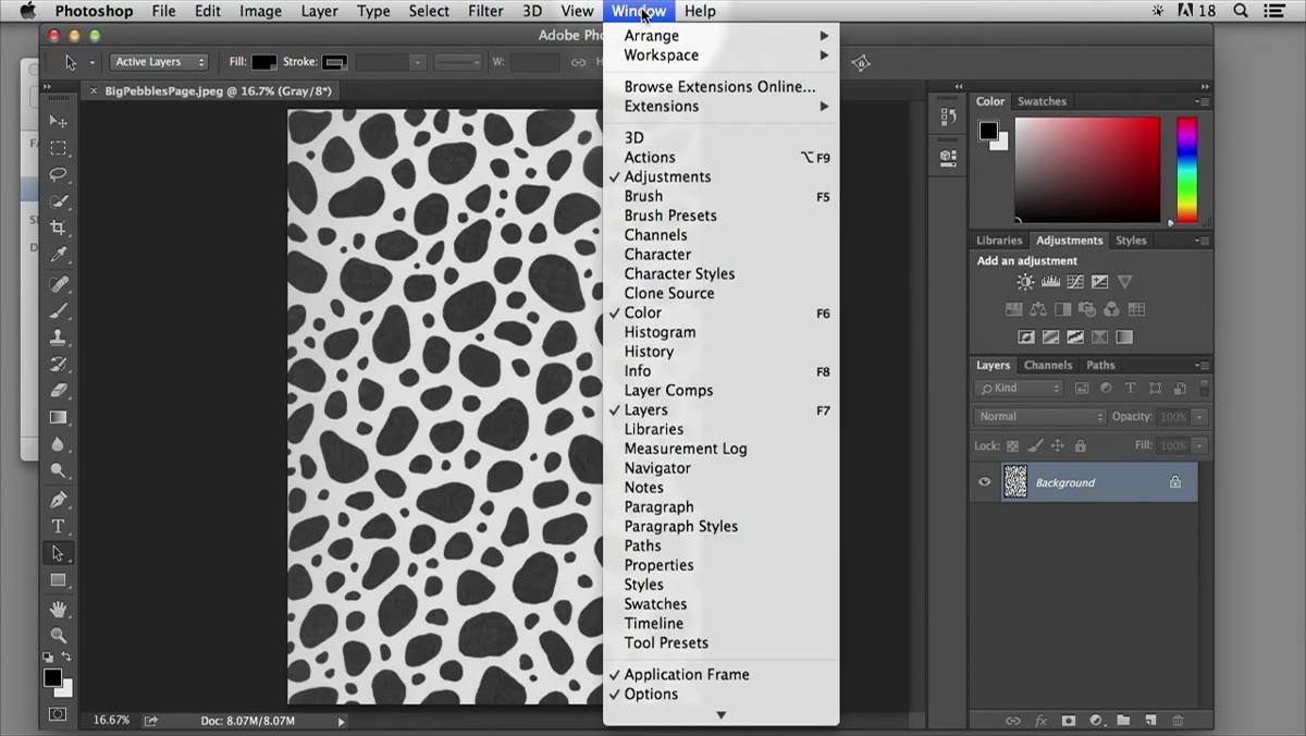 Adjustments panel open showing Brightness/Contrast option
If you’ve never touched the Adjustments panel, here’s where to find it. Go to Window in the top menu bar and select Adjustments. It’ll dock into your workspace, usually on the right side. You’ll see a grid of small icons representing different adjustment types. You’re looking for Brightness/Contrast, which looks like a half-filled circle with a slider implied underneath. Click it.
Adjustments panel open showing Brightness/Contrast option
If you’ve never touched the Adjustments panel, here’s where to find it. Go to Window in the top menu bar and select Adjustments. It’ll dock into your workspace, usually on the right side. You’ll see a grid of small icons representing different adjustment types. You’re looking for Brightness/Contrast, which looks like a half-filled circle with a slider implied underneath. Click it.
This opens a non-destructive adjustment layer directly above your scan in the Layers panel. That’s a nice bonus. If you go too far and want to dial it back, you can just double-click the adjustment layer and tweak the values. Nothing gets baked in until you flatten or export.
Step 3: Crank the Contrast Hard
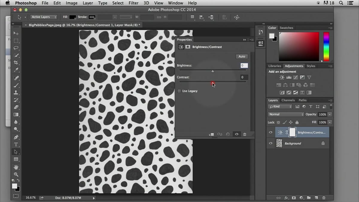 Brightness/Contrast sliders with contrast pushed to maximum
This is the actual technique, and it’s blunt in the best way. Leave the Brightness slider alone and push the Contrast slider as far right as it goes. We’re talking maximum contrast, not a tasteful nudge. You want your black lines to go fully black and your white background to stay fully white. No greys, no gradients, no “artistic” middle ground.
Brightness/Contrast sliders with contrast pushed to maximum
This is the actual technique, and it’s blunt in the best way. Leave the Brightness slider alone and push the Contrast slider as far right as it goes. We’re talking maximum contrast, not a tasteful nudge. You want your black lines to go fully black and your white background to stay fully white. No greys, no gradients, no “artistic” middle ground.
You’ll see the image snap from that soft, slightly washed-out scan quality into something that looks almost like a woodcut. That’s exactly what you want. Illustrator’s Image Trace algorithm works by reading tonal values and converting them into paths. When everything is either black or white, the trace is clean and predictable. When there are greys in the mix, you get jagged edges, extra noise, and paths that look like they were drawn by someone having a bad day.
Step 4: Export as JPEG at Maximum Quality
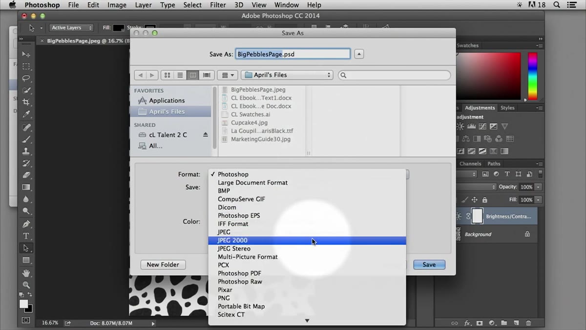 Save As dialog with JPEG format and quality settings visible
Once the contrast is dialed in, you’re done with the editing side. Go to File > Export > Export As (or File > Save As if you prefer the older dialog) and choose JPEG as your format. Set the quality to maximum, which typically shows as 12 or 100 depending on which dialog you’re using. The instructor mentions she sometimes sees it default to 8 or 9 and just leaves it, but honestly, for a file that’s heading into Illustrator for tracing, maximum quality costs you nothing and gives you sharper edge data for the trace.
Save As dialog with JPEG format and quality settings visible
Once the contrast is dialed in, you’re done with the editing side. Go to File > Export > Export As (or File > Save As if you prefer the older dialog) and choose JPEG as your format. Set the quality to maximum, which typically shows as 12 or 100 depending on which dialog you’re using. The instructor mentions she sometimes sees it default to 8 or 9 and just leaves it, but honestly, for a file that’s heading into Illustrator for tracing, maximum quality costs you nothing and gives you sharper edge data for the trace.
Save it with a name you’ll actually recognize when you’re hunting for it in Illustrator. “scan_contrast_v1.jpg” is infinitely better than “IMG_4872_copy_final.jpg.” Future you will be grateful.
Step 5: Open in Illustrator and Run Image Trace
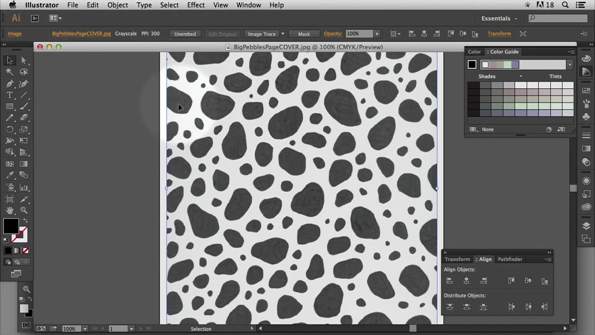 Scanned image selected in Illustrator with Image Trace panel open
This is where Photoshop hands off to Illustrator, but it’s worth including for context. Open your saved JPEG in Illustrator, select it, and head to Window > Image Trace to open the panel. Run the trace. Illustrator will warn you that it might take a moment depending on file complexity. Click OK and let it work.
Scanned image selected in Illustrator with Image Trace panel open
This is where Photoshop hands off to Illustrator, but it’s worth including for context. Open your saved JPEG in Illustrator, select it, and head to Window > Image Trace to open the panel. Run the trace. Illustrator will warn you that it might take a moment depending on file complexity. Click OK and let it work.
The result is a traced version of your drawing sitting on top of the original embedded image. Two critical steps follow: click Expand in the control bar at the top, and then go to Object > Ungroup. Expand converts the trace result into actual editable vector paths. Ungroup breaks those paths into individual elements so you can select and manipulate them independently. Skip Expand and you’ll be confused about why nothing is editable. The instructor says she forgets it regularly, so don’t feel bad if you do too.
Step 6: Clean Up the White Fills
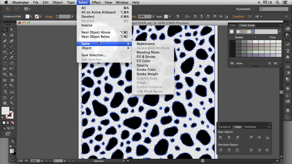 Select Same Fill Color used to select and delete white vector pieces
After ungrouping, you’ll notice Illustrator has left a bunch of white filled shapes scattered throughout the artwork. These are artifacts from the trace process, areas it read as “white space” and converted into actual white vector shapes. They’re invisible against a white background but will cause problems if you place the art over any color.
Select Same Fill Color used to select and delete white vector pieces
After ungrouping, you’ll notice Illustrator has left a bunch of white filled shapes scattered throughout the artwork. These are artifacts from the trace process, areas it read as “white space” and converted into actual white vector shapes. They’re invisible against a white background but will cause problems if you place the art over any color.
To get rid of them efficiently, click one of the white shapes, then go to Select > Same > Fill Color. This selects every object in the document sharing that same white fill. Hit Delete. The white artifacts disappear and you’re left with just the black linework, ready to be colored, scaled, or dropped into any layout you want.
One Thing I’d Add: Check Your Scan DPI Before You Start
The tutorial doesn’t get into this, but it’s something I’ve learned the annoying way. If you’re scanning at 72 DPI because that’s whatever your scanner defaulted to, you’re going to get soft, mushy edges even after pushing the contrast to maximum. Scan at a minimum of 300 DPI for anything you plan to trace. At 600 DPI you get genuinely crisp results, especially for detailed linework. The file size goes up, but the trace quality difference is noticeable. Illustrator handles the resolution reduction when it converts to vectors anyway, so you’re not carrying that large file around forever.
If you’re pulling art from a phone photo instead of a scanner, the same principle applies. Photograph in good light, make sure the paper is flat, and use the highest resolution your phone will give you. The contrast bump in Photoshop helps, but it can’t manufacture detail that was never there to begin with.
The single most important thing this workflow teaches is that Photoshop doesn’t need to do everything. Sometimes its job is to set Illustrator up for success, get the image into the best possible state, and then step aside. That contrast adjustment takes about ten seconds. The time it saves you in Illustrator cleanup is significant.
Watch the full tutorial on YouTube to see the complete workflow, including how to use your finished vector as a product cover and how to build a custom color palette from a photo using the eyedropper tool.
Comments (3)
I keep coming back to this article. It's that useful.
Quality content like this is rare. Keep it up.
I keep coming back to this article. It's that useful.
Leave a Comment