I spent an embarrassing amount of time early in my freelance career fighting with Photoshop’s brush tool. I’d lower the opacity to build up a soft mask, then wonder why my strokes looked choppy and inconsistent. I’d click, release, click again, and end up with these weird hard rings of buildup that looked nothing like the smooth, natural blending I was going for. Turns out I was using the wrong setting entirely, and nobody had ever taken five minutes to explain the difference.
That’s exactly what Matt Kloskowski does in this tutorial, and he does it better than anything I’d stumbled across before. Watch the full tutorial on YouTube - it’s short, focused, and genuinely one of those things that changes how you work. The premise is simple: take a photo of a bird, blend it with a texture layer, and use brushing and masking to bring it all together. But the real value is the two-minute breakdown of Flow versus Opacity that happens before any of that. If you’ve been defaulting to Opacity your whole life, buckle up.
The distinction sounds subtle. It isn’t. Once you feel the difference in practice, you’ll have a hard time going back to doing it the old way.
Step 1: Set Up a Simple Test Canvas
 Blank white canvas with brush tool selected
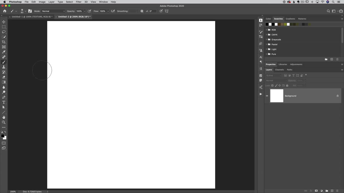
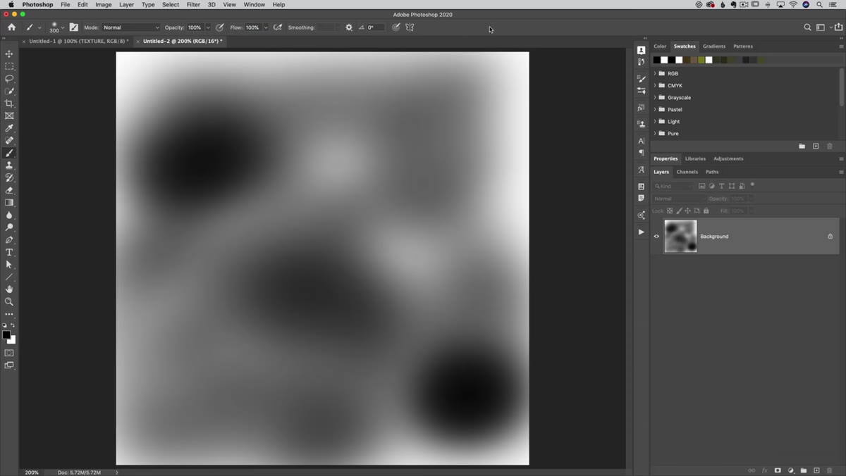
Before touching any real project, do what Matt does here and test this on a blank white canvas. Grab your Brush tool (B), pick a soft round brush, set your foreground color to black, and make sure Opacity is at 100% with Flow also at 100%. Give it a quick stroke so you have a reference for what full-strength painting looks like. This baseline matters because the differences you’re about to see are subtle enough that without a clean comparison, they won’t stick.
Blank white canvas with brush tool selected
Before touching any real project, do what Matt does here and test this on a blank white canvas. Grab your Brush tool (B), pick a soft round brush, set your foreground color to black, and make sure Opacity is at 100% with Flow also at 100%. Give it a quick stroke so you have a reference for what full-strength painting looks like. This baseline matters because the differences you’re about to see are subtle enough that without a clean comparison, they won’t stick.
Step 2: Understand What Opacity Actually Does
 Low opacity brush strokes on white canvas showing no buildup
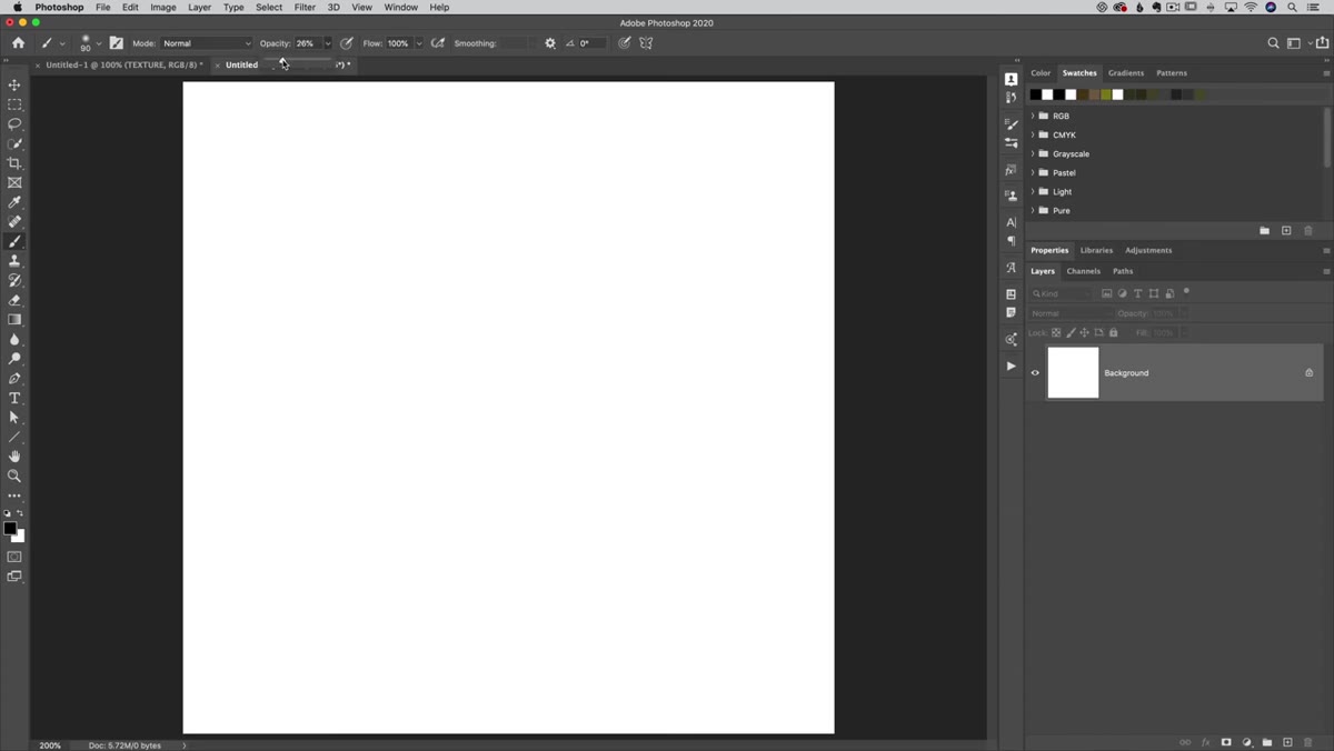
Drop your Opacity down to around 25-30% and leave Flow at 100%. Now paint a stroke, scribble back and forth over the same area, and watch what happens - which is essentially nothing. No matter how many times you drag back over the same spot within a single click-and-drag action, the color refuses to build up past that opacity percentage. You’re capped.
Low opacity brush strokes on white canvas showing no buildup
Drop your Opacity down to around 25-30% and leave Flow at 100%. Now paint a stroke, scribble back and forth over the same area, and watch what happens - which is essentially nothing. No matter how many times you drag back over the same spot within a single click-and-drag action, the color refuses to build up past that opacity percentage. You’re capped.
Here’s the key behavior to notice: if you release your mouse and click again, then paint over the same area, it will build up another layer. Release again, click again, another layer. So Opacity controls the ceiling for any single continuous stroke. This is great when you need a specific, predictable transparency, but it creates that choppy, click-release-click-release rhythm that makes natural blending feel like a fight.
Step 3: See What Flow Does Differently
 Flow set to 10% with visible buildup as brush passes over same area
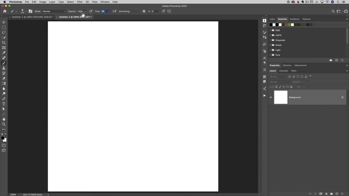
Now set Opacity back to 100% and bring Flow down to around 10%. Click and drag, then deliberately loop back over the same area without releasing your mouse. Watch the color accumulate. The more you scribble over a spot in a single stroke, the darker and more saturated it gets, gradually building up like actual paint or ink would on a surface.
Flow set to 10% with visible buildup as brush passes over same area
Now set Opacity back to 100% and bring Flow down to around 10%. Click and drag, then deliberately loop back over the same area without releasing your mouse. Watch the color accumulate. The more you scribble over a spot in a single stroke, the darker and more saturated it gets, gradually building up like actual paint or ink would on a surface.
This is the fundamental difference. Flow controls how much paint is deposited per pass, but it doesn’t cap you mid-stroke. You can keep building within a single continuous motion. The result is a much more organic feel, especially useful for masking, dodging and burning, or any situation where you want to carefully push a painted area without committing to a fixed transparency level from the start.
Step 4: Decide When to Combine Them (And When Not To)
 Both opacity and flow settings visible in options bar
Matt makes a point worth repeating here: you can use Opacity and Flow together, but doing so makes things less predictable, not more. Both settings will interact, and unless you have a specific reason to combine them, you’re adding a variable that’s hard to mentally track mid-session.
Both opacity and flow settings visible in options bar
Matt makes a point worth repeating here: you can use Opacity and Flow together, but doing so makes things less predictable, not more. Both settings will interact, and unless you have a specific reason to combine them, you’re adding a variable that’s hard to mentally track mid-session.
His general practice is to pick one or the other depending on the job. Opacity for situations where you need a hard, fixed transparency. Flow for anything that benefits from gradual, natural buildup. I’ve landed in the same place after trying the combination approach a few times and spending more time second-guessing my settings than actually painting. Keep it simple.
Step 5: Apply It to a Real Image with a Selection
 Select Subject applied to bird photo layer
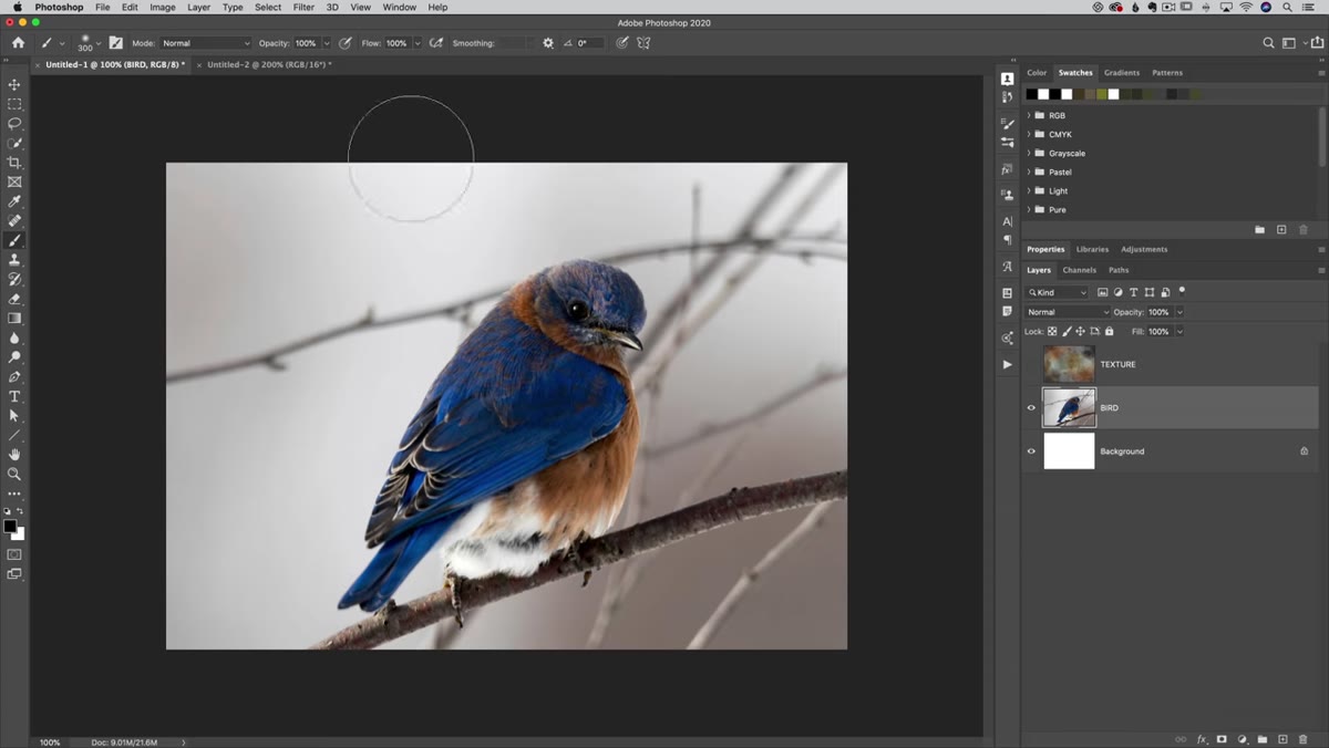
With the concept locked in, Matt moves to the actual project: a bird photo with a texture layer sitting on top. He hides the texture layer temporarily and clicks on the bird layer, then runs Select > Subject. The Select Subject tool has gotten genuinely good, and for something like a bird against a relatively clean background, it does most of the heavy lifting instantly.
Select Subject applied to bird photo layer
With the concept locked in, Matt moves to the actual project: a bird photo with a texture layer sitting on top. He hides the texture layer temporarily and clicks on the bird layer, then runs Select > Subject. The Select Subject tool has gotten genuinely good, and for something like a bird against a relatively clean background, it does most of the heavy lifting instantly.
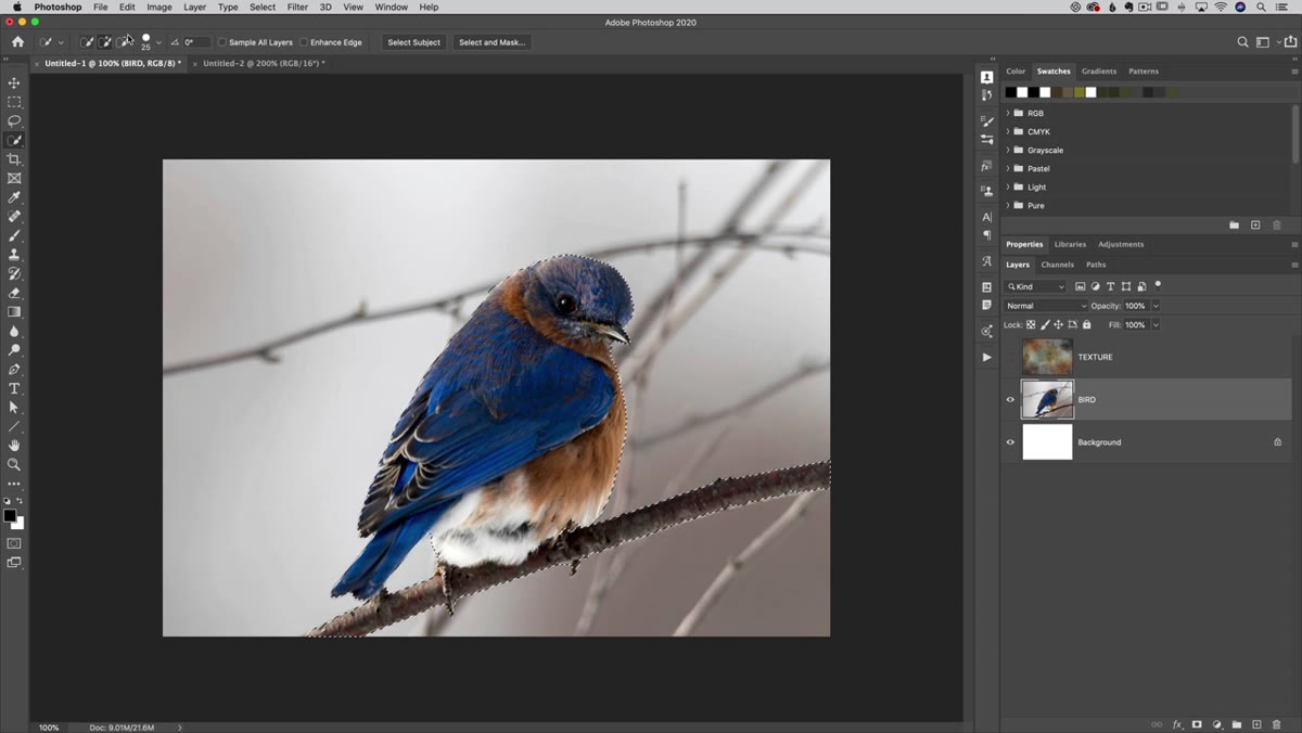
From there, he switches to the Quick Selection tool to clean up the edges. The bracket keys, left and right, resize the brush on the fly, which is the only sane way to work with Quick Selection on detailed edges. To add to the selection, just brush normally. To subtract, hold Option (Mac) or Alt (PC) to flip into subtract mode and paint away any areas the automatic selection grabbed that you didn’t want - like a stray branch or background chunk that snuck in.
Step 6: Use Flow-Based Brushing to Refine the Mask
 Quick selection tool refining edges in subtract mode
Once you have a solid working selection, the Flow setting becomes your best friend for mask refinement. Convert the selection to a layer mask, then switch to a low-Flow brush (10-15% is a good starting point) to paint on the mask and finesse the edges. Because Flow builds up gradually, you can make multiple gentle passes along a tricky edge without suddenly blowing it out or creating harsh lines.
Quick selection tool refining edges in subtract mode
Once you have a solid working selection, the Flow setting becomes your best friend for mask refinement. Convert the selection to a layer mask, then switch to a low-Flow brush (10-15% is a good starting point) to paint on the mask and finesse the edges. Because Flow builds up gradually, you can make multiple gentle passes along a tricky edge without suddenly blowing it out or creating harsh lines.
This is where the whole tutorial clicks into place practically. It’s not just a theoretical exercise. Soft, organic masks on textured backgrounds or hair and feathers - anything with edge complexity - respond much better to Flow-based brushing than the click-release-click routine you’d get stuck in with Opacity alone.
A Note from My Own Workflow
I’d been using a Wacom tablet for a couple of years before learning this distinction, which is almost funny because a pressure-sensitive pen is basically designed to exploit exactly this kind of nuanced brush behavior. I was using a sports car to go to the mailbox. Once I set my pen’s pressure to control Flow instead of Opacity, the whole thing started feeling like painting rather than clicking a software interface. If you’re on a tablet and haven’t experimented with mapping pressure to Flow specifically, that’s worth an afternoon of testing on its own.
Also, this translates directly to Lightroom and Camera Raw if you use the Adjustment Brush there. The Flow slider in those tools behaves identically. One concept, multiple tools.
The single most important thing here is this: Opacity sets a ceiling, Flow controls accumulation. Once that’s in your muscle memory, your masking and painting work will feel less like wrestling with the software and more like actually making something.
Watch the full tutorial on YouTube to see Matt walk through the complete bird-and-texture project from start to finish. The brushing explanation alone is worth the watch time.
Comments (2)
This is exactly what I needed today. Been struggling with this for weeks.
I've been looking for exactly this kind of tutorial. Perfect timing.
Leave a Comment