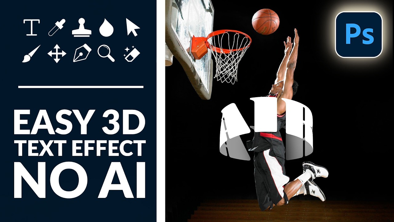
There’s a specific kind of design envy that hits when you see text curving around a subject like it actually exists in the same physical space. Not slapped on top. Not dropped in as an afterthought. Actually wrapping. I’ve faked this effect badly more times than I care to admit, usually by just skewing text and hoping nobody looked too closely. Spoiler: they always look too closely.
So when I came across this Aaron Nace (PHLEARN) tutorial on creating a 3D text effect in Photoshop, I sat up a little straighter in my coffee shop booth. The promise was real depth, real dimension, no AI shortcuts, and no destructive edits. That last part matters to me more than it used to, ever since I flattened a client’s layered file thinking I was saving a copy. We don’t talk about that day. The point is: non-destructive workflows are your best insurance policy, and this technique leans into that fully.
What Aaron builds here is a wrap effect where text appears to loop around a subject, part of it passing in front, part of it disappearing behind, with shadow work that sells the illusion. It’s a technique that shows up everywhere in editorial design, album covers, and promotional graphics, and once you understand the mechanics, you’ll start seeing it (and wanting to use it) constantly.
Step 1: Set Up Your Text Layer
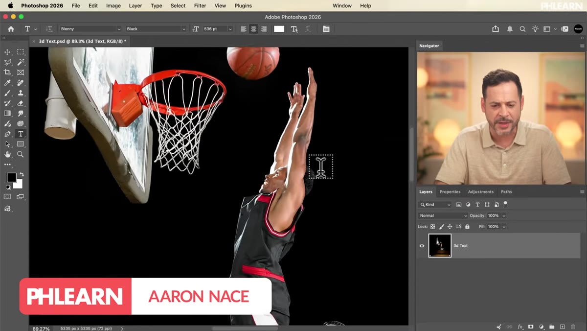
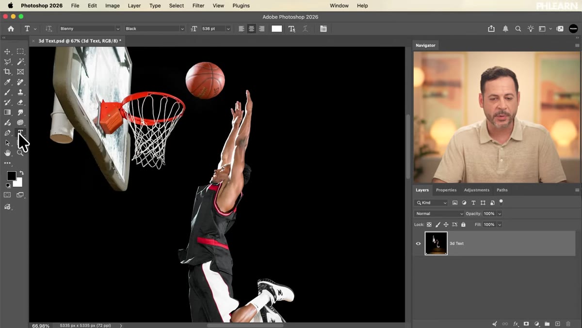 Type tool selected in toolbar, white text typed over subject
Grab the Type tool (keyboard shortcut: T, which is one of those sensible shortcuts I genuinely appreciate) and click anywhere on your canvas. Aaron types the word “AIR” here, using white text so it’s visible against the image. The exact position doesn’t matter yet since you’ll be moving things around anyway. Just get the word on screen, confirm it with the checkmark in the options bar, and reposition it roughly over your subject with the Move tool.
Type tool selected in toolbar, white text typed over subject
Grab the Type tool (keyboard shortcut: T, which is one of those sensible shortcuts I genuinely appreciate) and click anywhere on your canvas. Aaron types the word “AIR” here, using white text so it’s visible against the image. The exact position doesn’t matter yet since you’ll be moving things around anyway. Just get the word on screen, confirm it with the checkmark in the options bar, and reposition it roughly over your subject with the Move tool.
Font choice matters more here than in a lot of effects because the warping will be more readable with thick, chunky letterforms. Aaron uses Blenny, a bold display font available through Adobe Fonts if you’re on a Creative Cloud subscription. To grab it, go to Type, then More from Adobe Fonts, search “Blenny,” and click Add Family. It syncs in about a minute. If you want to use something you already have, just go thick and wide – condensed or script fonts will fight you later.
Step 2: Duplicate the Layer and Name Your Parts
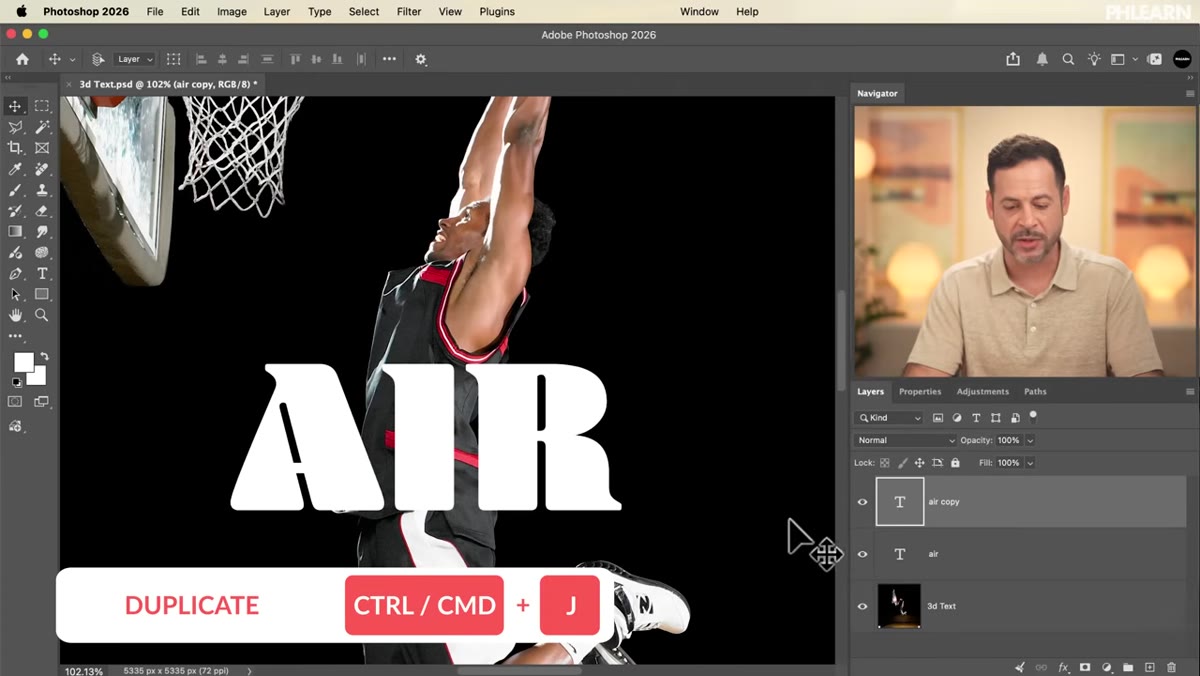 Two text layers in the Layers panel labeled air front and air back
Here’s where the 3D logic starts. You need two versions of your text: one that will sit in front of your subject, and one that will sit behind. Duplicate your text layer with Ctrl+J (Cmd+J on Mac) and rename the layers something sensible – Aaron goes with “air front” and “air back.” Obvious naming, yes, but when you’re juggling masks and adjustments later, “Layer 3 copy 2” is how you end up staring at your screen at midnight wondering what you were thinking.
Two text layers in the Layers panel labeled air front and air back
Here’s where the 3D logic starts. You need two versions of your text: one that will sit in front of your subject, and one that will sit behind. Duplicate your text layer with Ctrl+J (Cmd+J on Mac) and rename the layers something sensible – Aaron goes with “air front” and “air back.” Obvious naming, yes, but when you’re juggling masks and adjustments later, “Layer 3 copy 2” is how you end up staring at your screen at midnight wondering what you were thinking.
Change the color of the back layer to a mid-gray so you can visually distinguish the two while you’re working. Click into the layer with the Type tool active, then click the color swatch in the options bar and pick something darker than white. You’re not committing to that color permanently – it’s just a working state so you can see what’s happening as you build the effect.
Step 3: Apply the Warp to Create Curvature
 Warp controls visible on text layer, arc curve being adjusted
With one of your text layers selected, go to Edit, then Transform, then Warp. This is the engine of the whole effect. The Warp tool lets you bend your text along a curve, which is what creates the illusion that it’s following the contour of your subject rather than just floating in front of it. You’ll want an arc that mirrors the shape of whatever you’re wrapping around – if your subject is roughly cylindrical or has a curved shoulder, follow that line.
Warp controls visible on text layer, arc curve being adjusted
With one of your text layers selected, go to Edit, then Transform, then Warp. This is the engine of the whole effect. The Warp tool lets you bend your text along a curve, which is what creates the illusion that it’s following the contour of your subject rather than just floating in front of it. You’ll want an arc that mirrors the shape of whatever you’re wrapping around – if your subject is roughly cylindrical or has a curved shoulder, follow that line.
Apply the same warp logic to both layers, but with intentional variation. The front layer and the back layer should share a consistent curvature so the text reads as one continuous piece looping around an object. Think of it like the two halves of a ring – they curve the same way because they’re part of the same circle. If one arc is dramatically different from the other, the illusion breaks immediately.
Step 4: Mask Each Layer to Your Subject
 Text wrapping around subject, demonstrating front and back separation
This is where it gets satisfying. Use a subject selection (Select, then Subject works well here) to isolate your main figure, then apply that selection as a layer mask. The front text layer should be masked so only the text that falls in front of the subject is visible. The back layer gets the inverse mask – showing only what would logically be hidden behind the subject.
Text wrapping around subject, demonstrating front and back separation
This is where it gets satisfying. Use a subject selection (Select, then Subject works well here) to isolate your main figure, then apply that selection as a layer mask. The front text layer should be masked so only the text that falls in front of the subject is visible. The back layer gets the inverse mask – showing only what would logically be hidden behind the subject.
To invert a mask, just click on it in the Layers panel and hit Ctrl+I (Cmd+I). Getting this right is the whole trick. When both layers are visible simultaneously, you should see text that appears to thread through your subject: some letters crossing in front, the rest tucking behind. If the masking looks rough, use a soft brush on the mask to clean up transitions at the edges.
Step 5: Add Shadows to Sell the Depth
 Shadow effects applied beneath text layers, adding dimension
Technically correct masking gets you halfway there. Shadows get you the rest. The front text layer should cast a subtle shadow onto the subject beneath it, and the edge where text disappears behind the subject should have a soft darkening that implies overlap. You can do this with a Drop Shadow layer style (Layer, Layer Style, Drop Shadow) on the front text layer, keeping the opacity low and the size soft.
Shadow effects applied beneath text layers, adding dimension
Technically correct masking gets you halfway there. Shadows get you the rest. The front text layer should cast a subtle shadow onto the subject beneath it, and the edge where text disappears behind the subject should have a soft darkening that implies overlap. You can do this with a Drop Shadow layer style (Layer, Layer Style, Drop Shadow) on the front text layer, keeping the opacity low and the size soft.
For the back layer, consider adding a slight darkening along the visible edges using a Curves or Brightness/Contrast adjustment clipped directly to that layer. The back of a wrapped object naturally receives less light, so even a modest contrast shift reads as dimensional. Don’t go heavy – if you have to wonder whether the effect is too subtle, it probably isn’t.
One Thing I’d Add From My Own Experience
Aaron’s technique is clean and the workflow is genuinely non-destructive, which I respect. Where I’d push further: convert both text layers to Smart Objects before you start warping. That way, if you want to edit the actual text later, or adjust the warp after the fact, you’re not rebuilding from scratch. I learned this the annoying way when a client asked me to change a word after I’d already built out the full mask setup on a flattened layer. Smart Objects would have made that a two-minute fix instead of a twenty-minute one.
Also worth noting: this technique scales to any text, any subject, any word count. It’s not “AIR”-specific. I’ve used the same basic approach on full phrases running across a portrait, and with clean masking it holds up. The more complex the subject silhouette, the more mask refinement you’ll need, but the core logic stays the same.
The biggest thing this tutorial drilled into me is that 3D illusions in Photoshop aren’t about fancy filters or AI generation. They’re about understanding what light and occlusion actually do and then mimicking that with layers, masks, and a little patience. Get the front-versus-back logic right, add honest shadows, and flat text stops looking flat.
Watch the full tutorial on YouTube to see Aaron walk through the whole thing, and grab the free project assets from the PHLEARN site if you want to follow along with the exact same image.
Comments (2)
Love how you break down complex stuff into manageable steps.
Bookmarked. Coming back to this one for sure.
Leave a Comment