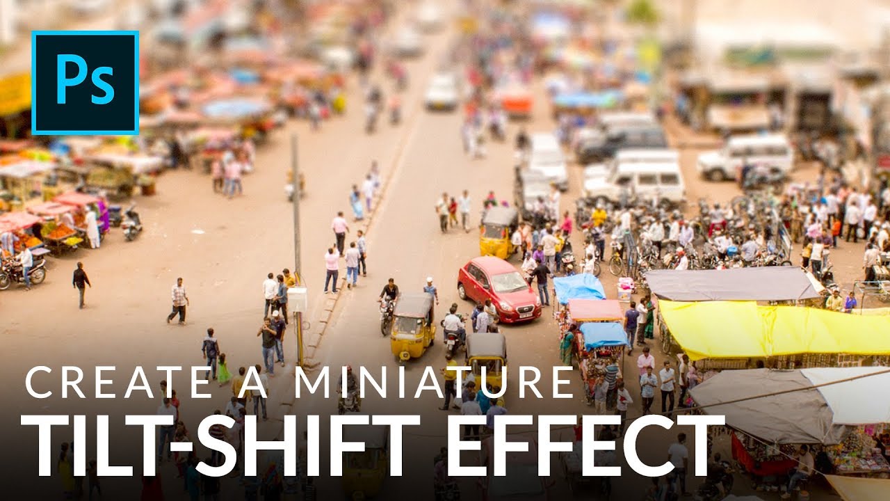
There’s a certain kind of photo that stops people mid-scroll. The city looks like a model train set. The crowd looks like a handful of tiny plastic people. Everything feels weirdly toy-like and satisfying. That’s the tilt-shift effect, and for years I assumed it required either an absurdly expensive specialty lens or some dark Photoshop sorcery I hadn’t been initiated into. Turns out it’s neither. It’s a gradient mask and a blur filter, and you can knock it out in under ten minutes once you know what you’re doing.
In this Aaron Nace (PHLEARN) tutorial, Watch the full tutorial on YouTube, Aaron walks through a clean, non-destructive approach to the tilt-shift look using a gradient mask on a blur filter. The technique is simpler than you’d expect, but the setup decisions he makes along the way are what actually separate a convincing result from something that just looks like you smeared Vaseline on the top and bottom of your photo.
Before you even open Photoshop, Aaron spends time talking about photo selection, and honestly that section of the tutorial is worth as much as the technique itself. The effect lives or dies on your source image. So let me walk you through the whole thing.
Step 1: Understand What You’re Actually Simulating
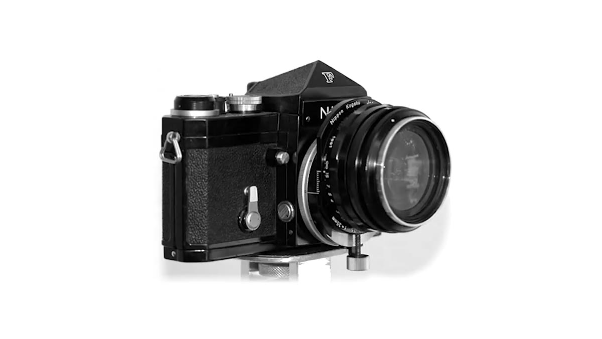 Aaron explaining the real tilt-shift lens and its function
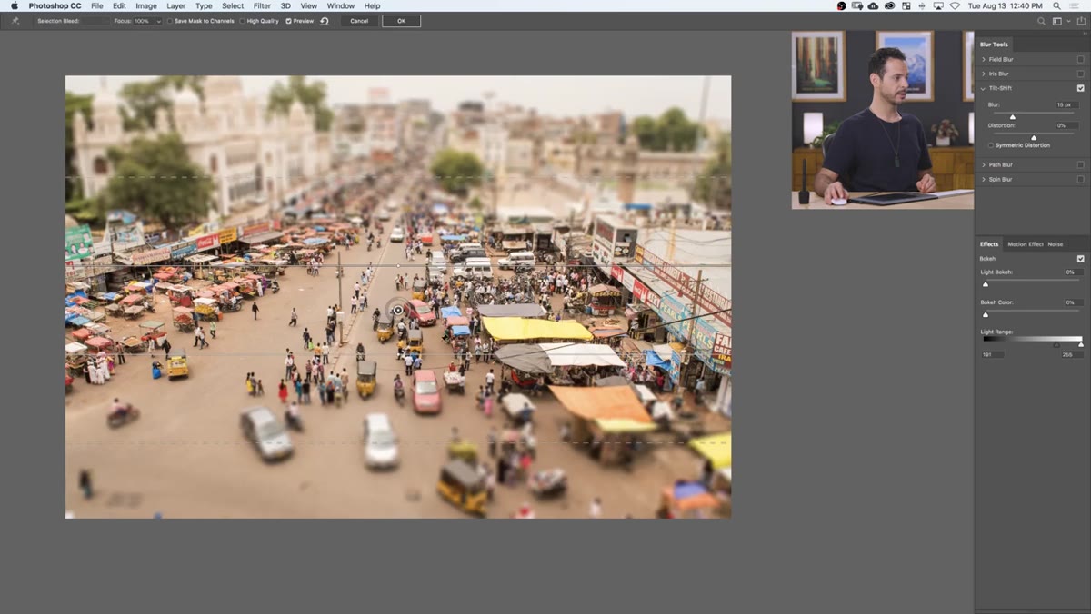
The tilt-shift effect mimics what a physical tilt-shift lens does, specifically the “tilt” part. A real tilt-shift lens lets photographers rotate the focal plane so that only a horizontal strip through the middle of the frame is sharp, with everything above and below falling out of focus fast. When that happens on an aerial or elevated shot of a city or crowd, the brain reads it as a macro photo of something tiny, because that’s the only context where we normally see that kind of shallow depth of field.
Aaron explaining the real tilt-shift lens and its function
The tilt-shift effect mimics what a physical tilt-shift lens does, specifically the “tilt” part. A real tilt-shift lens lets photographers rotate the focal plane so that only a horizontal strip through the middle of the frame is sharp, with everything above and below falling out of focus fast. When that happens on an aerial or elevated shot of a city or crowd, the brain reads it as a macro photo of something tiny, because that’s the only context where we normally see that kind of shallow depth of field.
Knowing this tells you something useful: the blur needs to be strongest at the top and bottom edges and fade to zero in the middle. Not a uniform blur, not a vignette. A gradient blur, centered on whatever you want to look “in focus.”
Step 2: Pick the Right Photo
 Aaron showing an example image shot from above with crowd detail
Aaron makes a strong case for being picky here and I’d back him up completely. The effect works best with photos shot from above, ideally at a slight downward angle rather than straight down. You want subjects in both the foreground and background so there’s actual depth to play with. You also want the left and right sides of the frame to be relatively clear, because the blur only runs top to bottom. If you’ve got a skyscraper running the full vertical height of your frame, blurring the top and bottom just makes the building look out of focus, not miniature.
Aaron showing an example image shot from above with crowd detail
Aaron makes a strong case for being picky here and I’d back him up completely. The effect works best with photos shot from above, ideally at a slight downward angle rather than straight down. You want subjects in both the foreground and background so there’s actual depth to play with. You also want the left and right sides of the frame to be relatively clear, because the blur only runs top to bottom. If you’ve got a skyscraper running the full vertical height of your frame, blurring the top and bottom just makes the building look out of focus, not miniature.
Crowds, cityscapes, busy markets, sports stadiums shot from the upper deck. These all work well. A portrait does not.
Step 3: Convert the Background Layer
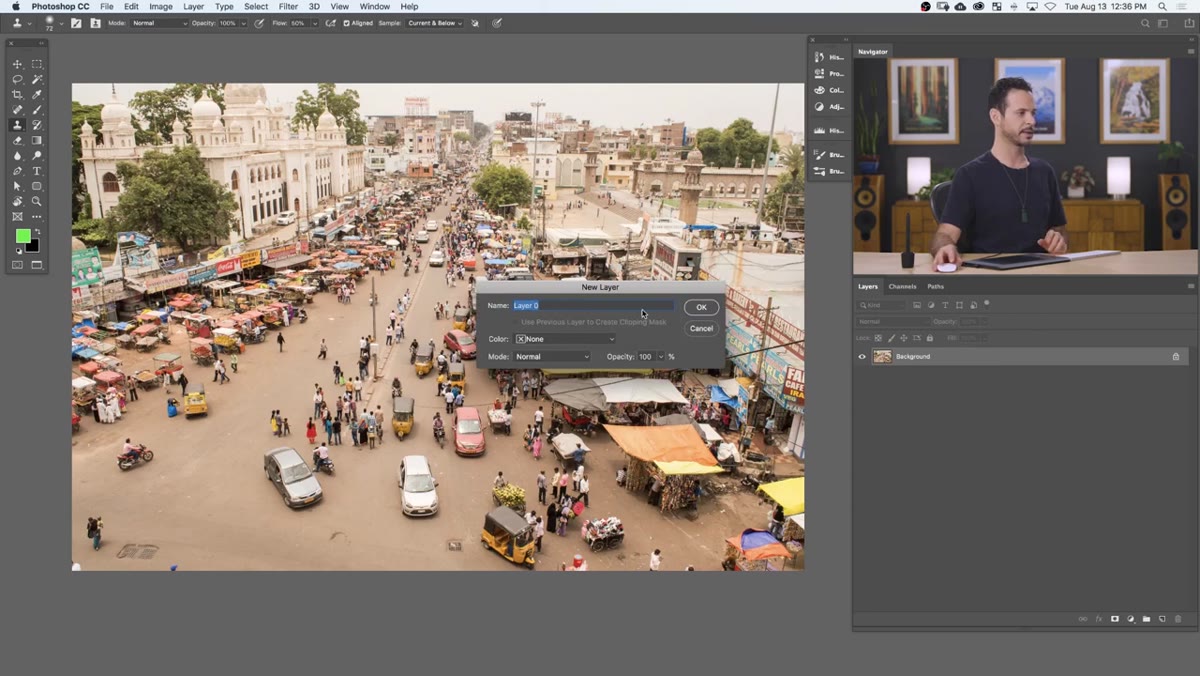
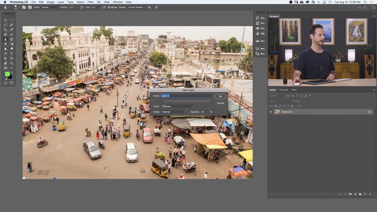 Double-clicking the background layer to convert it to a normal layer
Before touching any filters, double-click the Background layer in the Layers panel to convert it to a regular layer. Just click OK in the dialog that appears. This is a small step but an important one. The Background layer in Photoshop is locked by default, which creates unnecessary friction when you start masking and adjusting. Converting it gives you a fully editable layer to work with and sets you up for a cleaner, non-destructive workflow going forward.
Double-clicking the background layer to convert it to a normal layer
Before touching any filters, double-click the Background layer in the Layers panel to convert it to a regular layer. Just click OK in the dialog that appears. This is a small step but an important one. The Background layer in Photoshop is locked by default, which creates unnecessary friction when you start masking and adjusting. Converting it gives you a fully editable layer to work with and sets you up for a cleaner, non-destructive workflow going forward.
This is the kind of thing that feels like housekeeping but saves you from a headache later. Ask me how I know. (A client’s worth of flattened files. That’s how I know.)
Step 4: Convert to a Smart Object
 Right-clicking the layer to convert it to a Smart Object
Right-click the layer and choose “Convert to Smart Object.” This is the move that keeps everything editable. When you apply a blur to a Smart Object, it comes in as a Smart Filter, which means you can go back and adjust the blur amount any time without starting over. It also means the Smart Filter comes with its own built-in mask, which is exactly what we’re going to use to control where the blur appears.
Right-clicking the layer to convert it to a Smart Object
Right-click the layer and choose “Convert to Smart Object.” This is the move that keeps everything editable. When you apply a blur to a Smart Object, it comes in as a Smart Filter, which means you can go back and adjust the blur amount any time without starting over. It also means the Smart Filter comes with its own built-in mask, which is exactly what we’re going to use to control where the blur appears.
If you skip this step and apply the blur directly to a regular layer, you’re committed. The blur is baked in. Non-destructive workflow isn’t just a buzzword, it’s the difference between a 30-second adjustment and starting from scratch.
Step 5: Apply the Gaussian Blur
 Applying Gaussian Blur from the Filter menu to the Smart Object
Go to Filter, Blur, Gaussian Blur. The radius you use will depend on your image resolution and how dramatic you want the effect, but Aaron’s working in a range that gives a strong, visible blur without completely destroying the texture of the image. Start somewhere around 20-30 pixels and adjust from there. You want the blurred version to look clearly out of focus, not just slightly soft.
Applying Gaussian Blur from the Filter menu to the Smart Object
Go to Filter, Blur, Gaussian Blur. The radius you use will depend on your image resolution and how dramatic you want the effect, but Aaron’s working in a range that gives a strong, visible blur without completely destroying the texture of the image. Start somewhere around 20-30 pixels and adjust from there. You want the blurred version to look clearly out of focus, not just slightly soft.
Click OK. The blur is now applied as a Smart Filter, and you’ll see the filter mask thumbnail appear in the Layers panel directly below your Smart Object layer. That mask is where the real work happens.
Step 6: Paint the Gradient Mask
 Clicking the Smart Filter mask and applying a gradient in the mask
Click directly on the Smart Filter mask thumbnail. Make sure your foreground color is black and your background color is white. Select the Gradient tool (G), choose the Reflected Gradient option from the options bar at the top, and make sure it’s set to a black-to-white gradient.
Clicking the Smart Filter mask and applying a gradient in the mask
Click directly on the Smart Filter mask thumbnail. Make sure your foreground color is black and your background color is white. Select the Gradient tool (G), choose the Reflected Gradient option from the options bar at the top, and make sure it’s set to a black-to-white gradient.
Now drag from the center of your image outward. The reflected gradient will paint black (hiding the blur) in the middle of the frame and white (revealing the blur) at the top and bottom, which is exactly the pattern you want. The center of your image stays sharp. The edges go soft. Adjust where you start and end the drag to control how wide the in-focus zone is. Tighter drag equals a narrower sharp band and a more dramatic effect.
Step 7: Boost the Colors
 Adding a Hue/Saturation adjustment layer to punch up the colors
One finishing touch Aaron recommends: add a Hue/Saturation adjustment layer and push the saturation up noticeably. Real miniature and model photography tends to have punchy, slightly over-saturated colors because of the lighting and materials involved. Nudging the saturation up on your tilt-shift image reinforces the toy-like quality and makes the whole effect read more convincingly.
Adding a Hue/Saturation adjustment layer to punch up the colors
One finishing touch Aaron recommends: add a Hue/Saturation adjustment layer and push the saturation up noticeably. Real miniature and model photography tends to have punchy, slightly over-saturated colors because of the lighting and materials involved. Nudging the saturation up on your tilt-shift image reinforces the toy-like quality and makes the whole effect read more convincingly.
Don’t go overboard. You’re not making a cartoon. But a +20 to +30 bump in saturation makes a real difference in how complete the effect feels.
One Thing I’d Add: Try It on Video Stills
I’ve started pulling single frames from drone footage and running this technique on them. Aerial video stills are often shot from exactly the right angle for tilt-shift, they tend to have rich detail across the whole frame, and the slightly compressed look of a video frame actually suits the effect well. If you have any travel footage sitting around, it’s worth experimenting with. Some of my favorite results have come from source material I’d otherwise never have used as a standalone image.
The biggest thing this tutorial drove home for me is that photo selection is half the technique. You can execute every Photoshop step perfectly and still get a flat result if your source image doesn’t have the right perspective and depth. Pick the right photo first, then the Photoshop part almost does itself.
Watch the full tutorial on YouTube to see Aaron walk through the whole thing with his sample image. Worth the 10 minutes.
Comments
Leave a Comment