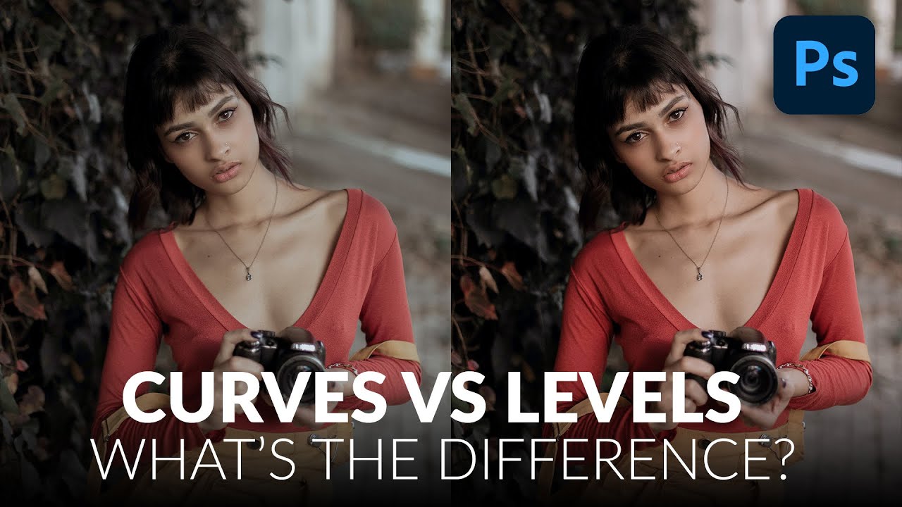
For years I used Levels for everything. Exposure fix? Levels. Quick color correction? Levels. Basically anything that required me to not completely ruin a client’s photo? Levels. It felt safe. Predictable. And I won’t lie, part of the reason I avoided Curves was that the interface looked like something out of a seismograph reading and I had no idea what I was supposed to do with it. Then I watched this Aaron Nace tutorial from PHLEARN and it genuinely reframed how I think about both tools. Watch the full tutorial on YouTube
The short version: Levels is great for fast, simple tonal adjustments, and most of the time it’ll get the job done. But Curves gives you a level of control that Levels just can’t match, and once you understand why, you’ll stop treating Curves like some intimidating advanced-mode thing and start reaching for it on purpose.
Here’s the full walkthrough based on the tutorial, written so you can follow along without having the video running in another tab.
Step 1: Set Up Both Adjustment Layers Side by Side
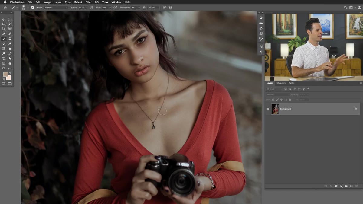 Levels and Curves adjustment layers added to the layer panel
Start by creating both adjustment layers at once so you can compare them directly. Go to Layer > New Adjustment Layer > Levels, hit OK, then repeat for Layer > New Adjustment Layer > Curves. You’ll end up with two adjustment layers stacked in your Layers panel. This isn’t just a setup step for the sake of organization. Seeing them next to each other makes it obvious pretty quickly that they’re displaying the same underlying information in different ways.
Levels and Curves adjustment layers added to the layer panel
Start by creating both adjustment layers at once so you can compare them directly. Go to Layer > New Adjustment Layer > Levels, hit OK, then repeat for Layer > New Adjustment Layer > Curves. You’ll end up with two adjustment layers stacked in your Layers panel. This isn’t just a setup step for the sake of organization. Seeing them next to each other makes it obvious pretty quickly that they’re displaying the same underlying information in different ways.
Step 2: Read the Histogram in Both Panels
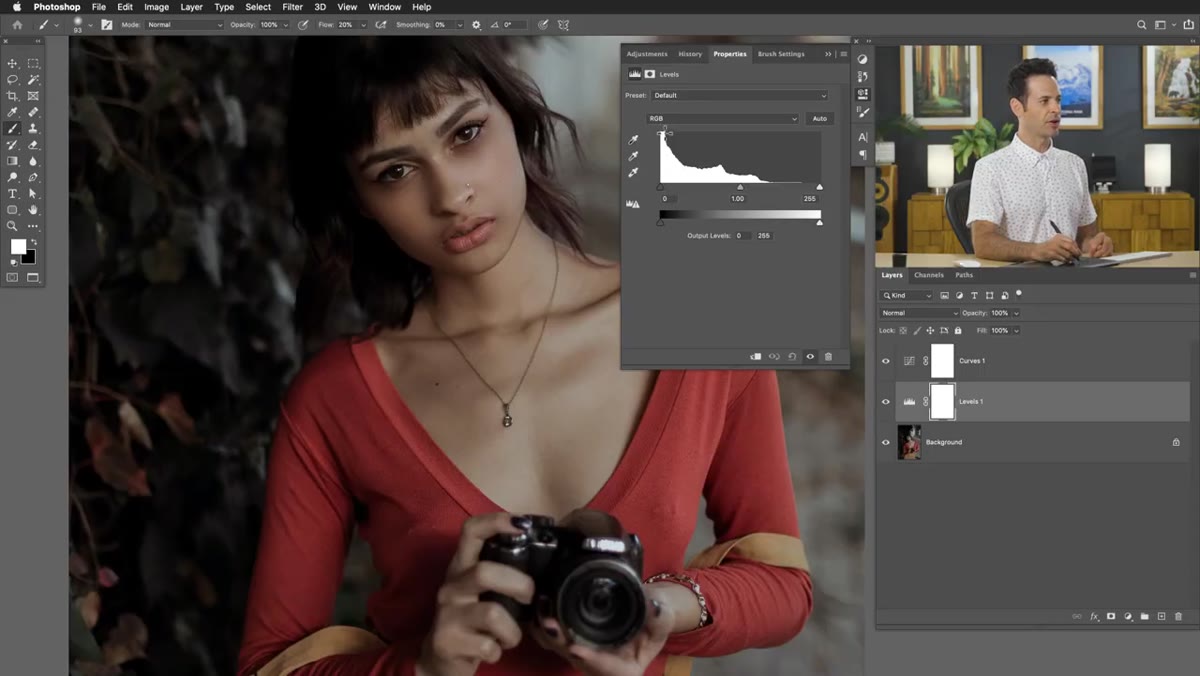 Levels and Curves panels open showing histogram data
Open up both adjustment panels and take a look at the charts inside each one. What you’re looking at in both cases is your image’s histogram, which is just a visual map of tonal information. Dark tones live on the left, highlights on the right, and midtones in the middle. In Levels the histogram sits horizontally inside the panel. In Curves it’s displayed more as a background behind the grid, stretched vertically, but it’s showing the exact same data.
Levels and Curves panels open showing histogram data
Open up both adjustment panels and take a look at the charts inside each one. What you’re looking at in both cases is your image’s histogram, which is just a visual map of tonal information. Dark tones live on the left, highlights on the right, and midtones in the middle. In Levels the histogram sits horizontally inside the panel. In Curves it’s displayed more as a background behind the grid, stretched vertically, but it’s showing the exact same data.
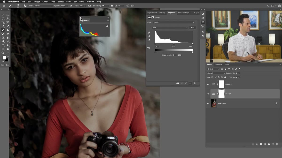
If your image is heavily shadowed, you’ll see a big spike on the left side of the histogram. If it’s blown out, the spike shifts right. Aaron’s sample image has most of its information clustered in the shadows, which you can see clearly in both panels. Understanding what the histogram is telling you is the actual skill here. The tools are just how you respond to it.
Step 3: Use the Eyedroppers to Set Black, White, and Gray Points
 Clicking black point eyedropper on a dark area of the image
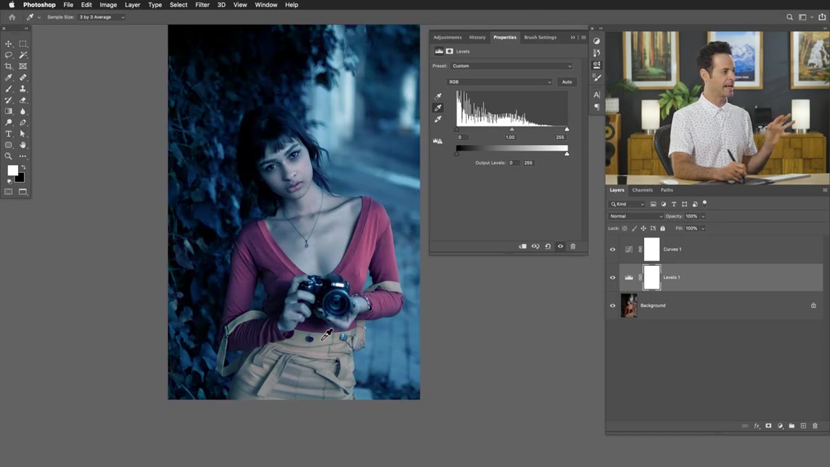
Both Levels and Curves include three eyedroppers: one for setting the black point, one for the white point, and one for the midtone gray point. These work identically in both tools, so don’t let anyone tell you Curves is more powerful just because of this feature. Click the black point eyedropper, then click on the darkest area in your image that you want to be pure black. Do the same with the white point eyedropper on your brightest area.
Clicking black point eyedropper on a dark area of the image
Both Levels and Curves include three eyedroppers: one for setting the black point, one for the white point, and one for the midtone gray point. These work identically in both tools, so don’t let anyone tell you Curves is more powerful just because of this feature. Click the black point eyedropper, then click on the darkest area in your image that you want to be pure black. Do the same with the white point eyedropper on your brightest area.
The midtone eyedropper is where things get interesting for color correction. If you click it on a neutral gray area of your image, Photoshop uses that reference to correct the white balance across the whole photo. Click somewhere that isn’t actually neutral gray and you’ll shift the color cast in the wrong direction fast. Aaron demonstrates this by clicking on a red area, which swings the image toward cyan as a compensation, and then on a yellow area, which pushes it toward blue. If your image has a strong color cast and you have a reliable gray reference point, this single click can save you a ton of manual adjustment time.
Step 4: Manually Set the Black Point Using Input Sliders in Levels
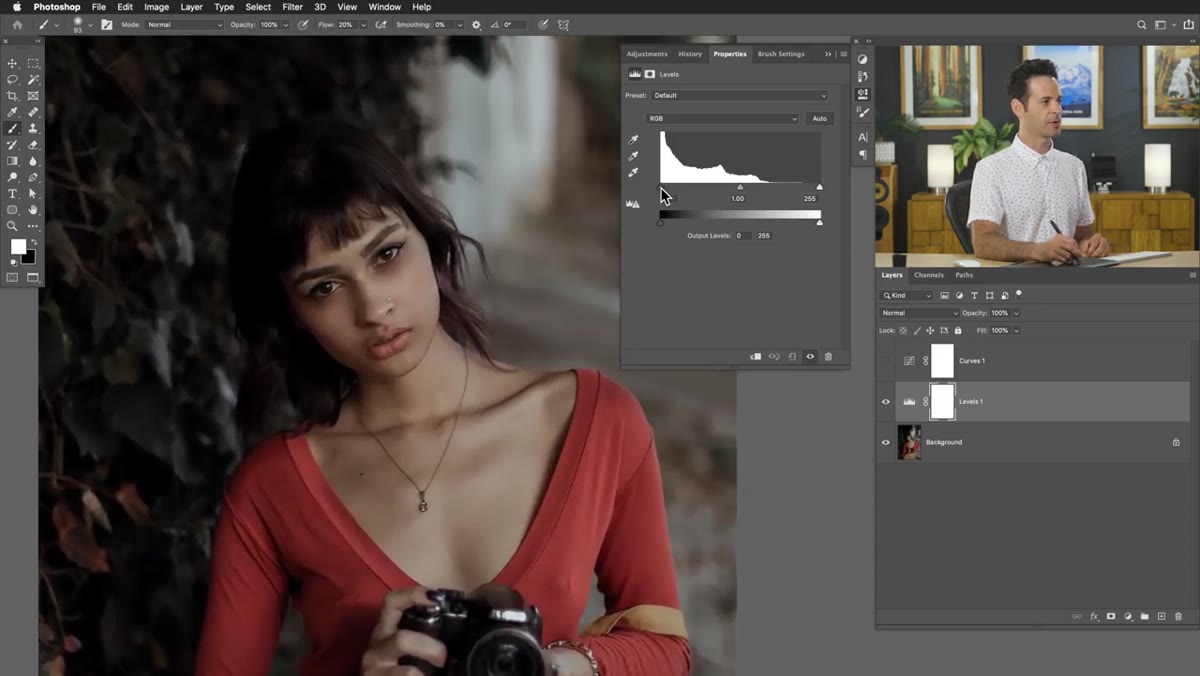 Dragging the black point slider to the right under the histogram
Now let’s go beyond eyedroppers and do things manually. In the Levels panel you’ll see three triangle sliders underneath the histogram: black on the left, white on the right, and gray in the middle. Dragging the black slider to the right tells Photoshop “everything to the left of this point should now be pure black.” That effectively crushes the shadows and increases contrast.
Dragging the black point slider to the right under the histogram
Now let’s go beyond eyedroppers and do things manually. In the Levels panel you’ll see three triangle sliders underneath the histogram: black on the left, white on the right, and gray in the middle. Dragging the black slider to the right tells Photoshop “everything to the left of this point should now be pure black.” That effectively crushes the shadows and increases contrast.
The key thing to understand here is that you’re remapping tonal values. If your image’s darkest pixels are actually a dark gray rather than true black, dragging that slider inward clips them to black. You can see this in real time as you drag. The image gets richer and punchier in the shadows pretty immediately. Don’t go too far or you’ll lose shadow detail that might actually matter.
Step 5: Understand Why Curves Gives You More Control
 Curves panel showing the diagonal line with adjustable anchor points
Here’s where Curves earns its place in the toolkit. In Levels you get three control points: shadows, midtones, highlights. That’s it. In Curves, you’re working with a diagonal line that runs from the bottom-left (pure black) to the top-right (pure white), and you can place anchor points anywhere along that line and drag them independently. More points, more control.
Curves panel showing the diagonal line with adjustable anchor points
Here’s where Curves earns its place in the toolkit. In Levels you get three control points: shadows, midtones, highlights. That’s it. In Curves, you’re working with a diagonal line that runs from the bottom-left (pure black) to the top-right (pure white), and you can place anchor points anywhere along that line and drag them independently. More points, more control.
Want to brighten just the midtones without touching the shadows or highlights? Put a point in the middle of the curve and pull it up. Want an S-curve for that punchy contrast look that’s basically industry-standard at this point? Add a point in the lower quarter and drag it down slightly, add one in the upper quarter and drag it up. Levels can approximate some of this, but it can’t match the precision of having six or seven custom control points across the tonal range.
Step 6: Apply Corrections and Compare the Results
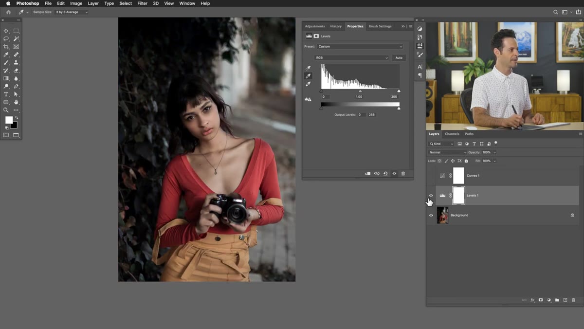 Before and after toggle showing image with corrections applied
Once you’ve made your adjustments in either panel, toggle the layer visibility on and off to compare against the original. In the Layers panel, click the eye icon next to each adjustment layer. This is the fastest sanity check available. It’s easy to over-correct when you’re staring at sliders, and a quick before-and-after toggle usually tells you immediately if you’ve pushed something too far.
Before and after toggle showing image with corrections applied
Once you’ve made your adjustments in either panel, toggle the layer visibility on and off to compare against the original. In the Layers panel, click the eye icon next to each adjustment layer. This is the fastest sanity check available. It’s easy to over-correct when you’re staring at sliders, and a quick before-and-after toggle usually tells you immediately if you’ve pushed something too far.
If you’re using both adjustment layers together (which you generally wouldn’t in a real project but makes sense here for comparison), make sure to solo each one by Alt-clicking its visibility icon so you’re seeing the effect in isolation.
A Note From My Own Workflow
I spent a long time treating Curves as the “advanced” option that I’d get to eventually. What I’ve actually found is that it’s not harder, it’s just different. The learning curve (sorry) is mostly about understanding what the diagonal line represents and trusting yourself to move it intentionally. For quick tonal fixes on simple images, I still default to Levels. But any time I’m doing serious color work or trying to target a specific tonal range without affecting the rest of the image, Curves is the tool I want open.
One habit that helped me: I stopped trying to do everything with one point on the Curves line. Add multiple anchor points and use them to lock parts of the curve in place while you adjust others. It’s a small thing but it makes a big difference in how much control you actually feel like you have.
The single most important thing to take away from this is that Levels and Curves are not competing tools. They’re different interfaces for the same underlying concept. Start with Levels when speed matters, graduate to Curves when precision does. Watch the full tutorial on YouTube to see Aaron Nace walk through every step with a real image, including the color correction stuff that’s genuinely hard to fully appreciate without seeing it in motion.
Comments (1)
This is exactly what I needed today. Been struggling with this for weeks.
Leave a Comment