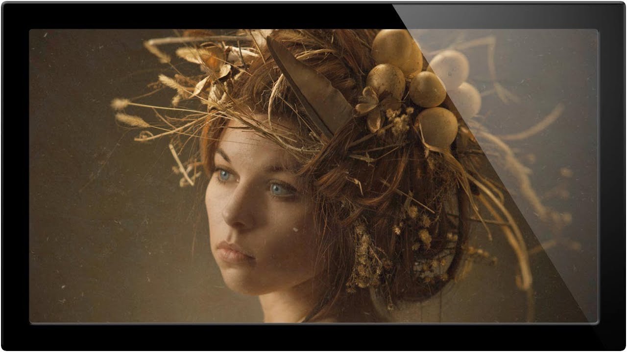
I have a confession. For the first two years of my freelance career, I used blend modes almost entirely by feel. I’d click through the dropdown like I was spinning a prize wheel, stop when something looked interesting, and call it a day. It worked, sort of, the way guessing works. Sometimes brilliant, mostly embarrassing in hindsight. The thing nobody told me early on is that blend modes aren’t random. They’re organized into logical groups, and once you understand the groups, the whole system clicks into place.
In this Aaron Nace (PHLEARN) tutorial, Watch the full tutorial on YouTube, Aaron breaks down blend modes from a practical standpoint using a real portrait and some texture images to demonstrate. He covers what the groups actually do, which ones are worth your time, and a genuinely useful trick for cycling through them quickly. The whole thing is around ten minutes and it’s the kind of video I wish had existed back when I was making graphics for friends out of a coffee shop with zero formal training.
Step 1: Set Up Your Layers
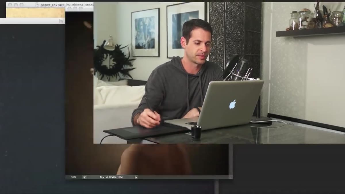 Portrait photo open in Photoshop with texture layers panel visible
Start with a base image and at least one additional layer sitting on top of it. Aaron uses a portrait as his base and brings in separate texture images to use as overlay layers. To copy a layer from one open document to another and have it land centered on your canvas, hold Shift while dragging. Without that Shift key, the layer drops wherever your cursor is, which is annoying and almost never where you want it. Once your texture is in place, convert it to a Smart Object to keep things non-destructive, then hit OK.
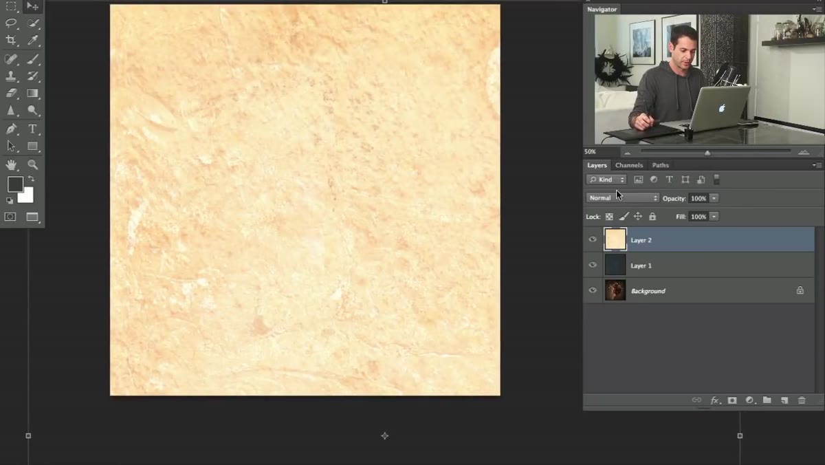
You should end up with your base image on the bottom and your texture layer sitting on top, both visible in the Layers panel. At this point the texture is in Normal mode at 100% opacity, meaning it just covers everything underneath it like a blanket.
Step 2: Understand Why Opacity Alone Isn’t the Answer
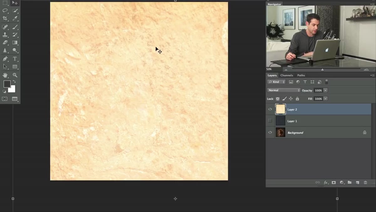 Texture layer set to reduced opacity showing flat blending result
A lot of people stop at opacity when they want to blend a layer into an image. It’s the obvious dial to reach for. But dropping opacity just makes a layer transparent. It doesn’t actually blend the pixel information in any intelligent way. What you get is two layers that look like they’re awkwardly stacked on top of each other, neither one fully committing.
Aaron makes this point clearly by reducing the opacity of the texture layer. The result looks weak. The texture and the photo underneath coexist without any real relationship. Blend modes change that relationship at the pixel level, which is a fundamentally different operation than just turning down the volume.
Step 3: Learn the Blend Mode Groups
 Blend mode dropdown open showing grouped sections in Photoshop
Open the blend mode dropdown on any layer and take a look at how it’s organized. The list is divided into groups separated by thin lines, and those groups are not decorative. Each group has a shared behavioral logic.
The top section is Normal mode (and Dissolve, which is a niche case). Below that is the Darken group, which includes Multiply, Color Burn, and Linear Burn. Everything in this group makes your layer interact with the layers beneath it by darkening them. Below that is the Lighten group, with Screen and its cousins, which lightens instead. Then you hit the Contrast group, which is where Overlay, Soft Light, and Hard Light live. These modes mix the dark and light information from your layer to increase contrast on whatever is beneath. Then there’s the Difference group, which Aaron honestly describes as the weird ones you’ll probably never use. Finally, the Color group at the bottom affects hue, saturation, and luminosity independently.
Knowing the group tells you the direction you’re heading before you even click. Want to add a dark texture effect? Go to the Darken group and experiment from there. Want to light something up? Lighten group. This alone cuts your guessing time in half.
Step 4: Apply Multiply for Dark Texture Effects
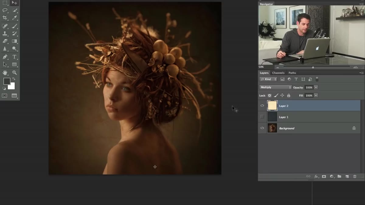 Texture layer in Multiply blend mode overlaid on portrait
For this specific scenario, a texture layer that’s mostly light tones sitting over a portrait, the Lighten and Darken modes both produce almost nothing. Lighten makes the texture invisible because it can only show pixels lighter than what’s already on the canvas, and most of the canvas already matches or beats it. Darken produces the same flatness in the opposite direction.
Multiply is where things get interesting. It takes the dark information in your layer and superimposes it onto everything below, regardless of whether those pixels are technically darker than the underlying image. The result is that the texture’s detail actually shows up. Aaron moves the layer around the canvas at this point and you can see it behaves like a real texture overlay, adding a gritty, concrete-like quality to the image. This is one of the most practical uses of blend modes in day-to-day work. Drop a texture on top of anything, set it to Multiply, adjust opacity to taste, and you’ve got a stylized photo effect in about 30 seconds.
Step 5: Cycle Through Blend Modes Quickly With a Keyboard Shortcut
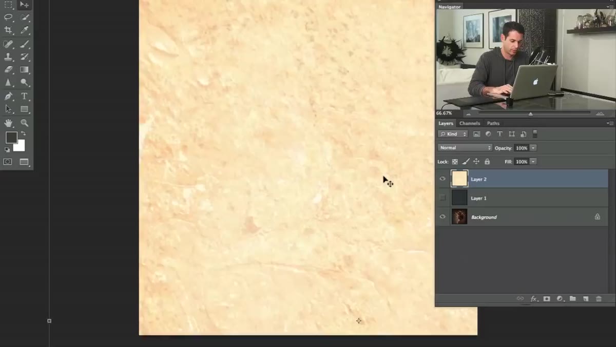 Blend mode being changed using keyboard shortcut while layer is selected
Here’s the actual time-saver Aaron introduces toward the end of the video and it’s the one tip that immediately changed how I work. Instead of clicking through the dropdown one by one, you can cycle through blend modes using a keyboard shortcut. Make sure you have the Move tool selected (not a brush or any other tool that has its own opacity controls), then hold Shift and press the plus or minus keys. Shift+Plus moves you down the list, Shift+Minus moves you up.
This is the kind of shortcut that sounds small but completely changes your workflow when you’re in an exploratory phase. Rather than constantly returning to the dropdown, you stay in the canvas and just tap through options visually. Your eyes stay where they should be, on the image, not the UI.
What I’d Add From My Own Experience
The Overlay and Soft Light modes from the Contrast group deserve more attention than they get in a beginner context. I use them constantly when I want to drop a texture onto a photo without it going as dark or heavy as Multiply does. Soft Light in particular is forgiving. It respects the highlights and shadows of the layer beneath it instead of bulldozing them. If Multiply is a sledgehammer, Soft Light is a brush.
One other thing worth knowing: blend modes interact differently depending on the tonal value of your layer. A dark texture in Multiply hits harder than a midtone texture. So if your effect feels too subtle, try duplicating the blend mode layer rather than cranking up a different mode. Sometimes two layers at Multiply 50% looks better than one layer at Multiply 100%.
The single most important thing to take away is this: blend modes are grouped by behavior, and knowing the group tells you almost everything you need to know before you click. Stop cycling blindly from Normal to Dissolve to Darken and back again. Pick the group that matches your goal, then experiment within it.
Watch the full tutorial on YouTube and see Aaron walk through the whole thing with a real image.
Comments
Leave a Comment