Client work has a funny way of forcing you to get good at things you’ve been half-assing for years. For me, black and white conversion was one of those things. I’d been hitting Shift+Command+U, calling it done, and moving on. Then I handed a moody portrait to a client who came back and said it looked “flat and kind of sad, but not in a good way.” Fair. I had no real control over the tonal relationships in the image. The highlights were blowing out, the shadows were muddy, and I’d done nothing to actually work the image into black and white. I’d just drained the color and hoped for the best.
That’s what pulled me into part two of Aaron Nace’s black and white series over at PHLEARN. Watch the full tutorial on YouTube – it picks up right where part one left off, and this time Nace gets into the Photoshop mechanics in a way that’s actually useful at a working level. He also spends real time on when black and white makes sense, which sounds like fluff but genuinely isn’t.
If you’ve ever converted a perfectly good photo to black and white and had it look weirdly wrong without being able to explain why, this tutorial gives you the vocabulary and the tools to fix that.
Step 1: Decide If Black and White Is Actually Right for the Image
 Stylized color photo shown before and after B&W conversion
Before you open a single panel, Nace makes a point that’s worth sitting with: not every image belongs in black and white. He shows a highly stylized, color-saturated photo where the whole composition relies on vivid reds to direct the viewer’s eye. Converted to black and white, it doesn’t just lose its punch – it starts to look like the wrong tool was used for the job.
Stylized color photo shown before and after B&W conversion
Before you open a single panel, Nace makes a point that’s worth sitting with: not every image belongs in black and white. He shows a highly stylized, color-saturated photo where the whole composition relies on vivid reds to direct the viewer’s eye. Converted to black and white, it doesn’t just lose its punch – it starts to look like the wrong tool was used for the job.
The rule of thumb he lands on is that black and white tends to work best with images that have a natural, emotional quality to them. Heavy stylization, neon color grading, and in-your-face graphic design aesthetics usually fight against the medium rather than benefit from it. Worth asking yourself before you reach for the desaturate shortcut: is the feeling of this image something that lives in the color, or something that would survive without it?
Step 2: Understand Selective Color (and Why It’s Usually a Trap)
 Single red rose isolated in otherwise black and white image
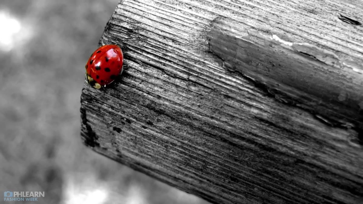
Nace touches on selective color – the technique where most of an image goes black and white except for one isolated element. You’ve seen it: the single red rose in a grayscale scene, or the colorful balloon floating over a desaturated street.
Single red rose isolated in otherwise black and white image
Nace touches on selective color – the technique where most of an image goes black and white except for one isolated element. You’ve seen it: the single red rose in a grayscale scene, or the colorful balloon floating over a desaturated street.
His take is diplomatic but honest. It works in very specific contexts, like when a filmmaker needs to direct the viewer’s attention to one precise thing for narrative reasons. Outside of those rare cases, it’s a technique that’s available in your toolkit, not one you should be reaching for often. As someone who made a lot of questionable graphic design decisions in my early career, I’d call this section a gentle intervention.
Step 3: Use Shift+Command+U for a Fast Baseline Desaturation
 Photoshop canvas after desaturation shortcut applied
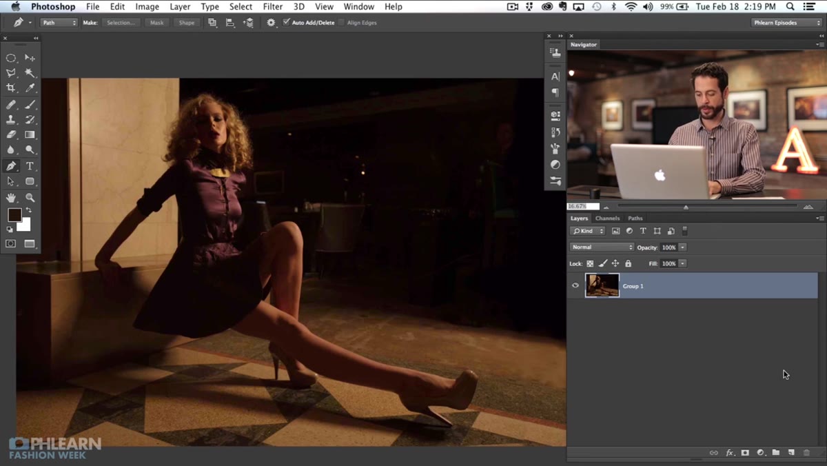
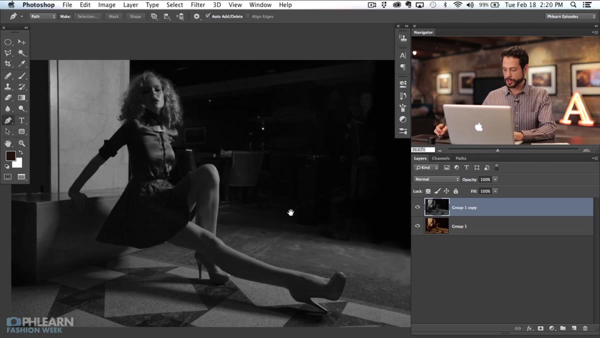
Once Nace moves into Photoshop, he restores a color image from the previous episode and converts it back to black and white using the desaturate shortcut. On a Mac, that’s Shift+Command+U. On Windows, it’s Shift+Control+U. This strips out all the color data without touching the luminosity or tone values.
Photoshop canvas after desaturation shortcut applied
Once Nace moves into Photoshop, he restores a color image from the previous episode and converts it back to black and white using the desaturate shortcut. On a Mac, that’s Shift+Command+U. On Windows, it’s Shift+Control+U. This strips out all the color data without touching the luminosity or tone values.
He’s upfront that this method gives you zero control over how different colors translate into tones. Blues and reds might land at almost the same gray value, which can flatten the image. But the point of this step isn’t to end here – it’s to get a fast starting point that you’ll then shape using curves and levels. Think of desaturation as laying a rough draft on the table, not finishing the piece.
Step 4: Use Curves to Shape the Tonal Range
 Curves adjustment panel open on a black and white image
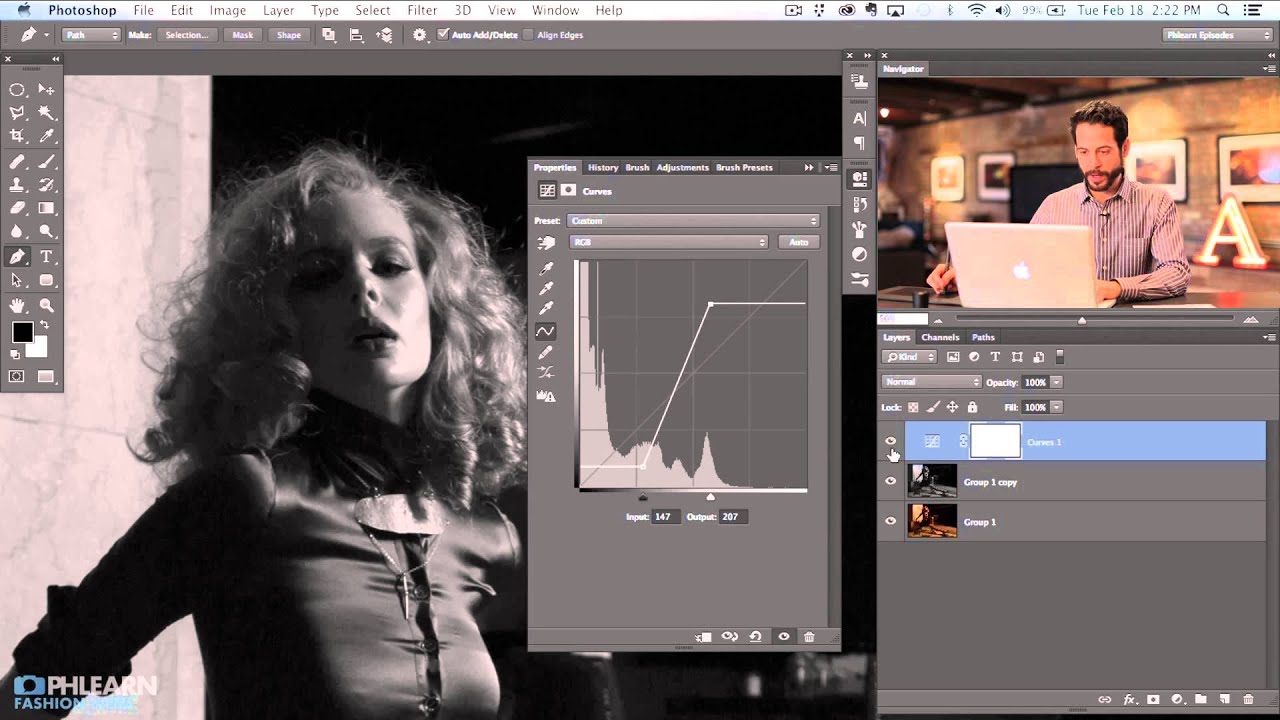
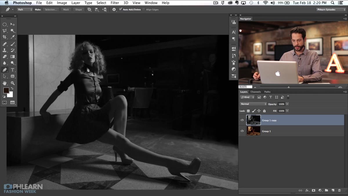
This is where the tutorial starts earning its keep. With the image desaturated, Nace opens a Curves adjustment to take control of the lights and darks. In a color image, curves let you adjust individual color channels – but in a desaturated image, you’re working purely with luminosity, which means every adjustment directly controls how the tones feel.
Curves adjustment panel open on a black and white image
This is where the tutorial starts earning its keep. With the image desaturated, Nace opens a Curves adjustment to take control of the lights and darks. In a color image, curves let you adjust individual color channels – but in a desaturated image, you’re working purely with luminosity, which means every adjustment directly controls how the tones feel.
Pulling the highlights up brightens the image without blowing out the whites if you’re careful. Dragging the shadows down adds depth and keeps dark areas from going completely black. The S-curve – a gentle compression of the very darkest shadows and the very brightest highlights, with a boost in the midtone contrast – is a classic starting point for portraits. The goal is to make the image feel intentional rather than flat. If the desaturation step was the rough draft, curves is your first real editorial pass.
Step 5: Refine with Levels for Final Tonal Control
 Levels adjustment panel showing input and output sliders
Levels works alongside curves and gives you a more direct interface for setting your black point, white point, and midtone gamma. Nace uses it to tighten up the tonal range after the curve is applied. If your image has a lot of gray where you want real blacks, dragging the left input slider inward clips those darker values to pure black. Same principle on the right side for whites.
Levels adjustment panel showing input and output sliders
Levels works alongside curves and gives you a more direct interface for setting your black point, white point, and midtone gamma. Nace uses it to tighten up the tonal range after the curve is applied. If your image has a lot of gray where you want real blacks, dragging the left input slider inward clips those darker values to pure black. Same principle on the right side for whites.
What I find useful about combining curves and levels is that they cover different jobs. Curves let you sculpt contrast at specific points across the tonal range, with a lot of fine-grained control. Levels lets you set your absolute floor and ceiling cleanly and quickly. Using both gives you more to work with than either one alone.
What I’d Add From My Own Workflow
Here’s something the tutorial doesn’t explicitly cover but that I’ve found essential: do your desaturation and your curves work on adjustment layers, not directly on the pixel layer. If you flatten everything and then decide the highlights are too hot or the shadows are eating important detail, you’re starting over. Adjustment layers let you go back, tweak the curve, and keep iterating without any destructive consequences.
I learned this the expensive way. A client once asked me to revise a black and white retouch three rounds deep, and I had baked every adjustment into a flattened file. The hour it took to redo it from scratch was a lesson I’ve only needed once. Non-destructive habits aren’t just good practice – they’re the difference between a 5-minute revision and a full rebuild.
The single biggest thing this tutorial reinforced for me is that desaturation is a starting point, not a technique. Getting a good black and white image means actively shaping the tones after you remove the color – and that requires understanding what curves and levels are actually doing. The shortcut is easy. The thinking is what takes practice.
Watch the full tutorial on YouTube and pay close attention to the before/after comparisons Nace walks through. Seeing the flat desaturation versus the sculpted curves version side by side is worth more than anything I can put into words here.
Comments
Leave a Comment